Data Label: Labeling the Steps: The Significance of Data Labels in Excel Step Charts
1. Visualizing Data Progression
Step charts are a unique and powerful tool in data visualization, particularly useful when you want to display data that changes at irregular intervals. Unlike line charts, which interpolate values between data points, step charts display each data segment distinctly, making them ideal for visualizing inventory levels, interest rates, or any data where the change occurs at specific points in time. They are especially prevalent in financial contexts where they can illustrate stock price movements with precision, capturing the discrete jumps that occur with trading activity.
Insights from Different Perspectives:
1. Financial Analysts: They appreciate step charts for their ability to show exact moments of price changes, which is crucial for understanding market dynamics.
2. Project Managers: For them, step charts can represent project milestones and the progression between phases with clarity.
3. Data Scientists: They often use step charts to highlight the results of discrete event simulations or to showcase the stepwise function of an algorithm.
In-Depth Information:
- Data Labels: These are critical in step charts as they provide context to each step, indicating what the data point represents. For example, in a chart tracking project milestones, labels might include "Phase 1 Completion" or "Regulatory Approval".
- Axis Configuration: The X-axis typically represents time or stages, while the Y-axis shows the value or status. It's important to ensure that the axis scales are set appropriately to reflect the nature of the data.
- Color Coding: Utilizing different colors for steps can help differentiate between data series or highlight significant changes.
Examples to Highlight Ideas:
- Inventory Management: A step chart could show the number of units in stock over time, with steps down indicating sales and steps up showing new stock arrivals.
- Interest Rate Changes: A bank might use a step chart to depict the changes in interest rates over time, with each step representing a change in policy.
Step charts serve as a bridge between tabular data and a narrative, telling the story of how data evolves over time. They turn abstract numbers into a visual journey, making it easier for the audience to follow along and understand the significance of each data point. Whether it's for financial analysis, project management, or scientific research, step charts offer a structured way to present data that moves in steps rather than slopes.

Visualizing Data Progression - Data Label: Labeling the Steps: The Significance of Data Labels in Excel Step Charts
2. Definitions and Importance
data labeling is a critical process in the realm of data science and machine learning, serving as the foundation upon which models are trained and insights are derived. It involves the assignment of relevant and informative tags or labels to raw data, such as images, text, or videos, to identify certain attributes or elements within them. This process is essential for supervised learning models, where the algorithm learns to predict outcomes from input data that is paired with the correct output. The importance of data labeling cannot be overstated, as the quality and accuracy of the labels directly influence the performance of the machine learning models.
From the perspective of a data scientist, data labeling is the step that bridges the gap between abstract theory and practical application. It's where the rubber meets the road, so to speak. For a business analyst, data labeling is a way to add measurable value to raw data, transforming it into a strategic asset. And from the viewpoint of a machine learning engineer, it's the meticulous task that can make or break the success of an AI system.
Here's an in-depth look at the basics of data labeling:
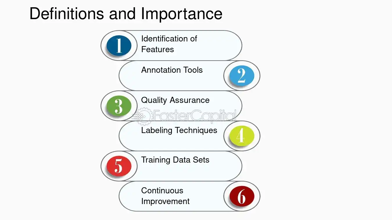
1. Identification of Features: The first step in data labeling is identifying the features that are relevant to the problem at hand. For example, in a step chart in Excel, data labels can help identify significant changes in data trends over time.
2. Annotation Tools: Various tools are available for data labeling, ranging from simple manual labeling to more sophisticated semi-automated tools. These tools help streamline the labeling process and ensure consistency across datasets.
3. Quality Assurance: Ensuring the accuracy of data labels is paramount. This often involves a review process where multiple annotators label the same piece of data, and discrepancies are resolved through consensus or expert review.
4. Labeling Techniques: Different types of data require different labeling techniques. For instance, bounding boxes are commonly used for objects in images, while text classification might involve identifying sentiment or topics.
5. Training Data Sets: The labeled data forms the training set for machine learning models. The diversity and size of this dataset are crucial for building robust models.
6. Continuous Improvement: Data labeling is not a one-time task. As models are deployed and more data is collected, the labeling process continues, allowing models to learn and improve over time.
To highlight the importance of data labeling with an example, consider a step chart in Excel that tracks the quarterly sales figures of a company. By labeling each step with the corresponding quarter and sales figure, the chart becomes much more informative, allowing viewers to quickly grasp trends and make informed decisions. Similarly, in machine learning, accurately labeled data leads to more reliable predictions, whether it's recognizing objects in images or understanding the sentiment behind a customer review.
Data labeling is a multifaceted process that plays a vital role in extracting meaningful information from raw data. It's a task that requires attention to detail, a clear understanding of the objectives, and a commitment to quality. Whether you're a data scientist, a business analyst, or a machine learning engineer, mastering the basics of data labeling is a step towards unlocking the full potential of data-driven decision-making.
Definitions and Importance - Data Label: Labeling the Steps: The Significance of Data Labels in Excel Step Charts
3. Adding Labels to Your Excel Step Chart
Adding labels to an Excel step chart can transform a simple set of data into a clear and informative visual story. Labels provide context, making it easier for viewers to understand the significance of each step in the data series. They act as signposts, guiding the audience through the data's narrative and highlighting key points. From a data analyst's perspective, labels are essential for pinpointing specific values and trends that might otherwise go unnoticed. For the end-user, they offer a quick reference without the need to cross-reference with other materials. Moreover, in a collaborative setting, labels can facilitate discussion by providing a common reference point for team members.
Here's a detailed guide on how to add labels to your Excel step chart:
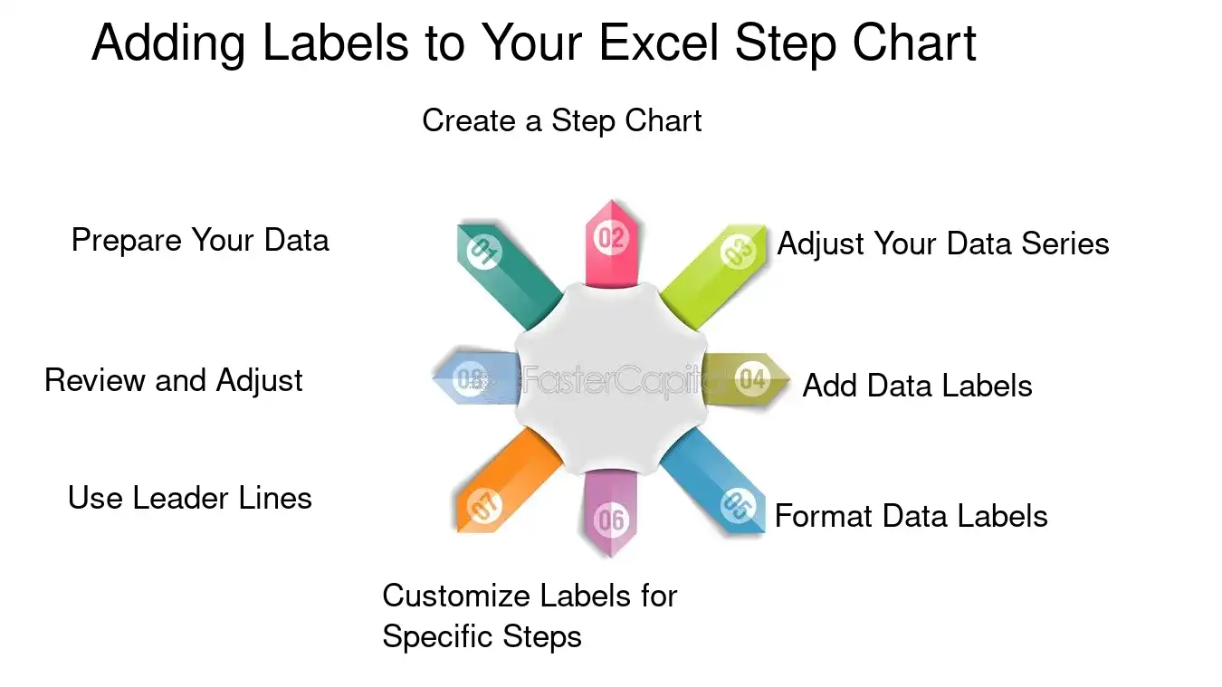
1. Prepare Your Data: Before creating your step chart, organize your data in two columns: one for the 'steps' (categories or time periods) and one for the values you want to plot.
2. Create a Step Chart: Go to the 'Insert' tab, click on 'Line Chart', and select the 'Line with Markers' option. This will serve as the basis for your step chart.
3. Adjust Your Data Series: Right-click on the chart and choose 'Select Data'. Here, you can adjust the horizontal (category) axis labels and the data series to ensure they're correctly aligned with your step chart.
4. Add Data Labels: Once your step chart is ready, click on the series to select it. Then, right-click and choose 'Add Data Labels'. You can then position them above, below, or next to the data points.
5. Format Data Labels: For more control over the appearance of your labels, right-click on them and select 'Format Data Labels'. You can choose the label position, number format, and even add a callout line for clarity.
6. Customize Labels for Specific Steps: If you want to emphasize certain steps, you can click on individual labels and format them differently, changing the font size, color, or style.
7. Use Leader Lines: If your chart is crowded, consider adding leader lines to your labels. These lines connect the label to the corresponding data point, making it easier to follow.
8. Review and Adjust: Take a step back and review your labeled step chart. Ensure that the labels are readable and the chart is not cluttered. Adjust the label positions if necessary to improve clarity.
For example, if you're tracking the quarterly sales data of a product, your step chart might show a sudden spike in Q2. Adding a label to this data point could provide insight into the cause, such as "Q2 Spike - Major Marketing Campaign".
Remember, the goal of adding labels is not just to display data but to tell its story effectively. By carefully placing and formatting labels, you can ensure that your Excel step chart is both informative and engaging.
Adding Labels to Your Excel Step Chart - Data Label: Labeling the Steps: The Significance of Data Labels in Excel Step Charts
4. Tips and Tricks for Clarity
Customizing data labels in excel step charts is a nuanced process that can significantly enhance the readability and effectiveness of your data presentation. The key to clarity lies in the thoughtful placement and formatting of these labels. By default, Excel provides a basic setup for data labels, but it often requires fine-tuning to align with the specific needs of your dataset and audience. From the perspective of a data analyst, clear labels are crucial for quick interpretation, while a graphic designer might emphasize the aesthetic integration of labels within the chart. A project manager, on the other hand, would advocate for labels that facilitate clear communication among stakeholders. Regardless of the viewpoint, the ultimate goal is to achieve a balance between functionality and visual appeal.
Here are some in-depth tips and tricks for customizing data labels in excel step charts:
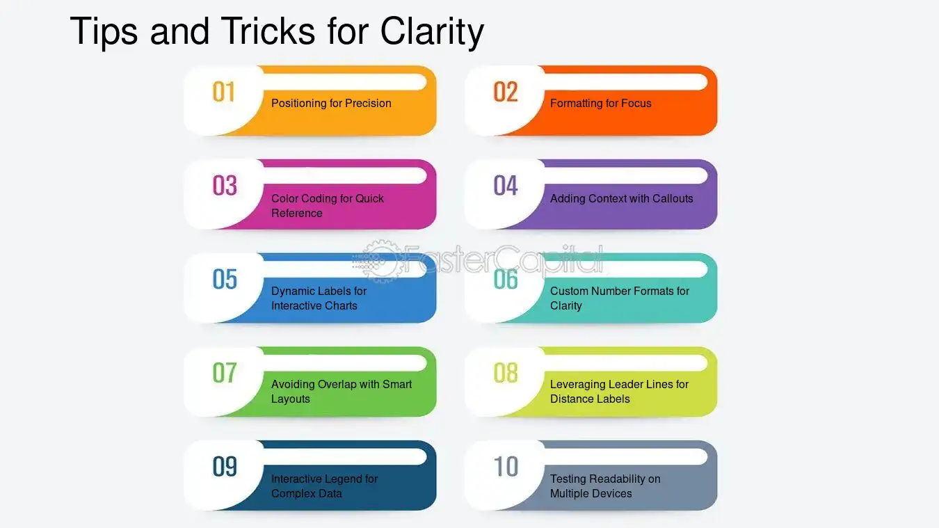
1. Positioning for Precision: The default position of data labels might not always be ideal. For instance, consider a step chart tracking quarterly sales figures. Instead of having the labels sit directly on the steps, which can be visually cluttering, you could position them above each step to ensure they are easily readable without obscuring the data points.
2. Formatting for Focus: Use font styles and sizes that make your labels stand out, yet remain part of the overall chart design. Bold fonts can highlight key data points, like a record-breaking sales quarter, while a consistent size maintains uniformity.
3. color Coding for quick Reference: Assign colors to your data labels that correspond with the data series or categories they represent. This is particularly useful in a step chart that compares multiple products' sales over time. For example, Product A's data labels could be blue, while Product B's could be green, allowing for immediate visual differentiation.
4. Adding Context with Callouts: Sometimes, a data point requires additional explanation. Using callouts can provide this context without crowding the chart. Imagine a sudden spike in user engagement on a website; a callout can succinctly explain that this was due to a successful marketing campaign.
5. Dynamic Labels for Interactive Charts: If your step chart will be used in a dynamic presentation, consider using dynamic labels that appear when a viewer hovers over a data point. This keeps the chart clean while still offering detailed information on demand.
6. custom Number formats for Clarity: Excel allows you to customize the number format of your data labels. If you're dealing with large numbers, you might format them to display in thousands (K) or millions (M) to keep the labels concise and the chart uncluttered.
7. Avoiding Overlap with Smart Layouts: Overlapping labels can render a chart unreadable. Use Excel's 'Label Options' to adjust the layout and avoid overlap. For instance, if two steps are very close in value, staggering the labels can prevent them from running into each other.
8. Leveraging Leader Lines for Distance Labels: When labels are placed outside of the chart area to avoid clutter, leader lines can be used to connect the label to the corresponding step, ensuring that the association is clear.
9. Interactive Legend for Complex Data: In a step chart with multiple variables, an interactive legend that highlights the related steps when selected can enhance understanding without overloading the chart with labels.
10. Testing Readability on Multiple Devices: Ensure that your customized labels are legible across different devices, especially if your chart will be viewed on mobile phones or tablets, where screen size can affect the presentation.
By implementing these tips, you can transform a standard Excel step chart into a powerful tool for data storytelling. Remember, the goal is to make the data as accessible and understandable as possible, without sacrificing the chart's integrity or visual appeal. Customizing data labels is an art that balances information with design, ensuring that your audience can quickly grasp the story behind the numbers.
Tips and Tricks for Clarity - Data Label: Labeling the Steps: The Significance of Data Labels in Excel Step Charts
5. Enhancing Interpretation
In the realm of data visualization, data labels serve as a critical bridge between raw data and human interpretation. They are not merely annotations; they are the narrative that guides the audience through the numerical story being told. Particularly in Excel step charts, which are used to represent discrete changes and trends over time, data labels transform what could be a perplexing zigzag of lines into a clear exposition of facts and figures. They provide context, clarify what might otherwise be ambiguous, and offer a direct insight into the data set's nuances.
From the perspective of a data analyst, data labels are indispensable. They allow for a quick scan of information, making it easier to identify patterns, outliers, or points of interest. For instance, in a step chart tracking quarterly sales, data labels can immediately inform the viewer of peak seasons or unexpected dips without the need to cross-reference with the axis.
For a project manager, data labels in a step chart can highlight milestones or critical shifts in a project's timeline. This can be particularly useful in presentations or reports where detailed explanations are not feasible. For example, a label indicating the implementation of a new policy can quickly show its impact on project performance.
Here are some in-depth insights into the use of data labels in data analysis:
1. Precision and Clarity: Data labels must be precise. A common practice is to round numbers for simplicity, but this must be done judiciously to avoid misinterpretation. For example, labeling a point as "$1.5M" instead of "$1,452,345" in a revenue chart maintains clarity while conveying the necessary level of detail.
2. Strategic Placement: The placement of data labels is as important as the information they convey. Labels should be placed where they are easily associated with the corresponding data point without cluttering the chart. In Excel, this might mean using leader lines or positioning labels outside of the chart area to maintain readability.
3. Consistency: Consistency in label formatting across a dataset ensures that once a viewer learns to read the chart, they can apply that knowledge throughout without confusion. For instance, if a step chart uses red labels to denote a decrease in values, this color coding should be consistent throughout the dataset.
4. Interactive Labels: In digital reports, interactive data labels can enhance user engagement. Hovering over a data point to reveal additional information can provide depth without overwhelming the primary view. For example, hovering over a sales figure could reveal the number of transactions that contributed to that total.
5. Custom Formatting: Excel allows for custom formatting of data labels, which can be used to emphasize certain data points. Bold or colored labels can draw attention to significant events or changes, such as a record-breaking sales quarter.
6. Integration with Analysis Tools: Data labels can be dynamically linked to analysis tools within excel. For example, a label can display a summary statistic calculated from the underlying data, such as an average or a percentage change.
7. Accessibility: Data labels should be designed with accessibility in mind. This means considering color contrast, font size, and the inclusion of alternative text for screen readers.
By incorporating these practices, data labels become more than mere markers; they become a storytelling tool that enhances the interpretative power of data analysis. They bridge the gap between complex datasets and actionable insights, making them an essential element in any data analyst's toolkit. Whether for internal review or external presentation, well-crafted data labels in Excel step charts can significantly elevate the communicative value of data visualizations.

Enhancing Interpretation - Data Label: Labeling the Steps: The Significance of Data Labels in Excel Step Charts
6. Using Data Labels to Tell a Story
In the realm of data visualization, step charts serve as a powerful tool to depict changes and trends over time. Unlike traditional line charts, step charts create a visual staircase, emphasizing the exact point of change and the duration of stability before the next shift. This characteristic makes them particularly useful for data that involves sudden jumps or drops, such as interest rates, stock prices, or inventory levels. The addition of data labels transforms these charts from mere representations of numbers into narratives that engage the viewer, guiding them through the data's story with clarity and precision.
1. Data Labels as Storytellers: Each label acts as a narrative anchor, drawing attention to significant events or milestones within the dataset. For instance, in a step chart tracking a company's stock price, a data label might highlight a sharp increase following a successful product launch, providing context that enriches the viewer's understanding.
2. Enhancing Readability: Data labels can include additional details like percentages, absolute changes, or annotations. This eliminates the need for viewers to cross-reference with the axis, allowing for a more intuitive reading experience. For example, a step chart showing monthly sales might use data labels to display the percentage change from month to month, making it easier to spot trends at a glance.
3. Interactive Elements: Modern data visualization tools allow for interactive data labels in step charts. These can reveal more detailed information on hover or click, such as explanatory notes or related data points. This interactivity not only engages the viewer but also allows for a cleaner chart design, free from clutter.
4. Customization for Impact: Data labels can be customized in terms of font, color, and placement to emphasize certain data points over others. Highlighting a record-breaking quarter in bold red, for instance, immediately draws the viewer's eye and underscores its importance.
5. Use in Reporting and Presentations: In corporate settings, step charts with data labels are invaluable. They can succinctly communicate key performance indicators, making them ideal for reports and presentations where time is limited, and the message needs to be clear and impactful.
Example: Consider a step chart depicting the number of subscribers to a streaming service over a year. The data labels could tell a story of growth, with annotations explaining that a spike in subscribers in June coincided with the release of a highly anticipated show, while a dip in September might be attributed to the end of a promotional period.
Data labels in step charts are not just a feature; they are a necessity for anyone looking to present data in a way that is both informative and engaging. By turning numbers into a narrative, they allow viewers to connect with the data on a more intuitive level, making complex information accessible to all.
Find a tech team for your Startup NOW
FasterCapital's internal team works by your side and handles your technical development from A to Z!
7. Troubleshooting Common Issues with Data Labels in Step Charts
Data labels serve as critical navigational aids in step charts, providing immediate clarity and enhancing the overall comprehension of the data presented. However, users often encounter issues that can obscure the data's narrative, such as overlapping labels, incorrect positioning, or formatting inconsistencies. These problems can significantly detract from the chart's effectiveness, leading to misinterpretation or even complete misunderstanding of the data trends and values. Addressing these issues requires a systematic approach that considers the unique characteristics of step charts, where data points are connected by horizontal and vertical lines, representing different categories or time intervals.
Troubleshooting common issues with data labels in step charts involves several key steps:
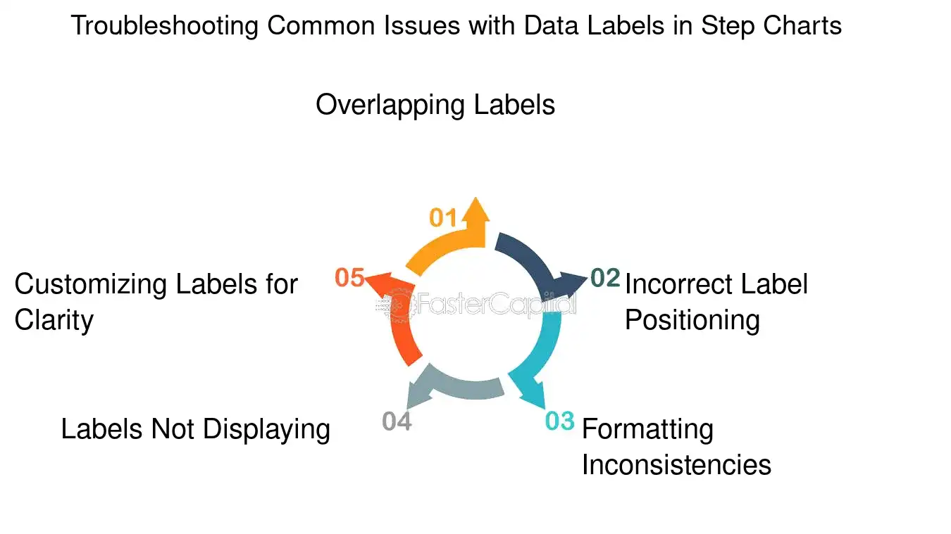
1. Overlapping Labels: When labels overlap, they become unreadable. To resolve this, adjust the label's position manually or use Excel's "Label Options" to stagger the labels, ensuring each is distinct and legible.
- Example: If two data points are at 50 and 52, place one label above and one below the data point line.
2. Incorrect Label Positioning: Sometimes, labels may not align with their corresponding data points. This can be corrected by setting the label position to 'Center' to align it directly with the step's midpoint.
- Example: For a data point at the transition from one step to the next, center the label to avoid confusion about which step it belongs to.
3. Formatting Inconsistencies: Consistent label formatting is essential for readability. Ensure all labels have the same font size, color, and style unless differentiation is necessary to highlight specific data points.
- Example: Use bold formatting only for the highest and lowest points to draw attention to them, while keeping the rest uniform.
4. Labels Not Displaying: If labels are not showing, check the "Add Data Labels" option is selected. If they still don't appear, the chart area might be too small, and resizing the chart or font size may be necessary.
- Example: After adding a new data series, if labels don't show up, resize the chart area to accommodate the additional labels.
5. Customizing Labels for Clarity: In some cases, adding custom text to labels or using value from cells can provide clearer context. This can be done through the "Format Data Labels" pane, where you can choose to link labels to cell contents.
- Example: Instead of just the value, include a short descriptor like 'Q1' or 'Peak' to give more context.
By carefully examining and adjusting these aspects, the integrity and communicative power of the step chart can be preserved, ensuring that the data labels fulfill their role as effective storytelling tools within the visual narrative. Remember, the goal is to make the data as accessible and intelligible as possible to all viewers, regardless of their familiarity with the dataset or the subject matter.
Troubleshooting Common Issues with Data Labels in Step Charts - Data Label: Labeling the Steps: The Significance of Data Labels in Excel Step Charts
8. Dynamic Data Labels in Excel
Dynamic data labels in Excel are a powerful feature that can significantly enhance the readability and functionality of step charts. These labels provide real-time updates as the underlying data changes, offering an immediate visual cue to the viewer about the data's current state. This dynamic aspect is particularly useful in scenarios where data is not static and can change frequently, such as in financial dashboards or project timelines. By employing dynamic data labels, users can create more interactive and informative charts that better serve the needs of their audience.
From a design perspective, dynamic labels keep the chart clean and focused, as they only appear when necessary, reducing clutter. For analysts, this feature is a time-saver, as it automates the process of updating labels with new data points. Developers appreciate the flexibility dynamic labels offer when creating custom Excel applications. And end-users benefit from the enhanced clarity and immediacy of information presentation.
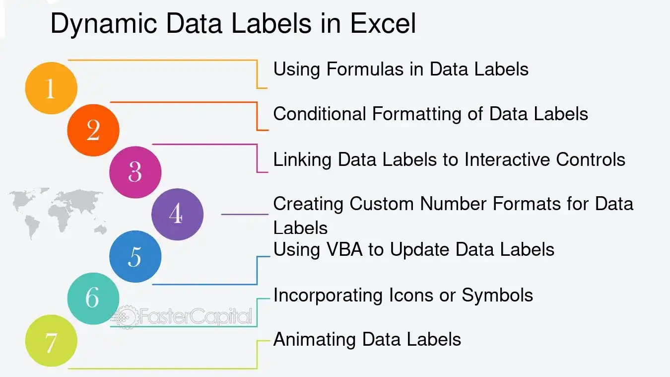
Here are some advanced techniques for utilizing dynamic data labels in Excel:
1. Using Formulas in Data Labels: Instead of static text, you can use a formula for a data label that references a cell. This means when the cell's value changes, the data label automatically updates. For example, if you have a sales chart and you want to display the percentage change, you can set a data label to reference a cell that calculates this percentage.
2. conditional Formatting of data Labels: Excel allows you to apply conditional formatting to data labels. You can set rules for the labels to change color, font, or even visibility based on the data they represent. For instance, a data label could turn red if a value drops below a certain threshold, drawing immediate attention to it.
3. Linking Data Labels to Interactive Controls: By linking data labels to form controls like sliders or dropdown menus, you can create an interactive experience. As the user adjusts the control, the data labels update to reflect the new data. This is particularly useful for what-if analysis and dynamic reports.
4. Creating Custom Number Formats for Data Labels: Excel's custom number formats can be used to display data labels in a more meaningful way. For example, instead of showing a large number that represents revenue, you can format the data label to show the value in millions with an "M" suffix.
5. Using VBA to Update Data Labels: For more advanced customization, visual Basic for applications (VBA) can be used to programmatically update data labels based on certain conditions or events. This allows for a high degree of control over how and when data labels are displayed.
6. Incorporating Icons or Symbols: Excel supports the use of icons and symbols in data labels, which can be used to convey information visually. For example, an upward arrow icon next to a data label could indicate an increase in value, making it instantly recognizable.
7. Animating Data Labels: While Excel does not natively support animated charts, you can simulate animation through VBA by sequentially updating data labels to create a sense of motion. This can be an engaging way to present data changes over time.
To illustrate these techniques, consider a step chart tracking monthly sales. By applying conditional formatting, the data labels for months with the highest sales could be highlighted in green, while those with the lowest sales could be in red. Linking these labels to a dropdown menu allows the viewer to select different product categories, dynamically updating the chart to display the relevant sales data.
In summary, dynamic data labels in Excel offer a range of possibilities for enhancing data visualization. By understanding and applying these advanced techniques, users can transform their step charts into more dynamic, informative, and interactive tools for data analysis.
Dynamic Data Labels in Excel - Data Label: Labeling the Steps: The Significance of Data Labels in Excel Step Charts
9. The Impact of Data Labels on Data Presentation
Data labels serve as a critical bridge between the raw data and the story it tells, transforming a mere collection of numbers into a narrative that can inform, persuade, or enlighten an audience. In the realm of Excel step charts, these labels are not just markers; they are the narrators that guide the viewer through the intricacies of the data's journey. They provide context, clarify trends, and highlight key milestones that might otherwise be lost in a sea of points and lines. The impact of data labels on data presentation is multifaceted and profound, influencing not only the comprehension but also the retention of information presented.
From the perspective of a data analyst, data labels are indispensable for pinpointing exact values and making precise comparisons. For instance, in a step chart showcasing quarterly sales figures, labels can instantly convey whether a particular quarter met the forecasted targets. On the other hand, a graphic designer might emphasize the aesthetic integration of labels within the chart, ensuring that they contribute to a visually cohesive and engaging narrative. Meanwhile, a business executive relies on these labels to quickly extract actionable insights without getting bogged down in the underlying data complexities.
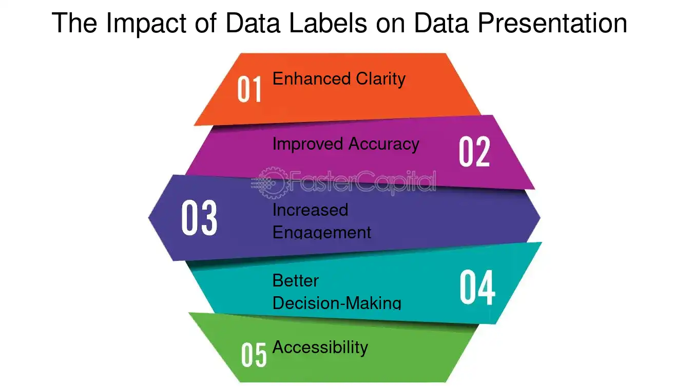
Here are some in-depth insights into the impact of data labels on data presentation:
1. Enhanced Clarity: Labels act as signposts, guiding the viewer's eye and helping them follow the data's progression over time or categories. For example, in a step chart tracking the adoption rate of a new software version, labels can clearly indicate the points of significant uptake or decline.
2. Improved Accuracy: By providing exact figures, labels help avoid misinterpretation of data visualizations. This is particularly important in fields like finance or medicine, where precision is paramount.
3. Increased Engagement: Well-designed labels can make a chart more interactive and interesting. Interactive dashboards often use hover-over data labels to give users more control over the information they see.
4. Better Decision-Making: In strategic contexts, labels can highlight critical data points that might influence business decisions, such as sudden spikes in user engagement following a marketing campaign.
5. Accessibility: For audiences with visual impairments or cognitive differences, data labels can make charts more accessible by offering alternative ways to interpret the visual information.
To illustrate, consider a step chart depicting the growth of renewable energy usage over a decade. Without labels, it might show a general upward trend, but with labels indicating key policy changes or technological advancements, the chart tells a story of cause and effect, of challenges overcome and milestones achieved.
Data labels are not mere annotations; they are an essential element of data presentation that can significantly enhance the effectiveness and impact of a visual narrative. Whether for detailed analysis, aesthetic storytelling, or strategic decision-making, the careful application of data labels can transform a simple chart into a compelling data-driven story.
The Impact of Data Labels on Data Presentation - Data Label: Labeling the Steps: The Significance of Data Labels in Excel Step Charts