SlideShare a Scribd company logo
START USING CSS GRID LAYOUT TODAY
@rachelandrew @ Render Conf
Rachel Andrew
▸ CSS Working Group Invited Expert
▸ Google Developer Expert
▸ co-founder Perch CMS
▸ Old Nerd.
▸ You can find me in most places as @rachelandrew you can email
me@rachelandrew.co.uk or check out my site at https://rachelandrew.co.uk
March 2017 March 2017 March 2017 March 2017 March 2017
Start using CSS Grid Layout Today
▸ What is grid & why is it different to flexbox?
▸ How do I get started using grid in production?
▸ What about old browsers?
Why not use
flexbox?
CSS Grid Layout
Flexbox is for one-dimensional layout
Render Conf: Start using CSS Grid Layout Today
Grid is for two-dimensional layout
Render Conf: Start using CSS Grid Layout Today
.grid {
display: grid;
grid-gap: 20px;
grid-template-columns: repeat(auto-
fill, minmax(200px, 1fr));
}
Grid minmax() and auto-fill
Creating a flexible number of flexible
tracks, with a little bit of grid spec
magic.
http://codepen.io/rachelandrew/pen/evjdLM
If you are adding widths to all your
flex items, you probably need grid.
.example1 {
display: flex;
justify-content: space-between;
flex-wrap: wrap;
margin: 30px;
}
Flexbox
Using space-between
http://codepen.io/rachelandrew/pen/MpBbwX
Render Conf: Start using CSS Grid Layout Today
.example2 {
display: flex;
flex-wrap: wrap;
}
.example2 > div {
flex: 1 1 0;
}
.example2 > div.bigger {
flex: 4 1 0;
}
Flexbox
Some things grow larger than other
things.
This is defined using flex properties on
the item.
http://codepen.io/rachelandrew/pen/MpBbwX
Render Conf: Start using CSS Grid Layout Today
Grid works from the container in
.example1 {
display: grid;
grid-gap: 20px;
grid-template-columns: 1fr 1fr 1fr;
margin: 20px;
}
Grid
Define column tracks. Items are
constrained by those tracks.
http://codepen.io/rachelandrew/pen/JWBbJP
Render Conf: Start using CSS Grid Layout Today
.example2 {
display: grid;
grid-gap: 20px;
grid-template-columns: 2fr 1fr 2fr;
margin: 20px;
}
Grid
To make some tracks larger than
others, we do that when defining the
tracks on the container not on the
item itself.
http://codepen.io/rachelandrew/pen/JWBbJP
Render Conf: Start using CSS Grid Layout Today
Other layout methods start with the
item.
.box {
float: left;
width: 33.3333%;
}
A float grid
The float property and widths are
added to the items.
.box {
display: inline-block;
width: 33.3333%;
}
inline-block grid
The display property is set to inline-
block and width is added to the item.
.container {

display: flex;

}

.box {
flex: 0 0 33.3333%;
}
Flex grid
We add display: flex to the container
however to make a grid out of flex
items we need to use the flex
properties in the items.
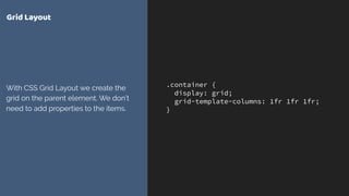
.container {
display: grid;
grid-template-columns: 1fr 1fr 1fr;
}
Grid Layout
With CSS Grid Layout we create the
grid on the parent element. We don’t
need to add properties to the items.
Grid is all about the container
Grid or Flexbox
… and that’s just the start
‣ Grid allows you to layer items, or for two items to occupy
the same space
‣ Grid allows full control of negative space in your designs
‣ Grid has methods such as the dense packing mode to
backfill gaps in a tight-packed grid
Flexbox or Grid?
Use Flexbox when …
‣ Your content is a row OR a column
‣ You want the size of items to dictate their layout
‣ You want to distribute space
Flexbox or Grid?
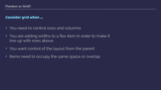
Consider grid when …
‣ You need to control rows and columns
‣ You are adding widths to a flex item in order to make it
line up with rows above.
‣ You want control of the layout from the parent
‣ Items need to occupy the same space or overlap
Using grid in
production
CSS Grid Layout
Render Conf: Start using CSS Grid Layout Today
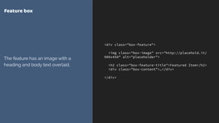
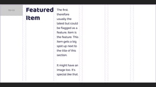
<div class="box-feature">
<img class="box-image" src="http://placehold.it/
900x450" alt="placeholder">
<h2 class="box-feature-title">Featured Item</h2>
<div class="box-content">…</div>
</div>
Feature box
The feature has an image with a
heading and body text overlaid.
.box-feature {
display: grid;
grid-gap: 20px;
grid-template-columns: repeat(6, 1fr);
}
Feature box
display: grid turns on grid layout
grid-gap defines gutters between
grid items
grid-template-columns creates
column tracks. In this case creating a
grid with 6 equal columns.
The fr unit defines a fraction of the
available space in the grid container
Render Conf: Start using CSS Grid Layout Today
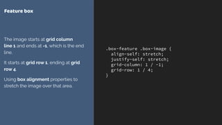
.box-feature .box-image {
align-self: stretch;
justify-self: stretch;
grid-column: 1 / -1;
grid-row: 1 / 4;
}
Feature box
The image starts at grid column 

line 1 and ends at -1, which is the end
line.
It starts at grid row 1, ending at grid
row 4.
Using box alignment properties to
stretch the image over that area.
Grid lines respect writing mode.
Column line 1 is on the left and -1 on
the right in a LTR language.
Explicit vs. Implicit Grid
▸ The Explicit Grid is created when you define tracks with grid-template-
columns and grid-template-rows
▸ If you place an item outside of that grid, or auto-placed content requires
further row or column tracks these are added by grid as the Implicit Grid.
Render Conf: Start using CSS Grid Layout Today
.box-feature .box-feature-title {
grid-column: 3 / -1;
grid-row: 1;
background-color: rgba(0,0,0,0.7);
color: #fff;
align-self: start;
padding: 20px;
}
.box-feature .box-content {
grid-column: 2 / -1;
grid-row: 2;
background-color: rgba(0,0,0,0.7);
color: #fff;
padding: 20px;
}
Feature box
Positioning the content inside the
area that the image is stretched over.
http://codepen.io/rachelandrew/pen/evQjMx
Layering items on the grid
▸ You can position items into the same grid cells
▸ Items further down in the source appear on top of earlier items
▸ Control the stack using z-index
Render Conf: Start using CSS Grid Layout Today
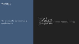
.listing {
display: grid;
grid-template-columns: repeat(12,1fr);
grid-gap: 20px;
}
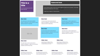
The listing
The container for our boxes has 12
equal columns.
Render Conf: Start using CSS Grid Layout Today
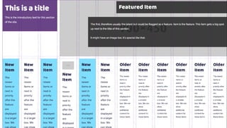
.box-title {
grid-column: 1 / 4;
grid-row: 1 / 2;
}
.box-feature {
grid-column: 4 / -1;
grid-row: 1 / 2;
}
The listing
Positioning the title top left and the
feature top right
Render Conf: Start using CSS Grid Layout Today
.box-newer {
grid-column: auto / span 4;
}
.box-newer.box-media {
grid-row-end: span 2;
}
Larger boxes
Newer items span 4 column tracks. If
they also have a class of box-media
they span 2 row tracks.
.box-older {
grid-column: auto / span 3;
}
Smaller boxes
The boxes for older items span 3
tracks.
http://codepen.io/rachelandrew/pen/Opaopw
Going
responsive
CSS Grid
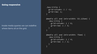
.box-title {
grid-column: 1 / -1;
grid-row: 1;
}
@media all and (min-width: 53.125em) {
.box-title {
grid-column: 1 / 6;
grid-row: 1 / 3;
}
}
@media all and (min-width: 75em) {
.box-title {
grid-column: 1 / 4;
grid-row: 1 / 2;
}
}
Going responsive
Inside media queries we can redefine
where items sit on the grid.
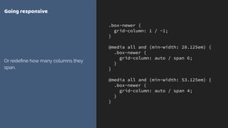
.box-newer {
grid-column: 1 / -1;
}
@media all and (min-width: 28.125em) {
.box-newer {
grid-column: auto / span 6;
}
}
@media all and (min-width: 53.125em) {
.box-newer {
grid-column: auto / span 4;
}
}
Going responsive
Or redefine how many columns they
span.
http://codepen.io/rachelandrew/pen/gmQdgz
What about
old browsers?
CSS Grid Layout
What about old browsers?
If using display: grid on a container, child items:
‣ Using float, lose their float behaviour
‣ The vertical-align property has no effect
‣ Flex items become grid items
‣ Items set to display: block or inline-block become grid
items
‣ Items set to display: table-cell stop creating anonymous
boxes
You do not need to build “two
layouts”
Render Conf: Start using CSS Grid Layout Today
.listing {
display: flex;
flex-wrap: wrap;
margin: 0 20px;
display: grid;
grid-template-columns: repeat(12,1fr);
grid-gap: 20px;
}
.listing > * {
flex: 1 1 30%;
margin: 0 20px 20px 20px;
}
Adding a flex fallback
Browsers that support display: flex
and not grid will turn the children into
flex, not grid, items.
The flex properties applied to those
items will be ignored by grid layout.
Feature Queries are your new best
friend
Render Conf: Start using CSS Grid Layout Today
.listing > * {
flex: 1 1 30%;
margin: 0 20px 20px 20px;
}
@supports(display: grid) {
.listing > * {
margin: 0;
}
}
Using feature queries
Add a margin for flex layout, remove it
if we are using grid layout.
Render Conf: Start using CSS Grid Layout Today
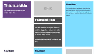
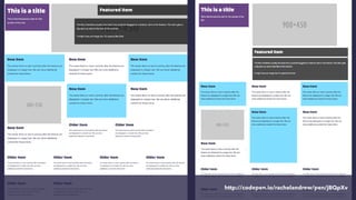
.listing .box-feature {
flex: 1 1 60%;
}
Flex layout
Give the feature box a larger flex-
basis percentage.
http://codepen.io/rachelandrew/pen/jBQpXv
.grid > div {
float: left;
}
.grid {
display: grid;
grid-gap: 10px;
grid-template-columns: repeat(3, auto);
width: 500px;
}
Float and Clear
The float and clear properties have
no effect on a grid item.


https://codepen.io/rachelandrew/pen/YZeqZv
.grid > div {
display: inline-block;
}
.grid {
display: grid;
grid-gap: 10px;
grid-template-columns: repeat(3, auto);
width: 500px;
}
display: inline-block
The properties associated with
something being inline-block cease
to apply.


https://codepen.io/rachelandrew/pen/vxdGjQ
.grid > div {
display: table-cell;
vertical-align: top;
}
.grid {
border-spacing: 10px;
}
.grid {
display: grid;
grid-gap: 10px;
grid-template-columns: repeat(3, auto);
width: 500px;
}
display: table
Anonymous boxes will not be
generated and the item will become a
grid item.


https://codepen.io/rachelandrew/pen/bqLpQN
.grid > div {
display: inline-block;
vertical-align: top;
}
.grid {
display: grid;
grid-gap: 10px;
grid-template-columns: repeat(3, auto);
width: 500px;
}
The vertical-align property
Can be used as a fallback for box
alignment and ceases to apply on grid
items.


https://codepen.io/rachelandrew/pen/vxdGaQ
.grid {
column-count: 3;
width: 500px;
}
.grid {
display: grid;
grid-gap: 10px;
grid-template-columns: repeat(3, auto);
}
Multiple-column layout
Multiple-column layout properties
cease to apply in grid layout.


https://codepen.io/rachelandrew/pen/JWpXxv
.grid {
display: flex;
align-items: center;
width: 500px;
height: 200px;
border: 1px dotted #694486;
}
.grid > div {
flex: 1;
}
.grid {
display: grid;
grid-gap: 10px;
grid-template-columns: repeat(3, auto);
}
Flex layout
Grid will override flex layout and
shares box alignment properties.


https://codepen.io/rachelandrew/pen/YZeqMB
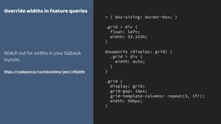
Overrides inside @supports are
mostly widths & margins
* { box-sizing: border-box; }
.grid > div {
float: left;
width: 33.333%;
}
@supports (display: grid) {
.grid > div {
width: auto;
}
}
.grid {
display: grid;
grid-gap: 10px;
grid-template-columns: repeat(3, 1fr);
width: 500px;
}
Override widths in feature queries
Watch out for widths in your fallback
layouts.


https://codepen.io/rachelandrew/pen/JWpXNr
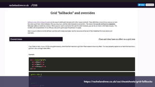
https://rachelandrew.co.uk/css/cheatsheets/grid-fallbacks
is here!
CSS Grid
Find out more
I made you some resources
Visit Grid by Example for worked examples, and a free video
tutorial:

http://gridbyexample.com
I created a huge set of guides for MDN: 

https://developer.mozilla.org/en-US/docs/Web/CSS/
CSS_Grid_Layout
Over 4 years of grid thoughts on my site at:

https://rachelandrew.co.uk/archives/tag/cssgrid 

THANK YOU!
@rachelandrew


Talk resources & code: https://rachelandrew.co.uk/speaking/event/render2017

More Related Content

PPTX
css.ppt
PDF
CSS Lists and Tables
PDF
Intro to HTML & CSS
PPT
Introduction To HTML
PPT
Html basics
PDF
Build a Website Using HTML + CSS
PPT
Intro Html
css.ppt
CSS Lists and Tables
Intro to HTML & CSS
Introduction To HTML
Html basics
Build a Website Using HTML + CSS
Intro Html

What's hot (20)

PPT
Css Ppt
PDF
Introduction to CSS3
PPTX
Introducing Cascading Style Sheets
PPT
Html ppt
PPTX
Web design - Working with forms in HTML
PPTX
(Fast) Introduction to HTML & CSS
PPT
Understanding THML
PPT
Html Intro2
PPT
Eye catching HTML BASICS tips: Learn easily
PDF
Introduction to HTML and CSS
PPT
CSS Basics
PPTX
UI developer
PDF
Introduction to Html and Css.pdf
PPTX
PPTX
PPTX
HTML: Tables and Forms
PPTX
Advanced angular
PPTX
Javascript
PPTX
Web application architecture
PPTX
Css Ppt
Introduction to CSS3
Introducing Cascading Style Sheets
Html ppt
Web design - Working with forms in HTML
(Fast) Introduction to HTML & CSS
Understanding THML
Html Intro2
Eye catching HTML BASICS tips: Learn easily
Introduction to HTML and CSS
CSS Basics
UI developer
Introduction to Html and Css.pdf
HTML: Tables and Forms
Advanced angular
Javascript
Web application architecture
Ad

Viewers also liked (20)

PDF
Laracon Online: Grid and Flexbox
PDF
Introducing CSS Grid Layout
PDF
Codecinella / Using CodePen to learn, prototype and inspire the front end
PDF
Scalability, Availability & Stability Patterns
PDF
Rosales alexis comunicación
PDF
Putting Flexbox into Practice (Fronteers)
PDF
Flexbox and Grid Layout
PDF
Flexbox: One Giant Leap for Web Layout (GenerateConf 2013)
DOC
Устав проекта
PDF
Next-level CSS
PDF
Vortex II -- The Industrial IoT Connectivity Standard
PDF
Not Your Father's Database by Vida Ha
PPTX
Intro to Flexbox - A Magical CSS Property
PDF
Understanding flex box CSS Day 2016
PDF
GOTO Berlin - You can use CSS for that
PDF
Without Resilience, Nothing Else Matters
PDF
Content-Driven Layouts with Flexbox (Chris Sauve, CSSDay 2015)
PDF
Life Beyond the Illusion of Present
PPTX
Internet of Things Security: IBM HorizonWatch 2016 Trend Brief
PPTX
The 4 Stages Of Learning
Laracon Online: Grid and Flexbox
Introducing CSS Grid Layout
Codecinella / Using CodePen to learn, prototype and inspire the front end
Scalability, Availability & Stability Patterns
Rosales alexis comunicación
Putting Flexbox into Practice (Fronteers)
Flexbox and Grid Layout
Flexbox: One Giant Leap for Web Layout (GenerateConf 2013)
Устав проекта
Next-level CSS
Vortex II -- The Industrial IoT Connectivity Standard
Not Your Father's Database by Vida Ha
Intro to Flexbox - A Magical CSS Property
Understanding flex box CSS Day 2016
GOTO Berlin - You can use CSS for that
Without Resilience, Nothing Else Matters
Content-Driven Layouts with Flexbox (Chris Sauve, CSSDay 2015)
Life Beyond the Illusion of Present
Internet of Things Security: IBM HorizonWatch 2016 Trend Brief
The 4 Stages Of Learning
Ad

Similar to Render Conf: Start using CSS Grid Layout Today (20)

PDF
Grid and Flexbox - Smashing Conf SF
PDF
Start Using CSS Grid Layout Today - RuhrJS
PDF
Frontend United: Start using CSS Grid Layout today!
PDF
Evergreen websites for Evergreen browsers
PDF
DevFest Nantes - Start Using CSS Grid Layout today
PDF
Laying out the future with grid & flexbox - Smashing Conf Freiburg
PDF
Future Layout & Performance
PDF
The New CSS Layout - dotCSS
PDF
Laying out the future
PDF
The Right Layout Tool for the Job
PPTX
MTA css layouts
PDF
CSSConf.asia - Laying out the future
PDF
CSS Conf Budapest - New CSS Layout
PDF
Confoo: The New CSS Layout
PDF
View Source London: Solving Layout Problems with CSS Grid & Friends
PDF
CSS Grid Layout from the inside out (HTML5DevConf Autumn 2015)
PDF
Solving Layout Problems with CSS Grid & Friends - DevFest17
PDF
Talk Web Design: Get Ready For CSS Grid Layout
PDF
Fluent: Making Sense of the New CSS Layout
PDF
Making the most of New CSS Layout
Grid and Flexbox - Smashing Conf SF
Start Using CSS Grid Layout Today - RuhrJS
Frontend United: Start using CSS Grid Layout today!
Evergreen websites for Evergreen browsers
DevFest Nantes - Start Using CSS Grid Layout today
Laying out the future with grid & flexbox - Smashing Conf Freiburg
Future Layout & Performance
The New CSS Layout - dotCSS
Laying out the future
The Right Layout Tool for the Job
MTA css layouts
CSSConf.asia - Laying out the future
CSS Conf Budapest - New CSS Layout
Confoo: The New CSS Layout
View Source London: Solving Layout Problems with CSS Grid & Friends
CSS Grid Layout from the inside out (HTML5DevConf Autumn 2015)
Solving Layout Problems with CSS Grid & Friends - DevFest17
Talk Web Design: Get Ready For CSS Grid Layout
Fluent: Making Sense of the New CSS Layout
Making the most of New CSS Layout

More from Rachel Andrew (20)

PDF
All Day Hey! Unlocking The Power of CSS Grid Layout
PDF
SmashingConf SF: Unlocking the Power of CSS Grid Layout
PDF
Unlocking the Power of CSS Grid Layout
PDF
The Creative New World of CSS
PDF
Into the Weeds of CSS Layout
PDF
Graduating to Grid
PDF
404.ie: Solving Layout Problems with CSS Grid & Friends
PDF
Solving Layout Problems with CSS Grid & Friends - WEBU17
PDF
Solving Layout Problems with CSS Grid & Friends - NordicJS
PDF
Google Developers Experts Summit 2017 - CSS Layout
PDF
Web Summer Camp Keynote
PDF
New CSS Layout Meets the Real World
PDF
An Event Apart DC - New CSS Layout meets the Real World
PDF
Perch, Patterns and Old Browsers
PDF
What I discovered about layout vis CSS Grid
PDF
Where does CSS come from?
PDF
CSS Grid for html5j
PDF
An Event Apart Seattle - New CSS Layout Meets the Real World
PDF
CSS Grid Layout for Frontend NE
PDF
Confoo: You can use CSS for that!
All Day Hey! Unlocking The Power of CSS Grid Layout
SmashingConf SF: Unlocking the Power of CSS Grid Layout
Unlocking the Power of CSS Grid Layout
The Creative New World of CSS
Into the Weeds of CSS Layout
Graduating to Grid
404.ie: Solving Layout Problems with CSS Grid & Friends
Solving Layout Problems with CSS Grid & Friends - WEBU17
Solving Layout Problems with CSS Grid & Friends - NordicJS
Google Developers Experts Summit 2017 - CSS Layout
Web Summer Camp Keynote
New CSS Layout Meets the Real World
An Event Apart DC - New CSS Layout meets the Real World
Perch, Patterns and Old Browsers
What I discovered about layout vis CSS Grid
Where does CSS come from?
CSS Grid for html5j
An Event Apart Seattle - New CSS Layout Meets the Real World
CSS Grid Layout for Frontend NE
Confoo: You can use CSS for that!

Recently uploaded (20)

PPTX
VMware vSphere Foundation How to Sell Presentation-Ver1.4-2-14-2024.pptx
PDF
Diabetes mellitus diagnosis method based random forest with bat algorithm
PDF
Peak of Data & AI Encore- AI for Metadata and Smarter Workflows
PDF
How UI/UX Design Impacts User Retention in Mobile Apps.pdf
PDF
Machine learning based COVID-19 study performance prediction
PDF
GDG Cloud Iasi [PUBLIC] Florian Blaga - Unveiling the Evolution of Cybersecur...
PDF
Chapter 3 Spatial Domain Image Processing.pdf
PDF
Spectral efficient network and resource selection model in 5G networks
PDF
The Rise and Fall of 3GPP – Time for a Sabbatical?
PDF
Dropbox Q2 2025 Financial Results & Investor Presentation
PDF
cuic standard and advanced reporting.pdf
PDF
KodekX | Application Modernization Development
PPTX
Detection-First SIEM: Rule Types, Dashboards, and Threat-Informed Strategy
PDF
Network Security Unit 5.pdf for BCA BBA.
PDF
Empathic Computing: Creating Shared Understanding
PDF
Blue Purple Modern Animated Computer Science Presentation.pdf.pdf
PDF
Electronic commerce courselecture one. Pdf
PPTX
breach-and-attack-simulation-cybersecurity-india-chennai-defenderrabbit-2025....
PDF
Review of recent advances in non-invasive hemoglobin estimation
PDF
NewMind AI Weekly Chronicles - August'25 Week I
VMware vSphere Foundation How to Sell Presentation-Ver1.4-2-14-2024.pptx
Diabetes mellitus diagnosis method based random forest with bat algorithm
Peak of Data & AI Encore- AI for Metadata and Smarter Workflows
How UI/UX Design Impacts User Retention in Mobile Apps.pdf
Machine learning based COVID-19 study performance prediction
GDG Cloud Iasi [PUBLIC] Florian Blaga - Unveiling the Evolution of Cybersecur...
Chapter 3 Spatial Domain Image Processing.pdf
Spectral efficient network and resource selection model in 5G networks
The Rise and Fall of 3GPP – Time for a Sabbatical?
Dropbox Q2 2025 Financial Results & Investor Presentation
cuic standard and advanced reporting.pdf
KodekX | Application Modernization Development
Detection-First SIEM: Rule Types, Dashboards, and Threat-Informed Strategy
Network Security Unit 5.pdf for BCA BBA.
Empathic Computing: Creating Shared Understanding
Blue Purple Modern Animated Computer Science Presentation.pdf.pdf
Electronic commerce courselecture one. Pdf
breach-and-attack-simulation-cybersecurity-india-chennai-defenderrabbit-2025....
Review of recent advances in non-invasive hemoglobin estimation
NewMind AI Weekly Chronicles - August'25 Week I

Render Conf: Start using CSS Grid Layout Today

  • 1. START USING CSS GRID LAYOUT TODAY @rachelandrew @ Render Conf
  • 2. Rachel Andrew ▸ CSS Working Group Invited Expert ▸ Google Developer Expert ▸ co-founder Perch CMS ▸ Old Nerd. ▸ You can find me in most places as @rachelandrew you can email me@rachelandrew.co.uk or check out my site at https://rachelandrew.co.uk
  • 3. March 2017 March 2017 March 2017 March 2017 March 2017
  • 4. Start using CSS Grid Layout Today ▸ What is grid & why is it different to flexbox? ▸ How do I get started using grid in production? ▸ What about old browsers?
  • 6. Flexbox is for one-dimensional layout
  • 8. Grid is for two-dimensional layout
  • 10. .grid { display: grid; grid-gap: 20px; grid-template-columns: repeat(auto- fill, minmax(200px, 1fr)); } Grid minmax() and auto-fill Creating a flexible number of flexible tracks, with a little bit of grid spec magic. http://codepen.io/rachelandrew/pen/evjdLM
  • 11. If you are adding widths to all your flex items, you probably need grid.
  • 12. .example1 { display: flex; justify-content: space-between; flex-wrap: wrap; margin: 30px; } Flexbox Using space-between http://codepen.io/rachelandrew/pen/MpBbwX
  • 14. .example2 { display: flex; flex-wrap: wrap; } .example2 > div { flex: 1 1 0; } .example2 > div.bigger { flex: 4 1 0; } Flexbox Some things grow larger than other things. This is defined using flex properties on the item. http://codepen.io/rachelandrew/pen/MpBbwX
  • 16. Grid works from the container in
  • 17. .example1 { display: grid; grid-gap: 20px; grid-template-columns: 1fr 1fr 1fr; margin: 20px; } Grid Define column tracks. Items are constrained by those tracks. http://codepen.io/rachelandrew/pen/JWBbJP
  • 19. .example2 { display: grid; grid-gap: 20px; grid-template-columns: 2fr 1fr 2fr; margin: 20px; } Grid To make some tracks larger than others, we do that when defining the tracks on the container not on the item itself. http://codepen.io/rachelandrew/pen/JWBbJP
  • 21. Other layout methods start with the item.
  • 22. .box { float: left; width: 33.3333%; } A float grid The float property and widths are added to the items.
  • 23. .box { display: inline-block; width: 33.3333%; } inline-block grid The display property is set to inline- block and width is added to the item.
  • 24. .container {
 display: flex;
 }
 .box { flex: 0 0 33.3333%; } Flex grid We add display: flex to the container however to make a grid out of flex items we need to use the flex properties in the items.
  • 25. .container { display: grid; grid-template-columns: 1fr 1fr 1fr; } Grid Layout With CSS Grid Layout we create the grid on the parent element. We don’t need to add properties to the items.
  • 26. Grid is all about the container
  • 27. Grid or Flexbox … and that’s just the start ‣ Grid allows you to layer items, or for two items to occupy the same space ‣ Grid allows full control of negative space in your designs ‣ Grid has methods such as the dense packing mode to backfill gaps in a tight-packed grid
  • 28. Flexbox or Grid? Use Flexbox when … ‣ Your content is a row OR a column ‣ You want the size of items to dictate their layout ‣ You want to distribute space
  • 29. Flexbox or Grid? Consider grid when … ‣ You need to control rows and columns ‣ You are adding widths to a flex item in order to make it line up with rows above. ‣ You want control of the layout from the parent ‣ Items need to occupy the same space or overlap
  • 33. <div class="box-feature"> <img class="box-image" src="http://placehold.it/ 900x450" alt="placeholder"> <h2 class="box-feature-title">Featured Item</h2> <div class="box-content">…</div> </div> Feature box The feature has an image with a heading and body text overlaid.
  • 34. .box-feature { display: grid; grid-gap: 20px; grid-template-columns: repeat(6, 1fr); } Feature box display: grid turns on grid layout grid-gap defines gutters between grid items grid-template-columns creates column tracks. In this case creating a grid with 6 equal columns.
  • 35. The fr unit defines a fraction of the available space in the grid container
  • 37. .box-feature .box-image { align-self: stretch; justify-self: stretch; grid-column: 1 / -1; grid-row: 1 / 4; } Feature box The image starts at grid column 
 line 1 and ends at -1, which is the end line. It starts at grid row 1, ending at grid row 4. Using box alignment properties to stretch the image over that area.
  • 38. Grid lines respect writing mode. Column line 1 is on the left and -1 on the right in a LTR language.
  • 39. Explicit vs. Implicit Grid ▸ The Explicit Grid is created when you define tracks with grid-template- columns and grid-template-rows ▸ If you place an item outside of that grid, or auto-placed content requires further row or column tracks these are added by grid as the Implicit Grid.
  • 41. .box-feature .box-feature-title { grid-column: 3 / -1; grid-row: 1; background-color: rgba(0,0,0,0.7); color: #fff; align-self: start; padding: 20px; } .box-feature .box-content { grid-column: 2 / -1; grid-row: 2; background-color: rgba(0,0,0,0.7); color: #fff; padding: 20px; } Feature box Positioning the content inside the area that the image is stretched over.
  • 43. Layering items on the grid ▸ You can position items into the same grid cells ▸ Items further down in the source appear on top of earlier items ▸ Control the stack using z-index
  • 46. .listing { display: grid; grid-template-columns: repeat(12,1fr); grid-gap: 20px; } The listing The container for our boxes has 12 equal columns.
  • 49. .box-title { grid-column: 1 / 4; grid-row: 1 / 2; } .box-feature { grid-column: 4 / -1; grid-row: 1 / 2; } The listing Positioning the title top left and the feature top right
  • 51. .box-newer { grid-column: auto / span 4; } .box-newer.box-media { grid-row-end: span 2; } Larger boxes Newer items span 4 column tracks. If they also have a class of box-media they span 2 row tracks.
  • 52. .box-older { grid-column: auto / span 3; } Smaller boxes The boxes for older items span 3 tracks.
  • 55. .box-title { grid-column: 1 / -1; grid-row: 1; } @media all and (min-width: 53.125em) { .box-title { grid-column: 1 / 6; grid-row: 1 / 3; } } @media all and (min-width: 75em) { .box-title { grid-column: 1 / 4; grid-row: 1 / 2; } } Going responsive Inside media queries we can redefine where items sit on the grid.
  • 56. .box-newer { grid-column: 1 / -1; } @media all and (min-width: 28.125em) { .box-newer { grid-column: auto / span 6; } } @media all and (min-width: 53.125em) { .box-newer { grid-column: auto / span 4; } } Going responsive Or redefine how many columns they span.
  • 59. What about old browsers? If using display: grid on a container, child items: ‣ Using float, lose their float behaviour ‣ The vertical-align property has no effect ‣ Flex items become grid items ‣ Items set to display: block or inline-block become grid items ‣ Items set to display: table-cell stop creating anonymous boxes
  • 60. You do not need to build “two layouts”
  • 62. .listing { display: flex; flex-wrap: wrap; margin: 0 20px; display: grid; grid-template-columns: repeat(12,1fr); grid-gap: 20px; } .listing > * { flex: 1 1 30%; margin: 0 20px 20px 20px; } Adding a flex fallback Browsers that support display: flex and not grid will turn the children into flex, not grid, items. The flex properties applied to those items will be ignored by grid layout.
  • 63. Feature Queries are your new best friend
  • 65. .listing > * { flex: 1 1 30%; margin: 0 20px 20px 20px; } @supports(display: grid) { .listing > * { margin: 0; } } Using feature queries Add a margin for flex layout, remove it if we are using grid layout.
  • 67. .listing .box-feature { flex: 1 1 60%; } Flex layout Give the feature box a larger flex- basis percentage.
  • 69. .grid > div { float: left; } .grid { display: grid; grid-gap: 10px; grid-template-columns: repeat(3, auto); width: 500px; } Float and Clear The float and clear properties have no effect on a grid item.
 
 https://codepen.io/rachelandrew/pen/YZeqZv
  • 70. .grid > div { display: inline-block; } .grid { display: grid; grid-gap: 10px; grid-template-columns: repeat(3, auto); width: 500px; } display: inline-block The properties associated with something being inline-block cease to apply.
 
 https://codepen.io/rachelandrew/pen/vxdGjQ
  • 71. .grid > div { display: table-cell; vertical-align: top; } .grid { border-spacing: 10px; } .grid { display: grid; grid-gap: 10px; grid-template-columns: repeat(3, auto); width: 500px; } display: table Anonymous boxes will not be generated and the item will become a grid item.
 
 https://codepen.io/rachelandrew/pen/bqLpQN
  • 72. .grid > div { display: inline-block; vertical-align: top; } .grid { display: grid; grid-gap: 10px; grid-template-columns: repeat(3, auto); width: 500px; } The vertical-align property Can be used as a fallback for box alignment and ceases to apply on grid items.
 
 https://codepen.io/rachelandrew/pen/vxdGaQ
  • 73. .grid { column-count: 3; width: 500px; } .grid { display: grid; grid-gap: 10px; grid-template-columns: repeat(3, auto); } Multiple-column layout Multiple-column layout properties cease to apply in grid layout.
 
 https://codepen.io/rachelandrew/pen/JWpXxv
  • 74. .grid { display: flex; align-items: center; width: 500px; height: 200px; border: 1px dotted #694486; } .grid > div { flex: 1; } .grid { display: grid; grid-gap: 10px; grid-template-columns: repeat(3, auto); } Flex layout Grid will override flex layout and shares box alignment properties.
 
 https://codepen.io/rachelandrew/pen/YZeqMB
  • 75. Overrides inside @supports are mostly widths & margins
  • 76. * { box-sizing: border-box; } .grid > div { float: left; width: 33.333%; } @supports (display: grid) { .grid > div { width: auto; } } .grid { display: grid; grid-gap: 10px; grid-template-columns: repeat(3, 1fr); width: 500px; } Override widths in feature queries Watch out for widths in your fallback layouts.
 
 https://codepen.io/rachelandrew/pen/JWpXNr
  • 79. Find out more I made you some resources Visit Grid by Example for worked examples, and a free video tutorial:
 http://gridbyexample.com I created a huge set of guides for MDN: 
 https://developer.mozilla.org/en-US/docs/Web/CSS/ CSS_Grid_Layout Over 4 years of grid thoughts on my site at:
 https://rachelandrew.co.uk/archives/tag/cssgrid 

  • 80. THANK YOU! @rachelandrew
 
 Talk resources & code: https://rachelandrew.co.uk/speaking/event/render2017