SlideShare a Scribd company logo
Assembling Sass
___ FOUNDATION
1.1 Sass,Not SASS
1.2 SCSS: Sassy CSS
1.3 Commenting
1.4 Importing
1.5 Nesting Selectors
1.6 The Parent Selector
1.7 Nesting Pitfalls
1.1 Sass,Not SASS
CSS is crafted to be simple,
but scaling simplicity is difficult.
1.1 Sass,Not SASS
At Scale
๏ Slight variations of colors, fonts, numbers,
& other properties arise
๏ Effective curbing of repetition can decline
๏ Stylesheet size may become unmanageable
1.1 Sass,Not SASS
Enter Sass
๏ Syntactically Awesome Stylesheets
๏ Looks like CSS, but adds features to
combat shortcomings
๏ Preprocessor, like CoffeeScript & Haml:
Sass File Sass Compiler CSS File
๏ Created by Hampton Catlin
๏ Primary developers:
Nathan Weizenbaum & Chris Eppstein
๏ Baked into Rails
1.1 Sass,Not SASS
Assembly Tip
SASS Sass
1.1 Sass,Not SASS
1.2 SCSS: Sassy CSS
1.3 Commenting
1.4 Importing
1.5 Nesting Selectors
1.6 The Parent Selector
1.7 Nesting Pitfalls
๏ Sassy CSS (.scss) is the default file extension
๏ CSS is valid SCSS
๏ A second syntax (.sass) exists, but we'll focus on SCSS
for the course
1.2 SCSS: Sassy CSS
$main: #444;
.btn {
color: $main;
display: block;
}
.btn-a {
color: lighten($main, 30%);
&:hover {
color: lighten($main, 40%);
}
}
.btn {
color: #444444;
display: block;
}
.btn-a {
color: #919191;
}
.btn-a:hover {
color: #aaaaaa;
}
application.scss application.css
1.2 SCSS: Sassy CSS
Assembly Tip
Since CSS doubles as valid
SCSS, try writing styles
normally & slowly incorporate
new techniques.
๏ Sass adds // for single line comments - not
output after compile
1.3 Commenting
// These comments will
// not be output to the
// compiled CSS file
/* This comment will */
application.scss application.css
1.3 Commenting
A S S E M B L Y
R
E J E C T E D
/*
* Imports styles found in 'buttons.css'
* when the browser requests application.css
*/
@import "buttons.css";
application.css
1.4 Importing
๏ The CSS @import rule has been avoided:
prevents parallel downloading
๏ @import with .scss or .sass happens
during compile rather than client-side
๏ File extension is optional
1.4 Importing
// Imports styles found in 'buttons.scss'
// when the compiler processes application.scss
@import "buttons";
application.scss
application.scss
buttons.scss
application.css
buttons.css
?
1.4 Importing
Partials
Adding an underscore creates a partial. Partials can be
imported, but will not compile to .css
application.scss
_buttons.scss
application.css
1.4 Importing
// Will import _buttons.sass, buttons.sass,
// _buttons.scss, or buttons.scss
@import "buttons";
application.scss
application.scss
_buttons.scss
application.css
1.4 Importing
1.1 Sass,Not SASS
1.2 SCSS: Sassy CSS
1.3 Commenting
1.4 Importing
1.5 Nesting Selectors
1.6 The Parent Selector
1.7 Nesting Pitfalls
.content {
border: 1px solid #ccc;
padding: 20px;
}
.content h2 {
font-size: 3em;
margin: 20px 0;
}
.content p {
font-size: 1.5em;
margin: 15px 0;
}
application.css
1.5 Nesting Selectors
A S S E M B L Y
R
E J E C T E D
application.css
.content {
border: 1px solid #ccc;
padding: 20px;
}
.content h2 {
font-size: 3em;
margin: 20px 0;
}
.content p {
font-size: 1.5em;
margin: 15px 0;
}
.content {
border: 1px solid #ccc;
padding: 20px;
}
.content h2 {
font-size: 3em;
margin: 20px 0;
}
.content p {
font-size: 1.5em;
margin: 15px 0;
}
application.scss
1.5 Nesting Selectors
}
.content
.content
application.css
.content {
border: 1px solid #ccc;
padding: 20px;
}
.content h2 {
font-size: 3em;
margin: 20px 0;
}
.content p {
font-size: 1.5em;
margin: 15px 0;
}
.content {
border: 1px solid #ccc;
padding: 20px;
application.scss
1.5 Nesting Selectors
}
.content.content
h2 {
font-size: 3em;
margin: 20px 0;
}
p {
font-size: 1.5em;
margin: 15px 0;
}
A
S S E M B L Y
A P P R O V
E
D
.btn {
text: {
decoration: underline;
transform: lowercase;
}
}
.btn {
text-decoration: underline;
text-transform: lowercase;
}
application.scss application.css
Nesting Properties
Certain properties with matching namespaces are nestable:
1.5 Nesting Selectors
1.6 The Parent Selector
While nesting, the & symbol references the parent selector:
.content {
border: 1px solid #ccc;
padding: 20px;
}
.content {
border: 1px solid #ccc;
padding: 20px;
}
application.scss application.css
.callout {
border-color: red;
}
&.callout {
border-color: green;
}
.content .callout {
border-color: red;
}
.content.callout {
border-color: green;
}
a {
color: #999;
&:hover {
color: #777;
}
&:active {
color: #888;
}
}
a {
color: #999;
}
a:hover {
color: #777;
}
a:active {
color: #888;
}
application.scss application.css
1.6 The Parent Selector
Parent Selector Nesting
Selectors can also be added before the & reference:
.sidebar {
float: right;
width: 300px;
}
.users .sidebar {
width: 400px;
}
application.css
A S S E M B L Y
R
E J E C T E D
1.6 The Parent Selector
.sidebar {
float: right;
width: 300px;
{
width: 400px;
}
}
.sidebar {
float: right;
width: 300px;
}
.users .sidebar {
width: 400px;
}
application.scss application.css
1.6 The Parent Selector
.users &
A
S S E M B L Y
A P P R O V
E
D
.sidebar {
float: right;
width: 300px;
h2 {
color: #777;
.users & {
color: #444;
}
}
}
.sidebar {
float: right;
width: 300px;
}
.sidebar h2 {
color: #777;
}
.users .sidebar h2 {
color: #444;
}
application.scss application.css
1.6 The Parent Selector
๏ Nesting is easy, but dangerous
๏ Do not nest unnecessarily
1.7 Nesting Pitfalls
.content {
background: #ccc;
.cell {
h2 {
a {
&:hover {
color: red;
}
}
}
}
}
.content {
background: #ccc;
}
.content .cell h2 a:hover {
color: red;
}
application.scss application.css
A S S E M B L Y
R
E J E C T E D
1.7 Nesting Pitfalls
Assembly Tip
Try limiting your nesting to 3
or 4 levels and consider
refactoring anything deeper.
___ VARIABLE
2.1 Variable Declaration + Use
2.2 Types
2.3 Scope
2.4 Interpolation
๏ Native CSS variable support is still in its infancy,
but Sass affords us a way to set reusable values
๏ Variable names begin with $, like $base
2.1 Variable Declaration + Use
$base: #777777; .sidebar {
border: 1px solid #777777;
}
.sidebar p {
color: #777777;
}
application.scss application.css
2.1 Variable Declaration + Use
.sidebar {
border: 1px solid $base;
p {
color: $base;
}
}
$title: 'My Blog';
$title: 'About Me'
h2:before {
content: $title;
}
h2:before {
content: 'About Me';
}
application.scss application.css
The Default Flag
Variable definitions can optionally take the !default flag:
2.1 Variable Declaration + Use
;
h2:before {
content: 'My Blog';
}
application.scss application.css
2.1 Variable Declaration + Use
$title: 'My Blog';
$title: 'About Me'
h2:before {
content: $title;
}
!default;
$rounded: 5px;
@import "buttons";
application.scss
2.1 Variable Declaration + Use
$rounded: 3px !default;
.btn-a {
border-radius: $rounded;
color: #777;
}
.btn-b {
border-radius: $rounded;
color: #222;
}
_buttons.scss
$rounded: 5px;
@import "buttons";
application.scss
2.1 Variable Declaration + Use
.btn-a {
border-radius: 5px;
color: #777;
}
.btn-b {
border-radius: 5px;
color: #222;
}
application.css
$rounded: false;
$shadow: true;
2.2 Types
Booleans
$rounded: 4px;
$line-height: 1.5;
$font-size: 3rem;
Numbers - can be set with or without units:
$base: purple;
$border: rgba(0, 255, 0, 0.5);
$shadow: #333;
2.2 Types
Colors
$header: 'Helvetica Neue';
$callout: Arial;
$message: "Loading...";
Strings - can be set with or without quotes:
$authors: nick, dan, aimee, drew;
$margin: 40px 0 20px 100px;
2.2 Types
Lists
$shadow: null;
Null
2.1 Variable Declaration + Use
2.2 Types
2.3 Scope
2.4 Interpolation
p {
$border: #ccc;
border-top: 1px solid $border;
}
h1 {
border-top: 1px solid $border;
}
Syntax error: Undefined
variable: "$border"
application.scss application.css
2.3 Scope
2.3 Scope
Reassignment in a Declaration
๏ Variables set inside a declaration (within { }) aren't
usable outside that block
๏ Setting new values to variables set outside a
declaration changes future instances
$color-base: #777777;
.sidebar {
$color-base: #222222;
background: $color-base;
}
application.scss
.sidebar {
background: #222222;
}
application.css
2.3 Scope
p {
color: #222222;
}
p {
color: $color-base;
}
$side: top;
sup {
position: relative;
#{$side}: -0.5em;
}
sup {
position: relative;
top: -0.5em;
}
application.scss application.css
2.4 Interpolation
Use the Ruby-esque #{$variable} to shim variables
into selectors, property names, and strings:
.callout-#{$side} {
background: #777;
}
.callout-top {
background: #777;
}
Assembly Tip
Be considerate of variable
naming. $color-base
gets a lot more mileage
than $color-blue.
___ MIXIN
3.1 Mixin Setup + Use
3.2 Adding Arguments
3.3 Multiple Arguments
3.4 Variable Arguments
3.5 Interpolation + Mixins
.btn-a {
background: #777;
border: 1px solid #ccc;
font-size: 1em;
text-transform: uppercase;
}
.btn-b {
background: #ff0;
border: 1px solid #ccc;
font-size: 1em;
text-transform: uppercase;
}
application.css
3.1 Mixin Setup + Use
A S S E M B L Y
R
E J E C T E D
]
]
@mixin button {
}
_buttons.scss
Mixins
Blocks of reusable code that take optional arguments:
3.1 Mixin Setup + Use
border: 1px solid #ccc;
font-size: 1em;
text-transform: uppercase;
_buttons.scss
.btn-a {
border: 1px solid #ccc;
font-size: 1em;
text-transform: uppercase;
background: #777;
}
application.css
3.1 Mixin Setup + Use
@mixin button {
}
border: 1px solid #ccc;
font-size: 1em;
text-transform: uppercase;
.btn-a {
@include button;
background: #777;
}
.btn-b {
@include button;
background: #ff0;
}
.btn-b {
border: 1px solid #ccc;
font-size: 1em;
text-transform: uppercase;
background: #ff0;
}
Assembly Tip
Make sure the @mixin block
comes before the @include,
especially when importing
files containing mixins.
Assembly Tip
@include = use a mixin
@import = import a file
@mixin button {
border: 1px solid #ccc;
font-size: 1em;
text-transform: uppercase;
}
.btn-a {
@include button;
background: #777;
}
.btn-b {
@include button;
background: #ff0;
}
_buttons.scss
.btn-a {
border: 1px solid #ccc;
font-size: 1em;
text-transform: uppercase;
background: #777;
}
.btn-b {
border: 1px solid #ccc;
font-size: 1em;
text-transform: uppercase;
background: #ff0;
}
application.css
A S S E M B L Y
R
E J E C T E D
3.1 Mixin Setup + Use
]
]
.btn-a,
.btn-b {
background: #777;
border: 1px solid #ccc;
font-size: 1em;
text-transform: uppercase;
}
.btn-b {
background: #ff0;
}
application.css
We're Just Repeating Properties
It's more efficient to use CSS here (for now):
3.1 Mixin Setup + Use
If that's the case, what are
mixins good for then?
3.1 Mixin Setup + Use
.content {
-webkit-box-sizing: border-box;
-moz-box-sizing: border-box;
box-sizing: border-box;
border: 1px solid #ccc;
padding: 20px;
}
application.css
3.2 Adding Arguments
.content {
-webkit-box-sizing: border-box;
-moz-box-sizing: border-box;
box-sizing: border-box;
border: 1px solid #ccc;
padding: 20px;
}
application.css
@mixin box-sizing {
-webkit-box-sizing: border-box;
-moz-box-sizing: border-box;
box-sizing: border-box;
}
application.scss
A S S E M B L Y
R
E J E C T E D
3.2 Adding Arguments
.content {
@include box-sizing;
border: 1px solid #ccc;
padding: 20px;
}
@mixin box-sizing {
-webkit-box-sizing:
-moz-box-sizing:
box-sizing:
}
application.scss
Arguments
Values passed into a mixin, potentially altering output:
3.2 Adding Arguments
($x)
$x;
$x;
$x;
application.scss
.content {
-webkit-box-sizing: border-box;
-moz-box-sizing: border-box;
box-sizing: border-box;
border: 1px solid #ccc;
padding: 20px;
}
application.css
3.2 Adding Arguments
.content {
@include box-sizing(border-box);
border: 1px solid #ccc;
padding: 20px;
}
@mixin box-sizing {
-webkit-box-sizing:
-moz-box-sizing:
box-sizing:
}
($x)
$x;
$x;
$x;
.callout {
@include box-sizing(content-box);
}
.callout {
-webkit-box-sizing: content-box;
-moz-box-sizing: content-box;
box-sizing: content-box;
}
@mixin box-sizing($x ) {
-webkit-box-sizing: $x;
-moz-box-sizing: $x;
box-sizing: $x;
}
application.scss
Default Values
Optionally, what arguments will default to if not included:
3.2 Adding Arguments
: border-box
application.scss
.content {
-webkit-box-sizing: border-box;
-moz-box-sizing: border-box;
box-sizing: border-box;
border: 1px solid #ccc;
padding: 20px;
}
application.css
3.2 Adding Arguments
.content {
@include box-sizing;
border: 1px solid #ccc;
padding: 20px;
}
.callout {
@include box-sizing(content-box);
}
@mixin box-sizing($x ) {
-webkit-box-sizing: $x;
-moz-box-sizing: $x;
box-sizing: $x;
}
: border-box
.callout {
-webkit-box-sizing: content-box;
-moz-box-sizing: content-box;
box-sizing: content-box;
}
A
S S E M B L Y
A P P R O V
E
D
3.1 Mixin Setup + Use
3.2 Adding Arguments
3.3 Multiple Arguments
3.4 Variable Arguments
3.5 Interpolation + Mixins
@mixin button(
border-radius: $radius;
color: $color;
}
.btn-a {
@include button(
_buttons.scss
.btn-a {
border-radius: 4px;
color: #000;
}
application.css
3.3 Multiple Arguments
$radius, $color) {
4px, #000);
}
_buttons.scss
Syntax error: Mixin button is
missing argument $color.
application.css
3.3 Multiple Arguments
@mixin button(
border-radius: $radius;
color: $color;
}
.btn-a {
@include button(
$radius, $color) {
4px);
}
@mixin button(
border-radius: $radius;
color: $color;
}
.btn-a {
@include button(
_buttons.scss
.btn-a {
border-radius: 4px;
color: #000;
}
application.css
3.3 Multiple Arguments
$radius, $color ) {
4px);
}
: #000
_buttons.scss
Syntax error: Required argument
$color must come before any
optional arguments.
application.css
3.3 Multiple Arguments
@mixin button(
border-radius: $radius;
color: $color;
}
.btn-a {
@include button(
$color: #000, $radius) {
4px);
}
_buttons.scss
.btn-a {
border-radius: 5px;
color: #777777;
}
application.css
3.3 Multiple Arguments
@mixin button(
border-radius: $radius;
color: $color;
}
.btn-a {
@include button(
$radius, $color: #000) {
$color: #777777,
$radius: 5px);
}
.btn-a {
-webkit-transition: color 0.3s ease-in, background 0.5s ease-out;
-moz-transition: color 0.3s ease-in, background 0.5s ease-out;
transition: color 0.3s ease-in, background 0.5s ease-out;
}
application.css
3.4 Variable Arguments
@mixin transition(
-webkit-transition: $val;
-moz-transition: $val;
transition: $val;
}
Mixin transition takes 1
argument but 2 were passed.
_buttons.scss application.css
Passing valid, comma-separated CSS as a single value:
3.4 Variable Arguments
) {$val
.btn-a {
@include transition(color 0.3s
ease-in, background 0.5s ease-out);
}
.btn-a {
-webkit-transition: color 0.3s
ease-in, background 0.5s ease-out;
-moz-transition: color 0.3s
ease-in, background 0.5s ease-out;
transition: color 0.3s ease-in,
background 0.5s ease-out;
}
_buttons.scss application.css
Adding ... to an argument creates a variable argument (vararg):
3.4 Variable Arguments
@mixin transition(
-webkit-transition: $val;
-moz-transition: $val;
transition: $val;
}
) {$val...
.btn-a {
@include transition(color 0.3s
ease-in, background 0.5s ease-out);
}
@mixin button($radius, $color) {
border-radius: $radius;
color: $color;
}
.btn-a {
border-radius: 4px;
color: #000;
}
_buttons.scss application.css
Variable arguments in reverse:
3.4 Variable Arguments
$properties: 4px, #000;
.btn-a {
@include button($properties...);
}
@mixin
}
_buttons.scss
.btn-a {
border-right-color: #ff0;
}
application.css
3.5 Interpolation + Mixins
@mixin highlight-r($color) {
border-right-color: $color;
}
@mixin highlight-b($color) {
border-bottom-color: $color;
}
@mixin highlight-l($color) {
border-left-color: $color;
}
.btn-a {
@include highlight-r(#f00);
}
highlight-t($color) {
border-top-color: $color;
_buttons.scss
.btn-a {
border-right-color: #ff0;
}
application.css
3.5 Interpolation + Mixins
@mixin
}
highlight($color, $side) {
.btn-a {
@include highlight(#f00, right);
}
border-#{$side}-color: $color;
___ EXTEND
4.1 Extend Setup + Use
4.2 Nesting + Extend
4.3 Extend Pitfalls
4.4 Placeholder Selectors
.btn-a {
background: #777;
border: 1px solid #ccc;
font-size: 1em;
text-transform: uppercase;
}
.btn-b {
background: #ff0;
border: 1px solid #ccc;
font-size: 1em;
text-transform: uppercase;
}
application.css
4.1 Extend Setup + Use
.btn-a,
.btn-b {
background: #777;
border: 1px solid #ccc;
font-size: 1em;
text-transform: uppercase;
}
.btn-b {
background: #ff0;
}
application.css
application.css
.btn-a {
background: #777;
border: 1px solid #ccc;
font-size: 1em;
text-transform: uppercase;
}
_buttons.scss
Extend
Sass will track and automatically combine selectors for us:
4.1 Extend Setup + Use
.btn-a,
.btn-b {
background: #777;
border: 1px solid #ccc;
font-size: 1em;
text-transform: uppercase;
}
.btn-b {
background: #ff0;
}
.btn-b {
@extend .btn-a;
background: #ff0;
}
4.1 Extend Setup + Use
.btn-a,
.btn-b {
}
.btn-b {
}
...
...
.btn-b {
@extend .btn-a;
background: #ff0;
}
.content {
border: 1px solid #ccc;
padding: 20px;
h2 {
font-size: 3em;
margin: 20px 0;
}
}
application.scss
.content,
.callout {
application.css
4.2 Nesting + Extend
.callout {
@extend .content;
background: #ddd;
}
border: 1px solid #ccc;
padding: 20px;
}
.content h2,
.callout h2 {
font-size: 3em;
margin: 20px 0;
}
.callout {
background: #ddd;
}
.callout {
@extend .content;
background: #ddd;
}
4.2 Nesting + Extend
.content,
.callout {
...
}
.content h2,
.callout h2 {
...
}
.callout {
...
}
4.1 Extend Setup + Use
4.2 Nesting + Extend
4.3 Extend Pitfalls
4.4 Placeholder Selectors
.btn-a {
background: #777;
border: 1px solid #ccc;
font-size: 1em;
text-transform: uppercase;
}
.btn-b {
@extend .btn-a;
background: #ff0;
}
_buttons.scss
.btn-a,
.btn-b {
background: #777;
border: 1px solid #ccc;
font-size: 1em;
text-transform: uppercase;
}
.btn-b {
background: #ff0;
}
.sidebar .btn-a,
.sidebar .btn-b {
text-transform: lowercase;
}
application.css
4.3 Extend Pitfalls
A S S E M B L Y
R
E J E C T E D
.sidebar .btn-a {
text-transform: lowercase;
}
๏ Since .btn-b extends .btn-a, every instance that
modifies .btn-a also modifies .btn-b
๏ Stylesheet bloat, if these extra styles aren't needed
๏ We can counteract with placeholder selectors
4.3 Extend Pitfalls
Assembly Tip
Always, always check the CSS
output of your Sass before
using it on a live site.
๏ Placeholder selectors are denoted with a %
๏ Can be extended, but never become a selector of
their own
4.4 Placeholder Selectors
background: #777;
border: 1px solid #ccc;
font-size: 1em;
text-transform: uppercase;
}
_buttons.scss
.btn-a,
.btn-b {
background: #777;
border: 1px solid #ccc;
font-size: 1em;
text-transform: uppercase;
}
.btn-b {
background: #ff0;
}
.sidebar .btn-a,
.sidebar .btn-b {
text-transform: lowercase;
}
application.css
4.4 Placeholder Selectors
.sidebar .btn-a {
text-transform: lowercase;
}
.btn-b {
background: #ff0;
}
.btn-a {
@extend .btn-a;
_buttons.scss
.btn-a,
.btn-b {
background: #777;
border: 1px solid #ccc;
font-size: 1em;
text-transform: uppercase;
}
.btn-b {
background: #ff0;
}
application.css
4.4 Placeholder Selectors
background: #777;
border: 1px solid #ccc;
font-size: 1em;
text-transform: uppercase;
}
.sidebar .btn-a {
text-transform: lowercase;
}
.btn-a {
@extend %btn;
}
%btn {
.sidebar .btn-a {
text-transform: lowercase;
}
.btn-b {
background: #ff0;
}
@extend %btn;
A
S S E M B L Y
A P P R O V
E
D
%ir {
border: 0;
font: 0/0 a;
text-shadow: none;
color: transparent;
background-color: transparent;
}
.logo,
.social {
border: 0;
font: 0/0 a;
text-shadow: none;
color: transparent;
background-color: transparent;
}
application.scss application.css
Extend common blocks to avoid extra HTML classes:
4.4 Placeholder Selectors
.logo {
@extend %ir;
}
.social {
@extend %ir;
}
Assembly Tip
Versions of IE prior to 9 have
a limit of 4095 selectors-per-
CSS file limit.
___ DIRECTIVE
5.1 Functions
5.2 If
5.3 Each
5.4 For + While
5.5 Mixin' In
5.1 Functions
Responsive Refresher
๏ Straight from Journey Into Mobile:
๏ If the target size of our sidebar is 350px and the
context of its parent is 1000px:
350px / 1000px = 0.35
0.35 * 100 = 35%
target / context
@function fluidize(
}
application.scss
.sidebar {
width: 35%;
}
application.css
5.1 Functions
) {
@return
.sidebar {
width: fluidize(
}
);
35%;
application.scss
.sidebar {
width: 35%;
}
application.css
5.1 Functions
@function fluidize(
}
) {
@return
.sidebar {
width: fluidize(
}
);350px, 1000px
($target / $context) * 100%;
$target, $context
5.1 Functions
๏ More on responsive design + Sass later, including a
built-in fluidize replacement
๏ Function arguments = same rules as mixin arguments
$theme: dark;
header {
header {
background: #000;
}
application.scss application.css
Using @if, we can conditionally output code:
5.2 If
@if $theme == dark {
background: #000;
}
}
Comparisons
๏ == equal to
๏ != not equal to
๏ > greater than *
๏ >= greater than or equal to *
๏ < less than *
๏ <= less than or equal to *
5.2 If
* numbers only
$theme: light;
header {
application.scss
5.2 If
@if $theme == dark {
background: #000;
}
}
application.scss
header {
background: #fff;
}
application.css
@else provides a fallback if everything evaluates false or null:
5.2 If
$theme: light;
header {
@if $theme == dark {
background: #000;
}
}
} @else {
background: #fff;
application.scss
header {
background: pink;
}
application.css
@else if allows for multiple comparisons:
5.2 If
$theme: pink;
header {
@if $theme == dark {
background: #000;
}
}
} @else {
background: #fff;
} @else if $theme == pink {
background: pink;
5.1 Functions
5.2 If
5.3 Each
5.4 For + While
5.5 Mixin' In
5.3 Each
Interating Over a List
๏ The @each directive allows us to loop through each
list item:
$authors: nick aimee dan drew;
@each $author in $authors {
}
application.scss
.author-nick {
background: url(author-nick.jpg);
}
.author-aimee {
background: url(author-aimee.jpg);
}
.author-dan {
background: url(author-dan.jpg);
}
.author-drew {
background: url(author-drew.jpg);
}
application.css
5.3 Each
1: nick
2: aimee
3: dan
4: drew
$author
background: url(author-
#{$author}.jpg);
.author-#{$author} {
}
.item {
position: absolute;
right: 0;
@for $i from 1 through 3 {
}
}
application.scss
.item {
position: absolute;
right: 0;
}
.item.item-1 {
top: 30px;
}
.item.item-2 {
top: 60px;
}
.item.item-3 {
top: 90px;
}
application.css
5.4 For + While
1: 1
2: 2
3: 3
$i
top: $i * 30px;
&.item-#{$i} {
}
5.4 For + While
๏ @for and @while = @each with more control
๏ @while requires manually updating the index
$i: 1;
application.scss
.item {
position: absolute;
right: 0;
}
.item.item-1 {
top: 30px;
}
.item.item-2 {
top: 60px;
}
.item.item-3 {
top: 90px;
}
application.css
5.4 For + While
1: 1
2: 2
3: 3
4: 4
$i
.item {
position: absolute;
right: 0;
}
@while $i < 4 {
}
&.item-#{$i} {
top: $i * 30px;
}
$i: $i + 1;
application.scss
.item {
position: absolute;
right: 0;
}
.item.item-2 {
top: 60px;
}
.item.item-4 {
top: 120px;
}
.item.item-6 {
top: 180px;
}
application.css
5.4 For + While
$i: 2;
.item {
position: absolute;
right: 0;
}
@while $i <= 6 {
}
&.item-#{$i} {
top: $i * 30px;
}
$i: $i + 2; 1: 2
2: 4
3: 6
4: 8
$i
5.1 Functions
5.2 If
5.3 Each
5.4 For + While
5.5 Mixin' In
Mixins Extend Functions
๏ Similar sets of
properties used
multiple times with
small variations
๏ Sets of properties
that match exactly
๏ Commonly-used
operations to
determine values
5.5 Mixin' In
@mixin button($color, $rounded:
color: $color;
}
_buttons.scss
.btn-a {
color: black;
}
application.css
5.5 Mixin' In
.btn-a {
@include button(#000, false);
}
.btn-b {
@include button(#333);
}
) {true
@if $rounded
}
{== true
border-radius: 4px; .btn-b {
color: #333333;
border-radius: 4px;
}
_buttons.scss
.btn-a {
color: black;
}
application.css
5.5 Mixin' In
@mixin button($color, $rounded:
color: $color;
}
.btn-a {
@include button(#000);
}
.btn-b {
@include button(#333, 4px);
}
) {false
@if $rounded
}
{
border-radius: $rounded; .btn-b {
color: #333333;
border-radius: 4px;
}
___ MATH + COLOR
6.1 Basic Arithmetic
6.2 Differing Units
6.3 Math Functions
6.4 Math + Color
6.5 Color Shortcuts
6.6 Color Functions
Number Operations
๏ + addition
๏ - subtraction
๏ * multiplication
๏ / division
๏ % modulo
6.1 Basic Arithmetic
Modulo = remainder from a division operation. 12 % 3
results in 0, while 12 % 5 returns 2.
Assembly Tip
Sass defaults to returning
(up to) five digits after a
decimal point.
Division
๏ The trickiest of the number operations, due to font:
font: normal 2em/1.5 Helvetica, sans-serif;
6.1 Basic Arithmetic
Triggering Division
๏ Variable involved - $size / 10
๏ Parenthesis - (100px / 20)
๏ Another arithmetic operation - 20px * 5 / 2
6.1 Basic Arithmetic
$family: "Helvetica " + "Neue"; // "Helvetica Neue"
String Addition
Addition on strings concatenates them:
6.1 Basic Arithmetic
$family: 'sans-' + serif // 'sans-serif'
$family: sans- + 'serif' // sans-serif
Initial left-side string determines post-concatenation quotes:
h2 {
font-size: 10px + 4pt;
}
h2 {
font-size: 15.33333px;
}
application.scss application.css
If the units differ, Sass attempts combination:
6.2 Differing Units
h2 {
font-size: 10px + 4em;
}
Incompatible units: 'em'
and 'px'.
application.scss application.css
Incompatible units will throw an error:
6.2 Differing Units
Pre-Defined Math Utilities
๏ round($number) - round to closest whole number
๏ ceil($number) - round up
๏ floor($number) - round down
๏ abs($number) - absolute value
๏ min($list) - minimum list value
๏ max($list) - maximum list value
๏ percentage($number) - convert to percentage
6.3 Math Functions
h2 {
line-height: ceil(1.2);
}
h2 {
line-height: 2;
}
application.scss application.css
Called the same way as custom functions:
6.3 Math Functions
.sidebar {
width: percentage(350px/1000px);
}
.sidebar {
width: 35%;
}
application.scss application.css
percentage() replaces our custom fluidize():
6.3 Math Functions
$context: 1000px;
.sidebar {
width: percentage(450px/$context);
}
.sidebar {
width: 45%;
}
application.scss application.css
percentage() replaces our custom fluidize():
6.3 Math Functions
6.1 Basic Arithmetic
6.2 Differing Units
6.3 Math Functions
6.4 Math + Color
6.5 Color Shortcuts
6.6 Color Functions
Color Juggling
๏ Easier recall through variables
๏ Simplified alteration via color utility functions
๏ Faster representation using shorthand
6.4 Math + Color
$color-base: #333333;
.addition {
background: $color-base + #112233;
}
application.scss
.addition {
background: #445566;
}
application.css
6.4 Math + Color
.subtraction {
background: $color-base - #112233;
}
.multiplication {
background: $color-base * 2;
}
.division {
background: $color-base / 2;
}
.subtraction {
background: #221100;
}
.multiplication {
background: #666666;
}
.division {
background: #191919;
}
Assembly Tip
Where possible, use color
utility functions instead of
color arithmetic: easier to
predict and maintain.
$color: #333333;
.alpha {
background: rgba(51,51,51,0.8);
}
application.scss
.alpha {
background: rgba(51,51,51,0.8);
}
application.css
6.5 Color Shortcuts
A S S E M B L Y
R
E J E C T E D
$color: #333333;
.alpha {
}
application.scss
.alpha {
background: rgba(51,51,51,0.8);
}
application.css
6.5 Color Shortcuts
background: rgba($color,0.8);
.beta {
background: rgba(#000,0.8);
}
.beta {
background: rgba(0,0,0,0.8);
}
A
S S E M B L Y
A P P R O V
E
D
6.1 Basic Arithmetic
6.2 Differing Units
6.3 Math Functions
6.4 Math + Color
6.5 Color Shortcuts
6.6 Color Functions
6.6 Color Functions
Color utility functions:
workflow-altering convenience
$color: #333;
.lighten {
color: lighten($color, 20%);
}
application.scss
.lighten {
background: #666666;
}
application.css
6.6 Color Functions
.darken {
color: darken($color, 20%);
}
.darken {
background: black;
}
$color: #87bf64;
.saturate {
color: saturate($color, 20%);
}
application.scss
.saturate {
background: #82d54e;
}
application.css
6.6 Color Functions
.desaturate {
color: desaturate($color, 20%);
}
.desaturate {
background: #323130;
}
.mix-a {
color: mix(#ffff00, #107fc9);
}
application.scss
.mix-a {
background: #87bf64;
}
application.css
6.6 Color Functions
+
.mix-b {
color: mix(#ffff00, #107fc9, 30%);
}
.mix-b {
background: #57a58c;
}
$color: #87bf64;
.grayscale {
color: grayscale($color);
}
application.scss
.grayscale {
color: #929292;
}
application.css
6.6 Color Functions
.invert {
color: invert($color);
}
.complement {
color: complement($color);
}
.invert {
color: #78409b;
}
.complement {
color: #9c64bf;
}
Assembly Tip
But wait, there's more!
http://sass-lang.com/docs/yardoc/Sass/Script/Functions.html
___ RESPONSIVE
7.1 The Movement
7.2 Nested Media Queries
7.3 Respond-To
7.4 Responsive Pitfalls
7.1 The Movement
Responsive design rapidly
progressed beyond good idea
and into common practice
Media Queries
๏ Easier fluid calculation and media query handling
๏ Journey Into Mobile
7.1 The Movement
.sidebar {
border: 1px solid #ccc;
}
@media (min-width: 700px) {
.sidebar {
float: right;
width: 30%;
}
}
application.css
Media Queries
Basic construction:
7.1 The Movement
.sidebar {
border: 1px solid #ccc;
}
@media (min-width: 700px) {
.sidebar {
float: right;
width: 30%;
}
}
application.css
7.2 Nested Media Queries
.sidebar {
border: 1px solid #ccc;
}
@media (min-width: 700px) {
.sidebar {
float: right;
width: 30%;
}
}
application.css
.sidebar {
border: 1px solid #ccc;
}
application.scss
7.2 Nested Media Queries
@media (min-width: 700px) {
float: right;
width: 30%;
}
A
S S E M B L Y
A P P R O V
E
D
7.1 The Movement
7.2 Nested Media Queries
7.3 Respond-To
7.4 Responsive Pitfalls
7.3 Respond-To
๏ @content - pass a block of
properties to a mixin
.sidebar {
border: 1px solid #ccc;
application.scss
.sidebar {
border: 1px solid #ccc;
}
@media (min-width: 700px) {
.sidebar {
float: right;
width: 30%;
}
}
application.css
7.3 Respond-To
}
}
float: right;
width: 30%;
@media (min-width: 700px) {
@mixin respond-to
application.scss
.sidebar {
border: 1px solid #ccc;
}
@media (min-width: 700px) {
.sidebar {
float: right;
width: 30%;
}
}
application.css
7.3 Respond-To
A S S E M B L Y
R
E J E C T E D
.sidebar {
border: 1px solid #ccc;
}
}
float: right;
width: 30%;
@include respond-to {
{
@media (min-width: 700px) {
@content
}
}
@mixin respond-to
application.scss
.sidebar {
border: 1px solid #ccc;
}
@media (min-width: 700px) {
.sidebar {
float: right;
width: 30%;
}
}
application.css
7.3 Respond-To
.sidebar {
border: 1px solid #ccc;
}
}
float: right;
width: 30%;
@include respond-to {
{
@media (min-width: 700px) {
@content
}
}
application.scss
.sidebar {
border: 1px solid #ccc;
}
@media (min-width: 700px) {
.sidebar {
float: right;
width: 30%;
}
}
application.css
7.3 Respond-To
@mixin respond-to
.sidebar {
border: 1px solid #ccc;
}
}
float: right;
width: 30%;
@include respond-to {
@if $media == tablet {
}
{
@media (min-width: 700px) {
@content
}
}
(tablet)
($media)
application.scss
.sidebar {
border: 1px solid #ccc;
}
@media (min-width: 900px) {
.sidebar {
float: right;
width: 30%;
}
}
application.css
7.3 Respond-To
@mixin respond-to
.sidebar {
border: 1px solid #ccc;
}
}
float: right;
width: 30%;
@include respond-to {
{
@media (min-width: $query) {
@content
}
}
(900px)
($query)
application.scss
.sidebar {
border: 1px solid #ccc;
}
@media (max-width: 600px) {
.sidebar {
float: right;
width: 30%;
}
}
application.css
7.3 Respond-To
@mixin respond-to
float: right;
width: 30%;
.sidebar {
border: 1px solid #ccc;
}
}
@include respond-to
{
{
@media ($val: $query) {
@content
}
}
(max-width,
600px)
($val, $query)
A
S S E M B L Y
A P P R O V
E
D
7.1 The Movement
7.2 Nested Media Queries
7.3 Respond-To
7.4 Responsive Pitfalls
.sidebar {
border: 1px solid #ccc;
}
.callout {
@media (min-width: 700px) {
@extend .sidebar;
width: 35%;
}
}
application.scss
Declarations outside @media cannot be extended inside:
7.4 Responsive Pitfalls
@media (min-width: 700px) {
.content {
border: 1px solid #ccc;
}
.aside {
@extend .content;
width: 35%;
}
}
application.scss
@media (min-width: 700px) {
.content,
.aside {
border: 1px solid #ccc;
}
.aside {
width: 35%;
}
}
application.css
7.4 Responsive Pitfalls
.sidebar {
@media (min-width: 700px) {
width: 50%;
}
}
.callout {
@media (min-width: 700px) {
width: 35%;
}
}
@media (min-width: 700px) {
.sidebar {
width: 50%;
}
}
@media (min-width: 700px) {
.callout {
width: 35%;
}
}
application.scss application.css
Matching media queries are not combined:
7.4 Responsive Pitfalls
Sometimes, manual combination is best:
7.4 Responsive Pitfalls
@media (min-width: 700px) {
.sidebar {
width: 50%;
}
.callout {
width: 35%;
}
}
application.css
Assembling Sass

More Related Content

PDF
Getting Started with Sass & Compass
PDF
LessCSS Presentation @ April 2015 GTALUG Meeting
PDF
UI Realigning & Refactoring by Jina Bolton
PDF
Hardcore URL Routing for WordPress - WordCamp Atlanta 2014
PDF
2016 First steps with Angular 2 – enterjs
PDF
Styling with CSS
PPT
Hardcore URL Routing for WordPress - WordCamp Atlanta 2014 (PPT)
PDF
Brian Hoke: WordCamp Toronto 2014 Presentation "Sass & WordPress"
Getting Started with Sass & Compass
LessCSS Presentation @ April 2015 GTALUG Meeting
UI Realigning & Refactoring by Jina Bolton
Hardcore URL Routing for WordPress - WordCamp Atlanta 2014
2016 First steps with Angular 2 – enterjs
Styling with CSS
Hardcore URL Routing for WordPress - WordCamp Atlanta 2014 (PPT)
Brian Hoke: WordCamp Toronto 2014 Presentation "Sass & WordPress"

What's hot (20)

PPT
Google Bot Herding, PageRank Sculpting and Manipulation
PDF
Desenvolvimento web com Ruby on Rails (parte 2)
PPTX
I Love codeigniter, You?
TXT
Theme 23
PDF
WebcampZG - Rails 4
PDF
Recipe book flipped-coding
PDF
Kohana 3.2 documentation
PDF
The road to &lt;> styled-components: CSS in component-based systems by Max S...
PDF
A Practical Guide to HTML5
PDF
A Practical Guide to HTML5
PPTX
PSD to WordPress
ZIP
Twiggy - let's get our widget on!
PDF
Web Frontend development: tools and good practices to (re)organize the chaos
PDF
ApacheCon 2005
PPT
Synapseindia reviews sharing intro cakephp
PDF
OSDC 2009 Rails Turtorial
PPTX
Doing More With Less
RTF
Document
TXT
Date difference[1]
KEY
Zazzy WordPress Navigation WordCamp Milwaukee
Google Bot Herding, PageRank Sculpting and Manipulation
Desenvolvimento web com Ruby on Rails (parte 2)
I Love codeigniter, You?
Theme 23
WebcampZG - Rails 4
Recipe book flipped-coding
Kohana 3.2 documentation
The road to &lt;> styled-components: CSS in component-based systems by Max S...
A Practical Guide to HTML5
PSD to WordPress
Twiggy - let's get our widget on!
Web Frontend development: tools and good practices to (re)organize the chaos
ApacheCon 2005
Synapseindia reviews sharing intro cakephp
OSDC 2009 Rails Turtorial
Doing More With Less
Document
Date difference[1]
Zazzy WordPress Navigation WordCamp Milwaukee
Ad

Similar to Assembling Sass (20)

PDF
SASS, Compass, Gulp, Greensock
PPT
UNIT 3.ppt
KEY
Team styles
PDF
Sass and Compass - Getting Started
PDF
CSS 開發加速指南-Sass & Compass
PDF
CSS Extenders
PPTX
Syntactically awesome stylesheets (Sass)
PDF
LESS : The dynamic stylesheet language
PDF
Fasten RWD Development with Sass
PDF
Sass & Compass (Barcamp Stuttgart 2012)
PDF
Preprocessor presentation
PPTX
Modularization css with sass
KEY
Advanced sass/compass
PPT
An Introduction to CSS Preprocessors (SASS & LESS)
PDF
Responsive Design in Drupal with Zen and Zen Grids
PPT
Learn Sass and Compass quick
KEY
Sass compass
PPTX
Managing responsive websites with css preprocessors.
PDF
Theming and Sass
PPTX
Software programming tools for creating/managing CSS files
SASS, Compass, Gulp, Greensock
UNIT 3.ppt
Team styles
Sass and Compass - Getting Started
CSS 開發加速指南-Sass & Compass
CSS Extenders
Syntactically awesome stylesheets (Sass)
LESS : The dynamic stylesheet language
Fasten RWD Development with Sass
Sass & Compass (Barcamp Stuttgart 2012)
Preprocessor presentation
Modularization css with sass
Advanced sass/compass
An Introduction to CSS Preprocessors (SASS & LESS)
Responsive Design in Drupal with Zen and Zen Grids
Learn Sass and Compass quick
Sass compass
Managing responsive websites with css preprocessors.
Theming and Sass
Software programming tools for creating/managing CSS files
Ad

Recently uploaded (20)

PPTX
MCN 401 KTU-2019-PPE KITS-MODULE 2.pptx
PPTX
IOT PPTs Week 10 Lecture Material.pptx of NPTEL Smart Cities contd
PDF
PPT on Performance Review to get promotions
PDF
Well-logging-methods_new................
PPTX
FINAL REVIEW FOR COPD DIANOSIS FOR PULMONARY DISEASE.pptx
PDF
July 2025 - Top 10 Read Articles in International Journal of Software Enginee...
PPTX
CYBER-CRIMES AND SECURITY A guide to understanding
PDF
Mitigating Risks through Effective Management for Enhancing Organizational Pe...
PPTX
KTU 2019 -S7-MCN 401 MODULE 2-VINAY.pptx
DOCX
573137875-Attendance-Management-System-original
PPTX
Recipes for Real Time Voice AI WebRTC, SLMs and Open Source Software.pptx
PPT
Mechanical Engineering MATERIALS Selection
DOCX
ASol_English-Language-Literature-Set-1-27-02-2023-converted.docx
PPTX
Foundation to blockchain - A guide to Blockchain Tech
PDF
keyrequirementskkkkkkkkkkkkkkkkkkkkkkkkkkkkkkkkkkkkk
PPTX
additive manufacturing of ss316l using mig welding
PDF
composite construction of structures.pdf
PDF
Structs to JSON How Go Powers REST APIs.pdf
PPTX
CARTOGRAPHY AND GEOINFORMATION VISUALIZATION chapter1 NPTE (2).pptx
PDF
PRIZ Academy - 9 Windows Thinking Where to Invest Today to Win Tomorrow.pdf
MCN 401 KTU-2019-PPE KITS-MODULE 2.pptx
IOT PPTs Week 10 Lecture Material.pptx of NPTEL Smart Cities contd
PPT on Performance Review to get promotions
Well-logging-methods_new................
FINAL REVIEW FOR COPD DIANOSIS FOR PULMONARY DISEASE.pptx
July 2025 - Top 10 Read Articles in International Journal of Software Enginee...
CYBER-CRIMES AND SECURITY A guide to understanding
Mitigating Risks through Effective Management for Enhancing Organizational Pe...
KTU 2019 -S7-MCN 401 MODULE 2-VINAY.pptx
573137875-Attendance-Management-System-original
Recipes for Real Time Voice AI WebRTC, SLMs and Open Source Software.pptx
Mechanical Engineering MATERIALS Selection
ASol_English-Language-Literature-Set-1-27-02-2023-converted.docx
Foundation to blockchain - A guide to Blockchain Tech
keyrequirementskkkkkkkkkkkkkkkkkkkkkkkkkkkkkkkkkkkkk
additive manufacturing of ss316l using mig welding
composite construction of structures.pdf
Structs to JSON How Go Powers REST APIs.pdf
CARTOGRAPHY AND GEOINFORMATION VISUALIZATION chapter1 NPTE (2).pptx
PRIZ Academy - 9 Windows Thinking Where to Invest Today to Win Tomorrow.pdf

Assembling Sass

  • 3. 1.1 Sass,Not SASS 1.2 SCSS: Sassy CSS 1.3 Commenting 1.4 Importing 1.5 Nesting Selectors 1.6 The Parent Selector 1.7 Nesting Pitfalls
  • 4. 1.1 Sass,Not SASS CSS is crafted to be simple, but scaling simplicity is difficult.
  • 5. 1.1 Sass,Not SASS At Scale ๏ Slight variations of colors, fonts, numbers, & other properties arise ๏ Effective curbing of repetition can decline ๏ Stylesheet size may become unmanageable
  • 6. 1.1 Sass,Not SASS Enter Sass ๏ Syntactically Awesome Stylesheets ๏ Looks like CSS, but adds features to combat shortcomings ๏ Preprocessor, like CoffeeScript & Haml: Sass File Sass Compiler CSS File
  • 7. ๏ Created by Hampton Catlin ๏ Primary developers: Nathan Weizenbaum & Chris Eppstein ๏ Baked into Rails 1.1 Sass,Not SASS
  • 9. 1.1 Sass,Not SASS 1.2 SCSS: Sassy CSS 1.3 Commenting 1.4 Importing 1.5 Nesting Selectors 1.6 The Parent Selector 1.7 Nesting Pitfalls
  • 10. ๏ Sassy CSS (.scss) is the default file extension ๏ CSS is valid SCSS ๏ A second syntax (.sass) exists, but we'll focus on SCSS for the course 1.2 SCSS: Sassy CSS
  • 11. $main: #444; .btn { color: $main; display: block; } .btn-a { color: lighten($main, 30%); &:hover { color: lighten($main, 40%); } } .btn { color: #444444; display: block; } .btn-a { color: #919191; } .btn-a:hover { color: #aaaaaa; } application.scss application.css 1.2 SCSS: Sassy CSS
  • 12. Assembly Tip Since CSS doubles as valid SCSS, try writing styles normally & slowly incorporate new techniques.
  • 13. ๏ Sass adds // for single line comments - not output after compile 1.3 Commenting
  • 14. // These comments will // not be output to the // compiled CSS file /* This comment will */ /* This comment will */ application.scss application.css 1.3 Commenting
  • 15. A S S E M B L Y R E J E C T E D /* * Imports styles found in 'buttons.css' * when the browser requests application.css */ @import "buttons.css"; application.css 1.4 Importing
  • 16. ๏ The CSS @import rule has been avoided: prevents parallel downloading ๏ @import with .scss or .sass happens during compile rather than client-side ๏ File extension is optional 1.4 Importing
  • 17. // Imports styles found in 'buttons.scss' // when the compiler processes application.scss @import "buttons"; application.scss application.scss buttons.scss application.css buttons.css ? 1.4 Importing
  • 18. Partials Adding an underscore creates a partial. Partials can be imported, but will not compile to .css application.scss _buttons.scss application.css 1.4 Importing
  • 19. // Will import _buttons.sass, buttons.sass, // _buttons.scss, or buttons.scss @import "buttons"; application.scss application.scss _buttons.scss application.css 1.4 Importing
  • 20. 1.1 Sass,Not SASS 1.2 SCSS: Sassy CSS 1.3 Commenting 1.4 Importing 1.5 Nesting Selectors 1.6 The Parent Selector 1.7 Nesting Pitfalls
  • 21. .content { border: 1px solid #ccc; padding: 20px; } .content h2 { font-size: 3em; margin: 20px 0; } .content p { font-size: 1.5em; margin: 15px 0; } application.css 1.5 Nesting Selectors A S S E M B L Y R E J E C T E D
  • 22. application.css .content { border: 1px solid #ccc; padding: 20px; } .content h2 { font-size: 3em; margin: 20px 0; } .content p { font-size: 1.5em; margin: 15px 0; } .content { border: 1px solid #ccc; padding: 20px; } .content h2 { font-size: 3em; margin: 20px 0; } .content p { font-size: 1.5em; margin: 15px 0; } application.scss 1.5 Nesting Selectors } .content .content
  • 23. application.css .content { border: 1px solid #ccc; padding: 20px; } .content h2 { font-size: 3em; margin: 20px 0; } .content p { font-size: 1.5em; margin: 15px 0; } .content { border: 1px solid #ccc; padding: 20px; application.scss 1.5 Nesting Selectors } .content.content h2 { font-size: 3em; margin: 20px 0; } p { font-size: 1.5em; margin: 15px 0; } A S S E M B L Y A P P R O V E D
  • 24. .btn { text: { decoration: underline; transform: lowercase; } } .btn { text-decoration: underline; text-transform: lowercase; } application.scss application.css Nesting Properties Certain properties with matching namespaces are nestable: 1.5 Nesting Selectors
  • 25. 1.6 The Parent Selector While nesting, the & symbol references the parent selector: .content { border: 1px solid #ccc; padding: 20px; } .content { border: 1px solid #ccc; padding: 20px; } application.scss application.css .callout { border-color: red; } &.callout { border-color: green; } .content .callout { border-color: red; } .content.callout { border-color: green; }
  • 26. a { color: #999; &:hover { color: #777; } &:active { color: #888; } } a { color: #999; } a:hover { color: #777; } a:active { color: #888; } application.scss application.css 1.6 The Parent Selector
  • 27. Parent Selector Nesting Selectors can also be added before the & reference: .sidebar { float: right; width: 300px; } .users .sidebar { width: 400px; } application.css A S S E M B L Y R E J E C T E D 1.6 The Parent Selector
  • 28. .sidebar { float: right; width: 300px; { width: 400px; } } .sidebar { float: right; width: 300px; } .users .sidebar { width: 400px; } application.scss application.css 1.6 The Parent Selector .users & A S S E M B L Y A P P R O V E D
  • 29. .sidebar { float: right; width: 300px; h2 { color: #777; .users & { color: #444; } } } .sidebar { float: right; width: 300px; } .sidebar h2 { color: #777; } .users .sidebar h2 { color: #444; } application.scss application.css 1.6 The Parent Selector
  • 30. ๏ Nesting is easy, but dangerous ๏ Do not nest unnecessarily 1.7 Nesting Pitfalls
  • 31. .content { background: #ccc; .cell { h2 { a { &:hover { color: red; } } } } } .content { background: #ccc; } .content .cell h2 a:hover { color: red; } application.scss application.css A S S E M B L Y R E J E C T E D 1.7 Nesting Pitfalls
  • 32. Assembly Tip Try limiting your nesting to 3 or 4 levels and consider refactoring anything deeper.
  • 34. 2.1 Variable Declaration + Use 2.2 Types 2.3 Scope 2.4 Interpolation
  • 35. ๏ Native CSS variable support is still in its infancy, but Sass affords us a way to set reusable values ๏ Variable names begin with $, like $base 2.1 Variable Declaration + Use
  • 36. $base: #777777; .sidebar { border: 1px solid #777777; } .sidebar p { color: #777777; } application.scss application.css 2.1 Variable Declaration + Use .sidebar { border: 1px solid $base; p { color: $base; } }
  • 37. $title: 'My Blog'; $title: 'About Me' h2:before { content: $title; } h2:before { content: 'About Me'; } application.scss application.css The Default Flag Variable definitions can optionally take the !default flag: 2.1 Variable Declaration + Use ;
  • 38. h2:before { content: 'My Blog'; } application.scss application.css 2.1 Variable Declaration + Use $title: 'My Blog'; $title: 'About Me' h2:before { content: $title; } !default;
  • 39. $rounded: 5px; @import "buttons"; application.scss 2.1 Variable Declaration + Use $rounded: 3px !default; .btn-a { border-radius: $rounded; color: #777; } .btn-b { border-radius: $rounded; color: #222; } _buttons.scss
  • 40. $rounded: 5px; @import "buttons"; application.scss 2.1 Variable Declaration + Use .btn-a { border-radius: 5px; color: #777; } .btn-b { border-radius: 5px; color: #222; } application.css
  • 41. $rounded: false; $shadow: true; 2.2 Types Booleans $rounded: 4px; $line-height: 1.5; $font-size: 3rem; Numbers - can be set with or without units:
  • 42. $base: purple; $border: rgba(0, 255, 0, 0.5); $shadow: #333; 2.2 Types Colors $header: 'Helvetica Neue'; $callout: Arial; $message: "Loading..."; Strings - can be set with or without quotes:
  • 43. $authors: nick, dan, aimee, drew; $margin: 40px 0 20px 100px; 2.2 Types Lists $shadow: null; Null
  • 44. 2.1 Variable Declaration + Use 2.2 Types 2.3 Scope 2.4 Interpolation
  • 45. p { $border: #ccc; border-top: 1px solid $border; } h1 { border-top: 1px solid $border; } Syntax error: Undefined variable: "$border" application.scss application.css 2.3 Scope
  • 46. 2.3 Scope Reassignment in a Declaration ๏ Variables set inside a declaration (within { }) aren't usable outside that block ๏ Setting new values to variables set outside a declaration changes future instances
  • 47. $color-base: #777777; .sidebar { $color-base: #222222; background: $color-base; } application.scss .sidebar { background: #222222; } application.css 2.3 Scope p { color: #222222; } p { color: $color-base; }
  • 48. $side: top; sup { position: relative; #{$side}: -0.5em; } sup { position: relative; top: -0.5em; } application.scss application.css 2.4 Interpolation Use the Ruby-esque #{$variable} to shim variables into selectors, property names, and strings: .callout-#{$side} { background: #777; } .callout-top { background: #777; }
  • 49. Assembly Tip Be considerate of variable naming. $color-base gets a lot more mileage than $color-blue.
  • 51. 3.1 Mixin Setup + Use 3.2 Adding Arguments 3.3 Multiple Arguments 3.4 Variable Arguments 3.5 Interpolation + Mixins
  • 52. .btn-a { background: #777; border: 1px solid #ccc; font-size: 1em; text-transform: uppercase; } .btn-b { background: #ff0; border: 1px solid #ccc; font-size: 1em; text-transform: uppercase; } application.css 3.1 Mixin Setup + Use A S S E M B L Y R E J E C T E D ] ]
  • 53. @mixin button { } _buttons.scss Mixins Blocks of reusable code that take optional arguments: 3.1 Mixin Setup + Use border: 1px solid #ccc; font-size: 1em; text-transform: uppercase;
  • 54. _buttons.scss .btn-a { border: 1px solid #ccc; font-size: 1em; text-transform: uppercase; background: #777; } application.css 3.1 Mixin Setup + Use @mixin button { } border: 1px solid #ccc; font-size: 1em; text-transform: uppercase; .btn-a { @include button; background: #777; } .btn-b { @include button; background: #ff0; } .btn-b { border: 1px solid #ccc; font-size: 1em; text-transform: uppercase; background: #ff0; }
  • 55. Assembly Tip Make sure the @mixin block comes before the @include, especially when importing files containing mixins.
  • 56. Assembly Tip @include = use a mixin @import = import a file
  • 57. @mixin button { border: 1px solid #ccc; font-size: 1em; text-transform: uppercase; } .btn-a { @include button; background: #777; } .btn-b { @include button; background: #ff0; } _buttons.scss .btn-a { border: 1px solid #ccc; font-size: 1em; text-transform: uppercase; background: #777; } .btn-b { border: 1px solid #ccc; font-size: 1em; text-transform: uppercase; background: #ff0; } application.css A S S E M B L Y R E J E C T E D 3.1 Mixin Setup + Use ] ]
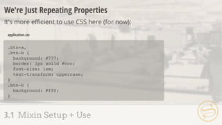
  • 58. .btn-a, .btn-b { background: #777; border: 1px solid #ccc; font-size: 1em; text-transform: uppercase; } .btn-b { background: #ff0; } application.css We're Just Repeating Properties It's more efficient to use CSS here (for now): 3.1 Mixin Setup + Use
  • 59. If that's the case, what are mixins good for then? 3.1 Mixin Setup + Use
  • 60. .content { -webkit-box-sizing: border-box; -moz-box-sizing: border-box; box-sizing: border-box; border: 1px solid #ccc; padding: 20px; } application.css 3.2 Adding Arguments
  • 61. .content { -webkit-box-sizing: border-box; -moz-box-sizing: border-box; box-sizing: border-box; border: 1px solid #ccc; padding: 20px; } application.css @mixin box-sizing { -webkit-box-sizing: border-box; -moz-box-sizing: border-box; box-sizing: border-box; } application.scss A S S E M B L Y R E J E C T E D 3.2 Adding Arguments .content { @include box-sizing; border: 1px solid #ccc; padding: 20px; }
  • 62. @mixin box-sizing { -webkit-box-sizing: -moz-box-sizing: box-sizing: } application.scss Arguments Values passed into a mixin, potentially altering output: 3.2 Adding Arguments ($x) $x; $x; $x;
  • 63. application.scss .content { -webkit-box-sizing: border-box; -moz-box-sizing: border-box; box-sizing: border-box; border: 1px solid #ccc; padding: 20px; } application.css 3.2 Adding Arguments .content { @include box-sizing(border-box); border: 1px solid #ccc; padding: 20px; } @mixin box-sizing { -webkit-box-sizing: -moz-box-sizing: box-sizing: } ($x) $x; $x; $x; .callout { @include box-sizing(content-box); } .callout { -webkit-box-sizing: content-box; -moz-box-sizing: content-box; box-sizing: content-box; }
  • 64. @mixin box-sizing($x ) { -webkit-box-sizing: $x; -moz-box-sizing: $x; box-sizing: $x; } application.scss Default Values Optionally, what arguments will default to if not included: 3.2 Adding Arguments : border-box
  • 65. application.scss .content { -webkit-box-sizing: border-box; -moz-box-sizing: border-box; box-sizing: border-box; border: 1px solid #ccc; padding: 20px; } application.css 3.2 Adding Arguments .content { @include box-sizing; border: 1px solid #ccc; padding: 20px; } .callout { @include box-sizing(content-box); } @mixin box-sizing($x ) { -webkit-box-sizing: $x; -moz-box-sizing: $x; box-sizing: $x; } : border-box .callout { -webkit-box-sizing: content-box; -moz-box-sizing: content-box; box-sizing: content-box; } A S S E M B L Y A P P R O V E D
  • 66. 3.1 Mixin Setup + Use 3.2 Adding Arguments 3.3 Multiple Arguments 3.4 Variable Arguments 3.5 Interpolation + Mixins
  • 67. @mixin button( border-radius: $radius; color: $color; } .btn-a { @include button( _buttons.scss .btn-a { border-radius: 4px; color: #000; } application.css 3.3 Multiple Arguments $radius, $color) { 4px, #000); }
  • 68. _buttons.scss Syntax error: Mixin button is missing argument $color. application.css 3.3 Multiple Arguments @mixin button( border-radius: $radius; color: $color; } .btn-a { @include button( $radius, $color) { 4px); }
  • 69. @mixin button( border-radius: $radius; color: $color; } .btn-a { @include button( _buttons.scss .btn-a { border-radius: 4px; color: #000; } application.css 3.3 Multiple Arguments $radius, $color ) { 4px); } : #000
  • 70. _buttons.scss Syntax error: Required argument $color must come before any optional arguments. application.css 3.3 Multiple Arguments @mixin button( border-radius: $radius; color: $color; } .btn-a { @include button( $color: #000, $radius) { 4px); }
  • 71. _buttons.scss .btn-a { border-radius: 5px; color: #777777; } application.css 3.3 Multiple Arguments @mixin button( border-radius: $radius; color: $color; } .btn-a { @include button( $radius, $color: #000) { $color: #777777, $radius: 5px); }
  • 72. .btn-a { -webkit-transition: color 0.3s ease-in, background 0.5s ease-out; -moz-transition: color 0.3s ease-in, background 0.5s ease-out; transition: color 0.3s ease-in, background 0.5s ease-out; } application.css 3.4 Variable Arguments
  • 73. @mixin transition( -webkit-transition: $val; -moz-transition: $val; transition: $val; } Mixin transition takes 1 argument but 2 were passed. _buttons.scss application.css Passing valid, comma-separated CSS as a single value: 3.4 Variable Arguments ) {$val .btn-a { @include transition(color 0.3s ease-in, background 0.5s ease-out); }
  • 74. .btn-a { -webkit-transition: color 0.3s ease-in, background 0.5s ease-out; -moz-transition: color 0.3s ease-in, background 0.5s ease-out; transition: color 0.3s ease-in, background 0.5s ease-out; } _buttons.scss application.css Adding ... to an argument creates a variable argument (vararg): 3.4 Variable Arguments @mixin transition( -webkit-transition: $val; -moz-transition: $val; transition: $val; } ) {$val... .btn-a { @include transition(color 0.3s ease-in, background 0.5s ease-out); }
  • 75. @mixin button($radius, $color) { border-radius: $radius; color: $color; } .btn-a { border-radius: 4px; color: #000; } _buttons.scss application.css Variable arguments in reverse: 3.4 Variable Arguments $properties: 4px, #000; .btn-a { @include button($properties...); }
  • 76. @mixin } _buttons.scss .btn-a { border-right-color: #ff0; } application.css 3.5 Interpolation + Mixins @mixin highlight-r($color) { border-right-color: $color; } @mixin highlight-b($color) { border-bottom-color: $color; } @mixin highlight-l($color) { border-left-color: $color; } .btn-a { @include highlight-r(#f00); } highlight-t($color) { border-top-color: $color;
  • 77. _buttons.scss .btn-a { border-right-color: #ff0; } application.css 3.5 Interpolation + Mixins @mixin } highlight($color, $side) { .btn-a { @include highlight(#f00, right); } border-#{$side}-color: $color;
  • 79. 4.1 Extend Setup + Use 4.2 Nesting + Extend 4.3 Extend Pitfalls 4.4 Placeholder Selectors
  • 80. .btn-a { background: #777; border: 1px solid #ccc; font-size: 1em; text-transform: uppercase; } .btn-b { background: #ff0; border: 1px solid #ccc; font-size: 1em; text-transform: uppercase; } application.css 4.1 Extend Setup + Use .btn-a, .btn-b { background: #777; border: 1px solid #ccc; font-size: 1em; text-transform: uppercase; } .btn-b { background: #ff0; } application.css
  • 81. application.css .btn-a { background: #777; border: 1px solid #ccc; font-size: 1em; text-transform: uppercase; } _buttons.scss Extend Sass will track and automatically combine selectors for us: 4.1 Extend Setup + Use .btn-a, .btn-b { background: #777; border: 1px solid #ccc; font-size: 1em; text-transform: uppercase; } .btn-b { background: #ff0; } .btn-b { @extend .btn-a; background: #ff0; }
  • 82. 4.1 Extend Setup + Use .btn-a, .btn-b { } .btn-b { } ... ... .btn-b { @extend .btn-a; background: #ff0; }
  • 83. .content { border: 1px solid #ccc; padding: 20px; h2 { font-size: 3em; margin: 20px 0; } } application.scss .content, .callout { application.css 4.2 Nesting + Extend .callout { @extend .content; background: #ddd; } border: 1px solid #ccc; padding: 20px; } .content h2, .callout h2 { font-size: 3em; margin: 20px 0; } .callout { background: #ddd; }
  • 84. .callout { @extend .content; background: #ddd; } 4.2 Nesting + Extend .content, .callout { ... } .content h2, .callout h2 { ... } .callout { ... }
  • 85. 4.1 Extend Setup + Use 4.2 Nesting + Extend 4.3 Extend Pitfalls 4.4 Placeholder Selectors
  • 86. .btn-a { background: #777; border: 1px solid #ccc; font-size: 1em; text-transform: uppercase; } .btn-b { @extend .btn-a; background: #ff0; } _buttons.scss .btn-a, .btn-b { background: #777; border: 1px solid #ccc; font-size: 1em; text-transform: uppercase; } .btn-b { background: #ff0; } .sidebar .btn-a, .sidebar .btn-b { text-transform: lowercase; } application.css 4.3 Extend Pitfalls A S S E M B L Y R E J E C T E D .sidebar .btn-a { text-transform: lowercase; }
  • 87. ๏ Since .btn-b extends .btn-a, every instance that modifies .btn-a also modifies .btn-b ๏ Stylesheet bloat, if these extra styles aren't needed ๏ We can counteract with placeholder selectors 4.3 Extend Pitfalls
  • 88. Assembly Tip Always, always check the CSS output of your Sass before using it on a live site.
  • 89. ๏ Placeholder selectors are denoted with a % ๏ Can be extended, but never become a selector of their own 4.4 Placeholder Selectors
  • 90. background: #777; border: 1px solid #ccc; font-size: 1em; text-transform: uppercase; } _buttons.scss .btn-a, .btn-b { background: #777; border: 1px solid #ccc; font-size: 1em; text-transform: uppercase; } .btn-b { background: #ff0; } .sidebar .btn-a, .sidebar .btn-b { text-transform: lowercase; } application.css 4.4 Placeholder Selectors .sidebar .btn-a { text-transform: lowercase; } .btn-b { background: #ff0; } .btn-a { @extend .btn-a;
  • 91. _buttons.scss .btn-a, .btn-b { background: #777; border: 1px solid #ccc; font-size: 1em; text-transform: uppercase; } .btn-b { background: #ff0; } application.css 4.4 Placeholder Selectors background: #777; border: 1px solid #ccc; font-size: 1em; text-transform: uppercase; } .sidebar .btn-a { text-transform: lowercase; } .btn-a { @extend %btn; } %btn { .sidebar .btn-a { text-transform: lowercase; } .btn-b { background: #ff0; } @extend %btn; A S S E M B L Y A P P R O V E D
  • 92. %ir { border: 0; font: 0/0 a; text-shadow: none; color: transparent; background-color: transparent; } .logo, .social { border: 0; font: 0/0 a; text-shadow: none; color: transparent; background-color: transparent; } application.scss application.css Extend common blocks to avoid extra HTML classes: 4.4 Placeholder Selectors .logo { @extend %ir; } .social { @extend %ir; }
  • 93. Assembly Tip Versions of IE prior to 9 have a limit of 4095 selectors-per- CSS file limit.
  • 95. 5.1 Functions 5.2 If 5.3 Each 5.4 For + While 5.5 Mixin' In
  • 96. 5.1 Functions Responsive Refresher ๏ Straight from Journey Into Mobile: ๏ If the target size of our sidebar is 350px and the context of its parent is 1000px: 350px / 1000px = 0.35 0.35 * 100 = 35% target / context
  • 97. @function fluidize( } application.scss .sidebar { width: 35%; } application.css 5.1 Functions ) { @return .sidebar { width: fluidize( } ); 35%;
  • 98. application.scss .sidebar { width: 35%; } application.css 5.1 Functions @function fluidize( } ) { @return .sidebar { width: fluidize( } );350px, 1000px ($target / $context) * 100%; $target, $context
  • 99. 5.1 Functions ๏ More on responsive design + Sass later, including a built-in fluidize replacement ๏ Function arguments = same rules as mixin arguments
  • 100. $theme: dark; header { header { background: #000; } application.scss application.css Using @if, we can conditionally output code: 5.2 If @if $theme == dark { background: #000; } }
  • 101. Comparisons ๏ == equal to ๏ != not equal to ๏ > greater than * ๏ >= greater than or equal to * ๏ < less than * ๏ <= less than or equal to * 5.2 If * numbers only
  • 102. $theme: light; header { application.scss 5.2 If @if $theme == dark { background: #000; } }
  • 103. application.scss header { background: #fff; } application.css @else provides a fallback if everything evaluates false or null: 5.2 If $theme: light; header { @if $theme == dark { background: #000; } } } @else { background: #fff;
  • 104. application.scss header { background: pink; } application.css @else if allows for multiple comparisons: 5.2 If $theme: pink; header { @if $theme == dark { background: #000; } } } @else { background: #fff; } @else if $theme == pink { background: pink;
  • 105. 5.1 Functions 5.2 If 5.3 Each 5.4 For + While 5.5 Mixin' In
  • 106. 5.3 Each Interating Over a List ๏ The @each directive allows us to loop through each list item: $authors: nick aimee dan drew;
  • 107. $authors: nick aimee dan drew; @each $author in $authors { } application.scss .author-nick { background: url(author-nick.jpg); } .author-aimee { background: url(author-aimee.jpg); } .author-dan { background: url(author-dan.jpg); } .author-drew { background: url(author-drew.jpg); } application.css 5.3 Each 1: nick 2: aimee 3: dan 4: drew $author background: url(author- #{$author}.jpg); .author-#{$author} { }
  • 108. .item { position: absolute; right: 0; @for $i from 1 through 3 { } } application.scss .item { position: absolute; right: 0; } .item.item-1 { top: 30px; } .item.item-2 { top: 60px; } .item.item-3 { top: 90px; } application.css 5.4 For + While 1: 1 2: 2 3: 3 $i top: $i * 30px; &.item-#{$i} { }
  • 109. 5.4 For + While ๏ @for and @while = @each with more control ๏ @while requires manually updating the index
  • 110. $i: 1; application.scss .item { position: absolute; right: 0; } .item.item-1 { top: 30px; } .item.item-2 { top: 60px; } .item.item-3 { top: 90px; } application.css 5.4 For + While 1: 1 2: 2 3: 3 4: 4 $i .item { position: absolute; right: 0; } @while $i < 4 { } &.item-#{$i} { top: $i * 30px; } $i: $i + 1;
  • 111. application.scss .item { position: absolute; right: 0; } .item.item-2 { top: 60px; } .item.item-4 { top: 120px; } .item.item-6 { top: 180px; } application.css 5.4 For + While $i: 2; .item { position: absolute; right: 0; } @while $i <= 6 { } &.item-#{$i} { top: $i * 30px; } $i: $i + 2; 1: 2 2: 4 3: 6 4: 8 $i
  • 112. 5.1 Functions 5.2 If 5.3 Each 5.4 For + While 5.5 Mixin' In
  • 113. Mixins Extend Functions ๏ Similar sets of properties used multiple times with small variations ๏ Sets of properties that match exactly ๏ Commonly-used operations to determine values 5.5 Mixin' In
  • 114. @mixin button($color, $rounded: color: $color; } _buttons.scss .btn-a { color: black; } application.css 5.5 Mixin' In .btn-a { @include button(#000, false); } .btn-b { @include button(#333); } ) {true @if $rounded } {== true border-radius: 4px; .btn-b { color: #333333; border-radius: 4px; }
  • 115. _buttons.scss .btn-a { color: black; } application.css 5.5 Mixin' In @mixin button($color, $rounded: color: $color; } .btn-a { @include button(#000); } .btn-b { @include button(#333, 4px); } ) {false @if $rounded } { border-radius: $rounded; .btn-b { color: #333333; border-radius: 4px; }
  • 116. ___ MATH + COLOR
  • 117. 6.1 Basic Arithmetic 6.2 Differing Units 6.3 Math Functions 6.4 Math + Color 6.5 Color Shortcuts 6.6 Color Functions
  • 118. Number Operations ๏ + addition ๏ - subtraction ๏ * multiplication ๏ / division ๏ % modulo 6.1 Basic Arithmetic Modulo = remainder from a division operation. 12 % 3 results in 0, while 12 % 5 returns 2.
  • 119. Assembly Tip Sass defaults to returning (up to) five digits after a decimal point.
  • 120. Division ๏ The trickiest of the number operations, due to font: font: normal 2em/1.5 Helvetica, sans-serif; 6.1 Basic Arithmetic
  • 121. Triggering Division ๏ Variable involved - $size / 10 ๏ Parenthesis - (100px / 20) ๏ Another arithmetic operation - 20px * 5 / 2 6.1 Basic Arithmetic
  • 122. $family: "Helvetica " + "Neue"; // "Helvetica Neue" String Addition Addition on strings concatenates them: 6.1 Basic Arithmetic $family: 'sans-' + serif // 'sans-serif' $family: sans- + 'serif' // sans-serif Initial left-side string determines post-concatenation quotes:
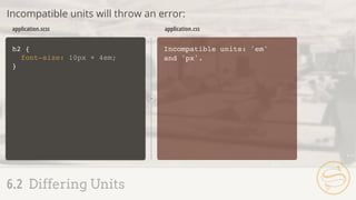
  • 123. h2 { font-size: 10px + 4pt; } h2 { font-size: 15.33333px; } application.scss application.css If the units differ, Sass attempts combination: 6.2 Differing Units
  • 124. h2 { font-size: 10px + 4em; } Incompatible units: 'em' and 'px'. application.scss application.css Incompatible units will throw an error: 6.2 Differing Units
  • 125. Pre-Defined Math Utilities ๏ round($number) - round to closest whole number ๏ ceil($number) - round up ๏ floor($number) - round down ๏ abs($number) - absolute value ๏ min($list) - minimum list value ๏ max($list) - maximum list value ๏ percentage($number) - convert to percentage 6.3 Math Functions
  • 126. h2 { line-height: ceil(1.2); } h2 { line-height: 2; } application.scss application.css Called the same way as custom functions: 6.3 Math Functions
  • 127. .sidebar { width: percentage(350px/1000px); } .sidebar { width: 35%; } application.scss application.css percentage() replaces our custom fluidize(): 6.3 Math Functions
  • 128. $context: 1000px; .sidebar { width: percentage(450px/$context); } .sidebar { width: 45%; } application.scss application.css percentage() replaces our custom fluidize(): 6.3 Math Functions
  • 129. 6.1 Basic Arithmetic 6.2 Differing Units 6.3 Math Functions 6.4 Math + Color 6.5 Color Shortcuts 6.6 Color Functions
  • 130. Color Juggling ๏ Easier recall through variables ๏ Simplified alteration via color utility functions ๏ Faster representation using shorthand 6.4 Math + Color
  • 131. $color-base: #333333; .addition { background: $color-base + #112233; } application.scss .addition { background: #445566; } application.css 6.4 Math + Color .subtraction { background: $color-base - #112233; } .multiplication { background: $color-base * 2; } .division { background: $color-base / 2; } .subtraction { background: #221100; } .multiplication { background: #666666; } .division { background: #191919; }
  • 132. Assembly Tip Where possible, use color utility functions instead of color arithmetic: easier to predict and maintain.
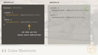
  • 133. $color: #333333; .alpha { background: rgba(51,51,51,0.8); } application.scss .alpha { background: rgba(51,51,51,0.8); } application.css 6.5 Color Shortcuts A S S E M B L Y R E J E C T E D
  • 134. $color: #333333; .alpha { } application.scss .alpha { background: rgba(51,51,51,0.8); } application.css 6.5 Color Shortcuts background: rgba($color,0.8); .beta { background: rgba(#000,0.8); } .beta { background: rgba(0,0,0,0.8); } A S S E M B L Y A P P R O V E D
  • 135. 6.1 Basic Arithmetic 6.2 Differing Units 6.3 Math Functions 6.4 Math + Color 6.5 Color Shortcuts 6.6 Color Functions
  • 136. 6.6 Color Functions Color utility functions: workflow-altering convenience
  • 137. $color: #333; .lighten { color: lighten($color, 20%); } application.scss .lighten { background: #666666; } application.css 6.6 Color Functions .darken { color: darken($color, 20%); } .darken { background: black; }
  • 138. $color: #87bf64; .saturate { color: saturate($color, 20%); } application.scss .saturate { background: #82d54e; } application.css 6.6 Color Functions .desaturate { color: desaturate($color, 20%); } .desaturate { background: #323130; }
  • 139. .mix-a { color: mix(#ffff00, #107fc9); } application.scss .mix-a { background: #87bf64; } application.css 6.6 Color Functions + .mix-b { color: mix(#ffff00, #107fc9, 30%); } .mix-b { background: #57a58c; }
  • 140. $color: #87bf64; .grayscale { color: grayscale($color); } application.scss .grayscale { color: #929292; } application.css 6.6 Color Functions .invert { color: invert($color); } .complement { color: complement($color); } .invert { color: #78409b; } .complement { color: #9c64bf; }
  • 141. Assembly Tip But wait, there's more! http://sass-lang.com/docs/yardoc/Sass/Script/Functions.html
  • 143. 7.1 The Movement 7.2 Nested Media Queries 7.3 Respond-To 7.4 Responsive Pitfalls
  • 144. 7.1 The Movement Responsive design rapidly progressed beyond good idea and into common practice
  • 145. Media Queries ๏ Easier fluid calculation and media query handling ๏ Journey Into Mobile 7.1 The Movement
  • 146. .sidebar { border: 1px solid #ccc; } @media (min-width: 700px) { .sidebar { float: right; width: 30%; } } application.css Media Queries Basic construction: 7.1 The Movement
  • 147. .sidebar { border: 1px solid #ccc; } @media (min-width: 700px) { .sidebar { float: right; width: 30%; } } application.css 7.2 Nested Media Queries
  • 148. .sidebar { border: 1px solid #ccc; } @media (min-width: 700px) { .sidebar { float: right; width: 30%; } } application.css .sidebar { border: 1px solid #ccc; } application.scss 7.2 Nested Media Queries @media (min-width: 700px) { float: right; width: 30%; } A S S E M B L Y A P P R O V E D
  • 149. 7.1 The Movement 7.2 Nested Media Queries 7.3 Respond-To 7.4 Responsive Pitfalls
  • 150. 7.3 Respond-To ๏ @content - pass a block of properties to a mixin
  • 151. .sidebar { border: 1px solid #ccc; application.scss .sidebar { border: 1px solid #ccc; } @media (min-width: 700px) { .sidebar { float: right; width: 30%; } } application.css 7.3 Respond-To } } float: right; width: 30%; @media (min-width: 700px) {
  • 152. @mixin respond-to application.scss .sidebar { border: 1px solid #ccc; } @media (min-width: 700px) { .sidebar { float: right; width: 30%; } } application.css 7.3 Respond-To A S S E M B L Y R E J E C T E D .sidebar { border: 1px solid #ccc; } } float: right; width: 30%; @include respond-to { { @media (min-width: 700px) { @content } }
  • 153. @mixin respond-to application.scss .sidebar { border: 1px solid #ccc; } @media (min-width: 700px) { .sidebar { float: right; width: 30%; } } application.css 7.3 Respond-To .sidebar { border: 1px solid #ccc; } } float: right; width: 30%; @include respond-to { { @media (min-width: 700px) { @content } }
  • 154. application.scss .sidebar { border: 1px solid #ccc; } @media (min-width: 700px) { .sidebar { float: right; width: 30%; } } application.css 7.3 Respond-To @mixin respond-to .sidebar { border: 1px solid #ccc; } } float: right; width: 30%; @include respond-to { @if $media == tablet { } { @media (min-width: 700px) { @content } } (tablet) ($media)
  • 155. application.scss .sidebar { border: 1px solid #ccc; } @media (min-width: 900px) { .sidebar { float: right; width: 30%; } } application.css 7.3 Respond-To @mixin respond-to .sidebar { border: 1px solid #ccc; } } float: right; width: 30%; @include respond-to { { @media (min-width: $query) { @content } } (900px) ($query)
  • 156. application.scss .sidebar { border: 1px solid #ccc; } @media (max-width: 600px) { .sidebar { float: right; width: 30%; } } application.css 7.3 Respond-To @mixin respond-to float: right; width: 30%; .sidebar { border: 1px solid #ccc; } } @include respond-to { { @media ($val: $query) { @content } } (max-width, 600px) ($val, $query) A S S E M B L Y A P P R O V E D
  • 157. 7.1 The Movement 7.2 Nested Media Queries 7.3 Respond-To 7.4 Responsive Pitfalls
  • 158. .sidebar { border: 1px solid #ccc; } .callout { @media (min-width: 700px) { @extend .sidebar; width: 35%; } } application.scss Declarations outside @media cannot be extended inside: 7.4 Responsive Pitfalls
  • 159. @media (min-width: 700px) { .content { border: 1px solid #ccc; } .aside { @extend .content; width: 35%; } } application.scss @media (min-width: 700px) { .content, .aside { border: 1px solid #ccc; } .aside { width: 35%; } } application.css 7.4 Responsive Pitfalls
  • 160. .sidebar { @media (min-width: 700px) { width: 50%; } } .callout { @media (min-width: 700px) { width: 35%; } } @media (min-width: 700px) { .sidebar { width: 50%; } } @media (min-width: 700px) { .callout { width: 35%; } } application.scss application.css Matching media queries are not combined: 7.4 Responsive Pitfalls
  • 161. Sometimes, manual combination is best: 7.4 Responsive Pitfalls @media (min-width: 700px) { .sidebar { width: 50%; } .callout { width: 35%; } } application.css