


![요소에 radial 그라데이션을 적용한다.
• background-image : radial-gradient([shape | size,] color n%, color n%, …);
• Shape : ellipse (기본값), circle
• Size Constant
(1)
Constant Description
closest-side
The gradient's ending shape meets the side of the box closest to its center (for circles
) or meets both the vertical and horizontal sides closest to the center (for ellipses).
closest-corner
The gradient's ending shape is sized so it exactly meets the closest corner of the box
from its center.
farthest-side
Similar to closest-side, except the ending shape is sized to meet the side of the box
farthest from its center (or vertical and horizontal sides).
farthest-corner
The gradient's ending shape is sized so it exactly meets the farthest corner of the box
from its center.
(2)
(3)
radial-gradient()
(1) background-image: radial-gradient(red 5%, yellow 25%, blue 50%, white);
(2) background-image: radial-gradient(closest-side, red 5%, yellow 25%, blue 50%, white);
(3) background-image: radial-gradient(circle closest-side, red 5%, yellow 25%, blue 50%, white);](https://image.slidesharecdn.com/cssfunctions-140522074712-phpapp01/85/CSS-Functions-8-320.jpg)


![• blur(npx) : 0 ~ npx
• brightness(n) : 1 ~ 100
• contrast(n%) : 0 ~ n%
• drop-shadow(<offset-x> <offset-y> [<blur-radius> <spread-radius> <color>])
• grayscale(n) : 0 ~ 1
• hue-rotate(ndeg) : 0 ~ 360deg
• invert(n%) : 0 ~ 100%
• opacity(n) : 0 ~ 1
• saturate(n) : 0 ~ 100
• sepia(n%) : 0 ~ 100%
요소에 다양한 필터를 적용
여러개의 필터가 동시에 사용될 수 있다.
-webkit-filter: grayscale(0.5) blur(10px);
https://developer.mozilla.org/en-US/docs/Web/CSS/filter
http://www.propra.nl/playground/css_filters/
* webkit만 지원
filter](https://image.slidesharecdn.com/cssfunctions-140522074712-phpapp01/85/CSS-Functions-12-320.jpg)


![애니메이션 프레임 수를 지정
direction :
• start : left-continuous function
프레임 시작 시점에 진행
• end : right-continuous function
프레임 종료 시점에 진행
https://developer.mozilla.org/en-US/docs/Web/CSS/timing-function
http://www.smashingmagazine.com/2014/04/15/understanding-css-timing-functions/
Timing-function #2
steps(number_of_steps[, direction])
-webkit-animation: keyframe 10s steps(10, end);
steps(1, start) step-start
steps(1, end) step-end](https://image.slidesharecdn.com/cssfunctions-140522074712-phpapp01/85/CSS-Functions-15-320.jpg)
![matrix()
matrix3d()
rotate3d()
rotateX() / rotateY() / rotateZ()
scale() / scale3d() / scaleX() / scaleY() / scaleZ()
skew() / skewX() / skewY()
translate() / translate3d() / translateX() / translateY() / translateZ()
perspective()
https://developer.mozilla.org/en-US/docs/Web/CSS/transform-function
http://www.vanseodesign.com/blog/demo/transforms/
Transform-function
transform : 함수(파라미터) [함수(파라미터) … ];](https://image.slidesharecdn.com/cssfunctions-140522074712-phpapp01/85/CSS-Functions-16-320.jpg)


CSS Functions
- 2. CSS 속성과 결합해 사용되는 함수로, 전달되는 파라미터에 따라 결과 값이 달라지며 함수 단독으로는 사용될 수 없다. url() 이미지 리소스를 사용할 수 있도록 한다. What are CSS functions? .sprite { background-image:url(http://img.naver.net/static/background.png); }
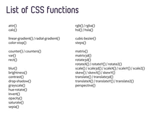
- 3. attr() calc() linear-gradient() / radial-gradient() color-stop() counter() / counters() var() rect() blur() brightness() contrast() drop-shadow() grayscale() hue-rotate() invert() opacity() saturate() sepia() rgb() / rgba() hsl() / hsla() cubic-bezier() steps() matrix() matrix3d() rotate3d() rotateX() / rotateY() / rotateZ() scale() / scale3d() / scaleX() / scaleY() / scaleZ() skew() / skewX() / skewY() translate() / translate3d() translateX() / translateY() / translateZ() perspective() List of CSS functions
- 4. 요소의 속성 값을 얻기 위해 사용 <p data-foo="hello">world</p> hello world *content 속성은 :before, :after 가상 선택자와 같이 사용되며 컨텐츠를 삽입 attr() p:before { content:attr(data-foo) " "; }
- 5. 계산식을 수행 <length>, <frequency>, <angle>, <time>, <number>, or <integer> 값이 적용되는 곳에 사용가능하며, 사칙연산을 통한 계산식을 수행한다. calc() .banner { width: calc(100% - 80px); }
- 6. linear-gradient() #1 요소에 linear 그라데이션을 적용한다. • background-image : linear-gradient(start position, color(start) n%, color(stop) n%); Start position: x축 시작점을 left로 지정 시 종료는 right, right가 시작점이면 종료는 left y축 시작점을 top으로 지정 시 종료는 bottom, bottom이 시작점이면 종료는 top • 모든 최신버전의 모던 브라우저에서 prefix를 통해 사용가능 (1) (2) (1) background-image : linear-gradient(left, red 35%, yellow 70%); (2) background-image : linear-gradient(left top, red 35%, yellow 70%);
- 7. linear-gradient() #2 • WebKit 계열 브라우저에서는 아래와 같은 방식으로 표현될 수도 있음 IE 이전 버전에서는 filter를 사용해 그라데이션을 적용할 수 있음 /* IE 5.5 ~ 7 */ filter: progid:DXImageTransform.Microsoft.gradient(startColorstr=red, endColorstr=yellow); /* IE 8+ */ -ms-filter: "progid:DXImageTransform.Microsoft.gradient(startColorstr=red, endColorstr=yellow)"; background-image: -webkit-gradient( linear, left bottom, right bottom, color-stop(0.35, red), color-stop(0.70, yellow) );
- 8. 요소에 radial 그라데이션을 적용한다. • background-image : radial-gradient([shape | size,] color n%, color n%, …); • Shape : ellipse (기본값), circle • Size Constant (1) Constant Description closest-side The gradient's ending shape meets the side of the box closest to its center (for circles ) or meets both the vertical and horizontal sides closest to the center (for ellipses). closest-corner The gradient's ending shape is sized so it exactly meets the closest corner of the box from its center. farthest-side Similar to closest-side, except the ending shape is sized to meet the side of the box farthest from its center (or vertical and horizontal sides). farthest-corner The gradient's ending shape is sized so it exactly meets the farthest corner of the box from its center. (2) (3) radial-gradient() (1) background-image: radial-gradient(red 5%, yellow 25%, blue 50%, white); (2) background-image: radial-gradient(closest-side, red 5%, yellow 25%, blue 50%, white); (3) background-image: radial-gradient(circle closest-side, red 5%, yellow 25%, blue 50%, white);
- 9. CSS가 관리하는 값으로, 룰에 의해 사용횟수에 따라 증가 • counter-reset : <name> - 새로운 카운터 인스턴스 생성 • counter-increment : <name> - 생성된 인스턴스의 카운터를 사용해 증가 • counter(<name>) - 단일 항목 출력 • counters(<name>, <구분 문자열>) - 중첩 항목의 값 출력 <h3>Introduction</h3> <h3>Body</h3> <h3>Conclusion</h3> Section 1: Introduction Section 2: Body Section 3: Conclusion counters body { counter-reset: section; } h3:before { counter-increment: section; content: "Section " counter(section) ": "; }
- 10. 반복적으로 사용되는 값을 변수의 형태로 저장해 사용 변수명은 ‘--‘ 접두 문자를 붙여 사용 변수의 값은 var()함수를 통해 사용 *FF31 nightly 지원 var() ol { background-color:var(--color); } :root { --color: red; } // 정의
- 11. 사각형 형태의 영역을 지정한다. clip은 특정 영역만 보여지도록 처리하는 속성 position:absolute인 경우에만 적용 ie8+ rect() img.clip { position:absolute; clip: rect(10px, 20px, 20px, 10px); } rect(<top>, <right>, <bottom>, <left>)
- 12. • blur(npx) : 0 ~ npx • brightness(n) : 1 ~ 100 • contrast(n%) : 0 ~ n% • drop-shadow(<offset-x> <offset-y> [<blur-radius> <spread-radius> <color>]) • grayscale(n) : 0 ~ 1 • hue-rotate(ndeg) : 0 ~ 360deg • invert(n%) : 0 ~ 100% • opacity(n) : 0 ~ 1 • saturate(n) : 0 ~ 100 • sepia(n%) : 0 ~ 100% 요소에 다양한 필터를 적용 여러개의 필터가 동시에 사용될 수 있다. -webkit-filter: grayscale(0.5) blur(10px); https://developer.mozilla.org/en-US/docs/Web/CSS/filter http://www.propra.nl/playground/css_filters/ * webkit만 지원 filter
- 13. Red-Green-Blue model (RGB) rgb(), rgba() Hue-Saturation-Luminosity model (HSL) hsl(), hsla() http://hslpicker.com/ color color : rgb(255, 0, 0) /* red */ color : rgba(255, 0, 0, 0.5) /* red, 50% opaque */ color : hsl(0, 100%, 50%) /* red */ color : hsla(0, 100%, 50%, 0.1) /* red, 10% opaque */
- 14. 애니메이션 진행시 중간 값을 계산하는 방법으로 베지어 곡선을 이용 cubic-bezier(x1, y1, x2, y2) http://cubic-bezier.com/ http://easings.net/ Timing-function #1 transition-timing-function: cubic-bezier(0.42, 0, 0.58, 1); animation-timing-function: cubic-bezier(0.42, 0, 0.58, 1);
- 15. 애니메이션 프레임 수를 지정 direction : • start : left-continuous function 프레임 시작 시점에 진행 • end : right-continuous function 프레임 종료 시점에 진행 https://developer.mozilla.org/en-US/docs/Web/CSS/timing-function http://www.smashingmagazine.com/2014/04/15/understanding-css-timing-functions/ Timing-function #2 steps(number_of_steps[, direction]) -webkit-animation: keyframe 10s steps(10, end); steps(1, start) step-start steps(1, end) step-end
- 16. matrix() matrix3d() rotate3d() rotateX() / rotateY() / rotateZ() scale() / scale3d() / scaleX() / scaleY() / scaleZ() skew() / skewX() / skewY() translate() / translate3d() / translateX() / translateY() / translateZ() perspective() https://developer.mozilla.org/en-US/docs/Web/CSS/transform-function http://www.vanseodesign.com/blog/demo/transforms/ Transform-function transform : 함수(파라미터) [함수(파라미터) … ];
- 17. • 특정 상태의 요소를 선택할 수 있도록 셀렉터에 추가되는 키워드 • 함수 표현식을 통해 사용되는 형태 존재 Pseudo-class? :dir() :lang() :not() :nth-child() :nth-last-child() :nth-of-type() :nth-last-of-type()
- 18. • :dir(ltr|rtl) 방향에 따른 가상 클래스 선택자 - ltr : left-to-right - rtl : right-toleft • :lang(lang) 언어에 따른 가상 클래스 선택자 요소에 lang 속성 값이 설정되어야 한다. Pseudo-class #1 p:-moz-dir(rtl) { color:red; } <p dir=“rtl”>this is red</p> div:lang(fr) { … } <div lang=“en”>hello</div> • :not(selector) 셀렉터와 부합되지 않는 조건의 가상 클래스 선택자 p:not(.test) { color:blue; } <p class=“test”>text1</p> <p>this is blue</p>
- 19. • :nth-child() 2n+1, odd : 홀수만 선택 2n, even : 짝수만 선택 0n+1, 1 : 첫 번째 자식 노드 -n+3 : 처음 3개의 자식 노드에 속하는 경우 Ex) 3의 배수인 요소들만 선택 :nth-child(3n+3) (3x0) + 3 = 3 (3x1) + 3 = 6 (3x2) + 3 = 9 … http://css-tricks.com/how-nth-child-works/ http://css-tricks.com/useful-nth-child-recipies/ Pseudo-class #2 element:nth-child(an + b) { style properties } a - cycle size n - counter (0부터 시작) b - offset value
- 20. • :nth-last-child() 후행 기준으로 선택 -n+4 : 마지막 4개 even : 마지막을 기준으로 짝수 • :nth-of-type() 요소의 타입의 순서를 통한 선택 • :nth-last-of-type() 요소의 타입을 통한 후행 기준 선택 https://developer.mozilla.org/en-US/docs/Web/CSS/Pseudo-classes http://css-tricks.com/examples/nth-child-tester/ Pseudo-class #3 tr:nth-last-child(-n+3); /* 뒤에서 마지막 3개의 tr 요소 */ span:nth-of-type(even); /* span 요소들 중, 짝수 */ span:nth-last-of-type(2)