SlideShare a Scribd company logo
4
Most read
7
Most read
11
Most read
This work is supported by the National Science Foundation’s
Directorate for Education and Human Resources (TUES-1245025, IUSE-
1612248, IUSE-1725347). Questions, contact education-AT-unavco.org
HOW TO FIND THE EQUATION OF A
TRENDLINE IN EXCEL, AND USE THAT
EQUATION TO CALCULATE RATES OF
CHANGE
DEVELOPED ON 2016 WINDOWS EXCEL
(DETAILS MAY BE SLIGHTLY DIFFERENT ON OTHER VERSIONS)
STEP 1
• Import your data
into excel
• Place your x-
values in the left
hand row, and
your y-values in
the right hand
row
STEP 2
• To plot your data, go
insert  charts  line
graph (or whichever style
of graph you are looking
for)
• Your graph should then
appear
STEP 3
• To add a trendline,
go design  Add
chart element 
scroll down the list
and hover over
trendline  click
on linear trendline
STEP 4
• Your trendline may be hard to see (shown in dotted blue line here)
• Double-click on your trendline
• A right hand window will pop up (format trendline window)
STEP 5
• On the format trendline window, click the paint bucket and
change the appearance of your trendline
STEP 6
• To display the equation of the line, click on the chart symbol
under trendline options and scroll down until you see “display
equation on chart”
• By checking the box, your equation will appear on your graph
STEP 7 (OPTIONAL)
• To lower your x-axis position (it looks bad here), double-
click on your y-axis values  a righthand window (format
axis) will pop up  click on the chart symbol  type in y-
value value for where you want your x-axis to cross
USING YOUR TRENDLINE EQUATION
• You can use your trendline equation to calculate rates of
change
• Your trendline equation may look something like this: y =
2.5822x – 5175.6
• or in general form, as y = m*x + c
• where m is the number for the gradient or slope of the line,
• and c is the intercept, the y-value when x = 0.
• In our example, the x-values represent time and the y-values
represent the change in mean sea level (in mm)
USING YOUR TRENDLINE EQUATION
• The slope of the line is 2.5822. What does this number mean?
• The slope of a line is the change in y produced by a 1 unit
increase in x.
• In our case, the equation is treating a 1 unit increase in x as 1
year.
• Our equation tells us that the during the period 1993–2003
the average change in sea level every year is plus 2.5822 mm.
USING YOUR TRENDLINE EQUATION
• So, if we wanted to calculate the average change in sea level after 5
years, then we would figure: 2.58*5yrs = 12.91mm
• If we wanted to calculate the average change in sea level after 20
years, we would figure: 2.58*20yrs = 51.64mm.
• After 10 weeks, then we would figure: 2.58*.1923 = 0.496mm.
• Now you can predict the change in sea level through any time
period!
• Note: the example here is based on the time period 1993–2003.
The slope will vary depending on which time period is being
considered.

More Related Content

PDF
Fluid Mechanic Lab - Bernoulli Equation
DOCX
Hand auger
PPTX
Carding machine
PPTX
Steam boiler & its use in Textile
PPTX
Abrasion resistance and pilling attitude of fleece fabric.
PPSX
Rotor spinning working principle
PPTX
Determination of the Yarn Count by Wrap reel & Analytical Balance
PPT
Survey on dyeing faults
Fluid Mechanic Lab - Bernoulli Equation
Hand auger
Carding machine
Steam boiler & its use in Textile
Abrasion resistance and pilling attitude of fleece fabric.
Rotor spinning working principle
Determination of the Yarn Count by Wrap reel & Analytical Balance
Survey on dyeing faults

What's hot (20)

PDF
LAB REPORT SHEAR FORCE IN A BEAM
DOCX
Project mercerization
PDF
02 - Process sequence of wet processing.pdf
PPTX
Singeing
PDF
Study On Beam Dyeing Machine
PPTX
Effect of work study & time study on production and quality
PDF
Winding by mim and groupmates
PPTX
Pad steam dyeing machine
PPTX
Coolmax fabric
PPTX
Seam slippage and seam grin
PPT
Yarn printing (Space dyeing)
PPTX
Penetration of bituminous materials
 
PPTX
Blow room machinery by aqsa khan
PDF
Fluid mechanics lab experiment 03_dead_weight piston_gauge
PDF
Beam dyeing machine
PDF
Blowroom
PDF
Screen Printing
DOCX
Hydrostatic force
PDF
Flock printing
PPTX
Analysis of Seam & Stitch Types & Class
LAB REPORT SHEAR FORCE IN A BEAM
Project mercerization
02 - Process sequence of wet processing.pdf
Singeing
Study On Beam Dyeing Machine
Effect of work study & time study on production and quality
Winding by mim and groupmates
Pad steam dyeing machine
Coolmax fabric
Seam slippage and seam grin
Yarn printing (Space dyeing)
Penetration of bituminous materials
 
Blow room machinery by aqsa khan
Fluid mechanics lab experiment 03_dead_weight piston_gauge
Beam dyeing machine
Blowroom
Screen Printing
Hydrostatic force
Flock printing
Analysis of Seam & Stitch Types & Class
Ad

Similar to Excel tutorial for creating trend lines and calculating rates of change (20)

PPT
timeseries.ppt
PPTX
timeseries-100127010913-phpapp02.pptx
PDF
Statistics assignment and homework help service
PPT
1634 time series and trend analysis
PPTX
Time Series
PPTX
PPT
Time Series and Forecasting slides ppt.ppt
PPTX
Time series
PPTX
Time series
PPTX
Business forecasting and timeseries analysis phpapp02
PPTX
presentation on Method of least Square.pptx
PPTX
Presentation on Method of least Square.pptx
PDF
Business statistics homework help service
PPT
8134485.ppt
PPTX
Moving avg & method of least square
PPTX
Moving average method maths ppt
PDF
Statistics assignment help service
PDF
Business statistics homework help
PPTX
Demand forecasting by time series analysis
PPT
SMD Presentation Time Series Data PPTX R
timeseries.ppt
timeseries-100127010913-phpapp02.pptx
Statistics assignment and homework help service
1634 time series and trend analysis
Time Series
Time Series and Forecasting slides ppt.ppt
Time series
Time series
Business forecasting and timeseries analysis phpapp02
presentation on Method of least Square.pptx
Presentation on Method of least Square.pptx
Business statistics homework help service
8134485.ppt
Moving avg & method of least square
Moving average method maths ppt
Statistics assignment help service
Business statistics homework help
Demand forecasting by time series analysis
SMD Presentation Time Series Data PPTX R
Ad

More from SERC at Carleton College (20)

PPTX
StatVignette03_Sig.Figs_v04_07_15_2020.pptx
PPTX
StatVignette06_HypTesting.pptx
PPTX
Unit 1 (optional slides)
PPTX
Cretaceous Coatlines and Modern Voting Patterns Presentation
PPTX
Climate and Biomes PPT 2
PPTX
weather tracking ppt
PPTX
Presentation: Unit 1 Introduction to the hydrological cycle
PPTX
StatVignette05_M3_v02_10_21_2020.pptx
PPTX
KSKL chapter 8 PPT
PPTX
KSKL chap 5 PPT
PPTX
KSKL_Chapter 4_ Chem Properties of Soils.pptx
PPTX
Degraded Soil Images.pptx
PPTX
Educators PPT file chapter 7
PPTX
Educators PPT file chapter 2
PPTX
Educators PPT file chapter 6
PPTX
Educators PPT chapter 3
PPTX
Unit 4 background presentation
PPTX
Presentation: Unit 3 background information
PPTX
Presentation: Unit 2 Measuring Groundwater Background Information
PPTX
Introduction to GPS presentation
StatVignette03_Sig.Figs_v04_07_15_2020.pptx
StatVignette06_HypTesting.pptx
Unit 1 (optional slides)
Cretaceous Coatlines and Modern Voting Patterns Presentation
Climate and Biomes PPT 2
weather tracking ppt
Presentation: Unit 1 Introduction to the hydrological cycle
StatVignette05_M3_v02_10_21_2020.pptx
KSKL chapter 8 PPT
KSKL chap 5 PPT
KSKL_Chapter 4_ Chem Properties of Soils.pptx
Degraded Soil Images.pptx
Educators PPT file chapter 7
Educators PPT file chapter 2
Educators PPT file chapter 6
Educators PPT chapter 3
Unit 4 background presentation
Presentation: Unit 3 background information
Presentation: Unit 2 Measuring Groundwater Background Information
Introduction to GPS presentation

Excel tutorial for creating trend lines and calculating rates of change

  • 1. This work is supported by the National Science Foundation’s Directorate for Education and Human Resources (TUES-1245025, IUSE- 1612248, IUSE-1725347). Questions, contact education-AT-unavco.org HOW TO FIND THE EQUATION OF A TRENDLINE IN EXCEL, AND USE THAT EQUATION TO CALCULATE RATES OF CHANGE DEVELOPED ON 2016 WINDOWS EXCEL (DETAILS MAY BE SLIGHTLY DIFFERENT ON OTHER VERSIONS)
  • 2. STEP 1 • Import your data into excel • Place your x- values in the left hand row, and your y-values in the right hand row
  • 3. STEP 2 • To plot your data, go insert  charts  line graph (or whichever style of graph you are looking for) • Your graph should then appear
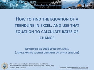
  • 4. STEP 3 • To add a trendline, go design  Add chart element  scroll down the list and hover over trendline  click on linear trendline
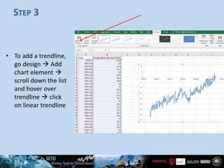
  • 5. STEP 4 • Your trendline may be hard to see (shown in dotted blue line here) • Double-click on your trendline • A right hand window will pop up (format trendline window)
  • 6. STEP 5 • On the format trendline window, click the paint bucket and change the appearance of your trendline
  • 7. STEP 6 • To display the equation of the line, click on the chart symbol under trendline options and scroll down until you see “display equation on chart” • By checking the box, your equation will appear on your graph
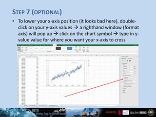
  • 8. STEP 7 (OPTIONAL) • To lower your x-axis position (it looks bad here), double- click on your y-axis values  a righthand window (format axis) will pop up  click on the chart symbol  type in y- value value for where you want your x-axis to cross
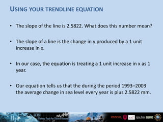
  • 9. USING YOUR TRENDLINE EQUATION • You can use your trendline equation to calculate rates of change • Your trendline equation may look something like this: y = 2.5822x – 5175.6 • or in general form, as y = m*x + c • where m is the number for the gradient or slope of the line, • and c is the intercept, the y-value when x = 0. • In our example, the x-values represent time and the y-values represent the change in mean sea level (in mm)
  • 10. USING YOUR TRENDLINE EQUATION • The slope of the line is 2.5822. What does this number mean? • The slope of a line is the change in y produced by a 1 unit increase in x. • In our case, the equation is treating a 1 unit increase in x as 1 year. • Our equation tells us that the during the period 1993–2003 the average change in sea level every year is plus 2.5822 mm.
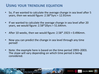
  • 11. USING YOUR TRENDLINE EQUATION • So, if we wanted to calculate the average change in sea level after 5 years, then we would figure: 2.58*5yrs = 12.91mm • If we wanted to calculate the average change in sea level after 20 years, we would figure: 2.58*20yrs = 51.64mm. • After 10 weeks, then we would figure: 2.58*.1923 = 0.496mm. • Now you can predict the change in sea level through any time period! • Note: the example here is based on the time period 1993–2003. The slope will vary depending on which time period is being considered.

Editor's Notes

  • #2: Excel interface will differ depending on the version of the software that is used.
  • #3: All figures were created from Ian Armstrong on his own Excel software. The displayed data is also self-created.
  • #12: The example used in this PowerPoint spans 1993–2003. Make sure students know that the rate of change they will calculate will differ from that reported here.