


Lecture 2-PPT statistics.pdf
- 2. A diagram is a visual form for presentation of statistical data. The diagram refers various types of devices such as bars, circles, maps, pictorials and cartograms etc.
- 3. They are simple, attractive and easy understandable They give quick information It helps to compare the variables Diagrams are more suitable to illustrate discrete data It will have more stable effect in the reader’s mind.
- 4. ◦ Diagrams shows approximate value ◦ Diagrams are not suitable for further analysis ◦ Some diagrams are limited to experts (multidimensional) ◦ Details cannot be provided fully ◦ It is useful only for comparison
- 5. Each diagram should have suitable title indicating the theme with which diagram is intended at the top or bottom. The size of diagram should emphasize the important characteristics of data. Approximate proposition should be maintained for length and breadth of diagram.
- 6. A proper / suitable scale to be applied for diagram Selection of approximate diagram is important and wrong selection may mislead the reader. Source of data should be mentioned at bottom. Diagram should be simple and attractive Diagram should be effective than complex.
- 7. This is simplest type of one dimensional diagram. On the basis of size of the figures, heights of the bar / lines are drawn. The distance between bars are kept uniform. The limitation of this diagram are it is not attractive cannot provide more than one information.
- 9. A simple bar diagram can be drawn using horizontal or vertical bar. In business and economics, it is very common diagram.
- 11. Multiple bar diagrams are used to provide more information than simple bar diagram. Multiple bar diagram provides more than one phenomenon and highly useful for direct comparison. The bars are drawn side by side and different columns, shades hatches can be used for indicating each variables used.
- 13. Subdivided bar diagram - definition Sub-divided Bar Diagram is a way of representation of data in which the total length of the bar is divided into different parts/components in particular ratios depending upon the contributions of various components.
- 14. Percentage Bar diagram: • This is derived further from the subdivided bar diagrams. In this, each bar has the same height that represents 100 percent of the Y-axis in totality. Further, each bar is divided into sections based on percentages calculated according to the contribution of these sections. • Percentage bar diagrams are used when the values are really high. This is because using subdivided bar diagrams in such cases would not be easy and appropriate.
- 16. In two-dimensional diagram both breadth and length of the diagram (i.e. area of the diagram) are considered as area of diagram represents the data. The important two dimensional diagrams are ◦ Rectangular diagram ◦ Square diagram
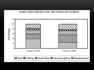
- 17. Rectangular diagram Rectangular diagrams are used to depict two or more variables. This diagram helps for direct comparison. The area of rectangular are kept in proportion to the values. It may be of two types. Percentage sub-divided rectangular diagram Sub-divided rectangular diagram
- 18. In former case width of the rectangular are proportional to the values, the various components of the values are converted into percentages and rectangles are divided according to them. While later case is used to show some related phenomenon like cost per unit, quality of production etc.
- 20. To draw square diagrams, the square root is taken of the values of the various items to be shown. A suitable scale may be used to depict the diagram. Ratios are to be maintained to draw squares.
- 21. Pie diagram helps us to show the portioning of a total into its component parts. It is used to show classes or groups of data in proportion to whole data set. The entire pie represents all the data, while each slice represents a different class or group within the whole.
- 24. A pictogram is one of the simplest (and most popular) forms of data visualization out there. Also known as “pictographs”, “icon charts”, “picture charts”, and “pictorial unit charts”, pictograms use a series of repeated icons to visualize simple data.
- 26. The following points are to be kept in mind for the choice of diagram. To common man, who has less knowledge in statistics cartogram and pictograms are suited. To present the components apart from magnitude of values, sub-divided bar diagram can be used. When a large number of components are to be shown, pie diagram is suitable
- 27. A graphic presentation a visual form of presentation graphs are drawn on a special type of paper known are graph paper. Common graphic representations are ◦ Histogram ◦ Frequency polygon ◦ Cumulative frequency curve (ogive)
- 28. It provides attractive and impressive view Simplifies complexity of data Helps for direct comparison It helps for further statistical analysis It is simplest method of presentation of data It shows trend and pattern of data
- 29. Diagram Graph 1. Ordinary paper can be used 1. Graph paper is required 2. It is attractive and easily understandable 2. Needs some effect to understand 3. It is appropriate and effective to measure more variable 3. It creates problem 4. It can’t be used for further analysis 4. Can be used for further analysis 5. It gives comparison 5. It shows relationship between variables 6. Data are represented by bars, rectangles 6. Points and lines are used to represent data
- 30. In this type of representation the given data are plotted in the form of series of rectangles. Class intervals are marked along the x-axis and the frequencies are along the y-axis according to suitable scale. Unlike the bar chart, which is one-dimensional, a histogram is two-dimensional in which the length and width are both important.
- 31. A histogram is constructed from a frequency distribution of grouped data, where the height of rectangle is proportional to respective frequency and width represents the class interval. Each rectangle is joined with other and the blank space between the rectangles would mean that the category is empty and there is no values in that class interval.
- 33. A frequency polygon is a line chart of frequency distribution in which either the values of discrete variables or the mid-point of class intervals are plotted against the frequency and those plotted points are joined together by straight lines.
- 35. ogives are the graphic representations of a cumulative frequency distribution. These ogives are classified as ‘less than’ and ‘more than ogives’. In case of ‘less than’, cumulative frequencies are plotted against upper boundaries of their respective class intervals. In case of ‘grater than’ cumulative frequencies are plotted against lower boundaries of their respective class intervals.
- 38. False Base Line is a device relating to graphical presentation. This line is used to break the continuity of Y-axis with the origin. A false base line is used when figures start with high values. If we maintain continuity of the value from the origin then sufficient portion of the graph would go waste.
- 39. In the diagram given here, since all the values are confined between 800 and 1100. Therefore, in such a case, a false base line is used. After the false base line, we can start from the actual high figures as shown in the graph.
- 40. Objects of using False Base: To magnify the major fluctuations on the graph so as to make them clearly visible. To economise in space On X-axis also, we can represent false base by drawing a kinked line.