


![In [3]: IFrame(src='html/tokyo_wards_choropleth.html', width=IFrame_width_px, height=IFram
e_heigth_px)
Out[3]:
+
-
Leaflet | Map tiles by Stamen Design, under CC BY 3.0. Data by OpenStreetMap, under ODbL.](https://image.slidesharecdn.com/pyconjp2017-171002062429/85/Geospatial-Data-Analysis-and-Visualization-in-Python-9-320.jpg)


![In [4]: IFrame(src='html/cityblock_choropleth_shinjuku3000.html', width=IFrame_width_px,
height=IFrame_heigth_px)
Out[4]:
+
-
2.0 2.5 3.0 3.5 4.0 4.5 5.0
Leaflet | Map tiles by Stamen Design, under CC BY 3.0. Data by OpenStreetMap, under ODbL.](https://image.slidesharecdn.com/pyconjp2017-171002062429/85/Geospatial-Data-Analysis-and-Visualization-in-Python-12-320.jpg)

![In [5]: IFrame(src='html/choropleth_with_timeslider.html', width=IFrame_width_px, height=I
Frame_heigth_px)
Out[5]:
Sun Jan 01 2006
+
-](https://image.slidesharecdn.com/pyconjp2017-171002062429/85/Geospatial-Data-Analysis-and-Visualization-in-Python-15-320.jpg)


![Let's take a look...
In [6]: data = pd.read_table('data/query_areas.txt', dtype={'zipcode': str})
data.reset_index(inplace=True, drop=True)
data.sample(5)
Out[6]:
northlatitude eastlongitude zipcode review_count total_score_ave
706187 34.586204 135.714230 6360082 24 3.46
92558 34.697354 135.501339 5300001 11 3.97
467249 35.968060 139.590300 3620042 1 3.50
40984 35.640797 139.673473 1540004 17 3.65
57418 35.457253 139.630277 2200012 60 3.11](https://image.slidesharecdn.com/pyconjp2017-171002062429/85/Geospatial-Data-Analysis-and-Visualization-in-Python-20-320.jpg)


![In [7]: data[['northlatitude', 'eastlongitude']].mean()
Out[7]: northlatitude 35.412935
eastlongitude 135.478591
dtype: float64](https://image.slidesharecdn.com/pyconjp2017-171002062429/85/Geospatial-Data-Analysis-and-Visualization-in-Python-23-320.jpg)


![In [8]: IFrame(src='html/tokyo_wards_choropleth.html', width=IFrame_width_px, height=IFram
e_heigth_px)
Out[8]:
+
-
Leaflet | Map tiles by Stamen Design, under CC BY 3.0. Data by OpenStreetMap, under ODbL.](https://image.slidesharecdn.com/pyconjp2017-171002062429/85/Geospatial-Data-Analysis-and-Visualization-in-Python-35-320.jpg)

![In [9]: IFrame(src='html/tokyo_wards_choropleth.html', width=1024, height=600)
Out[9]:
+
-
Leaflet | Map tiles by Stamen Design, under CC BY 3.0. Data by OpenStreetMap, under ODbL.](https://image.slidesharecdn.com/pyconjp2017-171002062429/85/Geospatial-Data-Analysis-and-Visualization-in-Python-37-320.jpg)

![In [10]: IFrame(src='html/wards_boundaries.html', width=1024, height=600)
Out[10]:
+
-
Leaflet | Data by OpenStreetMap, under ODbL.](https://image.slidesharecdn.com/pyconjp2017-171002062429/85/Geospatial-Data-Analysis-and-Visualization-in-Python-39-320.jpg)
![where to get the boundry data
the Internet ;)
In [11]:
More on how to collect boundaries with python later...
url = 'https://raw.githubusercontent.com/dataofjapan/land/master/tokyo.geojson'
filename = 'tokyo_wards.geojson'
### Load wards geojson data, or download if not already on disk
if not os.path.exists(filename):
r = requests.get(url)
with open(filename, 'w') as f:
f.write(json.dumps(json.loads(r.content.decode())))](https://image.slidesharecdn.com/pyconjp2017-171002062429/85/Geospatial-Data-Analysis-and-Visualization-in-Python-40-320.jpg)

![In [12]:
In [13]:
with open('data/tokyo_wards.geojson') as f:
wards = json.loads(f.read())
print('type: ', type(wards))
print('keys: ', wards.keys())
print()
pprint(wards['features'][0], max_seq_length = 10)
type: <class 'dict'>
keys: dict_keys(['crs', 'features', 'type'])
{'geometry': {'coordinates': [[[139.821051, 35.815077],
[139.821684, 35.814887],
[139.822599, 35.814509],
[139.8229070000001, 35.81437],
[139.822975, 35.814339],
[139.822977, 35.814338],
[139.823188, 35.814242],
[139.823348, 35.81417],
[139.823387, 35.814152],
[139.823403, 35.814138],
...]],
'type': 'Polygon'},
'properties': {'area_en': 'Tokubu',
'area_ja': '都区部',
'code': 131211,
'ward_en': 'Adachi Ku',
'ward_ja': '足立区'},
'type': 'Feature'}](https://image.slidesharecdn.com/pyconjp2017-171002062429/85/Geospatial-Data-Analysis-and-Visualization-in-Python-42-320.jpg)

![In [14]: !du h tokyo_wards.geojson
5.8M tokyo_wards.geojson](https://image.slidesharecdn.com/pyconjp2017-171002062429/85/Geospatial-Data-Analysis-and-Visualization-in-Python-44-320.jpg)
![In [15]: IFrame(src='html/wards_boundaries.html', width=1024, height=600)
Out[15]:
+
-
Leaflet | Data by OpenStreetMap, under ODbL.](https://image.slidesharecdn.com/pyconjp2017-171002062429/85/Geospatial-Data-Analysis-and-Visualization-in-Python-45-320.jpg)
![I wish I could e ciently handle such data...
... I wish there was something like pandas for
geospatial data, with, maybe I dunno, a geo-dataframe
or something?
In [16]: import geopandas as gpd
wards = gpd.read_file('data/tokyo_wards.geojson')](https://image.slidesharecdn.com/pyconjp2017-171002062429/85/Geospatial-Data-Analysis-and-Visualization-in-Python-46-320.jpg)
![In [17]: wards.head()
#wards.plot﴾figsize=﴾10,10﴿﴿;
Out[17]:
area_en area_ja code geometry ward_en ward_ja
0
Tokubu 都区部 131211
POLYGON ((139.821051
35.815077, 139.821684
35....
Adachi Ku 足立区
1
Tokubu 都区部 131059
POLYGON ((139.760933
35.732206, 139.761002
35....
Bunkyo
Ku
文京区
2
Tokubu 都区部 131016
POLYGON ((139.770135
35.705352, 139.770172
35....
Chiyoda
Ku
千代田
区
3
Tokubu 都区部 131067
POLYGON ((139.809714
35.728135, 139.809705
35....
Taito Ku 台東区
4
Tokubu 都区部 131091
(POLYGON ((139.719199
35.641847, 139.719346
35...
Shinagawa
Ku
品川区](https://image.slidesharecdn.com/pyconjp2017-171002062429/85/Geospatial-Data-Analysis-and-Visualization-in-Python-47-320.jpg)
![What's in the geometry column?
In [18]: wards.set_index('ward_ja', inplace=True)
type(wards.loc['新宿区', 'geometry'])
Out[18]: shapely.geometry.polygon.Polygon](https://image.slidesharecdn.com/pyconjp2017-171002062429/85/Geospatial-Data-Analysis-and-Visualization-in-Python-48-320.jpg)
![In [19]: polygon = wards.loc['新宿区', 'geometry']
polygon
Out[19]:](https://image.slidesharecdn.com/pyconjp2017-171002062429/85/Geospatial-Data-Analysis-and-Visualization-in-Python-49-320.jpg)


![In [21]: wards[wards['ward_ja'].str.contains('区')].plot(
figsize=(15,12), linewidth=3, edgecolor='black');](https://image.slidesharecdn.com/pyconjp2017-171002062429/85/Geospatial-Data-Analysis-and-Visualization-in-Python-54-320.jpg)


![In [22]: import folium
tokyo_center=(35.7035007,139.6524644)
m = folium.Map(location=tokyo_center, zoom_start=11)
folium.GeoJson(wards.to_json()).add_to(m)
m.save('html/folium_boundaries.html')](https://image.slidesharecdn.com/pyconjp2017-171002062429/85/Geospatial-Data-Analysis-and-Visualization-in-Python-60-320.jpg)
![In [23]: IFrame('html/folium_boundaries.html', height=IFrame_heigth_px, width=IFrame_width_
px)
Out[23]:
+
-
Leaflet | Data by OpenStreetMap, under ODbL.](https://image.slidesharecdn.com/pyconjp2017-171002062429/85/Geospatial-Data-Analysis-and-Visualization-in-Python-61-320.jpg)

![In [30]: data.sample(5)
Out[30]:
ward northlatitude eastlongitude zipcode review_count total_sco
140152 港区 35.656122 139.731141 1060032 22 3.19
105272 中央
区 35.683269 139.785155 1030013 2 3.47
97024 文京
区 35.705690 139.774493 1130034 23 3.10
37901 練馬
区 35.750053 139.634491 1790075 6 3.15
147327 港区 35.668359 139.729176 1070062 5 3.02](https://image.slidesharecdn.com/pyconjp2017-171002062429/85/Geospatial-Data-Analysis-and-Visualization-in-Python-63-320.jpg)
![sanity check - where is the geographical mean?
In [31]: data[['northlatitude', 'eastlongitude']].mean()
Out[31]: northlatitude 35.668068
eastlongitude 139.650324
dtype: float64](https://image.slidesharecdn.com/pyconjp2017-171002062429/85/Geospatial-Data-Analysis-and-Visualization-in-Python-64-320.jpg)

![It's time to calculate statistics for each ward
In [32]: groups = data[['review_count', 'total_score_ave', 'ward']].groupby('ward')
stats = groups.agg('mean').sort_values(by='total_score_ave', ascending=False)
counts = groups.size()](https://image.slidesharecdn.com/pyconjp2017-171002062429/85/Geospatial-Data-Analysis-and-Visualization-in-Python-66-320.jpg)
![In [33]: stats = stats.assign(count=counts)
stats.head(10)
Out[33]:
review_count total_score_ave count
ward
西東京市 6.903305 2.888752 817
清瀬市 5.931624 2.867308 234
杉並区 11.742827 2.865094 4810
東村山市 7.399381 2.862864 646
国立市 8.436426 2.843436 582
港区 22.841448 2.838996 16020
日野市 6.087566 2.830088 571
中央区 25.086408 2.824059 11897
葛飾区 8.505640 2.822050 2571
文京区 15.924992 2.817478 3053](https://image.slidesharecdn.com/pyconjp2017-171002062429/85/Geospatial-Data-Analysis-and-Visualization-in-Python-67-320.jpg)
![In [34]: stats.tail(10)
Out[34]:
review_count total_score_ave count
ward
東久留米市 5.412844 2.666697 436
東大和市 5.721154 2.661891 312
多摩市 6.726415 2.621450 848
武蔵村山市 7.125000 2.618581 296
三鷹市 9.731675 2.604777 764
板橋区 6.856051 2.586006 3140
稲城市 5.235849 2.520535 318
調布市 9.902878 2.370072 1390
狛江市 5.848101 2.143608 316
新島村 2.657143 2.087429 35](https://image.slidesharecdn.com/pyconjp2017-171002062429/85/Geospatial-Data-Analysis-and-Visualization-in-Python-68-320.jpg)
![Putting it all together
In [38]: from branca.colormap import linear
### OrRd colormap is kind of similar to tabelog score colors
colormap = linear.OrRd.scale(
stats['total_score_ave'].min(),
stats['total_score_ave'].max())
colors = stats['total_score_ave'].apply(colormap)
colors.sample(5)
Out[38]: ward
稲城市 #f98355
多摩市 #ef6548
清瀬市 #a30704
青梅市 #cf2a1b
東大和市 #e8553b
Name: total_score_ave, dtype: object](https://image.slidesharecdn.com/pyconjp2017-171002062429/85/Geospatial-Data-Analysis-and-Visualization-in-Python-69-320.jpg)
![In [39]: m = folium.Map(location=tokyo_center, #tiles='Stamen Toner',
zoom_start=11)
folium.GeoJson(
wards.to_json(),
style_function=lambda feature: {
'fillColor': colors.loc[feature['id']],
'color': 'black',
'weight': 1,
'dashArray': '5, 5',
'fillOpacity': 0.8,
'highlight': True
}
).add_to(m)
# folium.LayerControl﴾﴿.add_to﴾m﴿
m.add_child(colormap)
m.save('html/ward_choropleth_in_slides.html')
#folium.LayerControl﴾﴿.add_to﴾m﴿](https://image.slidesharecdn.com/pyconjp2017-171002062429/85/Geospatial-Data-Analysis-and-Visualization-in-Python-70-320.jpg)
![In [40]: IFrame(src='html/ward_choropleth_in_slides.html', height=IFrame_heigth_px, width=I
Frame_width_px)
Out[40]:
+
-
2.3 2.4 2.5 2.7 2.8 2.9 3.0
Leaflet | Data by OpenStreetMap, under ODbL.](https://image.slidesharecdn.com/pyconjp2017-171002062429/85/Geospatial-Data-Analysis-and-Visualization-in-Python-71-320.jpg)


![In [41]: import osmnx as ox
ox.plot_graph(ox.graph_from_place('新宿区'));](https://image.slidesharecdn.com/pyconjp2017-171002062429/85/Geospatial-Data-Analysis-and-Visualization-in-Python-91-320.jpg)
![In [42]: shinjuku_origin = (35.6918383, 139.702996)
street_graph = ox.graph_from_point(
shinjuku_origin,
distance=1000, # radius of 1000m
distance_type='network',
network_type='drive', # could also be 'bicycle', 'walk', etc.
simplify=False) # we'll see what this does in a moment](https://image.slidesharecdn.com/pyconjp2017-171002062429/85/Geospatial-Data-Analysis-and-Visualization-in-Python-92-320.jpg)
![In [43]: ox.plot_graph(street_graph);](https://image.slidesharecdn.com/pyconjp2017-171002062429/85/Geospatial-Data-Analysis-and-Visualization-in-Python-93-320.jpg)
![data is stored as a networkx directed graph
In [44]:
roads are edges
road intersections are nodes
print(type(street_graph))
<class 'networkx.classes.multidigraph.MultiDiGraph'>](https://image.slidesharecdn.com/pyconjp2017-171002062429/85/Geospatial-Data-Analysis-and-Visualization-in-Python-94-320.jpg)
![In [45]: street_graph.nodes(data=True)[:5]
Out[45]: [(1666084493, {'osmid': 1666084493, 'x': 139.6979529, 'y': 35.6981751}),
(1519087617, {'osmid': 1519087617, 'x': 139.7016291, 'y': 35.6922784}),
(2450450434,
{'highway': 'traffic_signals',
'osmid': 2450450434,
'x': 139.6987805,
'y': 35.6900131}),
(4717672458,
{'highway': 'crossing',
'osmid': 4717672458,
'x': 139.7016464,
'y': 35.6960468}),
(295405191, {'osmid': 295405191, 'x': 139.6994617, 'y': 35.6887217})]](https://image.slidesharecdn.com/pyconjp2017-171002062429/85/Geospatial-Data-Analysis-and-Visualization-in-Python-95-320.jpg)
![osmnx can plot with folium
In [46]: ox.plot_graph_folium(street_graph, edge_opacity=0.8)
Out[46]:
+
-
Leaflet | (c) OpenStreetMap contributors (c) CartoDB, CartoDB attributions](https://image.slidesharecdn.com/pyconjp2017-171002062429/85/Geospatial-Data-Analysis-and-Visualization-in-Python-96-320.jpg)

![osmnx can calculate useful statistics
In [47]: ox.basic_stats(street_graph)
Out[47]: {'circuity_avg': 0.99999999999999856,
'count_intersections': 1170,
'edge_density_km': None,
'edge_length_avg': 29.644130321357416,
'edge_length_total': 60088.652161391481,
'intersection_density_km': None,
'k_avg': 3.301302931596091,
'm': 2027,
'n': 1228,
'node_density_km': None,
'self_loop_proportion': 0.0,
'street_density_km': None,
'street_length_avg': 28.67747946921893,
'street_length_total': 42815.476847543861,
'street_segments_count': 1493,
'streets_per_node_avg': 2.4315960912052117,
'streets_per_node_counts': {0: 0, 1: 58, 2: 707, 3: 345, 4: 112, 5: 5, 6: 1},
'streets_per_node_proportion': {0: 0.0,
1: 0.04723127035830619,
2: 0.5757328990228013,
3: 0.28094462540716614,
4: 0.09120521172638436,
5: 0.004071661237785016,
6: 0.0008143322475570033}}](https://image.slidesharecdn.com/pyconjp2017-171002062429/85/Geospatial-Data-Analysis-and-Visualization-in-Python-98-320.jpg)
![you can use networkx algorithms
In [48]: import networkx as nx
b = nx.algorithms.betweenness_centrality(street_graph)
pd.Series(list(b.values())).hist(bins=100);](https://image.slidesharecdn.com/pyconjp2017-171002062429/85/Geospatial-Data-Analysis-and-Visualization-in-Python-99-320.jpg)


![def angle(a,b):
# print﴾a, b﴿
return degrees(arccos(dot(a, b)/(norm(a)*norm(b))))*sign(cross(b,a))
def step(graph, edge, path, depth):
depth += 1
# create list of successors to the edge
successors = [(edge[1], n) for n in graph.neighbors(edge[1])]
# Remove edge in the opposite direction, so that the algorithm doesn't simple
jump back to the previous point
successors.remove(tuple(np.flip((edge),0)))
# Remove edges that have already been traversed
successors = list(filter(lambda s: s not in traversed, successors))
if not successors:
# The successors have all been walked, so no more areas can be found
return
# calculate angles to incoming edge and order successors by smallest angle
angles = [angle(edge_coords.get(edge), edge_coords.get(successor)) for succes
sor in successors]
# pick leftmost edge
edge_to_walk = successors[np.argmin(angles)]
if edge_to_walk in path:
traversed.update([edge_to_walk])
#We are back where we started, which means that we found a polygon
graph_polygons.append(path)
return
else:
if depth > MAX_RECURSION_DEPTH:](https://image.slidesharecdn.com/pyconjp2017-171002062429/85/Geospatial-Data-Analysis-and-Visualization-in-Python-106-320.jpg)


![Using simpli ed street graph
In [49]: simple = ox.simplify_graph(street_graph)
ox.plot_graph(simple);](https://image.slidesharecdn.com/pyconjp2017-171002062429/85/Geospatial-Data-Analysis-and-Visualization-in-Python-116-320.jpg)
![In [50]: ox.plot_graph(street_graph);](https://image.slidesharecdn.com/pyconjp2017-171002062429/85/Geospatial-Data-Analysis-and-Visualization-in-Python-117-320.jpg)


![In [51]: IFrame(src='html/daikanyama_1000_notsimplified.html', width=1024, height=600)
Out[51]:
+
-
Leaflet | Map tiles by Stamen Design, under CC BY 3.0. Data by OpenStreetMap, under ODbL.](https://image.slidesharecdn.com/pyconjp2017-171002062429/85/Geospatial-Data-Analysis-and-Visualization-in-Python-121-320.jpg)

![In [52]: IFrame(src='html/daikanyama_1000_simplified.html', width=1024, height=600)
Out[52]:
+
-
Leaflet | Map tiles by Stamen Design, under CC BY 3.0. Data by OpenStreetMap, under ODbL.](https://image.slidesharecdn.com/pyconjp2017-171002062429/85/Geospatial-Data-Analysis-and-Visualization-in-Python-123-320.jpg)


![(more code...)
grid_size = 0.001
fdiv = lambda c: int(np.floor_divide(c, grid_size))
# Calculate grid for each point in polygons
# i.e. each polygon can be in multiple grids
grid_to_areas = {}
path_coords = [list(zip(*pol.exterior.coords.xy)) for pol in city_blocks.geometry
]
for area_number, path in enumerate(path_coords):
for point in path:
grid = (fdiv(point[0]), fdiv(point[1]))
if grid in grid_to_areas.keys():
grid_to_areas[grid].update([area_number])
else:
grid_to_areas[grid] = set([area_number])
# Calculate grid for each restaurant
# Each restaurant can only be in a single grid
restaurant_to_grid = list(map(tuple,restaurants[coordinate_columns].applymap(fdiv
).values))
restaurant_to_areas = {i:grid_to_areas.get(r) for i,r in enumerate(restaurant_to_
grid)}](https://image.slidesharecdn.com/pyconjp2017-171002062429/85/Geospatial-Data-Analysis-and-Visualization-in-Python-127-320.jpg)

![In [53]: IFrame(src='html/pythonpopupchoroplethAVERAGE.html', width=IFrame_width_px, heig
ht=IFrame_heigth_px)
Out[53]:
+
-
2.0 2.4 2.9 3.3 3.8 4.2 4.6
Leaflet | Map tiles by Stamen Design, under CC BY 3.0. Data by OpenStreetMap, under ODbL.](https://image.slidesharecdn.com/pyconjp2017-171002062429/85/Geospatial-Data-Analysis-and-Visualization-in-Python-129-320.jpg)

![In [54]: IFrame(src='html/pythonpopupchoroplethBEST.html', width=IFrame_width_px, height=
IFrame_heigth_px)
Out[54]:
+
-
2.0 2.5 3.0 3.5 4.0 4.5 5.0
Leaflet | Map tiles by Stamen Design, under CC BY 3.0. Data by OpenStreetMap, under ODbL.](https://image.slidesharecdn.com/pyconjp2017-171002062429/85/Geospatial-Data-Analysis-and-Visualization-in-Python-131-320.jpg)

![In [55]: IFrame(src='html/pythonpopupchoroplethWORST.html', width=IFrame_width_px, height
=IFrame_heigth_px)
Out[55]:
+
-
2.0 2.4 2.9 3.3 3.8 4.2 4.6
Leaflet | Map tiles by Stamen Design, under CC BY 3.0. Data by OpenStreetMap, under ODbL.](https://image.slidesharecdn.com/pyconjp2017-171002062429/85/Geospatial-Data-Analysis-and-Visualization-in-Python-133-320.jpg)


![In [56]: IFrame(src='http://dwilhelm89.github.io/LeafletSlider/', height=IFrame_heigth_px,
width=IFrame_width_px)
Out[56]:
Leaflet Time‑Slider Example
View on GitHub
+
-](https://image.slidesharecdn.com/pyconjp2017-171002062429/85/Geospatial-Data-Analysis-and-Visualization-in-Python-137-320.jpg)


![In [57]: from IPython.display import HTML, IFrame
IFrame(src='html/choropleth_with_timeslider.html', width=1024, height=600)
Out[57]:
Sun Jan 01 2006
+
-](https://image.slidesharecdn.com/pyconjp2017-171002062429/85/Geospatial-Data-Analysis-and-Visualization-in-Python-140-320.jpg)


![Links and References
In [ ]:
code for this presentation
geopandas
shapely docs
folium github examples
networkx
osmnx
Boeing, G. 2017. “OSMnx: New Methods for Acquiring, Constructing, Analyzing,
and Visualizing Complex Street Networks.” Computers, Environment and Urban
Systems 65, 126-139. doi:10.1016/j.compenvurbsys.2017.05.004
Validating OpenStreetMap / Arun Ganesh
Dots vs. polygons: How I choose the right visualization](https://image.slidesharecdn.com/pyconjp2017-171002062429/85/Geospatial-Data-Analysis-and-Visualization-in-Python-149-320.jpg)
Geospatial Data Analysis and Visualization in Python
- 1. Geospatial data analysis and visualization in Python PyCon JP 2017 Halfdan Rump
- 2. 日本語もオッケーっすよ!
- 5. What is geospatial data visualization?
- 6. I'll show you how to make maps in Python
- 7. I'll show you how to make interactive maps in Python
- 8. First we will make a simple map
- 9. In [3]: IFrame(src='html/tokyo_wards_choropleth.html', width=IFrame_width_px, height=IFram e_heigth_px) Out[3]: + - Leaflet | Map tiles by Stamen Design, under CC BY 3.0. Data by OpenStreetMap, under ODbL.
- 10. It's simple, so I'll show you the actual code
- 11. Then we'll add more detail
- 12. In [4]: IFrame(src='html/cityblock_choropleth_shinjuku3000.html', width=IFrame_width_px, height=IFrame_heigth_px) Out[4]: + - 2.0 2.5 3.0 3.5 4.0 4.5 5.0 Leaflet | Map tiles by Stamen Design, under CC BY 3.0. Data by OpenStreetMap, under ODbL.
- 13. more complicated, so I won't show much code
- 14. Finally we'll make this
- 15. In [5]: IFrame(src='html/choropleth_with_timeslider.html', width=IFrame_width_px, height=I Frame_heigth_px) Out[5]: Sun Jan 01 2006 + -
- 16. visualize data changes over space visualize data changes over time
- 17. what data are we plotting?
- 19. Our team got data from Tabelog! credit: Telegram Just Zoo it!
- 20. Let's take a look... In [6]: data = pd.read_table('data/query_areas.txt', dtype={'zipcode': str}) data.reset_index(inplace=True, drop=True) data.sample(5) Out[6]: northlatitude eastlongitude zipcode review_count total_score_ave 706187 34.586204 135.714230 6360082 24 3.46 92558 34.697354 135.501339 5300001 11 3.97 467249 35.968060 139.590300 3620042 1 3.50 40984 35.640797 139.673473 1540004 17 3.65 57418 35.457253 139.630277 2200012 60 3.11
- 21. Coordinates and a score Just what we need to make a map :)
- 22. before we get started... I may have found a conspiracy
- 25. credit: Telegram Just Zoo it!
- 26. I'll show you how to make choropleths in Python
- 28. a choropleth is a certain kind of map plot area borders plot with colors that re ect some statistic
- 30. choropleths are easy to interpret choropleths are pretty :)
- 31. There are several di erent ways of plotting data on a map Read more here
- 32. Why do I want them to be interactive?
- 33. Because it's much more fun :)
- 34. interactive maps are a tool for discovery
- 35. In [8]: IFrame(src='html/tokyo_wards_choropleth.html', width=IFrame_width_px, height=IFram e_heigth_px) Out[8]: + - Leaflet | Map tiles by Stamen Design, under CC BY 3.0. Data by OpenStreetMap, under ODbL.
- 36. Time to code!
- 37. In [9]: IFrame(src='html/tokyo_wards_choropleth.html', width=1024, height=600) Out[9]: + - Leaflet | Map tiles by Stamen Design, under CC BY 3.0. Data by OpenStreetMap, under ODbL.
- 39. In [10]: IFrame(src='html/wards_boundaries.html', width=1024, height=600) Out[10]: + - Leaflet | Data by OpenStreetMap, under ODbL.
- 40. where to get the boundry data the Internet ;) In [11]: More on how to collect boundaries with python later... url = 'https://raw.githubusercontent.com/dataofjapan/land/master/tokyo.geojson' filename = 'tokyo_wards.geojson' ### Load wards geojson data, or download if not already on disk if not os.path.exists(filename): r = requests.get(url) with open(filename, 'w') as f: f.write(json.dumps(json.loads(r.content.decode())))
- 41. let's see what we have
- 45. In [15]: IFrame(src='html/wards_boundaries.html', width=1024, height=600) Out[15]: + - Leaflet | Data by OpenStreetMap, under ODbL.
- 46. I wish I could e ciently handle such data... ... I wish there was something like pandas for geospatial data, with, maybe I dunno, a geo-dataframe or something? In [16]: import geopandas as gpd wards = gpd.read_file('data/tokyo_wards.geojson')
- 47. In [17]: wards.head() #wards.plot﴾figsize=﴾10,10﴿﴿; Out[17]: area_en area_ja code geometry ward_en ward_ja 0 Tokubu 都区部 131211 POLYGON ((139.821051 35.815077, 139.821684 35.... Adachi Ku 足立区 1 Tokubu 都区部 131059 POLYGON ((139.760933 35.732206, 139.761002 35.... Bunkyo Ku 文京区 2 Tokubu 都区部 131016 POLYGON ((139.770135 35.705352, 139.770172 35.... Chiyoda Ku 千代田 区 3 Tokubu 都区部 131067 POLYGON ((139.809714 35.728135, 139.809705 35.... Taito Ku 台東区 4 Tokubu 都区部 131091 (POLYGON ((139.719199 35.641847, 139.719346 35... Shinagawa Ku 品川区
- 48. What's in the geometry column? In [18]: wards.set_index('ward_ja', inplace=True) type(wards.loc['新宿区', 'geometry']) Out[18]: shapely.geometry.polygon.Polygon
- 50. work ow with GeoDataFrame is more or less identical to pandas.DataFrame
- 51. geopandas is a great library!
- 52. So, we can hold the boundary data in a GeoDataFrame
- 53. How do we plot them?
- 55. very fast to make, but...
- 56. we want something that runs in the browser
- 59. Making a map in two lines
- 61. In [23]: IFrame('html/folium_boundaries.html', height=IFrame_heigth_px, width=IFrame_width_ px) Out[23]: + - Leaflet | Data by OpenStreetMap, under ODbL.
- 62. We can use zipcodes to link restaurants to wards
- 63. In [30]: data.sample(5) Out[30]: ward northlatitude eastlongitude zipcode review_count total_sco 140152 港区 35.656122 139.731141 1060032 22 3.19 105272 中央 区 35.683269 139.785155 1030013 2 3.47 97024 文京 区 35.705690 139.774493 1130034 23 3.10 37901 練馬 区 35.750053 139.634491 1790075 6 3.15 147327 港区 35.668359 139.729176 1070062 5 3.02
- 64. sanity check - where is the geographical mean? In [31]: data[['northlatitude', 'eastlongitude']].mean() Out[31]: northlatitude 35.668068 eastlongitude 139.650324 dtype: float64
- 66. It's time to calculate statistics for each ward In [32]: groups = data[['review_count', 'total_score_ave', 'ward']].groupby('ward') stats = groups.agg('mean').sort_values(by='total_score_ave', ascending=False) counts = groups.size()
- 67. In [33]: stats = stats.assign(count=counts) stats.head(10) Out[33]: review_count total_score_ave count ward 西東京市 6.903305 2.888752 817 清瀬市 5.931624 2.867308 234 杉並区 11.742827 2.865094 4810 東村山市 7.399381 2.862864 646 国立市 8.436426 2.843436 582 港区 22.841448 2.838996 16020 日野市 6.087566 2.830088 571 中央区 25.086408 2.824059 11897 葛飾区 8.505640 2.822050 2571 文京区 15.924992 2.817478 3053
- 68. In [34]: stats.tail(10) Out[34]: review_count total_score_ave count ward 東久留米市 5.412844 2.666697 436 東大和市 5.721154 2.661891 312 多摩市 6.726415 2.621450 848 武蔵村山市 7.125000 2.618581 296 三鷹市 9.731675 2.604777 764 板橋区 6.856051 2.586006 3140 稲城市 5.235849 2.520535 318 調布市 9.902878 2.370072 1390 狛江市 5.848101 2.143608 316 新島村 2.657143 2.087429 35
- 69. Putting it all together In [38]: from branca.colormap import linear ### OrRd colormap is kind of similar to tabelog score colors colormap = linear.OrRd.scale( stats['total_score_ave'].min(), stats['total_score_ave'].max()) colors = stats['total_score_ave'].apply(colormap) colors.sample(5) Out[38]: ward 稲城市 #f98355 多摩市 #ef6548 清瀬市 #a30704 青梅市 #cf2a1b 東大和市 #e8553b Name: total_score_ave, dtype: object
- 71. In [40]: IFrame(src='html/ward_choropleth_in_slides.html', height=IFrame_heigth_px, width=I Frame_width_px) Out[40]: + - 2.3 2.4 2.5 2.7 2.8 2.9 3.0 Leaflet | Data by OpenStreetMap, under ODbL.
- 72. Now we have a toolbox! boundaries as shapely Polygon objects in geopandas dataframe can plot them using folium
- 73. What's next? wards are sort of large
- 74. the map we made is not very useful for discovery :( Can we nd boundaries for smaller areas?
- 77. zipcodes administrative boundaries de ned by the post service to serve their needs what about even smaller areas?
- 78. In general, what to do when there's no GeoJson?
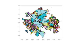
- 79. so now I wanted to calculate city blocks areas encapsulated by roads
- 81. why city blocks?
- 82. city blocks are the smallest city unit (apart from individual buildings)
- 83. city blocks re ect the topology of a city (they are not "just" administrative boundaries) we can use the city roads to calculate city blocks where can we get the road data?
- 85. largest open map on the planet anybody can edit map data
- 88. all this data is free Download OSM data through the Overpass API
- 90. short for Open Street Map NetworkX
- 94. data is stored as a networkx directed graph In [44]: roads are edges road intersections are nodes print(type(street_graph)) <class 'networkx.classes.multidigraph.MultiDiGraph'>
- 96. osmnx can plot with folium In [46]: ox.plot_graph_folium(street_graph, edge_opacity=0.8) Out[46]: + - Leaflet | (c) OpenStreetMap contributors (c) CartoDB, CartoDB attributions
- 98. osmnx can calculate useful statistics In [47]: ox.basic_stats(street_graph) Out[47]: {'circuity_avg': 0.99999999999999856, 'count_intersections': 1170, 'edge_density_km': None, 'edge_length_avg': 29.644130321357416, 'edge_length_total': 60088.652161391481, 'intersection_density_km': None, 'k_avg': 3.301302931596091, 'm': 2027, 'n': 1228, 'node_density_km': None, 'self_loop_proportion': 0.0, 'street_density_km': None, 'street_length_avg': 28.67747946921893, 'street_length_total': 42815.476847543861, 'street_segments_count': 1493, 'streets_per_node_avg': 2.4315960912052117, 'streets_per_node_counts': {0: 0, 1: 58, 2: 707, 3: 345, 4: 112, 5: 5, 6: 1}, 'streets_per_node_proportion': {0: 0.0, 1: 0.04723127035830619, 2: 0.5757328990228013, 3: 0.28094462540716614, 4: 0.09120521172638436, 5: 0.004071661237785016, 6: 0.0008143322475570033}}
- 99. you can use networkx algorithms In [48]: import networkx as nx b = nx.algorithms.betweenness_centrality(street_graph) pd.Series(list(b.values())).hist(bins=100);
- 100. osmnx is another tool for our toolbox! written by Geo Boeing
- 101. Now we can easily get street data How do we calculate the city blocks? nding certain kinds of cycles in the street graph
- 103. I couldn't nd an implementation but I found description of an algorithm so I decided to implement it here
- 104. The algorithm Pick a starting node Walk forward, while always turning left until you return to starting point Never walk the same road in the same direction twice Handle some edge cases
- 107. warning: recursive implementation! not trivial to parallelize
- 108. let's use that to nd city blocks in shinjuku!
- 110. slow for large areas of dense city network
- 111. Speeding up calculation Three ways that I could think of (apart from a more ef cient, non-recursive implementation ;)
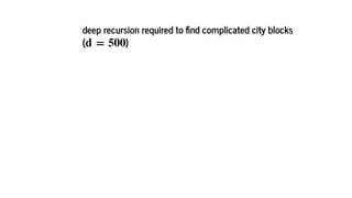
- 112. limit the number of recursions to depth constrains the algo to only nd city blocks with corners (a corner is a node in the street graph). d d
- 113. tremendous speedup with d = 10
- 114. deep recursion required to nd complicated city blocks ( )d = 500
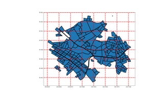
- 115. Removing roads that are dead ends reduces number of edges and nodes does not change the shape of the city blocks
- 116. Using simpli ed street graph In [49]: simple = ox.simplify_graph(street_graph) ox.plot_graph(simple);
- 118. reduces number of edges and nodes
- 119. This does change the shape of the city blocks
- 120. Daikanyama using original street graph
- 121. In [51]: IFrame(src='html/daikanyama_1000_notsimplified.html', width=1024, height=600) Out[51]: + - Leaflet | Map tiles by Stamen Design, under CC BY 3.0. Data by OpenStreetMap, under ODbL.
- 122. Daikanyama city blocks, using simpli ed road network
- 123. In [52]: IFrame(src='html/daikanyama_1000_simplified.html', width=1024, height=600) Out[52]: + - Leaflet | Map tiles by Stamen Design, under CC BY 3.0. Data by OpenStreetMap, under ODbL.
- 124. So now we can quickly calculate city blocks Let's turn the city blocks into a choropleth we can no longer use zipcodes to map restaurants to ares
- 125. place grid over area and calculate nearest grid
- 128. Group by city block and calculate stats use review count for opacity
- 129. In [53]: IFrame(src='html/pythonpopupchoroplethAVERAGE.html', width=IFrame_width_px, heig ht=IFrame_heigth_px) Out[53]: + - 2.0 2.4 2.9 3.3 3.8 4.2 4.6 Leaflet | Map tiles by Stamen Design, under CC BY 3.0. Data by OpenStreetMap, under ODbL.
- 130. Let's look at where the best restaurants are
- 131. In [54]: IFrame(src='html/pythonpopupchoroplethBEST.html', width=IFrame_width_px, height= IFrame_heigth_px) Out[54]: + - 2.0 2.5 3.0 3.5 4.0 4.5 5.0 Leaflet | Map tiles by Stamen Design, under CC BY 3.0. Data by OpenStreetMap, under ODbL.
- 132. Let's look at where the WORST restaurants are
- 133. In [55]: IFrame(src='html/pythonpopupchoroplethWORST.html', width=IFrame_width_px, height =IFrame_heigth_px) Out[55]: + - 2.0 2.4 2.9 3.3 3.8 4.2 4.6 Leaflet | Map tiles by Stamen Design, under CC BY 3.0. Data by OpenStreetMap, under ODbL.
- 134. Mapping time-dynamic data restaurant scores evolve over time
- 136. folium can make animations
- 137. In [56]: IFrame(src='http://dwilhelm89.github.io/LeafletSlider/', height=IFrame_heigth_px, width=IFrame_width_px) Out[56]: Leaflet Time‑Slider Example View on GitHub + -
- 138. Made TimeDynamicGeoJson plugin for folium
- 140. In [57]: from IPython.display import HTML, IFrame IFrame(src='html/choropleth_with_timeslider.html', width=1024, height=600) Out[57]: Sun Jan 01 2006 + -
- 141. will submit pull request to folium (after xing some bugs... )
- 142. Summary
- 143. 1. Three high-level libraries
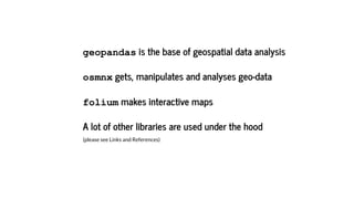
- 144. geopandas is the base of geospatial data analysis osmnx gets, manipulates and analyses geo-data folium makes interactive maps A lot of other libraries are used under the hood (please see Links and References)
- 145. My own contributions implementation of algo for calculating city blocks plugin for folium to make time dynamic choropleths
- 146. Why GIS in Python? ;)
- 148. Thank you :)
- 149. Links and References In [ ]: code for this presentation geopandas shapely docs folium github examples networkx osmnx Boeing, G. 2017. “OSMnx: New Methods for Acquiring, Constructing, Analyzing, and Visualizing Complex Street Networks.” Computers, Environment and Urban Systems 65, 126-139. doi:10.1016/j.compenvurbsys.2017.05.004 Validating OpenStreetMap / Arun Ganesh Dots vs. polygons: How I choose the right visualization