Data Visualization and Mapping using Javascript
14 likes8,075 views

The document summarizes Mack Hardy's presentation on data visualization at NetTuesday Vancouver. It provides examples of different tools that can be used to visualize data, such as Excel, Google Charts, maps, timelines, cartograms, and interactive visualizations using D3 and Raphael. It also discusses ethics and best practices around publishing open data. The presentation emphasized using visualization and storytelling to communicate patterns in data and provide context.


Data Visualization and Mapping using Javascript
- 1. Visualizing data using maps and other tools Mack Hardy Director at Affinity Bridge Presented Feb 5th, 2013 at NetTuesday Vancouver
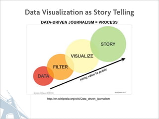
- 2. Data Visualization as Story Telling http://en.wikipedia.org/wiki/Data_driven_journalism
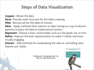
- 3. Steps of Data Visualization Acquire : Obtain the data Parse : Provide some structure for the data's meaning Filter : Remove all but the data of interest. Mine : Apply methods from statistics or data mining as a way to discern patterns or place the data in mathematical context. Represent : Choose a basic visual model, such as a bar graph, list, or tree. Refine : Improve the basic representation to make it clearer and more visually engaging. Interact : Add methods for manipulating the data or controlling what features are visible. O'reilly book "Vizualizing Data " by Ben Fry http://benfry.com/
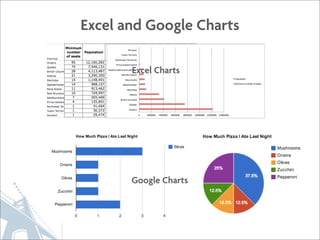
- 4. Excel and Google Charts Excel Charts Google Charts
- 5. So many other ways to show data http://www.visual-literacy.org/periodic_table/periodic_table.html
- 6. Maps
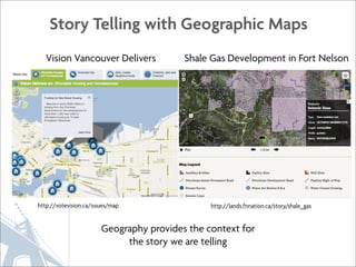
- 7. Story Telling with Geographic Maps Vision Vancouver Delivers Shale Gas Development in Fort Nelson http://votevision.ca/issues/map http://lands.fnnation.ca/story/shale_gas Geography provides the context for the story we are telling
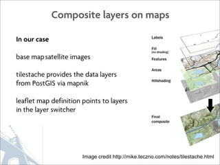
- 8. Composite layers on maps In our case base map satellite images tilestache provides the data layers from PostGIS via mapnik leaflet map definition points to layers in the layer switcher Image credit http://mike.teczno.com/notes/tilestache.html
- 9. Lot of Data on Geographic Maps
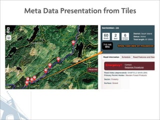
- 10. Meta Data Presentation from Tiles
- 11. Fusion Tables
- 12. Google Fusion Tables Build Example of making Choropleth in Fusion Tables https://github.com/affinitybridge/canada-provincial-population-choropleth
- 13. Fusion Tables as a Data Source Chris Herwig from MapBox http://mapbox.com/blog/mapbox-fusion-tables-drones/ http://hrwgc.github.com/places/drones/#8.00/32.886/70.467
- 15. Fusion Tables - Larger Data Set https://www.google.com/fusiontables/ DataSource?docid=1YHk08Ojrfdsn67tXq5-395UkSIDAuVgTwCHKVwk#map:id=3
- 16. Cartograms A map on which statistical information is shown in diagrammatic form. http://dl.dropbox.com/u/48433/datavis/canada/cartogram/cartogram_v1.html
- 17. Scaling Canada by Area Population http://bl.ocks.org/4687146
- 18. Cartogram of population vs parliamentary seats http://bl.ocks.org/4696122
- 19. Ecumene of Canadian Population Source: Canadian Census
- 20. Contiguous Cartogram of 2012 US Results Mark Newman, Department of Physics and Center for the Study of Complex Systems, University of Michigan http://www-personal.umich.edu/~mejn/election/2012/
- 21. World Oil Reserves http://wartard.blogspot.ca/2013/01/mali-french-go-to-desert.html
- 22. Making our Visualization Interactive D3 Raphael http://d3js.org http://raphaeljs.com
- 23. Walmart Locations All Hexed Up http://indiemaps.github.com/hexbin-js/tests/walmart.html
- 24. Graffiti in Vancouver http://bl.ocks.org/4711787 http://vancouver.ca/your-government/open-data-catalogue.aspx
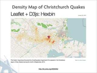
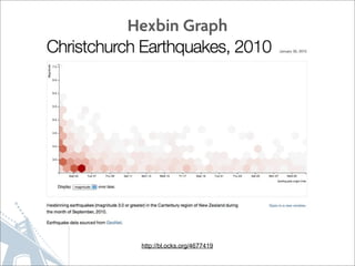
- 25. Density Map of Christchurch Quakes http://bl.ocks.org/4668062
- 27. Two aspects of dataset shown, plus geography http://bl.ocks.org/4710662
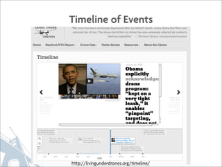
- 28. Earthquakes = Now with Timeline! http://bl.ocks.org/4718717
- 29. Ethics & Open Data Hugh Stimson Geocology Research @geocology
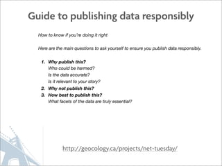
- 30. Guide to publishing data responsibly How to know if you’re doing it right Here are the main questions to ask yourself to ensure you publish data responsibly. 1. Why publish this? Who could be harmed? Is the data accurate? Is it relevant to your story? 2. Why not publish this? 3. How best to publish this? What facets of the data are truly essential? http://geocology.ca/projects/net-tuesday/
- 31. Discussion & Questions http://xkcd.com/523/ mack@affinitybridge.com http://affinitybridge.com @mackaffinity @affinitybridge
- 32. Fusion Tables Links http://www.visual-literacy.org/periodic_table/periodic_table.html http://votevision.ca/issues/map#creativity-jobs-and-finances http://lands.fnnation.ca/story/shale_gas http://stage.rr.affinitybridge.com/ http://stage.rr.affinitybridge.com/node/993#zoom=10&lat=48.9685&lng=-124.8322&layer=17 http://hrwgc.github.com/places/drones/#9.00/32.6285/69.7405 http://mapbox.com/blog/mapbox-fusion-tables-drones/ http://livingunderdrones.org/timeline/ https://www.google.com/fusiontables/DataSource?docid=1YHk08Ojrfdsn67tXq5-395UkSIDAuVgTwCHKVwk#map:id=3 Cartograms http://bl.ocks.org/4687146 D3 Hexbin and Examples http://bl.ocks.org/4696122 http://indiemaps.github.com/hexbin-js/tests/walmart.html http://wartard.blogspot.ca/2013/01/mali-french-go-to-desert.html http://bl.ocks.org/4711787 http://vancouver.ca/your-government/open-data-catalogue.aspx http://bl.ocks.org/4668062 http://bl.ocks.org/4677419 Hugh Stimson from Geocology http://bl.ocks.org/4710662 http://geocology.ca/projects/net-tuesday/ http://bl.ocks.org/4718717 http://thetyee.ca/News/2012/07/05/BCCarbonMapLessons/ http://www.lohud.com/interactive/article/20121223/NEWS01/121221011/Map-Where-gun-permits-your-neighborhood-?gcheck= http://www.poynter.org/how-tos/digital-strategies/199834/programmers-explain-how-to-turn-data-into-journalism-why-that- matters-after-gun-permit-data-publishing/ http://www.theatlanticcities.com/neighborhoods/2012/07/how-dramatically-alter-british-columbias-carbon-footprint/2489/