SlideShare a Scribd company logo
7 QC TOOLS
1. Flow Chart
2. Check Sheet
3. Histogram
4. Pareto
5. Cause & Effect Diagram
6. Scatter Plot
7. Control Chart
1. Flow Chart
2. Check Sheet
3. Histogram
4. Pareto
5. Cause & Effect Diagram
6. Scatter Plot
7. Control Chart
Flow Charts:
The benefits of flowcharts are as follows:
Communication: Flowcharts are better way of communicating the flow of a
system to all concerned.
Effective analysis: With the help of flowchart, problem can be analyzed in
more effective way.
Proper documentation: Program flowcharts serve as a good process
documentation, which is needed for various purposes.
Identifying errors: By breaking the process down into its constituent steps,
flowcharts can be useful in identifying where errors are likely to be found in the
system
• Flowcharts are pictorial representations of a process.
1. Flow Chart
2. Check Sheet
3. Histogram
4. Pareto
5. Cause & Effect Diagram
6. Scatter Plot
7. Control Chart
What is a check sheet ?
 The Check Sheet is a data-gathering and interpretation tool
 A Check Sheet is used for:
distinguishing between fact and opinion
gathering data about how often a problem is occurring
gathering data about the type of problem occurring
The most straight forward check sheet is simply to make a list of items that you
expect will appear in a process and to mark a check beside each item when it does
appear. This type of data collection can be used for almost anything, from checking
off the occurrence of particular types of defects to the counting of expected items
(e.g., the number of times the telephone rings before being answered).
Example of Check Sheet:
(continuous data use) No.___________741
PRODUCTION CHECK SHEET
Product Name_________________________________Alternator Pulley Date_________________________________12- 02- 02
Usage________________________________________Pulley Bolt Torque Factory_______________________________Church Street
Specification__________________________________2.2 +/- .5 Section Name__________________________SI Line
No. of Inspections______________________________185 Data Collector__________________________Sam The Man
Total Number__________________________________185 Group Name___________________________
Lot Number___________________________________1631 Remarks:_____________________________
Dimensions 1.5 1.6 1.7 1.8 1.9 2.0 2.1 2.2 2.3 2.4 2.5 2.6 2.7 2.8 2.9 3.0 3.1 3.2
40
35
SpecLSL
SpecUSL
30
25
20
15 X
XXXX
XX X
XXXXX
XX
10
XXX
XXXXX
XXXXX
XXXXX
XX
XXXXX
XXXXX
XXXXX
XXX
5
XX
XXXXX
XXXXX
XXXXX
XXXXX
XXXXX
XXXXX
XXXXX
XXXXX
XXXXX
XXXXX
XXX
X
0 X
XX
XXXXX
XXXXX
XXXXX
XXXXX
XXXXX
XXXXX
XXXXX
XXXXX
XXXXX
XXXXX
XXXXX
XXXXX
XXXXX
XXXXX
XX
X
TOTAL
FREQUENCY 1 2 7 13 10 16 19 17 12 16 20 17 13 8 5 6 2 1
1. Flow Chart
2. Check Sheet
3. Histogram
4. Pareto
5. Cause & Effect Diagram
6. Scatter Plot
7. Control Chart
• The purpose of a Histogram is to take the data that is
collected from a process and then display it graphically to
view how the distribution of the data, centers itself around
the mean, or main specification. From the data, the
histogram will graphically show:
The center of the data.
The spread of the data.
Any data skew ness (slant, bias or run at an angle).
The presence of outliers (product outside the specification
range).
The presence of multiple modes (or peaks) within the data.
Calculations needed…
Mean The average of all the values.
Minimum The smallest value.
Maximum The biggest value.
Std Dev An expression of how widely spread the values are
around the mean.
Class
Width
The x-axis distance between the left and right edges of
each bar in the histogram.
Number of
Classes
The number of bars (including zero height bars) in the
histograms.
Example: Histogram
The standard normal
distribution, with its zero
skewness and zero kurtosis
The standard normal distribution, with
its zero skewness and zero kurtosis
Example: Histogram
A truncated curve, with the peak at or
near the edge while trailing gently off
to the other side, often means that part
of the distribution has been removed
through screening, 100% inspection, or
review. These efforts are usually costly
and make good candidates for
improvement efforts
A double-peaked curve often means
that the data actually reflects two
distinct processes with different
centers. You will need to distinguish
between the two processes to get a
clear view of what is really happening
in either individual process
Example: Histogram
Outliers in a histogram – bars that are
removed from the others by at least the
width of one bar – sometimes indicate that
perhaps a separate process is included. It
may also indicate that special causes of
variation are present in the process and
should be investigated
A plateau-like curve often means that
the process is ill-defined to those
doing the work, which leaves
everyone on their own. Since
everyone handles the process
differently, there are many different
measurements with none standing
out. The solution here is to clearly
define an efficient process
Example: Histogram
1. Flow Chart
2. Check Sheet
3. Histogram
4. Pareto
5. Cause & Effect Diagram
6. Scatter Plot
7. Control Chart
• Pareto chart
• The Pareto chart is a specialized version of a histogram that ranks the
categories in the chart from most frequent to least frequent. A Pareto
Chart is useful for non-numeric data, such as "cause", "type", or
"classification". This tool helps to prioritize where action and process
changes should be focused. If one is trying to take action based upon
causes of accidents or events, it is generally most helpful to focus efforts
on the most frequent causes. Going after an "easy" yet infrequent cause
will probably not reap benefits.
 What Questions The Pareto Chart Answers
 What are the largest issues facing our team or business?
 What 20% of sources are causing 80% of the problems (80/20 Rule)?
 Where should we focus our efforts to achieve the greatest improvements?
Build a Pareto chart
 Sort your data in descending order by frequency of occurrence
Delay Due To Frequency % Cumulative %
Tool Change 31 36 36
No Raw material 26 30 66
No Steam Pressure 15 17 83
Power failure 9 10 93
others 6 7 100
87
 Create Percentage and Cumulative Percentage columns, as shown above.
7 qc tools
1. Flow Chart
2. Check Sheet
3. Histogram
4. Pareto
5. Cause & Effect Diagram
6. Scatter Plot
7. Control Chart
Cause & Effect Diagram
 The cause and effect diagram is used to explore all the
potential or real causes (or inputs) that result in a single
effect (or output).
 Causes are arranged according to their level of importance or
detail.
 Causes in a cause & effect diagram are frequently arranged
into four major categories. While these categories can be
anything, you will often see:
 Manpower, Methods, Materials, and Machinery (recommended for
manufacturing)
 equipment, policies, procedures, and people (recommended for
administration and service).
Example
MAN MACHINE
METHOD MATERIAL ATMOSPHERE
Lack of
operator
Skill.
Lack of
knowledge
H E efficiency
Bypass blower efficiency
Quality of ICW.
Speed of R/C Fan.
Proper sealing
Of I/C flange
& Base flange
Servo flapper
Opening of
bypass
Water
servo
opening
Stacking rule
Start bypass gas
Tempr.
Cooling water temp.
cooling water flow.
EXCESS
BYPASS
COOLING
TIME.Quality of
degd. coils
Coil
chemistry
Climatic
effect
ICW quality
1. Flow Chart
2. Check Sheet
3. Histogram
4. Pareto
5. Cause & Effect Diagram
6. Scatter Plot
7. Control Chart
Example of scatter plot
Study
Hours
Test
Score
3 80
5 90
2 75
6 80
7 90
1 50
2 65
7 85
1 40
7 100
The data displayed on the graph resembles a line rising from left to right. Since the
slope of the line is positive, there is a positive correlation between the two sets of
data. This means that according to this set of data, the longer one studies, the better
grade he will get in examination.
Types of scatter plots
Scatter Plot: No Relationship
Scatter Plot: Strong Linear
(positive correlation) Relationship
Scatter Plot: Strong Linear
(negative correlation) Relationship
Scatter Plot: Exact Linear (positive
correlation) Relationship
Types of scatter plots
Scatter Plot: Outlier
Types of scatter plots
1. Flow Chart
2. Check Sheet
3. Histogram
4. Pareto
5. Cause & Effect Diagram
6. Scatter Plot
7. Control Chart
All control charts have three basic components:
•a centerline, usually the mathematical average of all the samples plotted.
•upper and lower statistical control limits that define the constraints of common
cause variations.
•performance data plotted over time.
Elements of Typical Control Chart
1. Horizontal axis for sample number
2. Vertical axis for sample statistics e.g.
mean, range, standard deviation of sample.
3. Target Line
4. Upper control line
5. Upper warning line
6. Lower control line
7. Lower warning line
8. Plotting of sample statistics
9. Line connecting the plotted statistics
Elements of Typical Control Chart
1 2 3 4 5
Sample Number
Upper control line
Target
Lower control line
Upper warning line
Lower warning line
SampleStatistics
Types of control chart
Types of Control Chart
We have two main types of control charts. One for
variable data and the other for attribute data.
Since now world-wide, the current operating level is
‘number of parts defective per million parts
produced’, aptly described as ‘PPM’; control charts
for ‘attribute data’ has no meaning. The reason
being that the sample size for maintaining control
chart at the ‘PPM’ level, is very large, perhaps
equal to lot size, that means 100% inspection.
Most Commonly Used Variable Control Charts
Following are the most commonly used
variable control charts:
To track the accuracy of the process
- Mean control chart or x-bar chart
To track the precision of the process
- Range control chart
Most Common Type of Control Chart for
Variable Data
Variable
Control
Chart
For tracking
Accuracy
For tracking
Precision
Mean
control chart
Range
control chart
Concepts behind control charts
Case When Process Mean is at Target
43 48 49 50 51 52 5344 45 46 47
Target Process
Mean
Chances of getting a reading beyond U & L is almost nil
42
U
L
- 3 s +3 s U - L = 6 s
Case - Small Shift of the Process Mean
43 48 49 50 51 52 5344 45 46 47
Target
Process
Mean
Chances of getting a reading outside U is small
Small shift in process
42
Shaded area
shows the
probability of
getting
a reading
beyond U
UL
U-L = 6 s
Process
Mean
Case - Large Shift of the Process Mean
43 48 49 50 51 52 5344 45 46 47
Target
Chances of getting a reading outside U is large
Large shift in process
42
Shaded area
shows the
probability of
getting
a reading
beyond U
UL
U-L = 6 s
Summary of Effect of Process Shift
When there is no shift in the process nearly all the
observations fall within -3 s and + 3 s.
When there is small shift in the mean of process
some observations fall outside original -3 s and
+3 s zone.
Chances of an observation falling outside original
-3 s and + 3 s zone increases with the increase
in the shift of process mean.
Our Conclusion from Normal Distribution
When an observation falls within original +3 s
and -3 s zone of mean of a process, we
conclude that there is no shift in the mean of
process. This is so because falling of an
observation between these limits is a chance.
When an observation falls beyond original +3 s
and -3 s zone of process mean, we conclude
that there is shift in location of the process
If the process output follows these rules, the
process is said to be stable or in control with
only common causes of variation present. If it
fails to follow these rules, it may be out of
control with special causes of variation present.
These special causes must be found and
corrected.
Interpreting Control Chart
A single point above or below the control limits.
Probability of a point falling outside the control limit
is less than 0.14%. This pattern may indicate:
- a special cause of variation from a material,
equipment, method, operator etc.
- mismeasurement of a part or parts.
- miscalculated or misplotted data point.
Interpreting Control Chart
UCL
1 2 3 4 5 6 7 8
Sample Number
Statistics
UWL
LCL
Target
LWL
One point outside
control limit
Interpreting Control Chart
Seven consecutive points are falling on one side
of the centre line.
Probability of a point falling above or below the
centre line is 50-50. The probability of seven
consecutive points falling on one side of the
centre line is 0.78% ( 1 in 128)
This pattern indicates a shift in the process
output from changes in the equipment, methods,
or material or shift in the measurement system.
Interpreting Control Chart
UCLUCL
1 2 3 4 5 6 7 8
Sample Number
Statistics
UWLUWL
LCLLCL
TargetTarget
LWLLWL
Seven consecutive points on one
side of the centre line
Interpreting Control Chart
Two consecutive points fall between warning limit and
corresponding control limit.
In a normal distribution, the probability of two consecutive
points falling between warning limit and corresponding
control limit is 0.05%
(1 in 2000).
This could be due to large shift in the process, equipment,
material, method or
measurement system.
Interpreting Control Chart
UCL
1 2 3 4 5 6 7 8
Sample Number
Statistics
UWL
LCL
Target
LWL
Two consecutive points between warning limit and
corresponding control limit
Interpreting Control Chart
Two points out of three consecutive points fall
between warning limit and corresponding control
limit.
This could be due to large shift in the process,
equipment, material, method or measurement
system.
UCLUCL
1 2 3 4 5 6 7 8
Sample Number
Statistics
UWLUWL
LCLLCL
TargetTarget
LWLLWL
Two points out of three consecutive points
between warning limit and corresponding
control limit
Interpreting Control Chart
A trend of seven points in a row upward or
downward demonstrates nonrandomness.
This happens when
- Gradual deterioration or wear in
equipment.
- Improvement or deterioration in
technique.
- Operator fatigue.
Interpreting Control Chart
UCL
1 2 3 4 5 6 7 8
Sample Number
Statistics
UWL
LCL
Target
LWL
Seven consecutive points having
upward trend
Interpreting Control Chart
UCLUCL
1 2 3 4 5 6 7 8
Sample Number
Statistics
UWL
LCLLCL
Target
LWL
Seven consecutive points having
downward trend
Interpreting Control Chart

More Related Content

PPTX
7 qc tools
PPTX
7 quality control tools
PPT
The Seven Basic Tools of Quality
PPT
Quality Control Circle
PPT
7 new qc tools
PDF
7 QC Tools and Quality Circles (tai lieu tham khao)
PDF
7 QC Tools PDF | An eBook with A Detailed Description and Practical Examples
PDF
Statistical Process Control (SPC) Tools - 7 Basic Tools
7 qc tools
7 quality control tools
The Seven Basic Tools of Quality
Quality Control Circle
7 new qc tools
7 QC Tools and Quality Circles (tai lieu tham khao)
7 QC Tools PDF | An eBook with A Detailed Description and Practical Examples
Statistical Process Control (SPC) Tools - 7 Basic Tools

What's hot (20)

PPTX
The Basics 7 QC Tools - ADDVALUE - Nilesh Arora
PPT
7 QC Tools
PPTX
7 QC Tools Training
PPT
7QC Tools
PPT
7 qc tools
PPT
7 qc tools training material[1]
PPTX
Iatf 16949 training
PDF
Apqp ppt
PPTX
Statstical process control
PPT
Control charts
PPTX
7 qc tool training
PPT
New seven qc tools
PPTX
Statistical process control
PPT
Production and Quality Tools: The 7 Basic Quality Tools
PPTX
Fishbone Diagram, Ishikawa Diagram Training, Learn Fishbone in 3 Easy Steps
PPT
Training ppt for control plan
PPT
Apqp fundamentals
PDF
Quality control
PPTX
Seven quality tools
The Basics 7 QC Tools - ADDVALUE - Nilesh Arora
7 QC Tools
7 QC Tools Training
7QC Tools
7 qc tools
7 qc tools training material[1]
Iatf 16949 training
Apqp ppt
Statstical process control
Control charts
7 qc tool training
New seven qc tools
Statistical process control
Production and Quality Tools: The 7 Basic Quality Tools
Fishbone Diagram, Ishikawa Diagram Training, Learn Fishbone in 3 Easy Steps
Training ppt for control plan
Apqp fundamentals
Quality control
Seven quality tools
Ad

Viewers also liked (19)

PPTX
7 QC Tools
PPT
PPTX
Seven tools of quality control
PPTX
Seven Basic Tools
PPTX
7 Quality Control Tools (SQC Model) [MARCH 2009]
PDF
7 qc toolsTraining pdf
PDF
7 qc tools and spc training, December. 2015
PDF
PDF
six sigma & 7 qc tools
PDF
7 qc tool presentation material
PPTX
3. project charter, check sheet, pareto analysis & c&e diagram & matrix
PDF
Basic Statistical Process Control
PPTX
Principles of design of experiments (doe)20 5-2014
PPTX
Statistical Process Control
PPTX
Total quality management tools and techniques
PPTX
7 qc toools LEARN and KNOW how to BUILD IN EXCEL
PPT
PROJECT ON REDUCTION OF COMPLAINTS FROM NETWORK-anurag
PDF
7 QC Tools
7 QC Tools
Seven tools of quality control
Seven Basic Tools
7 Quality Control Tools (SQC Model) [MARCH 2009]
7 qc toolsTraining pdf
7 qc tools and spc training, December. 2015
six sigma & 7 qc tools
7 qc tool presentation material
3. project charter, check sheet, pareto analysis & c&e diagram & matrix
Basic Statistical Process Control
Principles of design of experiments (doe)20 5-2014
Statistical Process Control
Total quality management tools and techniques
7 qc toools LEARN and KNOW how to BUILD IN EXCEL
PROJECT ON REDUCTION OF COMPLAINTS FROM NETWORK-anurag
7 QC Tools
Ad

Similar to 7 qc tools (20)

PPT
Quality_Control_Tools.ppt
PPT
Tools and techniques used in tqm ppt
PDF
Seven traditional tools
PDF
Seven Basic Quality Control Tools أدوات ضبط الجودة السبعة
PPTX
TQM-Unit 3-7-1 tools of quality-New.pptx
PPTX
Statistical Control Process - Class Presentation
PPTX
CHAPTER 7.pptx
PDF
The 7 basic Quality Tools.pdf for helathcare
PDF
7 QC Tools For Problem Solving Presentation.pdf
PPT
7 QC - NEW.ppt
PPTX
7 TRADITIONAL TOOLS OF QUALITY
PPTX
7 QC(Quality Control) Tools
PPTX
QUALITY MANAGEMENT- SEVEN BASIC TOOLS OF QUALITY CONTROL
PPTX
Qulaity Control 1.pptx
PPT
Tqm old tools
PPT
OLD SEVEN TOOLS OF QUALTIY MANAGEMENT
PPT
Tqm old tools
PDF
old seven quality control tools
PPTX
7 tools essential for quality control.pptx
PDF
7 QC Tools and Problem Solving Presentation.pdf
Quality_Control_Tools.ppt
Tools and techniques used in tqm ppt
Seven traditional tools
Seven Basic Quality Control Tools أدوات ضبط الجودة السبعة
TQM-Unit 3-7-1 tools of quality-New.pptx
Statistical Control Process - Class Presentation
CHAPTER 7.pptx
The 7 basic Quality Tools.pdf for helathcare
7 QC Tools For Problem Solving Presentation.pdf
7 QC - NEW.ppt
7 TRADITIONAL TOOLS OF QUALITY
7 QC(Quality Control) Tools
QUALITY MANAGEMENT- SEVEN BASIC TOOLS OF QUALITY CONTROL
Qulaity Control 1.pptx
Tqm old tools
OLD SEVEN TOOLS OF QUALTIY MANAGEMENT
Tqm old tools
old seven quality control tools
7 tools essential for quality control.pptx
7 QC Tools and Problem Solving Presentation.pdf

Recently uploaded (20)

PDF
The Lost Whites of Pakistan by Jahanzaib Mughal.pdf
PPTX
master seminar digital applications in india
PDF
TR - Agricultural Crops Production NC III.pdf
PDF
2.FourierTransform-ShortQuestionswithAnswers.pdf
PDF
O7-L3 Supply Chain Operations - ICLT Program
PDF
Module 4: Burden of Disease Tutorial Slides S2 2025
PDF
STATICS OF THE RIGID BODIES Hibbelers.pdf
PPTX
Cell Structure & Organelles in detailed.
PPTX
school management -TNTEU- B.Ed., Semester II Unit 1.pptx
PDF
Supply Chain Operations Speaking Notes -ICLT Program
PPTX
human mycosis Human fungal infections are called human mycosis..pptx
PDF
Insiders guide to clinical Medicine.pdf
PPTX
Cell Types and Its function , kingdom of life
PPTX
Microbial diseases, their pathogenesis and prophylaxis
PDF
Complications of Minimal Access Surgery at WLH
PDF
VCE English Exam - Section C Student Revision Booklet
PDF
01-Introduction-to-Information-Management.pdf
PDF
Business Ethics Teaching Materials for college
PPTX
The Healthy Child – Unit II | Child Health Nursing I | B.Sc Nursing 5th Semester
PPTX
Introduction to Child Health Nursing – Unit I | Child Health Nursing I | B.Sc...
The Lost Whites of Pakistan by Jahanzaib Mughal.pdf
master seminar digital applications in india
TR - Agricultural Crops Production NC III.pdf
2.FourierTransform-ShortQuestionswithAnswers.pdf
O7-L3 Supply Chain Operations - ICLT Program
Module 4: Burden of Disease Tutorial Slides S2 2025
STATICS OF THE RIGID BODIES Hibbelers.pdf
Cell Structure & Organelles in detailed.
school management -TNTEU- B.Ed., Semester II Unit 1.pptx
Supply Chain Operations Speaking Notes -ICLT Program
human mycosis Human fungal infections are called human mycosis..pptx
Insiders guide to clinical Medicine.pdf
Cell Types and Its function , kingdom of life
Microbial diseases, their pathogenesis and prophylaxis
Complications of Minimal Access Surgery at WLH
VCE English Exam - Section C Student Revision Booklet
01-Introduction-to-Information-Management.pdf
Business Ethics Teaching Materials for college
The Healthy Child – Unit II | Child Health Nursing I | B.Sc Nursing 5th Semester
Introduction to Child Health Nursing – Unit I | Child Health Nursing I | B.Sc...

7 qc tools

  • 1. 7 QC TOOLS 1. Flow Chart 2. Check Sheet 3. Histogram 4. Pareto 5. Cause & Effect Diagram 6. Scatter Plot 7. Control Chart
  • 2. 1. Flow Chart 2. Check Sheet 3. Histogram 4. Pareto 5. Cause & Effect Diagram 6. Scatter Plot 7. Control Chart
  • 3. Flow Charts: The benefits of flowcharts are as follows: Communication: Flowcharts are better way of communicating the flow of a system to all concerned. Effective analysis: With the help of flowchart, problem can be analyzed in more effective way. Proper documentation: Program flowcharts serve as a good process documentation, which is needed for various purposes. Identifying errors: By breaking the process down into its constituent steps, flowcharts can be useful in identifying where errors are likely to be found in the system • Flowcharts are pictorial representations of a process.
  • 4. 1. Flow Chart 2. Check Sheet 3. Histogram 4. Pareto 5. Cause & Effect Diagram 6. Scatter Plot 7. Control Chart
  • 5. What is a check sheet ?  The Check Sheet is a data-gathering and interpretation tool  A Check Sheet is used for: distinguishing between fact and opinion gathering data about how often a problem is occurring gathering data about the type of problem occurring The most straight forward check sheet is simply to make a list of items that you expect will appear in a process and to mark a check beside each item when it does appear. This type of data collection can be used for almost anything, from checking off the occurrence of particular types of defects to the counting of expected items (e.g., the number of times the telephone rings before being answered).
  • 6. Example of Check Sheet: (continuous data use) No.___________741 PRODUCTION CHECK SHEET Product Name_________________________________Alternator Pulley Date_________________________________12- 02- 02 Usage________________________________________Pulley Bolt Torque Factory_______________________________Church Street Specification__________________________________2.2 +/- .5 Section Name__________________________SI Line No. of Inspections______________________________185 Data Collector__________________________Sam The Man Total Number__________________________________185 Group Name___________________________ Lot Number___________________________________1631 Remarks:_____________________________ Dimensions 1.5 1.6 1.7 1.8 1.9 2.0 2.1 2.2 2.3 2.4 2.5 2.6 2.7 2.8 2.9 3.0 3.1 3.2 40 35 SpecLSL SpecUSL 30 25 20 15 X XXXX XX X XXXXX XX 10 XXX XXXXX XXXXX XXXXX XX XXXXX XXXXX XXXXX XXX 5 XX XXXXX XXXXX XXXXX XXXXX XXXXX XXXXX XXXXX XXXXX XXXXX XXXXX XXX X 0 X XX XXXXX XXXXX XXXXX XXXXX XXXXX XXXXX XXXXX XXXXX XXXXX XXXXX XXXXX XXXXX XXXXX XXXXX XX X TOTAL FREQUENCY 1 2 7 13 10 16 19 17 12 16 20 17 13 8 5 6 2 1
  • 7. 1. Flow Chart 2. Check Sheet 3. Histogram 4. Pareto 5. Cause & Effect Diagram 6. Scatter Plot 7. Control Chart
  • 8. • The purpose of a Histogram is to take the data that is collected from a process and then display it graphically to view how the distribution of the data, centers itself around the mean, or main specification. From the data, the histogram will graphically show: The center of the data. The spread of the data. Any data skew ness (slant, bias or run at an angle). The presence of outliers (product outside the specification range). The presence of multiple modes (or peaks) within the data.
  • 9. Calculations needed… Mean The average of all the values. Minimum The smallest value. Maximum The biggest value. Std Dev An expression of how widely spread the values are around the mean. Class Width The x-axis distance between the left and right edges of each bar in the histogram. Number of Classes The number of bars (including zero height bars) in the histograms.
  • 11. The standard normal distribution, with its zero skewness and zero kurtosis The standard normal distribution, with its zero skewness and zero kurtosis Example: Histogram
  • 12. A truncated curve, with the peak at or near the edge while trailing gently off to the other side, often means that part of the distribution has been removed through screening, 100% inspection, or review. These efforts are usually costly and make good candidates for improvement efforts A double-peaked curve often means that the data actually reflects two distinct processes with different centers. You will need to distinguish between the two processes to get a clear view of what is really happening in either individual process Example: Histogram
  • 13. Outliers in a histogram – bars that are removed from the others by at least the width of one bar – sometimes indicate that perhaps a separate process is included. It may also indicate that special causes of variation are present in the process and should be investigated A plateau-like curve often means that the process is ill-defined to those doing the work, which leaves everyone on their own. Since everyone handles the process differently, there are many different measurements with none standing out. The solution here is to clearly define an efficient process Example: Histogram
  • 14. 1. Flow Chart 2. Check Sheet 3. Histogram 4. Pareto 5. Cause & Effect Diagram 6. Scatter Plot 7. Control Chart
  • 15. • Pareto chart • The Pareto chart is a specialized version of a histogram that ranks the categories in the chart from most frequent to least frequent. A Pareto Chart is useful for non-numeric data, such as "cause", "type", or "classification". This tool helps to prioritize where action and process changes should be focused. If one is trying to take action based upon causes of accidents or events, it is generally most helpful to focus efforts on the most frequent causes. Going after an "easy" yet infrequent cause will probably not reap benefits.  What Questions The Pareto Chart Answers  What are the largest issues facing our team or business?  What 20% of sources are causing 80% of the problems (80/20 Rule)?  Where should we focus our efforts to achieve the greatest improvements?
  • 16. Build a Pareto chart  Sort your data in descending order by frequency of occurrence Delay Due To Frequency % Cumulative % Tool Change 31 36 36 No Raw material 26 30 66 No Steam Pressure 15 17 83 Power failure 9 10 93 others 6 7 100 87  Create Percentage and Cumulative Percentage columns, as shown above.
  • 18. 1. Flow Chart 2. Check Sheet 3. Histogram 4. Pareto 5. Cause & Effect Diagram 6. Scatter Plot 7. Control Chart
  • 19. Cause & Effect Diagram  The cause and effect diagram is used to explore all the potential or real causes (or inputs) that result in a single effect (or output).  Causes are arranged according to their level of importance or detail.  Causes in a cause & effect diagram are frequently arranged into four major categories. While these categories can be anything, you will often see:  Manpower, Methods, Materials, and Machinery (recommended for manufacturing)  equipment, policies, procedures, and people (recommended for administration and service).
  • 20. Example MAN MACHINE METHOD MATERIAL ATMOSPHERE Lack of operator Skill. Lack of knowledge H E efficiency Bypass blower efficiency Quality of ICW. Speed of R/C Fan. Proper sealing Of I/C flange & Base flange Servo flapper Opening of bypass Water servo opening Stacking rule Start bypass gas Tempr. Cooling water temp. cooling water flow. EXCESS BYPASS COOLING TIME.Quality of degd. coils Coil chemistry Climatic effect ICW quality
  • 21. 1. Flow Chart 2. Check Sheet 3. Histogram 4. Pareto 5. Cause & Effect Diagram 6. Scatter Plot 7. Control Chart
  • 22. Example of scatter plot Study Hours Test Score 3 80 5 90 2 75 6 80 7 90 1 50 2 65 7 85 1 40 7 100 The data displayed on the graph resembles a line rising from left to right. Since the slope of the line is positive, there is a positive correlation between the two sets of data. This means that according to this set of data, the longer one studies, the better grade he will get in examination.
  • 23. Types of scatter plots Scatter Plot: No Relationship Scatter Plot: Strong Linear (positive correlation) Relationship
  • 24. Scatter Plot: Strong Linear (negative correlation) Relationship Scatter Plot: Exact Linear (positive correlation) Relationship Types of scatter plots
  • 25. Scatter Plot: Outlier Types of scatter plots
  • 26. 1. Flow Chart 2. Check Sheet 3. Histogram 4. Pareto 5. Cause & Effect Diagram 6. Scatter Plot 7. Control Chart
  • 27. All control charts have three basic components: •a centerline, usually the mathematical average of all the samples plotted. •upper and lower statistical control limits that define the constraints of common cause variations. •performance data plotted over time.
  • 28. Elements of Typical Control Chart 1. Horizontal axis for sample number 2. Vertical axis for sample statistics e.g. mean, range, standard deviation of sample. 3. Target Line 4. Upper control line 5. Upper warning line 6. Lower control line 7. Lower warning line 8. Plotting of sample statistics 9. Line connecting the plotted statistics
  • 29. Elements of Typical Control Chart 1 2 3 4 5 Sample Number Upper control line Target Lower control line Upper warning line Lower warning line SampleStatistics
  • 31. Types of Control Chart We have two main types of control charts. One for variable data and the other for attribute data. Since now world-wide, the current operating level is ‘number of parts defective per million parts produced’, aptly described as ‘PPM’; control charts for ‘attribute data’ has no meaning. The reason being that the sample size for maintaining control chart at the ‘PPM’ level, is very large, perhaps equal to lot size, that means 100% inspection.
  • 32. Most Commonly Used Variable Control Charts Following are the most commonly used variable control charts: To track the accuracy of the process - Mean control chart or x-bar chart To track the precision of the process - Range control chart
  • 33. Most Common Type of Control Chart for Variable Data Variable Control Chart For tracking Accuracy For tracking Precision Mean control chart Range control chart
  • 35. Case When Process Mean is at Target 43 48 49 50 51 52 5344 45 46 47 Target Process Mean Chances of getting a reading beyond U & L is almost nil 42 U L - 3 s +3 s U - L = 6 s
  • 36. Case - Small Shift of the Process Mean 43 48 49 50 51 52 5344 45 46 47 Target Process Mean Chances of getting a reading outside U is small Small shift in process 42 Shaded area shows the probability of getting a reading beyond U UL U-L = 6 s
  • 37. Process Mean Case - Large Shift of the Process Mean 43 48 49 50 51 52 5344 45 46 47 Target Chances of getting a reading outside U is large Large shift in process 42 Shaded area shows the probability of getting a reading beyond U UL U-L = 6 s
  • 38. Summary of Effect of Process Shift When there is no shift in the process nearly all the observations fall within -3 s and + 3 s. When there is small shift in the mean of process some observations fall outside original -3 s and +3 s zone. Chances of an observation falling outside original -3 s and + 3 s zone increases with the increase in the shift of process mean.
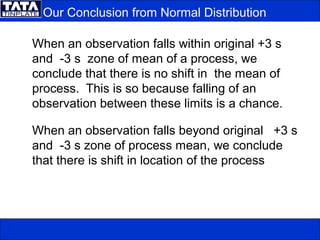
  • 39. Our Conclusion from Normal Distribution When an observation falls within original +3 s and -3 s zone of mean of a process, we conclude that there is no shift in the mean of process. This is so because falling of an observation between these limits is a chance. When an observation falls beyond original +3 s and -3 s zone of process mean, we conclude that there is shift in location of the process
  • 40. If the process output follows these rules, the process is said to be stable or in control with only common causes of variation present. If it fails to follow these rules, it may be out of control with special causes of variation present. These special causes must be found and corrected. Interpreting Control Chart
  • 41. Interpreting Control Chart A single point above or below the control limits. Probability of a point falling outside the control limit is less than 0.14%. This pattern may indicate: - a special cause of variation from a material, equipment, method, operator etc. - mismeasurement of a part or parts. - miscalculated or misplotted data point.
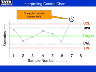
  • 42. Interpreting Control Chart UCL 1 2 3 4 5 6 7 8 Sample Number Statistics UWL LCL Target LWL One point outside control limit
  • 43. Interpreting Control Chart Seven consecutive points are falling on one side of the centre line. Probability of a point falling above or below the centre line is 50-50. The probability of seven consecutive points falling on one side of the centre line is 0.78% ( 1 in 128) This pattern indicates a shift in the process output from changes in the equipment, methods, or material or shift in the measurement system.
  • 44. Interpreting Control Chart UCLUCL 1 2 3 4 5 6 7 8 Sample Number Statistics UWLUWL LCLLCL TargetTarget LWLLWL Seven consecutive points on one side of the centre line
  • 45. Interpreting Control Chart Two consecutive points fall between warning limit and corresponding control limit. In a normal distribution, the probability of two consecutive points falling between warning limit and corresponding control limit is 0.05% (1 in 2000). This could be due to large shift in the process, equipment, material, method or measurement system.
  • 46. Interpreting Control Chart UCL 1 2 3 4 5 6 7 8 Sample Number Statistics UWL LCL Target LWL Two consecutive points between warning limit and corresponding control limit
  • 47. Interpreting Control Chart Two points out of three consecutive points fall between warning limit and corresponding control limit. This could be due to large shift in the process, equipment, material, method or measurement system.
  • 48. UCLUCL 1 2 3 4 5 6 7 8 Sample Number Statistics UWLUWL LCLLCL TargetTarget LWLLWL Two points out of three consecutive points between warning limit and corresponding control limit Interpreting Control Chart
  • 49. A trend of seven points in a row upward or downward demonstrates nonrandomness. This happens when - Gradual deterioration or wear in equipment. - Improvement or deterioration in technique. - Operator fatigue. Interpreting Control Chart
  • 50. UCL 1 2 3 4 5 6 7 8 Sample Number Statistics UWL LCL Target LWL Seven consecutive points having upward trend Interpreting Control Chart
  • 51. UCLUCL 1 2 3 4 5 6 7 8 Sample Number Statistics UWL LCLLCL Target LWL Seven consecutive points having downward trend Interpreting Control Chart