


Biostatistics methods of data organisation and presentation
- 1. Biostatistics (Biol5001) METHODS OF DATA Organization and PRESENTATION Instructor: Tatek Getachew(PhD) () Biol5001 1 / 29
- 2. Methods of Data Organization and Presentation Methods of Data Organization and Presentation Introduction Data collected from any source should be assembled in away that is convenient to understand and look attractive. This can be done by classification, tabulation, drawing graphs and diagrams. The first step in the analysis is to classify and tabulate the information collected Objectives To condense a mass of data in such away that similarities and dissimilarities can readily apprehended To facilitate comparisons and drawing inference To eliminate unnecessary details etc. () Biol5001 2 / 29
- 3. Methods of Data Organization and Presentation Classification and Tabulation Classification:- The first step of tabulation - is grouping of related facts in to groups or classes. Tabulation:- is a systematic arrangement of statistical data in to columns and rows (tables). Frequency Distribution A frequency distn is a special type of tabular representation in which values of a variable are classified in to set of classes with corresponding frequencies of occurrence. Eg. Frequency distribution of age of science students Age No Students 15-19 150 20-24 70 25-29 300 Terms associated with f.d Frequency is the no of occurrence of a certain variable in a data. ungrouped data:- data in its original raw form () Biol5001 3 / 29
- 4. Methods of Data Organization and Presentation Methods of Data Organization and Presentation The presentation of data is classified in to the following two categories: Tabular presentation Diagrammatic and Graphic presentation. The process of arranging data in to classes or categories according to similarities technically is called classification. Definition Raw Data: recorded information in its original collected form, whether it be counts or measurements. Class: is a description of a group of similar numbers in a data set. Frequency: is the number of times a variable value is repeated. Frequency distribution: is the organization of raw data in table form using classes and frequencies. () Biol5001 4 / 29
- 5. Methods of Data Organization and Presentation Frequency Distributions There are three basic types of frequency distributions Categorical frequency distribution Ungrouped frequency distribution Grouped frequency distribution Categorical frequency Distribution: Used for data that is qualitative such as nominal, or ordinal. e.g. marital status,blood type Example: Distribution of Blood Types Twenty-five army inductees were given a blood test to determine their blood type. The data set is A B B AB O O O B AB B B B O A O A O O O AB AB A O B A () Biol5001 5 / 29
- 6. Methods of Data Organization and Presentation Solution Since the data are categorical, There are four blood types: A, B, O, and AB. Step 1. Make a table as shown. A B C D Class Tally Frequency Percentage A B O AB Step 2. Tally the data and place the results in column B. Step 3. Count the tallies and place the results in column C. Step 4. Find the percentage of values in each class by using the formula % = f n × 100% (1) Step 5. Find the totals for columns C (frequency) and D (percent). The completed table is shown. () Biol5001 6 / 29
- 7. Methods of Data Organization and Presentation A B C D Class Tally Frequency Percentage A 5 20 B 7 28 O 9 36 AB 4 16 25 100 Ungrouped FD A FD of numerical data (quantitative) in which each value of a variable represents a single class (i.e. the values of the variable are not grouped). Example: The following data represent the mark of 20 students. 80 76 90 85 80 70 60 62 70 85 65 60 63 74 75 76 70 70 80 85 Construct a frequency distribution, which is ungrouped. () Biol5001 7 / 29
- 8. Methods of Data Organization and Presentation Arrange the data in ascending order 60 60 62 63 65 70 70 70 70 74 75 76 76 80 80 80 85 85 85 90 A B C D Mark Tally Frequency Percentage 60 2 10 62 1 5 63 1 5 65 1 5 70 4 20 74 1 5 75 2 10 76 1 5 80 3 15 85 3 15 90 1 5 20 () Biol5001 8 / 29
- 9. Methods of Data Organization and Presentation Grouped data data presented in the form of f.d Array data data arranged in ascending or descending order unit of measurement (u):- the smallest possible difference between any consecutive values in the recorded data. u=1 if the data are integers u=0.1 if the data are in to one decimal place u=0.01 if the data are in to two decimal place tally a traditional method of counting frequencies Class limit:- The end point of the class - the smallest and largest value of the class - smallest =⇒ lower class limit (Lcl) - largest =⇒ upper class limit (Ucl) Class boundaries are the true mathematical boundary of the class - are the precise points that separate various classes rather than the values included in any one of the class Lcb=Lcl-1 2u (lower class boundaries) Ucb=Ucl+1 2u (upper class boundaries) () Biol5001 9 / 29
- 10. Methods of Data Organization and Presentation Class Mark is the mid point of the class cm = Lcl + Ucl 2 = Ucb + Lcb 2 Class width (interval) is the length of the class w=Ucb-Lcb =Ucl-Lcl+u If the classes have uniform width w=cmi − cmi−1=Lcli − Lcli−1=Ucli − Ucli−1 Types of f.d Depending on the variable * Discrete * Continuous Depending on the information needed * Absolute * Relative * Commulative f.ds () Biol5001 10 / 29
- 11. Methods of Data Organization and Presentation Important points each observation should go to one and only one class The smallest and the largest observations fall with in the classification The class should not overlap Whenever possible make class intervals of the same size Whenever possible avoid open ended class For easy computation, reading and use of distribution, it is advisable to use width 5, 10, 15 or multiple of 5 steps In construction f.d i Arrange the data in ascending or descending order ii Determine the unit of measurements (u) iii Determine the range R=xmax − xmin iv Fix the number of classes (k) arbitrarily a the most common number of classes is between 5 and 15 b Alternatively use Sturge’s rule k = 1 + 3.322.logn where n is the number of observations () Biol5001 11 / 29
- 12. Methods of Data Organization and Presentation v Determine the class width (w) as w=R k vi Determine the lower class limit of the 1st class - arbitrarily, it may be xmin or any number less than xmin, but not greater than xmin vii Determine the upper class limit of the 1st class Ucli = Lcli + w − u Then determine the other classes Example: Construct a frequency distribution for the following data. 11 29 6 33 14 31 22 27 19 20 18 17 22 38 23 21 26 34 39 27 Soln Arrange the data in ascending order 6 11 14 17 18 19 20 21 22 22 23 26 27 27 29 31 33 34 38 39 () Biol5001 12 / 29
- 13. Methods of Data Organization and Presentation Solutions: 1: Find the highest and the lowest value H=39, L=6 2: U=19-18=1 3: Find the range; R=H-L=39-6=33 4: Select the number of classes desired using Sturge’s formula; =1 + 3.32log(20) = 5.32 = 6(roundingup) 5: Find the class width; w=R/k=33/6=5.5=6 (rounding up) 6: Select the starting point, let it be the minimum observation. 6, 12, 18, 24, 30, 36 are the lower class limits. 7: Find the upper class limit; e.g. the first upper class=12-U=12-1=11 11, 17, 23, 29, 35, 41 are the upper class limits. So combining step 6 and step 7, one can construct the following classes. () Biol5001 13 / 29
- 14. Methods of Data Organization and Presentation The complete frequency distribution follows: Class limit Class boundary Class Mark Tally Freq. 6-11 5.5-11.5 8.5 2 12-17 11.5-17.5 14.5 2 18-23 17.5-23.5 20.5 6 24-29 23.5-29.5 26.5 4 30-35 29.5-35.5 32.5 3 36-41 35.5-41.5 38.5 2 Or Class limit Class boundary Class Mark Tally Freq. 5-10 4.5-10.5 7.5 1 11-16 10.5-16.5 13.5 2 17-22 16.5-22.5 19.5 7 23-28 22.5-28.5 25.5 4 29-34 28.5-34.5 31.5 4 35-40 34.5-40.5 37.5 2 () Biol5001 14 / 29
- 15. Methods of Data Organization and Presentation Relative and Percentage f.d A relative f.d is a distribution in which frequency of classes are expressed relative to the total frequency. If the frequency of a class are given as a percentage of the total, then the f.d is called Percentage f.d Commulative Frequency Commulative frequency refers to the number of observation that are below as above a specific value Less than comm.fr refers to the number of items in the distribution that have a value equal or less than the upper class limit of the first, second, third and so on More than comm. freq refers to the number of items in the distribution that have a value equal or greater than the lower class limit () Biol5001 15 / 29
- 16. Methods of Data Organization and Presentation Eg. For the following distribution construct the less than and more than comm. f.d Class fr lessthan morethan 40-45 7 46-50 7 51-55 17 56-60 16 61-65 16 66-70 1 64 Class fr lessthan morethan 40-45 7 7 64 46-50 7 14 57 51-55 17 31 50 56-60 16 47 33 61-65 16 63 17 66-70 1 64 1 64 () Biol5001 16 / 29
- 17. Methods of Data Organization and Presentation Diagrammatic and Graphic presentation of data. One of the most convincing and appearing ways of in which statistical results may be presented is through diagrams and graphs. Importance: They have greater attraction. They facilitate comparison. They are easily understandable. -The most commonly used diagrammatic presentation for discrete as well as qualitative data are: Bar charts Pie charts () Biol5001 17 / 29
- 18. Methods of Data Organization and Presentation Bar charts:- are one dimensional rectangular diagram used to display mostly qualitative or discrete data. Features Equal spaces are left between successive bars Each has equal width The height of the bar corresponds to the frequency of the class it represents. Simple Bar charts:- vertical or horizontal bars are used to represent figures. The bars rankd and drawn by orders of length for categorical data. Eg. Consider the following data Type Area of scale Local Export Total Men’s 150 100 250 Women’s 125 225 350 Children 70 110 180 Total 345 435 780 () Biol5001 18 / 29
- 19. Methods of Data Organization and Presentation Children Men' s Women' s Horizontal Bars 0 50 100 150 200 250 300 350 Women's Men's Children Vertical Bars 0 50 100 150 200 250 300 350 2. Component (Stacked) Bar Chart These are like the ordinary bar chart except that bars are subdivided in to two or more component parts. Used to represent total figures items of components The components are proportional in size to the component parts of the total being represented by each bar () Biol5001 19 / 29
- 20. Methods of Data Organization and Presentation a. Actual Component Bar Chart:- where the overall height of the bar and the individual component length indicate actual figure Local Export Children Women's Men's 0 100 200 300 400 Men's Women's Children Export Local 0 50 100 150 200 250 300 350 b. Percentage Component Bar Chart:- In this chart the individual component length the percentage forms of the overall total. Men's Women's Children Local Export 0 0.2 0.4 0.6 0.8 1 Local Export Men's Women's Children 0 0.2 0.4 0.6 0.8 1 () Biol5001 20 / 29
- 21. Methods of Data Organization and Presentation 3. Multiple Bar Chart This is the chart in which component parts are shown as separate bars adjoining each other The height of each bar represent the actual value of the component figure Local Export Men's Women's Children 0 50 100 150 200 Men's Women's Children Local Export 0 50 100 150 200 () Biol5001 21 / 29
- 22. Methods of Data Organization and Presentation When to Use Each Chart Simple Bar Chart:- When change in the total are required Actual Component Bar Chart:- When changes in total and indication of the size of each component is required Percentage Bar Chart:- When changes in the relative size of component part is required Multiple Bar Chart:- When changes in the actual value of the component part is only required and the overall total is not important Pie Chart is a circle divided by radial lines in to sectors so that the area of each sector is proportional to the the size of the figure represented - Generally used to depict data classified by attributes Construction:- compute relative frequency () Biol5001 22 / 29
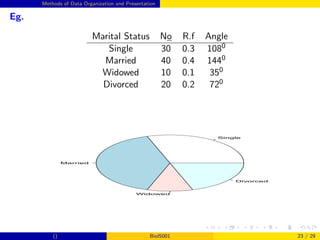
- 23. Methods of Data Organization and Presentation Eg. Marital Status No R.f Angle Single 30 0.3 1080 Married 40 0.4 1440 Widowed 10 0.1 350 Divorced 20 0.2 720 Single Married Widowed Divorced () Biol5001 23 / 29
- 24. Methods of Data Organization and Presentation Histogram is a graphical form of f.d consists of a set of adj rectangles whose bars are marked by class boundaries no gaps between successive bars The length corresponds with frequency of the class The width with the class interval can not be constructed for open ended classes Eg 1. Consider the ff frequency distribution Weight # of ra c.b 80-89 2 79.5-89.5 90-99 4 89.5-99.5 100-109 14 99.5-109.5 110-119 25 109.5-119.5 69.5 79.5 89.5 99.5 109.5 119.5 129.5 0 5 10 15 20 25 Eg 2. Consider the following frequency distribution () Biol5001 24 / 29
- 25. Methods of Data Organization and Presentation Frequency Polygon is a line graph of class frequencies plotted against class marks Assume two additional classes with zero frequency at the beginning and at the end Weight # of ra c.b cm 80-89 2 79.5-89.5 84.5 90-99 4 89.5-99.5 94.5 100-109 14 99.5-109.5 104.5 110-119 25 109.5-119.5 114.5 69.5 79.5 89.5 99.5 109.5 119.5 129.5 0 5 10 15 20 25 79.5 89.5 99.5 109.5 119.5 0 5 10 15 20 25 () Biol5001 25 / 29
- 26. Methods of Data Organization and Presentation Note:- The frequency polygon can be constructed by joining the mid points of the tops of the histogram with a line. -The advantage of frequency polygon against histogram is that it allows us to compare directly two or more frequency distributions. Commulative Frequency Polygon (Ogive) These are curves for commulative f.d where commulative frequencies are plotted on the vertical axis against class boundaries on the horizontal axis. Then the points are smoothly joined. We can have ”less than” or ”More than” Ogive LCF 69.5 79.5 89.5 99.5 119.5 0 5 15 25 35 45 MCF 69.5 79.5 89.5 99.5 119.5 0 5 15 25 35 45 () Biol5001 26 / 29
- 27. Methods of Data Organization and Presentation Graphs:- graphs usually take the form of lines or curves on a coordinate plane (mostly used for continuous data). Line Graph:- a graph denoted by joining a series of points that represent time series data by an appropriate line segment. Eg. The following data production of ... Production Year 1985 1986 1987 1988 1989 Quantity 9.5 10.2 11.4 12.6 10.6 1985 1986 1987 1988 1989 8 9 10 11 12 13 Production Y ear Quant i t y () Biol5001 27 / 29
- 28. Methods of Data Organization and Presentation Exercise 1 Suppose data collected for heights of 390 cows were tabulated in a frequency distribution and the following results were obtained fi 6, 25, 48, 72, 116, 60, 38, 23 and cm1=112, cm2=117 Determine the class width, class limit and less than and more than cummulative f.d 2 Given the following table M F Total Christian 40 25 65 Muslim 15 10 25 Others 5 5 10 Total 60 40 100 a) Which diagrammatic presentation is appropriate to compare religion with out considering sex? Why? b) If both between and with in comparisons of religion ans sex is required, which diagrammatic presentation is appropriate? () Biol5001 28 / 29
- 29. Methods of Data Organization and Presentation 1 Classify the following first as qualitative and quantitative and second as nominal, ordinal, interval, ratio Time for swimmers to complete a 50 meter race Months of the year September, October, . . . etc. Religion in Ethiopia 2 Suppose information is required on mentally ill person, who will be reluctant to give the information. If you must get the information, which method do you use? why? 3 Discuss difference between descriptive and inferential statistics, give examples. () Biol5001 29 / 29