SlideShare a Scribd company logo
Intro to HTML/CSS
                      Class 4 Handout: CSS3 with jsfiddle.net

1. Go to http://jsfiddle.net/7JCWN/1/


2. Rounded Corners

Find the id selector for #corners in the CSS. Add the following declarations and click “Run”:

/* firefox */
-moz-border-radius: 20px;
/* safari and chrome*/
-webkit-border-radius: 20px;
border-radius: 20px;

This should result in the following:


                                                                                                1
Now we have rounded corners on the box labeled “rounded corners”. You can play with the
border radius to see the effect. If we change the border radius to 10px, we see a more subtle
rounding:


If we change the radius to 50%, our corners look like this:


3. Unevenly Rounded Corners

You can specify a different border radius for each corner. Find the #uneven id selector and add
the following:
 border-top-right-radius: 160px 10px;
 border-top-left-radius: 160px 20px;
 border-bottom-left-radius: 160px 10px;
 border-bottom-right-radius: 160px 20px;


                                                                                                2
4. Drop Shadows

You can add drop shadows to your div by finding the #drop id selector and adding the following:


/* firefox */
-moz-box-shadow: black 0px 5px 5px;
/* safari and chrome*/
-webkit-box-shadow: black 0px 5px 5px;
/* fallback */
box-shadow: black 0px 5px 5px;


                                                                                              3
Which will give us something looking like this:


You can change the first value to affect the vertical offset, the second value to affect the
horizontal offset and the third value to affect the blur radius. Let’s try changing these to:
/* firefox */
-moz-box-shadow: gray 0px 10px 10px;
/* safari and chrome*/
-webkit-box-shadow: gray 0px 10px 10px;
/* fallback */
box-shadow: gray 0px 10px 10px;

Notice we also changed the color from black to gray.


                                                                                                4
5. Inset Shadows

Find the id selector #inset and add the following:

/* firefox */
-moz-box-shadow: inset black 0px 5px 5px;
/* safari and chrome*/
-webkit-box-shadow: inset black 0px 5px 5px;
box-shadow: inset black 0px 5px 5px;


                                                     5
Now you can see how the shadow is inset into the box.


6. Text Shadows

Find the class selector .textShadow and add:

text-shadow: 0 2px 5px black;


                                                        6
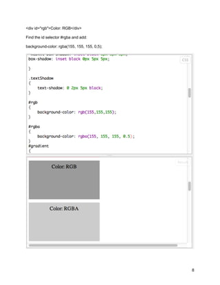
7. Color – rgb and rgba

Find the id selectors #rgb and enter the following:

background-color: rgb(155,155,155);

Add a <div> tag to the HTML above the RGBA div:


                                                      7
<div id="rgb">Color: RGB</div>

Find the id selector #rgba and add:

background-color: rgba(155, 155, 155, 0,5);


                                              8
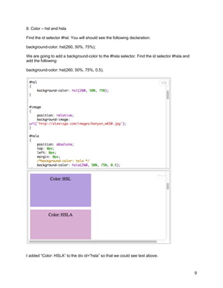
8. Color – hsl and hsla

Find the id selector #hsl. You will should see the following declaration:

background-color: hsl(260, 50%, 75%);

We are going to add a background-color to the #hsla selector. Find the id selector #hsla and
add the following:

background-color: hsl(260, 50%, 75%, 0.5);


I added “Color: HSLA” to the div id=”hsla” so that we could see text above.


                                                                                               9
Transforms

We are going to go to a new jsfiddle file: http://jsfiddle.net/8etSs/1/

9. Translate

Notice the positions of the rectangles in the preview pane called “pre-translate” an “post-
translate”.

Find the id selector #translate and add the following:

-webkit-transform: translateX(90px);
-moz-transform: translateX(90px);

You can see the post-translate box has moved 90px in the X direction:


                                                                                              10
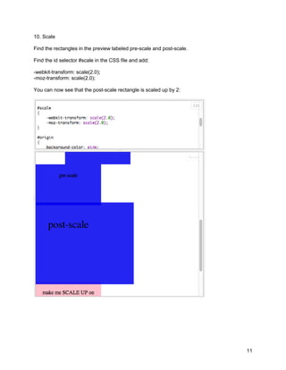
10. Scale

Find the rectangles in the preview labeled pre-scale and post-scale.

Find the id selector #scale in the CSS file and add:

-webkit-transform: scale(2.0);
-moz-transform: scale(2.0);

You can now see that the post-scale rectangle is scaled up by 2:


                                                                       11
11. Scale – Vertical and Horizontal

Let’s say we want to double the width of the post-scale box and leave the height. We would add
this to the #scale selector in place of what we had before:

-webkit-transform: scale(2.0, 1.0);
-moz-transform: scale(2.0, 1.0);

We are now scaling by 2 along the x-axis and 1 along the y-axis (original height):


                                                                                            12
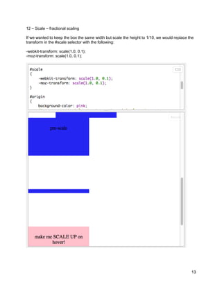
12 – Scale – fractional scaling

If we wanted to keep the box the same width but scale the height to 1/10, we would replace the
transform in the #scale selector with the following:

-webkit-transform: scale(1.0, 0.1);
-moz-transform: scale(1.0, 0.1);


                                                                                            13
13. Transform-origin

You can change the origin of an element to be somewhere other than the center with the
transform-origin property.

Find the id selector #origin and uncomment out the following:

-webkit-transform-origin: 0 0;
-moz-transform-origin: 0 0;
-op-transform-origin: 0 0;
transform-origin: 0 0;

Add to #origin-hover:

-webkit-transform: scale(2.0);
-moz-transform: scale(2.0);

Now look at how the box called “make me SCALE UP on hover!” scales up when you hover
your mouse over.

Comment out the transform-origin in #origin again and look at the difference.

14. Transitions

In the above example, add the following to #origin-hover:

-webkit-transition: all 1.0s;
-moz-transition: all 1.0s;
-o-transition: all 1.0s;

This will cause the scale up in the previous example to occur over 1 second. Try changing 1.0s
to other values, like 10s.


                                                                                            14
15. Transforms – Circle with Shadow

Go to jsfiddle.net: http://jsfiddle.net/fiddlefiddle/patYu/2/

In the #shadow selector, add the following:

position: relative;
border-radius: 75px;


                                                                15

More Related Content

PDF
Class 4 handout two column layout w mobile web design
PDF
Class 3 create an absolute layout with css abs position (aptana)
PDF
Rapid Prototyping
PDF
CSSプリプロセッサの取扱説明書
PDF
Haml, Sass & Compass
PDF
LessCSS Presentation @ April 2015 GTALUG Meeting
PDF
WordPress&映像配信セミナー+さぶみっと!オフ会 - 第1回 さぶみっと! WEB制作セミナー Supported by NTTスマートコネクト
DOC
Handout6 html frames
Class 4 handout two column layout w mobile web design
Class 3 create an absolute layout with css abs position (aptana)
Rapid Prototyping
CSSプリプロセッサの取扱説明書
Haml, Sass & Compass
LessCSS Presentation @ April 2015 GTALUG Meeting
WordPress&映像配信セミナー+さぶみっと!オフ会 - 第1回 さぶみっと! WEB制作セミナー Supported by NTTスマートコネクト
Handout6 html frames

What's hot (20)

KEY
Responsive Web Design & Typography
DOC
Handout3 links
PDF
Earn money with banner and text ads for Clickbank
TXT
PDF
モダンなCSS設計パターンを考える
RTF
Earn money with banner and text ads for clickbank
DOCX
Wiidget
PDF
Joomla! Frappe - Κατασκευή εφαρμογών για το Joomla! χωρίς να τραβάτε τα μαλιά...
DOC
Simple Blue Blog Template XML 的副本
PPT
Advanced Thesis Techniques and Tricks
ODP
Joomla! Day UK 2009 Basic Templates
PDF
In some simple steps, your site can stand out from the rest. Here's how...
PDF
Bringing Typography to the Web with sIFR 3 at <head>
PDF
Worth the hype - styled components
PDF
Responsive Typography II
TXT
Theme 23
PDF
Landing Pages 101
ODP
Joomla! Day UK 2009 Menus Presentation
PDF
LESS
Responsive Web Design & Typography
Handout3 links
Earn money with banner and text ads for Clickbank
モダンなCSS設計パターンを考える
Earn money with banner and text ads for clickbank
Wiidget
Joomla! Frappe - Κατασκευή εφαρμογών για το Joomla! χωρίς να τραβάτε τα μαλιά...
Simple Blue Blog Template XML 的副本
Advanced Thesis Techniques and Tricks
Joomla! Day UK 2009 Basic Templates
In some simple steps, your site can stand out from the rest. Here's how...
Bringing Typography to the Web with sIFR 3 at <head>
Worth the hype - styled components
Responsive Typography II
Theme 23
Landing Pages 101
Joomla! Day UK 2009 Menus Presentation
LESS
Ad

Viewers also liked (15)

PPT
Strategic sourcing change 2010
PPTX
휴대폰 블랙리스트 제도
PPTX
Cloud
PPT
infecções de pele e anexos
PDF
Class 3 Intro to HTML/ CSS Gdi cincinnati create a table layout with html (...
PDF
Girl Develop It Cincinnati: Intro to HTML/CSS Class 1
PPTX
Presentation1
PPTX
Tablet PC
PDF
Girl Develop It Cincinnati: Intro to HTML/CSS Class 4
PPTX
The gujarati language
PPTX
PPTX
SNS와 Privacy
PPTX
증강현실과 가상현실
PDF
Class 1 handout (2) html exercises
PDF
Class 2 handout (1) adding a css stylesheet
Strategic sourcing change 2010
휴대폰 블랙리스트 제도
Cloud
infecções de pele e anexos
Class 3 Intro to HTML/ CSS Gdi cincinnati create a table layout with html (...
Girl Develop It Cincinnati: Intro to HTML/CSS Class 1
Presentation1
Tablet PC
Girl Develop It Cincinnati: Intro to HTML/CSS Class 4
The gujarati language
SNS와 Privacy
증강현실과 가상현실
Class 1 handout (2) html exercises
Class 2 handout (1) adding a css stylesheet
Ad

Similar to Class 4 handout w css3 using j fiddle (20)

PDF
Mobile-first OOCSS, Sass & Compass at BBC Responsive News
PDF
Accelerated Stylesheets
KEY
HTML5, CSS3, and other fancy buzzwords
PDF
Big Design Conference: CSS3
PDF
[heweb11] CSS3 Makeover
PDF
CSS Less framework overview, Pros and Cons
PPT
CSS3 : Animation ,Transitions, Gradients
PPTX
INTRODUCTIONS OF CSS PART 2
KEY
CSS3: Ready for Primetime?
PDF
CSS3 3D Workshop
PDF
Keep calm and let's play CSS3
PDF
Sassive Aggressive: Using Sass to Make Your Life Easier (Refresh Boston Version)
PDF
Getting Started with Sass & Compass
PPT
Learn to love CSS3 | Joomla! Day Deutschland
PDF
HTML5 and CSS3 – exploring mobile possibilities - Dynabyte event
PDF
SASS, Compass, Gulp, Greensock
PPTX
Doing More With Less
PPT
Learn to Love CSS3 [English]
PDF
CSS Extenders
Mobile-first OOCSS, Sass & Compass at BBC Responsive News
Accelerated Stylesheets
HTML5, CSS3, and other fancy buzzwords
Big Design Conference: CSS3
[heweb11] CSS3 Makeover
CSS Less framework overview, Pros and Cons
CSS3 : Animation ,Transitions, Gradients
INTRODUCTIONS OF CSS PART 2
CSS3: Ready for Primetime?
CSS3 3D Workshop
Keep calm and let's play CSS3
Sassive Aggressive: Using Sass to Make Your Life Easier (Refresh Boston Version)
Getting Started with Sass & Compass
Learn to love CSS3 | Joomla! Day Deutschland
HTML5 and CSS3 – exploring mobile possibilities - Dynabyte event
SASS, Compass, Gulp, Greensock
Doing More With Less
Learn to Love CSS3 [English]
CSS Extenders

Recently uploaded (20)

PDF
Review of recent advances in non-invasive hemoglobin estimation
PPT
“AI and Expert System Decision Support & Business Intelligence Systems”
PDF
Profit Center Accounting in SAP S/4HANA, S4F28 Col11
PDF
Advanced methodologies resolving dimensionality complications for autism neur...
PPTX
Digital-Transformation-Roadmap-for-Companies.pptx
PPTX
MYSQL Presentation for SQL database connectivity
PDF
Diabetes mellitus diagnosis method based random forest with bat algorithm
PDF
Blue Purple Modern Animated Computer Science Presentation.pdf.pdf
PPTX
sap open course for s4hana steps from ECC to s4
PPTX
20250228 LYD VKU AI Blended-Learning.pptx
DOCX
The AUB Centre for AI in Media Proposal.docx
PDF
Unlocking AI with Model Context Protocol (MCP)
PDF
7 ChatGPT Prompts to Help You Define Your Ideal Customer Profile.pdf
PPTX
KOM of Painting work and Equipment Insulation REV00 update 25-dec.pptx
PDF
KodekX | Application Modernization Development
PDF
MIND Revenue Release Quarter 2 2025 Press Release
PDF
TokAI - TikTok AI Agent : The First AI Application That Analyzes 10,000+ Vira...
PDF
Mobile App Security Testing_ A Comprehensive Guide.pdf
PPTX
Effective Security Operations Center (SOC) A Modern, Strategic, and Threat-In...
PPTX
VMware vSphere Foundation How to Sell Presentation-Ver1.4-2-14-2024.pptx
Review of recent advances in non-invasive hemoglobin estimation
“AI and Expert System Decision Support & Business Intelligence Systems”
Profit Center Accounting in SAP S/4HANA, S4F28 Col11
Advanced methodologies resolving dimensionality complications for autism neur...
Digital-Transformation-Roadmap-for-Companies.pptx
MYSQL Presentation for SQL database connectivity
Diabetes mellitus diagnosis method based random forest with bat algorithm
Blue Purple Modern Animated Computer Science Presentation.pdf.pdf
sap open course for s4hana steps from ECC to s4
20250228 LYD VKU AI Blended-Learning.pptx
The AUB Centre for AI in Media Proposal.docx
Unlocking AI with Model Context Protocol (MCP)
7 ChatGPT Prompts to Help You Define Your Ideal Customer Profile.pdf
KOM of Painting work and Equipment Insulation REV00 update 25-dec.pptx
KodekX | Application Modernization Development
MIND Revenue Release Quarter 2 2025 Press Release
TokAI - TikTok AI Agent : The First AI Application That Analyzes 10,000+ Vira...
Mobile App Security Testing_ A Comprehensive Guide.pdf
Effective Security Operations Center (SOC) A Modern, Strategic, and Threat-In...
VMware vSphere Foundation How to Sell Presentation-Ver1.4-2-14-2024.pptx

Class 4 handout w css3 using j fiddle

  • 1. Intro to HTML/CSS Class 4 Handout: CSS3 with jsfiddle.net 1. Go to http://jsfiddle.net/7JCWN/1/ 2. Rounded Corners Find the id selector for #corners in the CSS. Add the following declarations and click “Run”: /* firefox */ -moz-border-radius: 20px; /* safari and chrome*/ -webkit-border-radius: 20px; border-radius: 20px; This should result in the following: 1
  • 2. Now we have rounded corners on the box labeled “rounded corners”. You can play with the border radius to see the effect. If we change the border radius to 10px, we see a more subtle rounding: If we change the radius to 50%, our corners look like this: 3. Unevenly Rounded Corners You can specify a different border radius for each corner. Find the #uneven id selector and add the following: border-top-right-radius: 160px 10px; border-top-left-radius: 160px 20px; border-bottom-left-radius: 160px 10px; border-bottom-right-radius: 160px 20px; 2
  • 3. 4. Drop Shadows You can add drop shadows to your div by finding the #drop id selector and adding the following: /* firefox */ -moz-box-shadow: black 0px 5px 5px; /* safari and chrome*/ -webkit-box-shadow: black 0px 5px 5px; /* fallback */ box-shadow: black 0px 5px 5px; 3
  • 4. Which will give us something looking like this: You can change the first value to affect the vertical offset, the second value to affect the horizontal offset and the third value to affect the blur radius. Let’s try changing these to: /* firefox */ -moz-box-shadow: gray 0px 10px 10px; /* safari and chrome*/ -webkit-box-shadow: gray 0px 10px 10px; /* fallback */ box-shadow: gray 0px 10px 10px; Notice we also changed the color from black to gray. 4
  • 5. 5. Inset Shadows Find the id selector #inset and add the following: /* firefox */ -moz-box-shadow: inset black 0px 5px 5px; /* safari and chrome*/ -webkit-box-shadow: inset black 0px 5px 5px; box-shadow: inset black 0px 5px 5px; 5
  • 6. Now you can see how the shadow is inset into the box. 6. Text Shadows Find the class selector .textShadow and add: text-shadow: 0 2px 5px black; 6
  • 7. 7. Color – rgb and rgba Find the id selectors #rgb and enter the following: background-color: rgb(155,155,155); Add a <div> tag to the HTML above the RGBA div: 7
  • 8. <div id="rgb">Color: RGB</div> Find the id selector #rgba and add: background-color: rgba(155, 155, 155, 0,5); 8
  • 9. 8. Color – hsl and hsla Find the id selector #hsl. You will should see the following declaration: background-color: hsl(260, 50%, 75%); We are going to add a background-color to the #hsla selector. Find the id selector #hsla and add the following: background-color: hsl(260, 50%, 75%, 0.5); I added “Color: HSLA” to the div id=”hsla” so that we could see text above. 9
  • 10. Transforms We are going to go to a new jsfiddle file: http://jsfiddle.net/8etSs/1/ 9. Translate Notice the positions of the rectangles in the preview pane called “pre-translate” an “post- translate”. Find the id selector #translate and add the following: -webkit-transform: translateX(90px); -moz-transform: translateX(90px); You can see the post-translate box has moved 90px in the X direction: 10
  • 11. 10. Scale Find the rectangles in the preview labeled pre-scale and post-scale. Find the id selector #scale in the CSS file and add: -webkit-transform: scale(2.0); -moz-transform: scale(2.0); You can now see that the post-scale rectangle is scaled up by 2: 11
  • 12. 11. Scale – Vertical and Horizontal Let’s say we want to double the width of the post-scale box and leave the height. We would add this to the #scale selector in place of what we had before: -webkit-transform: scale(2.0, 1.0); -moz-transform: scale(2.0, 1.0); We are now scaling by 2 along the x-axis and 1 along the y-axis (original height): 12
  • 13. 12 – Scale – fractional scaling If we wanted to keep the box the same width but scale the height to 1/10, we would replace the transform in the #scale selector with the following: -webkit-transform: scale(1.0, 0.1); -moz-transform: scale(1.0, 0.1); 13
  • 14. 13. Transform-origin You can change the origin of an element to be somewhere other than the center with the transform-origin property. Find the id selector #origin and uncomment out the following: -webkit-transform-origin: 0 0; -moz-transform-origin: 0 0; -op-transform-origin: 0 0; transform-origin: 0 0; Add to #origin-hover: -webkit-transform: scale(2.0); -moz-transform: scale(2.0); Now look at how the box called “make me SCALE UP on hover!” scales up when you hover your mouse over. Comment out the transform-origin in #origin again and look at the difference. 14. Transitions In the above example, add the following to #origin-hover: -webkit-transition: all 1.0s; -moz-transition: all 1.0s; -o-transition: all 1.0s; This will cause the scale up in the previous example to occur over 1 second. Try changing 1.0s to other values, like 10s. 14
  • 15. 15. Transforms – Circle with Shadow Go to jsfiddle.net: http://jsfiddle.net/fiddlefiddle/patYu/2/ In the #shadow selector, add the following: position: relative; border-radius: 75px; 15