SlideShare a Scribd company logo
Computational Data
Analytics
BOX plot
1. Introduction to Box Plots
Definition and Purpose:
Box Plot Definition:
A box plot (or box-and-whisker plot) is a graphical
representation used to show the distribution of a dataset.
It displays key statistical measures and the spread of data.
Role in Statistical Analysis:
Box plots help in visualizing the central tendency,
variability, and skewness of the data. They are useful for
comparing distributions between different groups.
Components of a Box Plot
The Box: The box represents the
interquartile range (IQR) , which
encompasses the middle 50% of
the data.
Median (Q2): The line inside the
box indicates the median value,
which is the midpoint of the data.
Quartiles (Q1, Q3): The edges of
the box represent the first
quartile (Q1) and the third
quartile (Q3), marking the 25th
and 75th percentiles, respectively.
IQR
range
Q3
Q1
Whiskers: The whiskers extend
from the edges of the box to the
minimum and maximum values
within a defined range.
Outliers: Data points outside the
range of the whiskers are
considered outliers. They are
often marked separately and
provide insight into the variability
and potential anomalies in the
data.
Types of Box Plots
Standard Box Plot: Displays median, quartiles, and potential
outliers to summarize data distribution.
Example: Comparing test scores of students from different
classes.
Notched Box Plot: Adds notches around the median to indicate
confidence intervals for comparing medians between groups.
Example: Comparing the median salaries between two different
job roles.
Violin Plot: Combines a box plot with a density plot to show the
data distribution’s shape and density.
Example: Analyzing the distribution of monthly expenditures
across different age groups.
Bean Plot: Uses bean like shapes to represent detailed data
distribution and density
Example: Visualizing the distribution of customer satisfaction
ratingsfor various products.
Boxen Plot: Shows more quantiles than a standard box plot,
providing detailed view of data distribution.
Example: Examining detailed income distributions across
variousincome brackets.
Horizontal Plot: Stacks multiple box plots horizontally to
compare distributions across time or categories in a compact
format.
Example: Comparing monthly sales data across multiple years.
Applications
Comparing Distributions: Box plots are useful for comparing the
distribution of data across different groups or categories. This can
help identify differences in medians, ranges, and the presence of
outliers.
Identifying Outliers: Outliers can be easily spotted in box plots, as
they are represented by points outside the whiskers. This helps in
identifying unusual data points that may require further
investigation.
Understanding Data Spread: Box plots provide a visual summary of
data spread, including the range, interquartile range, and skewness.
This is particularly useful in exploratory data analysis.
Statistical Summaries: Box plots provide a quick summary of key
statistical measures such as the median, quartiles, and range, making
them a valuable tool for statistical analysis.
Real-World Example: Test Scores
Scenario: Imagine you are a teacher analyzing the distribution
of scores from a recent math test. You have the following
test scores for your students:
45, 50, 52, 55, 60, 62, 65, 70, 72, 75, 80, 85, 90
Minimum: 45
First Quartile (Q1): 52 (25th percentile)
Median (Q2): 62 (50th percentile)
Third Quartile (Q3): 72 (75th percentile)
Maximum: 90
Program for Box Plot Using R
library(ggplot2)
data(mtcars)
boxplot(mtcars$mpg,
main="Box Plot of Miles Per Gallon",
ylab="Miles Per Gallon",
col="lightblue",
border="darkblue")
boxplot(mpg ~ cyl,
data=mtcars,
main="Box Plot of Miles Per Gallon by Number of Cylinders",
xlab="Number of Cylinders",
ylab="Miles Per Gallon",
col="lightgreen",
border="darkgreen")
Computational data analytics presentation for box plot in r programming
Conclusion
Box plots are a powerful tool in R programming for showing and
analyzing data. They provide a clear summary of your data by displaying
the range, average, and spread, which makes them very useful for both
initial data exploration and comparing different groups.
Box plots are used in many fields, such as business, healthcare, and
research. They help you see patterns, spot unusual data points, and make
better decisions based on your data.
As you work with box plots, it’s helpful to use them along with other
types of charts and analyses to get a fuller picture of your data. Keep
learning and exploring new tools and resources to improve your data
skills and make the most of your data analysis.
Thank you for
staying with us
Hope we made a point to putforth a understandable model
of box plot using R programming.

More Related Content

PPT
Pre_processing_the_data_using_advance_technique
PPTX
visual representation with BOX PLOT,BAR PLOTS
PDF
Quality Journey -- Box Plot.pdf
PDF
Tableau - box plot
DOCX
TSTD 6251  Fall 2014SPSS Exercise and Assignment 120 PointsI.docx
PPT
02Data(1).ppt Computer Science Computer Science
PPTX
Graphical Presentation of Data - Rangga Masyhuri Nuur LLU 27.pptx
PPTX
QQ Plot.pptx
Pre_processing_the_data_using_advance_technique
visual representation with BOX PLOT,BAR PLOTS
Quality Journey -- Box Plot.pdf
Tableau - box plot
TSTD 6251  Fall 2014SPSS Exercise and Assignment 120 PointsI.docx
02Data(1).ppt Computer Science Computer Science
Graphical Presentation of Data - Rangga Masyhuri Nuur LLU 27.pptx
QQ Plot.pptx

Similar to Computational data analytics presentation for box plot in r programming (20)

PPTX
Introduction to Descriptive Statistics
PDF
Unit---4.pdf how to gst du paper in this day and age
PPT
1) Chapter#02 Presentation of Data.ppt
PPTX
Boxplot_Final stats classes informations
PPT
02Data mining 243657786756868766758(1).ppt
PPT
Basic Statistics to start Analytics
PPT
02 data
PPTX
Data Visualization Fundamentals power.pptx
PDF
Summarizing Data : Listing and Grouping pdf
PPTX
Boxplot
PPTX
Outliers or anamolies IN DATA ANALYTICS.pptx
PPTX
Data mining
PPTX
ProbabilityandStatsUnitAPowerpoint-1.pptx
PDF
4. six sigma descriptive statistics
PPTX
Section 6 - Chapter 2 - Introduction to Statistics Part II
PDF
Chapter_5 Fundamentals of statisticsl.pdf
PDF
1.0 Descriptive statistics.pdf
PPT
Upstate CSCI 525 Data Mining Chapter 2
PPTX
Intro Tableau for beginners description
PPTX
Intro Tableau introduction to Beginners
Introduction to Descriptive Statistics
Unit---4.pdf how to gst du paper in this day and age
1) Chapter#02 Presentation of Data.ppt
Boxplot_Final stats classes informations
02Data mining 243657786756868766758(1).ppt
Basic Statistics to start Analytics
02 data
Data Visualization Fundamentals power.pptx
Summarizing Data : Listing and Grouping pdf
Boxplot
Outliers or anamolies IN DATA ANALYTICS.pptx
Data mining
ProbabilityandStatsUnitAPowerpoint-1.pptx
4. six sigma descriptive statistics
Section 6 - Chapter 2 - Introduction to Statistics Part II
Chapter_5 Fundamentals of statisticsl.pdf
1.0 Descriptive statistics.pdf
Upstate CSCI 525 Data Mining Chapter 2
Intro Tableau for beginners description
Intro Tableau introduction to Beginners
Ad

Recently uploaded (20)

PPTX
IBA_Chapter_11_Slides_Final_Accessible.pptx
PPTX
Introduction to machine learning and Linear Models
PPTX
advance b rammar.pptxfdgdfgdfsgdfgsdgfdfgdfgsdfgdfgdfg
PPTX
AI Strategy room jwfjksfksfjsjsjsjsjfsjfsj
PPTX
Acceptance and paychological effects of mandatory extra coach I classes.pptx
PPTX
Supervised vs unsupervised machine learning algorithms
PPTX
MODULE 8 - DISASTER risk PREPAREDNESS.pptx
PPTX
Introduction to Basics of Ethical Hacking and Penetration Testing -Unit No. 1...
PPTX
climate analysis of Dhaka ,Banglades.pptx
PPTX
Introduction to Knowledge Engineering Part 1
PPTX
Qualitative Qantitative and Mixed Methods.pptx
PPTX
Introduction-to-Cloud-ComputingFinal.pptx
PDF
“Getting Started with Data Analytics Using R – Concepts, Tools & Case Studies”
PDF
BF and FI - Blockchain, fintech and Financial Innovation Lesson 2.pdf
PDF
Galatica Smart Energy Infrastructure Startup Pitch Deck
PDF
annual-report-2024-2025 original latest.
PPTX
IB Computer Science - Internal Assessment.pptx
PDF
168300704-gasification-ppt.pdfhghhhsjsjhsuxush
PPTX
DISORDERS OF THE LIVER, GALLBLADDER AND PANCREASE (1).pptx
PPTX
Introduction to Firewall Analytics - Interfirewall and Transfirewall.pptx
IBA_Chapter_11_Slides_Final_Accessible.pptx
Introduction to machine learning and Linear Models
advance b rammar.pptxfdgdfgdfsgdfgsdgfdfgdfgsdfgdfgdfg
AI Strategy room jwfjksfksfjsjsjsjsjfsjfsj
Acceptance and paychological effects of mandatory extra coach I classes.pptx
Supervised vs unsupervised machine learning algorithms
MODULE 8 - DISASTER risk PREPAREDNESS.pptx
Introduction to Basics of Ethical Hacking and Penetration Testing -Unit No. 1...
climate analysis of Dhaka ,Banglades.pptx
Introduction to Knowledge Engineering Part 1
Qualitative Qantitative and Mixed Methods.pptx
Introduction-to-Cloud-ComputingFinal.pptx
“Getting Started with Data Analytics Using R – Concepts, Tools & Case Studies”
BF and FI - Blockchain, fintech and Financial Innovation Lesson 2.pdf
Galatica Smart Energy Infrastructure Startup Pitch Deck
annual-report-2024-2025 original latest.
IB Computer Science - Internal Assessment.pptx
168300704-gasification-ppt.pdfhghhhsjsjhsuxush
DISORDERS OF THE LIVER, GALLBLADDER AND PANCREASE (1).pptx
Introduction to Firewall Analytics - Interfirewall and Transfirewall.pptx
Ad

Computational data analytics presentation for box plot in r programming

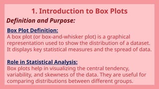
  • 2. 1. Introduction to Box Plots Definition and Purpose: Box Plot Definition: A box plot (or box-and-whisker plot) is a graphical representation used to show the distribution of a dataset. It displays key statistical measures and the spread of data. Role in Statistical Analysis: Box plots help in visualizing the central tendency, variability, and skewness of the data. They are useful for comparing distributions between different groups.
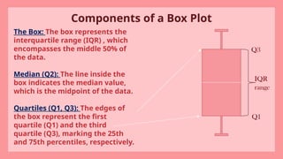
  • 3. Components of a Box Plot The Box: The box represents the interquartile range (IQR) , which encompasses the middle 50% of the data. Median (Q2): The line inside the box indicates the median value, which is the midpoint of the data. Quartiles (Q1, Q3): The edges of the box represent the first quartile (Q1) and the third quartile (Q3), marking the 25th and 75th percentiles, respectively. IQR range Q3 Q1
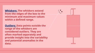
  • 4. Whiskers: The whiskers extend from the edges of the box to the minimum and maximum values within a defined range. Outliers: Data points outside the range of the whiskers are considered outliers. They are often marked separately and provide insight into the variability and potential anomalies in the data.
  • 5. Types of Box Plots Standard Box Plot: Displays median, quartiles, and potential outliers to summarize data distribution. Example: Comparing test scores of students from different classes. Notched Box Plot: Adds notches around the median to indicate confidence intervals for comparing medians between groups. Example: Comparing the median salaries between two different job roles. Violin Plot: Combines a box plot with a density plot to show the data distribution’s shape and density. Example: Analyzing the distribution of monthly expenditures across different age groups.
  • 6. Bean Plot: Uses bean like shapes to represent detailed data distribution and density Example: Visualizing the distribution of customer satisfaction ratingsfor various products. Boxen Plot: Shows more quantiles than a standard box plot, providing detailed view of data distribution. Example: Examining detailed income distributions across variousincome brackets. Horizontal Plot: Stacks multiple box plots horizontally to compare distributions across time or categories in a compact format. Example: Comparing monthly sales data across multiple years.
  • 7. Applications Comparing Distributions: Box plots are useful for comparing the distribution of data across different groups or categories. This can help identify differences in medians, ranges, and the presence of outliers. Identifying Outliers: Outliers can be easily spotted in box plots, as they are represented by points outside the whiskers. This helps in identifying unusual data points that may require further investigation. Understanding Data Spread: Box plots provide a visual summary of data spread, including the range, interquartile range, and skewness. This is particularly useful in exploratory data analysis. Statistical Summaries: Box plots provide a quick summary of key statistical measures such as the median, quartiles, and range, making them a valuable tool for statistical analysis.
  • 8. Real-World Example: Test Scores Scenario: Imagine you are a teacher analyzing the distribution of scores from a recent math test. You have the following test scores for your students: 45, 50, 52, 55, 60, 62, 65, 70, 72, 75, 80, 85, 90 Minimum: 45 First Quartile (Q1): 52 (25th percentile) Median (Q2): 62 (50th percentile) Third Quartile (Q3): 72 (75th percentile) Maximum: 90
  • 9. Program for Box Plot Using R library(ggplot2) data(mtcars) boxplot(mtcars$mpg, main="Box Plot of Miles Per Gallon", ylab="Miles Per Gallon", col="lightblue", border="darkblue") boxplot(mpg ~ cyl, data=mtcars, main="Box Plot of Miles Per Gallon by Number of Cylinders", xlab="Number of Cylinders", ylab="Miles Per Gallon", col="lightgreen", border="darkgreen")
  • 11. Conclusion Box plots are a powerful tool in R programming for showing and analyzing data. They provide a clear summary of your data by displaying the range, average, and spread, which makes them very useful for both initial data exploration and comparing different groups. Box plots are used in many fields, such as business, healthcare, and research. They help you see patterns, spot unusual data points, and make better decisions based on your data. As you work with box plots, it’s helpful to use them along with other types of charts and analyses to get a fuller picture of your data. Keep learning and exploring new tools and resources to improve your data skills and make the most of your data analysis.
  • 12. Thank you for staying with us Hope we made a point to putforth a understandable model of box plot using R programming.