SlideShare a Scribd company logo
INTRODUCTION
TO CSS
Cascading Style Sheets
LET’S TO
SKELETON OF
HTML
<!DOCTYPE html>
Defines the document type and version of HTML
being used.
it indicates that the document is written in
HTML5.
<!DOCTYPE HTML PUBLIC "-//W3C//DTD HTML
4.01 Transitional//EN" "
http://www.w3.org/TR/html4/loose.dtd">
document declaration for HTML 4 or
XHTML
<html>
The root element of the HTML
document.
<head>
Contains metadata about the document, such as character
set, viewport settings, title, and links to external resources like
stylesheets or scripts.
META DATA: Metadata is data about data. It provides
information about other data such as person details,
product information etc.,
<meta charset="UTF-8">
Specifies the character encoding for the document.
Character Encoding: Character encoding is a system
that maps characters to numerical codes for computer
processing.
UTF- 8: Unicode Transformation Format - 8 - bit is a
widely used character encoding standard.
Viewport: The viewport is the visible area of a web page on a
device's screen.
Width=device-width: This setting tells the browser to set the
width of the viewport to the width of the device's screen.
Initial-scale=1.0: This setting establishes the initial zoom level
when the web page is first loaded.
1.0 means that the web page will be displayed at its original size
without any zooming or scaling applied by default.
<meta name="viewport"
content="width=device-width, initial-scale=1.0">
<title>
Defines the title of the document, which appears in the
browser's title bar or tab.
<body>
Contains the content of the HTML document, such
as
headings, paragraphs, images, links, etc.
HTML
PHASE
TAGS
Emphasized Text(em):
The em tag is used to emphasized the text and this tag displays
the italic font in a browser.
Strong Text:
The strong tag is used to show important words in a sentence.
Abbreviation and Accronym:
Both <abbr> and <acronym> elements are used to define
abbreviations. The title attribute provides the full form of
each abbreviation when users hover over the abbreviation.
<abbr title = "Jaya Engineering College">JEC</abbr>
<acronym title="Jaya Engineering College">JEC</acronym>
Marked Text:
The <mark> tag is used to highlight some words in a sentence.
<mark>HTML</mark> mark tag</p>
Short Quotations:
To add double quotes within a sentence use <q> tag
<p>Python is a <q>Programming Language</q></p>
Special Term/ Definition:
The <dfn> tag stands for the "definition element", and it
specifies a term that is going to be defined within the content.
<p><dfn title="HyperText Markup Language">HTML</dfn> is
the standard markup language for creating web pages.</p>
HTML COMMENT TAG
HTML comments are not displayed in the browser, but they can
help document your HTML source code.
<!-- <p>Python is a Programming Language</p>-- >
HORIZONTAL RULE TAG
It is a self-closing tag used to insert a horizontal line or rule
across the webpage to visually separate content.
<p>Monitor</p>
<hr>
<p>CPU</p>
Introduction to Cascading Style Sheets .
HTML
ATTRIBUTES
The <a> tag defines a hyperlink.
href stands for hyperlink reference that specifies the
URL
of the page the link goes to.
<a href="https://example.com">Visit JEC</a>
href Attribute
_self: Opens the linked document in the same frame or window.
_blank: Opens the linked document in a new browser window or tab.
_parent: Opens the linked document in the parent frame.
_top: Opens the linked document in the full body of the window.
<a href="https://example.com" target="_self">Open in Same Window</a><br>
<a href="https://example.com" target="_blank">Open in New Tab</a><br>
<a href="https://example.com" target="parent name">Open in Parent
Frame</a><br>
<a href="https://example.com" target="_top">Open in Top Window</a><br>
href target
src Attribute
The <img> tag is used to embed an image in an HTML page.
The src attribute specifies the path to the image to be displayed.
<img src="computer.jpg">
Width & Height Attribute
The <img> tag should also contain the width and height
attributes, which specify the width and height of the image (in
pixels)
<img src="computer.jpg" width="500" height="600">
Alt Attribute
The required alt attribute for the <img> tag specifies an
alternate text for an image
<img src="computer.jpg" alt="computer wuith CPU">
Style Attribute
The style attribute is used to add styles to an element, such
as
color, font, size, and more.
<p style="color:red;">This is a red paragraph.</p>
HTML <center> TAG
HTML <center> tag in HTML is used to set the alignment of text
into the center.
<center> Contents... </center>
HTML <pre> TAG
the <pre> tag is used to display text in a fixed-width font, where
spaces and line breaks are respected exactly as they appear in
the HTML code.
Difference Between <b> and <b/> tag:
<br> - Line Break Tag:
This is the traditional way of writing a line break in HTML.
<br/> - XHTML Style Line Break Tag:
It's mainly used in XHTML or in HTML documents that are
served with an XHTML doctype declaration.
M O R E T O K N O W
M O R E T O K N O W
Difference Between <p>...</p> and <p/> tag:
<p>...</p> - Paragraph Tag:
This is the traditional way of defining a paragraph in HTML.
<p/> - Self-closing Paragraph Tag:
<p/> is not a standard HTML tag.
In HTML, the <p/> syntax is not recognized as a valid tag for
defining paragraphs.
It resembles the self-closing syntax often seen in XML or
XHTML.
LET’S TO
W H AT IS CSS?
It Stands for “Cascading Style Sheets”
It is used to define the visual appearance of web pages,
including layout, colors, fonts, and more.
The term "cascading" refers to the order of precedence
when multiple style rules apply to the same element
W H Y USE CSS?
CSS is used to control the visual presentation of web
pages, including layout, colors, fonts, and more.
It ensures consistent styling across multiple pages of a
website.
Enhanced user experience by improving readability,
accessibility, and visual appeal.
BASIC SYNTAX
Selector { Property: Value; }
Here,
Selector - select and style elements (eg: h1, p, etc.,)
Property - visual presentation of HTML elements(eg: color,
size, etc.,)
Value - choosen by the programmer.
h1{
color: blue;
font-size: 24px;
}
PROPERTIES
AND
VALUES
#intro {
color: rgb(255,255,0);
background-color: # ff 0 0 0 0 ;
}
<h1 id=”intro”>Hello
World</h1>
1) COLOR
color: Sets the text color.
background-color: Sets the background color
Example values: red, # 0 0 ff 0 0 , rgb(255, 0, 0)
2) FONT
font-family: Sets the font family.
font-size: Sets the font size.
font-weight: Sets the font weight.
font-style: Sets the font style.
Example values: Arial, 16px, bold
#intro {
font-family: Arial, sans-serif;
font-size: 24px;
font-style: italic;
font-weight: bold;
}
<h1 id=”intro”>Hello
World</h1>
Pixels(px):
Pixels are a fixed unit of measurement in web design.
1 pixel represents one dot on a screen.
Em:
Em is a relative unit based on the font size of the current element.
1em equals the font size of the current element.
Percentage(%):
Percentages are relative to the size of the parent element.
100% equals the size of the parent element.
For example, when the font size is set to 16px:
Font size in pixels (px): 16px.
Font size in em units (em): 1em.
Font size in percentage (%): 100% (assuming the parent's font size is
also 16px).
Fractional Unit(fr):
It's used within grid layout declarations.
When using "fr", the available space is divided into fractions, and
each track's size is determined by these fractions.
For example, grid-template-columns: 1fr 2fr 1fr; means that the grid
container is divided into 4 equal parts horizontally, with the middle
column being twice as wide as the outer ones.
Viewport Height (vh):
It represents a percentage of the height of the viewport or the
browser window.
1vh is equal to 1% of the viewport's height.
For example, if you set an element's height to 100vh, it would take up the
full height of the viewport, regardless of the actual height of the browser
window.
3) LAYOUT
width: Sets the width of an element.
height: Sets the height of an element.
margin: Sets the margin space around an element.
padding: Sets the padding space around an
element's content.
display: Specifies how an element is displayed.
Example values: 200px, 20%, auto, block, inline
SOME OF THE M A I N DISPLAY TYPES
<div class="box box-blue">1</div>
<div class="box box-red">2</div>
<div class="box box-yellow">3</div>
<div class="box box-green">4</div>
Inline:
This value makes the element generate an inline-level box. It does
not start on a new line and only takes up as much width as necessary.
.box{
width: 20%;
display: inline;
}
.box-blue{
background-color: blue;
}
.box-red{
background-color: red;
}
.box-yellow{
background-color: yellow;
}
.box-green{
background-color: green;
}
Before
Inline
After
Inline
Inline - block:
<div class="box box-blue">1</div>
<div class="box box-red">2</div>
<div class="box box-yellow">3</div>
<div class="box box-green">4</div>
inline-block is a display property value that allows elements to behave like inline
elements in that they flow within text content, yet they can be styled with properties
like width, height, margin, and padding similar to block-level elements.
.box{
width: 20%;
display: inline-block;
}
.box-blue{
background-color: blue;
}
.box-red{
background-color: red;
}
.box-yellow{
background-color: yellow;
}
.box-green{
background-color: green;
}
Inline-block
flex:
Flexbox is a layout model that helps you arrange elements inside a container
easily and flexibly.
<div class="container">
<div class="box box-blue">1</div>
<div class="box box-red">2</div>
<div class="box box-yellow">3</div>
<div class="box box-green">4</div>
</div>
.container{
display: flex;
}
.box{
width: 20%;
height: 40px;
}
.box-blue{
background-
color: blue;
}
.box-red{
background-color: red;
}
.box-yellow{
background-color: yellow;
}
.box-green{
background-color: green;
}
flex
none:
This value makes the element disappear from the page layout
entirely.
<div class="container">
<div class="box box-blue">1</div>
<div class="box box-red">2</div>
<div class="box
box-yellow">3</div>
<div class="box box-green">4</div>
</div>
.container{
display: none;
}
.box{
width: 20%;
height: 40px;
}
.box-blue{
background-
color: blue;
}
.box-red{
background-color: red;
}
.box-yellow{
background-color: yellow;
}
.box-green{
background-color:
green;
}
none
(nothing display)
MARGIN TYPES
Margin-top: Space from the top.
Margin-right: Space from the right.
Margin-bottom: Space from the bottom.
Margin-left: Space from the left.
Content
displayed at
Center
<div class="box">
<h1>Hello MCA</h1>
<p>Happy to meet
all</p>
</div>
.box {
margin-top: 28%;
margin-right: 1em;
margin-bottom: 20px;
margin-left: 25em;
}
.box {
margin: 28% 1em 20px
25em;
}
padding-top: 4%;
padding-right: 1em;
padding-bottom: 18px;
padding-left: 25em;
}
PADDING TYPES
<div class="box">
<h1>Hello MCA</h1>
<p>Happy to meet
all</p>
</div>
Padding-top: Space from the top inside.
Padding-right: Space from the right inside.
Padding-bottom: Space from the bottom inside.
Padding-left: Space from the left inside.
Content displayed at top
.box {
.box {
padding: 4% 1em 18px
25em;
}
TYPES OF
SELECTORS
1) SIMPLE SELECTORS
Targeting specific elements based on their type, class, or
ID.
TYPE
SELECTOR
CLASS
SELECTOR
ID
SELECTOR
ATTRIBUTE
SELECTOR
TYPE SELECTOR
Selects elements based on their HTML tag
name.
<p>Hello World</p>
p {
color: blue;
}
CLASS SELECTOR
Selects elements based on their class attribute.
It begins with a dot (.) followed by the class
name.
<p class=”introduce”>Hello World </p>
.introduce{
background-color: yellow;
}
ID SELECTOR
Selects a single element based on its unique ID
attribute.
It begins with a hash (#) followed by the ID name.
<p id=”intro”>Hello World</p>
#intro{
font-size: 24px;
}
ATTRIBUTE SELECTOR
Selects elements based on their attributes.
It allows you to target elements with specific attribute
values.
<p class=”introduce”>Hello World </p>
p[class=”introduce”]{
font-weight: bold;
}
attribute
attribute
value
element
2) UNIVERSAL SELECTORS
The Universal Selector, denoted by the asterisk (*).
It targets all elements on an HTML page.
<h1 class=”introduce”>Hello World
</h1>
<p id=”intro”>Hello World</p>
<ul>
<li>List item 1</li>
<li>List item 2</li>
</ul>
* {
font-weight: bold;
color: blue;
}
A Group Selector allows you to apply the same styles
to multiple selectors at once.
Example 1,
<h1 class=”introduce”>Hello World
</h1>
<p id=”intro”>Hello World</p>
<ul>
<li>List item 1</li>
<li>List item 2</li>
</ul>
3) GROUP SELECTOR
.introduce, #intro, ul {
color: red;
font-weight: bold;
}
A Group Selector allows you to apply the same styles
to multiple selectors at once.
Example 2,
<h1>Hello World
</h1>
<p>Hello World</p>
<ul>
<li>List item 1</li>
<li>List item 2</li>
</ul>
3) GROUP SELECTOR
h1, p, ul
{ color:
red;
font-
weight:
bold;
}
4) PSEUDO-CLASS SELECTOR
A pseudo-class selector in CSS is used to define a
special state or behavior of an HTML element.
It's denoted by a single colon (:) followed by the name of
the pseudo-element.
Some of the main type of pseudo-class selector are
:hover :first-child :last-child
:nth-child(n) :nth-child(odd)
:nth-child(even)
:hover: Selects an element when the user hovers over it with
the mouse pointer.
:first-child: Selects an element that is the first child of its parent.
:last-child: Selects an element that is the last child of its parent.
:nth-child(n): Selects elements that are the nth child of their
parent
:nth-child(odd): Selects odd-numbered children
:nth-child(even): Selects even-numbered children
h1:hover
{ background-
color:
red;
}
ul li:first-child
{ font-weight:
bold;
}
ul li:last-child {
color: blue;
}
ul li:nth-child(2) {
color: red;
}
ul li:nth-child(odd) {
background-color:
yellow;
}
ul li:nth-child(even)
{
background-color:
green;
}
<h1>Hello World
</h1>
<p>Hello World</p>
<ul>
<li>List item 1</li>
<li>List item 2</li>
<li>List item 3</li>
<li>List item 4</li>
<li>List item 5</li>
</ul>
Example
Output
5) PSEUDO-ELEMENT SELECTOR
A Pseudo-Element Selector in C S S allows you to style a
specific part of an element.
It's denoted by a double colon (::) followed by the name of the
pseudo-element.
Some of the main type of Pseudo-Element Selector are
::before ::after ::first-letter
::selection ::marker
::before: Adding content before the content of an element.
::after: Adding content after the content of an element.
::first-letter: Styling the first letter of text
::selection: It styles the portion of text that is selected by the
user
::marker: It styles only the marker of each list item
h1::before
{ content: "Before
"; color: blue;
}
p::after
{ content: " -
The
end";
font-weight: bold;
color: green;
}
p::first-letter
{ font-size:
150%; color:
red;
}
h1::selection
{ background-
color: yellow;
}
ul li::marker
{ content: "@
"; color:
orange;
}
<h1>Hello World </h1>
<p>Hello World</p>
<ul>
<li>List item 1</li>
<li>List item 2</li>
<li>List item 3</li>
<li>List item 4</li>
<li>List item 5</li>
</ul>
Example
Output
CSS
STYLING
IMAGE
A rounded image is a picturethat has its corners
smoothed out, making it look softer and more
gentle.
<img src="computer.jpg" alt="computer"
class="rounded-image">
.rounded-image
{ border-radius:
15%; width: 200px;
height: 200px;
}
1) ROUNDED IMAGE
A thumbnail image is a small-sized version of a
larger picture, often used for quick previews or
navigation purposes.
<img src="computer.jpg" alt="computer" class="rounded-
image">
.thumbnail
{ width:
100px; height:
100px;
border: 1px
solid # c c c ;
2) THUMBNAIL IMAGE
Polaroid images refer to instant photographs produced by Polaroid cameras
using instant film.
These images are characterized by their distinctive square format, white
borders, and quick development process.
<img src="computer.jpg" alt="computer" class="rounded-
image">
.polaroid-image
{ display: inline-block;
border: 10px solid #fff;
border-radius: 10px;
width: 50%;
height: auto;
}
3) POLAROID IMAGE
CSS
LAYOUTS
1) FLOAT LAYOUT
Elements are floated to the left or right within their
containing element, allowing other elements to flow around
them.
Commonly used for creating multi-column layouts.
F
L
O
A
T
L
A
Y
O
U
T
.name
{ float:
right;
}
<div class="name">
<h1>1.Santhosh</h1>
<h1>2.Manohar</
h1>
<h1>3.Vijay</h1>
</div>
L
A
Y
O
U
T
G
R
I
D
2) GRID LAYOUT
A way to organize content into rows and
columns on a web page.
Horizontal and vertical lines dividing the grid.
Some of the main properties used in the Grid
Layout,
grid-template-rows
Define the height of
each row.
grid-template-columns
Define the width of
each column.
L
A
Y
O
U
T
G
R
I
D
grid-template-rows
Define the height of each row.
<div class="name">
<h1>1.
Santhosh</h1>
<h1>2.
Manohar</h1>
<h1>3. Vijay</h1>
</div>
.name
{ display:
grid;
grid-
template-
rows: 50px
L
A
Y
O
U
T
G
R
I
D
grid-template-columns
Define the width of each column.
<div class="name">
<h1>1.
Santhosh</h1>
<h1>2.
Manohar</h1>
<h1>3. Vijay</h1>
</div>
.name
{ display:
grid;
grid-
template-
columns: 1fr
2fr 1fr;
}
L
A
Y
O
U
T
3) POSITION LAYOUT
CSS position property defines the positioning method of an element on a
web page. It allows you to control how an element is positioned within
its parent container or relative to other elements on the page.
P
O
S
I
T
I
O
N
Static Relative
Absolute
Fixed Sticky
STATIC
Elements are positioned according to the normal flow of the
document. This is the default position value.
<div class="static">Elements are positioned according to
the normal flow of the document. This is the default
position value.</div>
.static{
position: static;
top: 120px;
}
P O S I T I O N A Y O U T
<div class="relative">Elements are positioned relative to
their normal position in the document flow. You can use
top, bottom, left, and right properties to adjust their
position.</div>
RELATIVE
Elements are positioned relative to their normal position in
the document flow. You can use top, bottom, left, and right
properties to adjust their position.
P O S I T I O N
.relative{
position: relative;
top: 20px;
left: 50px;
}
L A Y O U
<div class="absolute">It refers to positioning an element
relative to its nearest positioned container instead of its
normal position in the document flow (usually the
viewport).</div>
ABSOLUTE
It refers to positioning an element relative to its nearest
positioned container instead of its normal position in the
document flow (usually the viewport).
P O S I T I O N
.absolute{
position: absolute;
top: 20px;
left: 50px;
}
L A Y O U
<div class="fixed"> Elements are positioned relative to
the viewport, meaning they stay in the same place even
when the page is scrolled.</div>
FIXED
Elements are positioned relative to the viewport, meaning
they stay in the same place even when the page is scrolled.
P O S I T I O N
.fixed{
position: fixed;
top: 20px;
left: 50px;
}
L A Y O U
<div class="sticky"> Elements are positioned based on
the user's scroll position. It acts like a combination of
relative and fixed positioning, depending on the scroll
position of the user.</div>
STICKY
Elements are positioned based on the user's scroll position.
It acts like a combination of relative and fixed positioning,
depending on the scroll position of the user.
P O S I T I O N
.sticky {
position: sticky;
top: 20px;
left: 50px;
}
L A Y O U
4) RESPONSIVE LAYOUT
A responsive layout is a design technique that allows web
pages to adapt and display content appropriately across
different screen sizes and devices.
Responsive layouts typically use media queries (@media)
to achieve this adaptability.
L
A
Y
O
U
T
R
E
S
P
O
N
S
I
V
E
<div class="hi">
<h1>Responsive Layout</h1>
<p>Responsive layouts typically use
media queries (@media) to achieve
this adaptability.</p>
</div>
.hi {
background-color: black;
color: white;
}
@media(max-width:
600px){
.hi{
background-color: red;
width: 25%;
}
L
A
Y
O
U
T
R
E
S
P
O
N
S
I
V
E
Before Restore
After
Restore
CSS
WEBSITE
LAYOUT
HEADER
NAVIGATION MENU
CONTENT CONTENT
FOOTER
M A I N CONTENT
1) HEADER
A header is usually located at the top of the website.
It often contains a logo or the website name.
<div class="header">
<h1>Header</h1>
</div>
.header {
background-color: #f1f1f1;
padding: 5px;
font-family: Arial;
}
2) NAVIGATION MENU
A navigation menu contains a list of links to help
visitors navigating through your website.
<div class="topnav">
<a href="#">Link</a>
</div>
.topnav{
background-color: black;
padding: 16px;
}
.topnav a
{ padding:
16px; color:
white;
text-
decoration:
none;
}
.topnav a:hover
{ background-color:
#ddd; color: black;
padding: 16px;
}
3) CONTENT
The layout in this section, often depends
on the target users.
.column{
<div
class="para">
<div
class="column">
<h1>MCA</h1>
<p>Add Your Content</p>
</div>
<div class="column">
<h1>MBA</h1>
<p>Add Your Content</p>
</div>
<div class="column">
<h1>M.COM</h1>
<p>Add Your Content
</p>
</div>
</div>
float: left;
padding:
10px; width:
30%
}
4) FOOTER
The footer is placed at the bottom of your page.
It often contains information like copyright and contact
info.
.footer {
background-color: #f1f1f1;
padding: 5px;
text-align: center;
}
<div class="footer">
<p>Footer</p>
</div>
REFERENCES
Skeleton of HTML: https://
www.w3schools.com/w3css/w3css_web_html.asp
HTML Phase Tags: https://
www.geeksforgeeks.org/html-phrase-tag/
HTML Comment Tag: https://
www.geeksforgeeks.org/html-comments/
CSS Properties and Values: https://
www.geeksforgeeks.org/css-properties-complete-
reference/
REFERENCES
CSS Selectors: https://
www.w3schools.com/CSS/css_selectors.asp
CSS Layouts:
https://developer.mozilla.org/en-US/docs/Learn/
CSS/CSS_layout
CSS Positions:
https://developer.mozilla.org/en-US/docs/Web/
CSS/position
CSS Website Layouts: https://
www.geeksforgeeks.org/css-website-layout/
REFERENCES
href Target: https://
www.w3schools.com/tags/att_a_target.asp
HTML Attributes:
https://developer.mozilla.org/en-US/docs/Learn/
CSS/CSS_layout
HTML Center Tag: https://
www.geeksforgeeks.org/html-center-tag/
<pre> Tag: https://
www.w3schools.com/tags/tag_pre.asp
THANK YOU

More Related Content

PDF
Web Dev Workshop at GDG on Campus:MGMCOE
PPTX
WEBSITE DESIGN AND DEVELOPMENT WITH CASCADING STYLE SHEETS(CSS)
PPTX
INTRODUCTION CODING - THE HTML AND CSS.pptx
DOCX
Lesson A.1 - Introduction to Web Development.docx
PPTX
html.pptx
PPTX
SDP_HTML.pptx
DOCX
PHP HTML CSS Notes
PDF
Html & Html5 from scratch
Web Dev Workshop at GDG on Campus:MGMCOE
WEBSITE DESIGN AND DEVELOPMENT WITH CASCADING STYLE SHEETS(CSS)
INTRODUCTION CODING - THE HTML AND CSS.pptx
Lesson A.1 - Introduction to Web Development.docx
html.pptx
SDP_HTML.pptx
PHP HTML CSS Notes
Html & Html5 from scratch

Similar to Introduction to Cascading Style Sheets . (20)

PPTX
Chapter 2 - Introduction to HTML (Basic Structures and Syntax).pptx
PPTX
HTMLforbeginerslearntocodeforbeginersinfh
PPTX
Tech Winter Break'24 Workshop A hands-o
PPTX
Workshop 2 Slides.pptx
PPT
SDP_-_Module_4.ppt
PPTX
Lab1_HTML.pptx
PDF
Chapter 2 Notes, MCQs, and QA (HTML and CSS).pdf
PPTX
Best Option to learn start here HTML.pptx
PDF
HTML_Training_101
PPTX
wd project.pptx
PPTX
An Overview of HTML, CSS & Java Script
PPSX
Computer language - HTML tags
PPTX
HTML.pptx
PDF
HTML2.pdf
PDF
Introduction to Html by Ankitkumar Singh
PPTX
htmlbcjdkkdkcjcjcjfkjccjckcjcjc_doc1.pptx
PPT
Intro webtechstc
PPT
Unit 2 (html)
PDF
Introduction to HTML and CSS
Chapter 2 - Introduction to HTML (Basic Structures and Syntax).pptx
HTMLforbeginerslearntocodeforbeginersinfh
Tech Winter Break'24 Workshop A hands-o
Workshop 2 Slides.pptx
SDP_-_Module_4.ppt
Lab1_HTML.pptx
Chapter 2 Notes, MCQs, and QA (HTML and CSS).pdf
Best Option to learn start here HTML.pptx
HTML_Training_101
wd project.pptx
An Overview of HTML, CSS & Java Script
Computer language - HTML tags
HTML.pptx
HTML2.pdf
Introduction to Html by Ankitkumar Singh
htmlbcjdkkdkcjcjcjfkjccjckcjcjc_doc1.pptx
Intro webtechstc
Unit 2 (html)
Introduction to HTML and CSS
Ad

Recently uploaded (20)

PPTX
Microbial diseases, their pathogenesis and prophylaxis
PPTX
GDM (1) (1).pptx small presentation for students
PDF
Insiders guide to clinical Medicine.pdf
PDF
Classroom Observation Tools for Teachers
PPTX
Pharmacology of Heart Failure /Pharmacotherapy of CHF
PDF
3rd Neelam Sanjeevareddy Memorial Lecture.pdf
PDF
Complications of Minimal Access Surgery at WLH
PDF
The Lost Whites of Pakistan by Jahanzaib Mughal.pdf
PDF
Module 4: Burden of Disease Tutorial Slides S2 2025
PDF
2.FourierTransform-ShortQuestionswithAnswers.pdf
PDF
Physiotherapy_for_Respiratory_and_Cardiac_Problems WEBBER.pdf
PDF
BÀI TẬP BỔ TRỢ 4 KỸ NĂNG TIẾNG ANH 9 GLOBAL SUCCESS - CẢ NĂM - BÁM SÁT FORM Đ...
PDF
VCE English Exam - Section C Student Revision Booklet
PPTX
1st Inaugural Professorial Lecture held on 19th February 2020 (Governance and...
PPTX
Pharma ospi slides which help in ospi learning
PDF
ANTIBIOTICS.pptx.pdf………………… xxxxxxxxxxxxx
PPTX
human mycosis Human fungal infections are called human mycosis..pptx
PPTX
master seminar digital applications in india
PDF
Chapter 2 Heredity, Prenatal Development, and Birth.pdf
PDF
Pre independence Education in Inndia.pdf
Microbial diseases, their pathogenesis and prophylaxis
GDM (1) (1).pptx small presentation for students
Insiders guide to clinical Medicine.pdf
Classroom Observation Tools for Teachers
Pharmacology of Heart Failure /Pharmacotherapy of CHF
3rd Neelam Sanjeevareddy Memorial Lecture.pdf
Complications of Minimal Access Surgery at WLH
The Lost Whites of Pakistan by Jahanzaib Mughal.pdf
Module 4: Burden of Disease Tutorial Slides S2 2025
2.FourierTransform-ShortQuestionswithAnswers.pdf
Physiotherapy_for_Respiratory_and_Cardiac_Problems WEBBER.pdf
BÀI TẬP BỔ TRỢ 4 KỸ NĂNG TIẾNG ANH 9 GLOBAL SUCCESS - CẢ NĂM - BÁM SÁT FORM Đ...
VCE English Exam - Section C Student Revision Booklet
1st Inaugural Professorial Lecture held on 19th February 2020 (Governance and...
Pharma ospi slides which help in ospi learning
ANTIBIOTICS.pptx.pdf………………… xxxxxxxxxxxxx
human mycosis Human fungal infections are called human mycosis..pptx
master seminar digital applications in india
Chapter 2 Heredity, Prenatal Development, and Birth.pdf
Pre independence Education in Inndia.pdf
Ad

Introduction to Cascading Style Sheets .

  • 4. <!DOCTYPE html> Defines the document type and version of HTML being used. it indicates that the document is written in HTML5. <!DOCTYPE HTML PUBLIC "-//W3C//DTD HTML 4.01 Transitional//EN" " http://www.w3.org/TR/html4/loose.dtd"> document declaration for HTML 4 or XHTML
  • 5. <html> The root element of the HTML document. <head> Contains metadata about the document, such as character set, viewport settings, title, and links to external resources like stylesheets or scripts. META DATA: Metadata is data about data. It provides information about other data such as person details, product information etc.,
  • 6. <meta charset="UTF-8"> Specifies the character encoding for the document. Character Encoding: Character encoding is a system that maps characters to numerical codes for computer processing. UTF- 8: Unicode Transformation Format - 8 - bit is a widely used character encoding standard.
  • 7. Viewport: The viewport is the visible area of a web page on a device's screen. Width=device-width: This setting tells the browser to set the width of the viewport to the width of the device's screen. Initial-scale=1.0: This setting establishes the initial zoom level when the web page is first loaded. 1.0 means that the web page will be displayed at its original size without any zooming or scaling applied by default. <meta name="viewport" content="width=device-width, initial-scale=1.0">
  • 8. <title> Defines the title of the document, which appears in the browser's title bar or tab. <body> Contains the content of the HTML document, such as headings, paragraphs, images, links, etc.
  • 10. Emphasized Text(em): The em tag is used to emphasized the text and this tag displays the italic font in a browser. Strong Text: The strong tag is used to show important words in a sentence. Abbreviation and Accronym: Both <abbr> and <acronym> elements are used to define abbreviations. The title attribute provides the full form of each abbreviation when users hover over the abbreviation. <abbr title = "Jaya Engineering College">JEC</abbr> <acronym title="Jaya Engineering College">JEC</acronym>
  • 11. Marked Text: The <mark> tag is used to highlight some words in a sentence. <mark>HTML</mark> mark tag</p> Short Quotations: To add double quotes within a sentence use <q> tag <p>Python is a <q>Programming Language</q></p> Special Term/ Definition: The <dfn> tag stands for the "definition element", and it specifies a term that is going to be defined within the content. <p><dfn title="HyperText Markup Language">HTML</dfn> is the standard markup language for creating web pages.</p>
  • 12. HTML COMMENT TAG HTML comments are not displayed in the browser, but they can help document your HTML source code. <!-- <p>Python is a Programming Language</p>-- >
  • 13. HORIZONTAL RULE TAG It is a self-closing tag used to insert a horizontal line or rule across the webpage to visually separate content. <p>Monitor</p> <hr> <p>CPU</p>
  • 16. The <a> tag defines a hyperlink. href stands for hyperlink reference that specifies the URL of the page the link goes to. <a href="https://example.com">Visit JEC</a> href Attribute
  • 17. _self: Opens the linked document in the same frame or window. _blank: Opens the linked document in a new browser window or tab. _parent: Opens the linked document in the parent frame. _top: Opens the linked document in the full body of the window. <a href="https://example.com" target="_self">Open in Same Window</a><br> <a href="https://example.com" target="_blank">Open in New Tab</a><br> <a href="https://example.com" target="parent name">Open in Parent Frame</a><br> <a href="https://example.com" target="_top">Open in Top Window</a><br> href target
  • 18. src Attribute The <img> tag is used to embed an image in an HTML page. The src attribute specifies the path to the image to be displayed. <img src="computer.jpg"> Width & Height Attribute The <img> tag should also contain the width and height attributes, which specify the width and height of the image (in pixels) <img src="computer.jpg" width="500" height="600">
  • 19. Alt Attribute The required alt attribute for the <img> tag specifies an alternate text for an image <img src="computer.jpg" alt="computer wuith CPU"> Style Attribute The style attribute is used to add styles to an element, such as color, font, size, and more. <p style="color:red;">This is a red paragraph.</p>
  • 20. HTML <center> TAG HTML <center> tag in HTML is used to set the alignment of text into the center. <center> Contents... </center> HTML <pre> TAG the <pre> tag is used to display text in a fixed-width font, where spaces and line breaks are respected exactly as they appear in the HTML code.
  • 21. Difference Between <b> and <b/> tag: <br> - Line Break Tag: This is the traditional way of writing a line break in HTML. <br/> - XHTML Style Line Break Tag: It's mainly used in XHTML or in HTML documents that are served with an XHTML doctype declaration. M O R E T O K N O W
  • 22. M O R E T O K N O W Difference Between <p>...</p> and <p/> tag: <p>...</p> - Paragraph Tag: This is the traditional way of defining a paragraph in HTML. <p/> - Self-closing Paragraph Tag: <p/> is not a standard HTML tag. In HTML, the <p/> syntax is not recognized as a valid tag for defining paragraphs. It resembles the self-closing syntax often seen in XML or XHTML.
  • 24. W H AT IS CSS? It Stands for “Cascading Style Sheets” It is used to define the visual appearance of web pages, including layout, colors, fonts, and more. The term "cascading" refers to the order of precedence when multiple style rules apply to the same element
  • 25. W H Y USE CSS? CSS is used to control the visual presentation of web pages, including layout, colors, fonts, and more. It ensures consistent styling across multiple pages of a website. Enhanced user experience by improving readability, accessibility, and visual appeal.
  • 26. BASIC SYNTAX Selector { Property: Value; } Here, Selector - select and style elements (eg: h1, p, etc.,) Property - visual presentation of HTML elements(eg: color, size, etc.,) Value - choosen by the programmer. h1{ color: blue; font-size: 24px; }
  • 28. #intro { color: rgb(255,255,0); background-color: # ff 0 0 0 0 ; } <h1 id=”intro”>Hello World</h1> 1) COLOR color: Sets the text color. background-color: Sets the background color Example values: red, # 0 0 ff 0 0 , rgb(255, 0, 0)
  • 29. 2) FONT font-family: Sets the font family. font-size: Sets the font size. font-weight: Sets the font weight. font-style: Sets the font style. Example values: Arial, 16px, bold #intro { font-family: Arial, sans-serif; font-size: 24px; font-style: italic; font-weight: bold; } <h1 id=”intro”>Hello World</h1>
  • 30. Pixels(px): Pixels are a fixed unit of measurement in web design. 1 pixel represents one dot on a screen. Em: Em is a relative unit based on the font size of the current element. 1em equals the font size of the current element. Percentage(%): Percentages are relative to the size of the parent element. 100% equals the size of the parent element. For example, when the font size is set to 16px: Font size in pixels (px): 16px. Font size in em units (em): 1em. Font size in percentage (%): 100% (assuming the parent's font size is also 16px).
  • 31. Fractional Unit(fr): It's used within grid layout declarations. When using "fr", the available space is divided into fractions, and each track's size is determined by these fractions. For example, grid-template-columns: 1fr 2fr 1fr; means that the grid container is divided into 4 equal parts horizontally, with the middle column being twice as wide as the outer ones. Viewport Height (vh): It represents a percentage of the height of the viewport or the browser window. 1vh is equal to 1% of the viewport's height. For example, if you set an element's height to 100vh, it would take up the full height of the viewport, regardless of the actual height of the browser window.
  • 32. 3) LAYOUT width: Sets the width of an element. height: Sets the height of an element. margin: Sets the margin space around an element. padding: Sets the padding space around an element's content. display: Specifies how an element is displayed. Example values: 200px, 20%, auto, block, inline
  • 33. SOME OF THE M A I N DISPLAY TYPES <div class="box box-blue">1</div> <div class="box box-red">2</div> <div class="box box-yellow">3</div> <div class="box box-green">4</div> Inline: This value makes the element generate an inline-level box. It does not start on a new line and only takes up as much width as necessary. .box{ width: 20%; display: inline; } .box-blue{ background-color: blue; } .box-red{ background-color: red; } .box-yellow{ background-color: yellow; } .box-green{ background-color: green; } Before Inline
  • 34. After Inline Inline - block: <div class="box box-blue">1</div> <div class="box box-red">2</div> <div class="box box-yellow">3</div> <div class="box box-green">4</div> inline-block is a display property value that allows elements to behave like inline elements in that they flow within text content, yet they can be styled with properties like width, height, margin, and padding similar to block-level elements. .box{ width: 20%; display: inline-block; } .box-blue{ background-color: blue; } .box-red{ background-color: red; } .box-yellow{ background-color: yellow; } .box-green{ background-color: green; } Inline-block
  • 35. flex: Flexbox is a layout model that helps you arrange elements inside a container easily and flexibly. <div class="container"> <div class="box box-blue">1</div> <div class="box box-red">2</div> <div class="box box-yellow">3</div> <div class="box box-green">4</div> </div> .container{ display: flex; } .box{ width: 20%; height: 40px; } .box-blue{ background- color: blue; } .box-red{ background-color: red; } .box-yellow{ background-color: yellow; } .box-green{ background-color: green; } flex
  • 36. none: This value makes the element disappear from the page layout entirely. <div class="container"> <div class="box box-blue">1</div> <div class="box box-red">2</div> <div class="box box-yellow">3</div> <div class="box box-green">4</div> </div> .container{ display: none; } .box{ width: 20%; height: 40px; } .box-blue{ background- color: blue; } .box-red{ background-color: red; } .box-yellow{ background-color: yellow; } .box-green{ background-color: green; } none (nothing display)
  • 37. MARGIN TYPES Margin-top: Space from the top. Margin-right: Space from the right. Margin-bottom: Space from the bottom. Margin-left: Space from the left. Content displayed at Center <div class="box"> <h1>Hello MCA</h1> <p>Happy to meet all</p> </div> .box { margin-top: 28%; margin-right: 1em; margin-bottom: 20px; margin-left: 25em; } .box { margin: 28% 1em 20px 25em; }
  • 38. padding-top: 4%; padding-right: 1em; padding-bottom: 18px; padding-left: 25em; } PADDING TYPES <div class="box"> <h1>Hello MCA</h1> <p>Happy to meet all</p> </div> Padding-top: Space from the top inside. Padding-right: Space from the right inside. Padding-bottom: Space from the bottom inside. Padding-left: Space from the left inside. Content displayed at top .box { .box { padding: 4% 1em 18px 25em; }
  • 40. 1) SIMPLE SELECTORS Targeting specific elements based on their type, class, or ID. TYPE SELECTOR CLASS SELECTOR ID SELECTOR ATTRIBUTE SELECTOR
  • 41. TYPE SELECTOR Selects elements based on their HTML tag name. <p>Hello World</p> p { color: blue; }
  • 42. CLASS SELECTOR Selects elements based on their class attribute. It begins with a dot (.) followed by the class name. <p class=”introduce”>Hello World </p> .introduce{ background-color: yellow; }
  • 43. ID SELECTOR Selects a single element based on its unique ID attribute. It begins with a hash (#) followed by the ID name. <p id=”intro”>Hello World</p> #intro{ font-size: 24px; }
  • 44. ATTRIBUTE SELECTOR Selects elements based on their attributes. It allows you to target elements with specific attribute values. <p class=”introduce”>Hello World </p> p[class=”introduce”]{ font-weight: bold; } attribute attribute value element
  • 45. 2) UNIVERSAL SELECTORS The Universal Selector, denoted by the asterisk (*). It targets all elements on an HTML page. <h1 class=”introduce”>Hello World </h1> <p id=”intro”>Hello World</p> <ul> <li>List item 1</li> <li>List item 2</li> </ul> * { font-weight: bold; color: blue; }
  • 46. A Group Selector allows you to apply the same styles to multiple selectors at once. Example 1, <h1 class=”introduce”>Hello World </h1> <p id=”intro”>Hello World</p> <ul> <li>List item 1</li> <li>List item 2</li> </ul> 3) GROUP SELECTOR .introduce, #intro, ul { color: red; font-weight: bold; }
  • 47. A Group Selector allows you to apply the same styles to multiple selectors at once. Example 2, <h1>Hello World </h1> <p>Hello World</p> <ul> <li>List item 1</li> <li>List item 2</li> </ul> 3) GROUP SELECTOR h1, p, ul { color: red; font- weight: bold; }
  • 48. 4) PSEUDO-CLASS SELECTOR A pseudo-class selector in CSS is used to define a special state or behavior of an HTML element. It's denoted by a single colon (:) followed by the name of the pseudo-element. Some of the main type of pseudo-class selector are :hover :first-child :last-child :nth-child(n) :nth-child(odd) :nth-child(even)
  • 49. :hover: Selects an element when the user hovers over it with the mouse pointer. :first-child: Selects an element that is the first child of its parent. :last-child: Selects an element that is the last child of its parent. :nth-child(n): Selects elements that are the nth child of their parent :nth-child(odd): Selects odd-numbered children :nth-child(even): Selects even-numbered children
  • 50. h1:hover { background- color: red; } ul li:first-child { font-weight: bold; } ul li:last-child { color: blue; } ul li:nth-child(2) { color: red; } ul li:nth-child(odd) { background-color: yellow; } ul li:nth-child(even) { background-color: green; } <h1>Hello World </h1> <p>Hello World</p> <ul> <li>List item 1</li> <li>List item 2</li> <li>List item 3</li> <li>List item 4</li> <li>List item 5</li> </ul> Example
  • 52. 5) PSEUDO-ELEMENT SELECTOR A Pseudo-Element Selector in C S S allows you to style a specific part of an element. It's denoted by a double colon (::) followed by the name of the pseudo-element. Some of the main type of Pseudo-Element Selector are ::before ::after ::first-letter ::selection ::marker
  • 53. ::before: Adding content before the content of an element. ::after: Adding content after the content of an element. ::first-letter: Styling the first letter of text ::selection: It styles the portion of text that is selected by the user ::marker: It styles only the marker of each list item
  • 54. h1::before { content: "Before "; color: blue; } p::after { content: " - The end"; font-weight: bold; color: green; } p::first-letter { font-size: 150%; color: red; } h1::selection { background- color: yellow; } ul li::marker { content: "@ "; color: orange; } <h1>Hello World </h1> <p>Hello World</p> <ul> <li>List item 1</li> <li>List item 2</li> <li>List item 3</li> <li>List item 4</li> <li>List item 5</li> </ul> Example
  • 57. A rounded image is a picturethat has its corners smoothed out, making it look softer and more gentle. <img src="computer.jpg" alt="computer" class="rounded-image"> .rounded-image { border-radius: 15%; width: 200px; height: 200px; } 1) ROUNDED IMAGE
  • 58. A thumbnail image is a small-sized version of a larger picture, often used for quick previews or navigation purposes. <img src="computer.jpg" alt="computer" class="rounded- image"> .thumbnail { width: 100px; height: 100px; border: 1px solid # c c c ; 2) THUMBNAIL IMAGE
  • 59. Polaroid images refer to instant photographs produced by Polaroid cameras using instant film. These images are characterized by their distinctive square format, white borders, and quick development process. <img src="computer.jpg" alt="computer" class="rounded- image"> .polaroid-image { display: inline-block; border: 10px solid #fff; border-radius: 10px; width: 50%; height: auto; } 3) POLAROID IMAGE
  • 61. 1) FLOAT LAYOUT Elements are floated to the left or right within their containing element, allowing other elements to flow around them. Commonly used for creating multi-column layouts. F L O A T L A Y O U T .name { float: right; } <div class="name"> <h1>1.Santhosh</h1> <h1>2.Manohar</ h1> <h1>3.Vijay</h1> </div>
  • 62. L A Y O U T G R I D 2) GRID LAYOUT A way to organize content into rows and columns on a web page. Horizontal and vertical lines dividing the grid. Some of the main properties used in the Grid Layout, grid-template-rows Define the height of each row. grid-template-columns Define the width of each column.
  • 63. L A Y O U T G R I D grid-template-rows Define the height of each row. <div class="name"> <h1>1. Santhosh</h1> <h1>2. Manohar</h1> <h1>3. Vijay</h1> </div> .name { display: grid; grid- template- rows: 50px
  • 64. L A Y O U T G R I D grid-template-columns Define the width of each column. <div class="name"> <h1>1. Santhosh</h1> <h1>2. Manohar</h1> <h1>3. Vijay</h1> </div> .name { display: grid; grid- template- columns: 1fr 2fr 1fr; }
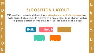
  • 65. L A Y O U T 3) POSITION LAYOUT CSS position property defines the positioning method of an element on a web page. It allows you to control how an element is positioned within its parent container or relative to other elements on the page. P O S I T I O N Static Relative Absolute Fixed Sticky
  • 66. STATIC Elements are positioned according to the normal flow of the document. This is the default position value. <div class="static">Elements are positioned according to the normal flow of the document. This is the default position value.</div> .static{ position: static; top: 120px; } P O S I T I O N A Y O U T
  • 67. <div class="relative">Elements are positioned relative to their normal position in the document flow. You can use top, bottom, left, and right properties to adjust their position.</div> RELATIVE Elements are positioned relative to their normal position in the document flow. You can use top, bottom, left, and right properties to adjust their position. P O S I T I O N .relative{ position: relative; top: 20px; left: 50px; } L A Y O U
  • 68. <div class="absolute">It refers to positioning an element relative to its nearest positioned container instead of its normal position in the document flow (usually the viewport).</div> ABSOLUTE It refers to positioning an element relative to its nearest positioned container instead of its normal position in the document flow (usually the viewport). P O S I T I O N .absolute{ position: absolute; top: 20px; left: 50px; } L A Y O U
  • 69. <div class="fixed"> Elements are positioned relative to the viewport, meaning they stay in the same place even when the page is scrolled.</div> FIXED Elements are positioned relative to the viewport, meaning they stay in the same place even when the page is scrolled. P O S I T I O N .fixed{ position: fixed; top: 20px; left: 50px; } L A Y O U
  • 70. <div class="sticky"> Elements are positioned based on the user's scroll position. It acts like a combination of relative and fixed positioning, depending on the scroll position of the user.</div> STICKY Elements are positioned based on the user's scroll position. It acts like a combination of relative and fixed positioning, depending on the scroll position of the user. P O S I T I O N .sticky { position: sticky; top: 20px; left: 50px; } L A Y O U
  • 71. 4) RESPONSIVE LAYOUT A responsive layout is a design technique that allows web pages to adapt and display content appropriately across different screen sizes and devices. Responsive layouts typically use media queries (@media) to achieve this adaptability. L A Y O U T R E S P O N S I V E <div class="hi"> <h1>Responsive Layout</h1> <p>Responsive layouts typically use media queries (@media) to achieve this adaptability.</p> </div> .hi { background-color: black; color: white; } @media(max-width: 600px){ .hi{ background-color: red; width: 25%; }
  • 75. 1) HEADER A header is usually located at the top of the website. It often contains a logo or the website name. <div class="header"> <h1>Header</h1> </div> .header { background-color: #f1f1f1; padding: 5px; font-family: Arial; }
  • 76. 2) NAVIGATION MENU A navigation menu contains a list of links to help visitors navigating through your website. <div class="topnav"> <a href="#">Link</a> <a href="#">Link</a> <a href="#">Link</a> </div> .topnav{ background-color: black; padding: 16px; } .topnav a { padding: 16px; color: white; text- decoration: none; } .topnav a:hover { background-color: #ddd; color: black; padding: 16px; }
  • 77. 3) CONTENT The layout in this section, often depends on the target users. .column{ <div class="para"> <div class="column"> <h1>MCA</h1> <p>Add Your Content</p> </div> <div class="column"> <h1>MBA</h1> <p>Add Your Content</p> </div> <div class="column"> <h1>M.COM</h1> <p>Add Your Content </p> </div> </div> float: left; padding: 10px; width: 30% }
  • 78. 4) FOOTER The footer is placed at the bottom of your page. It often contains information like copyright and contact info. .footer { background-color: #f1f1f1; padding: 5px; text-align: center; } <div class="footer"> <p>Footer</p> </div>
  • 79. REFERENCES Skeleton of HTML: https:// www.w3schools.com/w3css/w3css_web_html.asp HTML Phase Tags: https:// www.geeksforgeeks.org/html-phrase-tag/ HTML Comment Tag: https:// www.geeksforgeeks.org/html-comments/ CSS Properties and Values: https:// www.geeksforgeeks.org/css-properties-complete- reference/
  • 80. REFERENCES CSS Selectors: https:// www.w3schools.com/CSS/css_selectors.asp CSS Layouts: https://developer.mozilla.org/en-US/docs/Learn/ CSS/CSS_layout CSS Positions: https://developer.mozilla.org/en-US/docs/Web/ CSS/position CSS Website Layouts: https:// www.geeksforgeeks.org/css-website-layout/
  • 81. REFERENCES href Target: https:// www.w3schools.com/tags/att_a_target.asp HTML Attributes: https://developer.mozilla.org/en-US/docs/Learn/ CSS/CSS_layout HTML Center Tag: https:// www.geeksforgeeks.org/html-center-tag/ <pre> Tag: https:// www.w3schools.com/tags/tag_pre.asp