Making use of data visualization for software development
Download as PPTX, PDF1 like570 views

The document discusses the importance of data visualization in software development, particularly through the lens of business intelligence and decision-making. It offers insights on how to enhance data visualization through effective color usage, organization, and comparison, which aids in digesting information. The overall goal is to empower better decisions by learning from data and improving the way information is presented.


Making use of data visualization for software development
- 1. Ming Huang @panintelligence @mingzhi_huang 07/2015 Making Use of Data Visualization for Software Development 1
- 2. What we do 2 • Information dashboard for Business Intelligence • Mission: Enabling better decisions • Core values: innovative, open, supportive About me • Software Frontend Architect at Panintelligence • Web Frontend Development for 7 - 8 years • Responsible for reengineering Panintelligence dashboard @panintelligence @mingzhi_huang
- 3. What we do 3 • Information dashboard for Business Intelligence • Mission: Enabling better decisions • Core values: innovative, open, supportive About me • Software Frontend Architect at Panintelligence • Web Frontend Development for 7 - 8 years • Responsible for reengineering Panintelligence dashboard @panintelligence @mingzhi_huang Twitter
- 4. Introduction 4 Why Agile? Why Lean? @panintelligence @mingzhi_huang
- 5. 5 Introduction Shorten cycle Quicker feedback WHY Why Agile? Why Lean? @panintelligence @mingzhi_huang
- 6. 6 Incremental learning to minimize the risk of wrong decisions Shorten cycle Quicker feedback WHY Introduction Why Agile? Why Lean? Benefit @panintelligence @mingzhi_huang
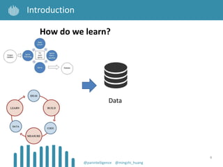
- 7. 7 Introduction How do we learn? @panintelligence @mingzhi_huang
- 8. 8 Introduction Data How do we learn? @panintelligence @mingzhi_huang
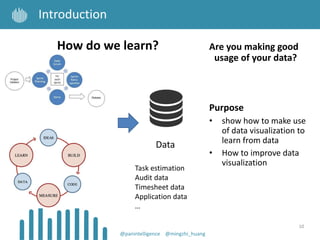
- 9. 9 Introduction Data How do we learn? Task estimation Audit data Timesheet data Application data … @panintelligence @mingzhi_huang
- 10. 10 Introduction Data Are you making good usage of your data? Purpose • show how to make use of data visualization to learn from data • How to improve data visualization How do we learn? Task estimation Audit data Timesheet data Application data … @panintelligence @mingzhi_huang
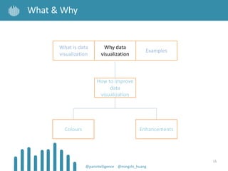
- 11. 11 Agenda @panintelligence @mingzhi_huang What is data visualization Why data visualization How to improve data visualization Colours Enhancements Examples
- 12. 12 What & Why @panintelligence @mingzhi_huang How to improve data visualization Colours Enhancements What is data visualization Why data visualization Examples
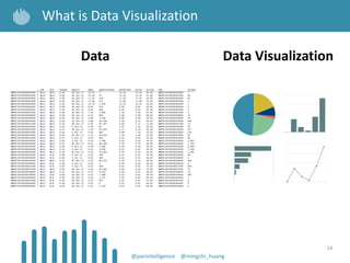
- 13. 13 What is Data Visualization Data @panintelligence @mingzhi_huang
- 14. 14 What is Data Visualization Data Data Visualization @panintelligence @mingzhi_huang
- 15. 15 What & Why @panintelligence @mingzhi_huang How to improve data visualization Colours Enhancements What is data visualization Why data visualization Examples
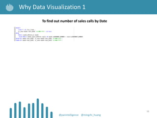
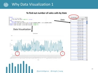
- 16. 16 Why Data Visualization 1 @panintelligence @mingzhi_huang To find out number of sales calls by Date
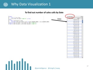
- 17. 17 Why Data Visualization 1 @panintelligence @mingzhi_huang To find out number of sales calls by Date Data
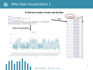
- 18. 18 Why Data Visualization 1 @panintelligence @mingzhi_huang To find out number of sales calls by Date Data Visualization Data
- 19. 19 Why Data Visualization 1 @panintelligence @mingzhi_huang To find out number of sales calls by Date Data Visualization Data
- 20. 20 Why Data Visualization 1 @panintelligence @mingzhi_huang To find out number of sales calls by Date Data Visualization Data
- 21. 21 Why Data Visualization 1 @panintelligence @mingzhi_huang To find out number of sales calls by Date Data Visualization Data
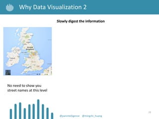
- 22. 22 Why Data Visualization 2 @panintelligence @mingzhi_huang Slowly digest the information No need to show you street names at this level
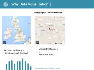
- 23. 23 Why Data Visualization 2 @panintelligence @mingzhi_huang Slowly digest the information No need to show you street names at this level Shows street names … And some pubs
- 24. 24 Why Data Visualization 2 @panintelligence @mingzhi_huang Slowly digest the information No need to show you street names at this level Shows street names … And some pubs Can you imagine what the data looks like for this?
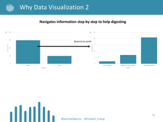
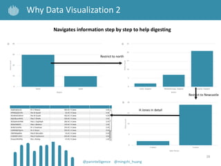
- 25. 25 Why Data Visualization 2 @panintelligence @mingzhi_huang Navigates information step by step to help digesting
- 26. 26 Why Data Visualization 2 @panintelligence @mingzhi_huang Navigates information step by step to help digesting Restrict to north
- 27. 27 Why Data Visualization 2 @panintelligence @mingzhi_huang Navigates information step by step to help digesting Restrict to north Restrict to Newcastle
- 28. 28 Why Data Visualization 2 @panintelligence @mingzhi_huang Navigates information step by step to help digesting Restrict to north Restrict to Newcastle H Jones in detail
- 29. 29 Why Data Visualization 3 @panintelligence @mingzhi_huang With a BI tool, the related SQL results can be grouped together
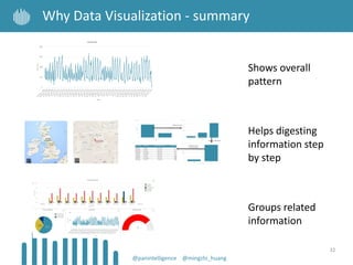
- 30. 30 Why Data Visualization - summary @panintelligence @mingzhi_huang Shows overall pattern
- 31. 31 Why Data Visualization - summary @panintelligence @mingzhi_huang Shows overall pattern Helps digesting information step by step
- 32. 32 Why Data Visualization - summary Shows overall pattern @panintelligence @mingzhi_huang Helps digesting information step by step Groups related information
- 33. 33 What & Why @panintelligence @mingzhi_huang How to improve data visualization Colours Enhancements What is data visualization Why data visualization Examples
- 34. 34 Why Data Visualization - Examples Data Visualization only matters, when it shows the information that is relevant to the users. @panintelligence @mingzhi_huang
- 35. 35 Why Data Visualization - Examples Data Visualization only matters, when it shows the information that is relevant to the users. @panintelligence @mingzhi_huang Software Development What do we care about?
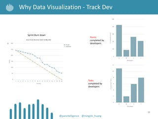
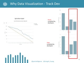
- 36. 36 Why Data Visualization - Track Dev @panintelligence @mingzhi_huang Sprint Burn down
- 37. 37 Why Data Visualization - Track Dev @panintelligence @mingzhi_huang Sprint Burn down Mike the Boss 20 days sprint???
- 38. 38 Why Data Visualization - Track Dev @panintelligence @mingzhi_huang Sprint Burn down Points completed by developers Tasks completed by developers
- 39. 39 Why Data Visualization - Track Dev @panintelligence @mingzhi_huang Sprint Burn down Points completed by developers Tasks completed by developers
- 40. 40 Why Data Visualization - Track Dev @panintelligence @mingzhi_huang Sprint Burn down Points completed by developers Tasks completed by developers Boss cares about
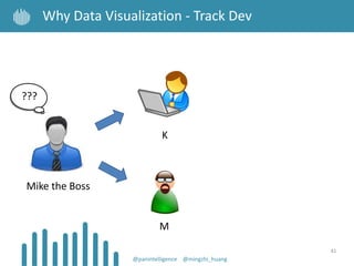
- 41. 41 Why Data Visualization - Track Dev @panintelligence @mingzhi_huang K M Mike the Boss ???
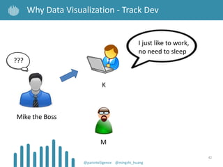
- 42. 42 Why Data Visualization - Track Dev @panintelligence @mingzhi_huang I just like to work, no need to sleep ??? K M Mike the Boss
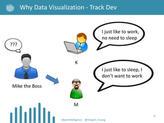
- 43. 43 Why Data Visualization - Track Dev @panintelligence @mingzhi_huang I just like to work, no need to sleep I just like to sleep, I don’t want to work ??? K M Mike the Boss
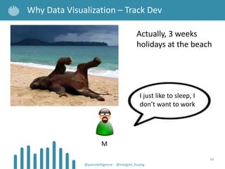
- 44. 44 Why Data Visualization – Track Dev @panintelligence @mingzhi_huang M Actually, 3 weeks holidays at the beach I just like to sleep, I don’t want to work
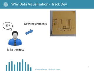
- 45. 45 Why Data Visualization - Track Dev @panintelligence @mingzhi_huang New requirements ??? Mike the Boss
- 46. 46 Why Data Visualization - Track Dev @panintelligence @mingzhi_huang New requirements I don’t like SQL ??? Mike the Boss
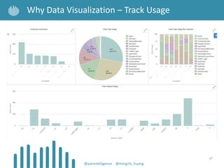
- 47. 47 @panintelligence @mingzhi_huang Why Data Visualization – Track Usage
- 48. 48 @panintelligence @mingzhi_huang Why Data Visualization - Track Usage
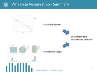
- 49. 49 @panintelligence @mingzhi_huang Why Data Visualization - Summary Track feature usage Track development Learn from data, Make better decisions
- 50. 50 How do we improve data visualization? @panintelligence @mingzhi_huang
- 51. 51 Choosing Colours @panintelligence @mingzhi_huang How to improve data visualization Colours Enhancements What is data visualization Why data visualization Examples
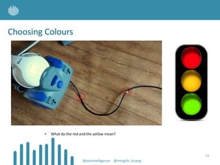
- 52. Choosing Colours 52 • What do the red and the yellow mean? @panintelligence @mingzhi_huang
- 53. Choosing Colours 53 • What do the red and the yellow mean? @panintelligence @mingzhi_huang
- 54. Choosing Colours 54 • Bright colours are generally used to represent exceptions @panintelligence @mingzhi_huang
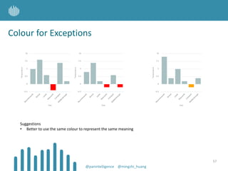
- 55. Colour for Exceptions • Take a guess about what red means 55 @panintelligence @mingzhi_huang
- 56. Colour for Exceptions • What would you guess orange means? (in the same dashboard) • Take a guess about what red means 56 @panintelligence @mingzhi_huang
- 57. Colour for Exceptions Suggestions • Better to use the same colour to represent the same meaning 57 @panintelligence @mingzhi_huang
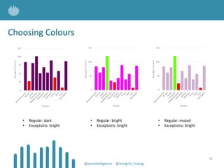
- 58. Choosing Colours • Can you easily tell what information in here is important? • Why more important? 58 @panintelligence @mingzhi_huang
- 59. Choosing Colours • How about this one? • How many of them are important items? 59 @panintelligence @mingzhi_huang
- 60. Choosing Colours • How about this one? • How many of them are important items? 60 @panintelligence @mingzhi_huang
- 61. Choosing Colours • Regular: bright • Exceptions: bright • Regular: muted • Exceptions: bright • Regular: dark • Exceptions: bright 61 @panintelligence @mingzhi_huang
- 62. Choosing Colours Which one highlights the exceptions? • Regular: bright • Exceptions: bright • Regular: muted • Exceptions: bright • Regular: dark • Exceptions: bright 62 @panintelligence @mingzhi_huang
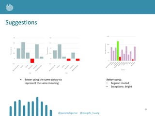
- 63. Suggestions 63 • Better using the same colour to represent the same meaning @panintelligence @mingzhi_huang
- 64. Suggestions • Better using the same colour to represent the same meaning 64 Better using: • Regular: muted • Exceptions: bright @panintelligence @mingzhi_huang
- 65. 65 How to improve data visualization Colours Enhancements Enhancements - what helps understanding @panintelligence @mingzhi_huang What is data visualization Why data visualization Examples
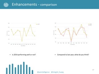
- 66. • Is 2014 performing well or not? 66 Enhancements - comparison @panintelligence @mingzhi_huang
- 67. • Is 2014 performing well or not? • Compared to last year, what do you think? 67 Enhancements - comparison @panintelligence @mingzhi_huang
- 68. • This shows the proportions 68 Enhancements - ordering Performance of different cities @panintelligence @mingzhi_huang
- 69. • This shows the proportions • How about providing alphabetical ordering? 69 Enhancements - ordering Performance of different cities @panintelligence @mingzhi_huang
- 70. Performance of different cities • This shows the proportions • How about providing alphabetical ordering? • How about providing proportion ordering? 70 Enhancements - ordering @panintelligence @mingzhi_huang
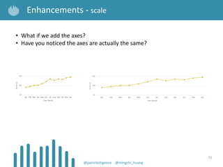
- 71. 71 Enhancements - scale • What’s the difference between these two charts? @panintelligence @mingzhi_huang
- 72. • What if we add the axes? • Have you noticed the axes are actually the same? 72 Enhancements - scale @panintelligence @mingzhi_huang
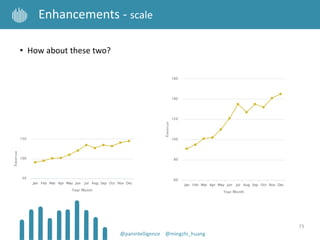
- 73. 73 Enhancements - scale • How about these two? @panintelligence @mingzhi_huang
- 74. • How about these two? • Have you noticed the starting points are different? 74 Enhancements - scale @panintelligence @mingzhi_huang
- 75. 75 Enhancements - scale When putting related information together Would this be even more confusing? Option 1 @panintelligence @mingzhi_huang
- 76. When putting related information together Would this be even more confusing? How about this? 76 Option 1 Option 2 Enhancements - scale @panintelligence @mingzhi_huang
- 77. 77 Enhancements - what helps understanding • Comparison provides context @panintelligence @mingzhi_huang
- 78. 78 Enhancements - what helps understanding • Comparison provides context • Ordering adds meaning @panintelligence @mingzhi_huang
- 79. • Comparison provides context • Ordering adds meaning • Consistent axes reduces misunderstanding 79 Enhancements - what helps understanding @panintelligence @mingzhi_huang
- 80. 80 Conclusion @panintelligence @mingzhi_huang Data visualization improves understanding Enhancement supports - Comparison - Ordering (Data connection) - Consistent scale Colours - Consistent colours - Bright for exceptions - Muted for less important
Editor's Notes
- #4: Socially active: twitter on every page
- #5: How does software development related to data visualization
- #9: If we want to consistently make good decisions, we need to have good evidence to prove what we do is right We produce lots of data when we do software development. And the most reliable evidence is: data
- #18: Can you easily understand what’s going on? Probably not that obvious Also, we need to scroll to see all the data We wouldn’t be able to look at the information at once, how is it possible to squeeze all of them into a small visual space then?
- #19: Shows the pattern Helps digesting the information
- #20: Shows the pattern Helps digesting the information
- #21: Shows the pattern Helps digesting the information
- #22: You now start to have new requirements: I want to know anything below 50
- #29: Instead of overwhelm you with all the data, We can take steps to learn from our data We allow people to navigate to the point that they care about the details
- #30: You don’t need to run SQL all the time, you can have the results side by side in their best visual representation Value comparison Proportion comparison Change over time Performance I just want to show you the benefits, we are not here to talk about BI tools
- #31: Why data visualization: Not just table – the result is the result of running SQL Easier to digest Shows summary vs. shows details – e.g. drill down Shows details with table vs line Results in new requirements Shows patterns that tell a story you may not know – e.g. 2 lines comparison Highlights problem – e.g. deviation chart Why BI tools: Remove repetition (grouping visual result of different queries) No need to repeatedly write the same query Consistently monitor the result of the same query Show one table vs show multiple related charts
- #32: Why data visualization: Not just table – the result is the result of running SQL Easier to digest Shows summary vs. shows details – e.g. drill down Shows details with table vs line Results in new requirements Shows patterns that tell a story you may not know – e.g. 2 lines comparison Highlights problem – e.g. deviation chart Why BI tools: Remove repetition (grouping visual result of different queries) No need to repeatedly write the same query Consistently monitor the result of the same query Show one table vs show multiple related charts
- #33: Why data visualization: Not just table – the result is the result of running SQL Easier to digest Shows summary vs. shows details – e.g. drill down Shows details with table vs line Results in new requirements Shows patterns that tell a story you may not know – e.g. 2 lines comparison Highlights problem – e.g. deviation chart Why BI tools: Remove repetition (grouping visual result of different queries) No need to repeatedly write the same query Consistently monitor the result of the same query Show one table vs show multiple related charts
- #35: Result -> Why? -> is it because …?
- #37: Result -> Why? -> is it because …? Data Visualization only matters, when it shows the information that is relevant to the users. So what do we care as developers? - Scrum burn down - Estimate vs actual - Tasks completed by developers - Points completed by developers - Estimate vs actual by tasks by developers - Usage of features (although our customers told us it’s important)
- #38: 20 days sprint? Or slow motion? The Test People to help improving release process
- #39: Ken is the winner Ming needs some kicking
- #40: Steve completes more points than Tiago Tiago completes more tasks than Steve = Steve worked on bigger tasks
- #42: Mike talk to K and M - K said: I just like to work, no need to sleep - M said: I just need to sleep, I don’t need to work (actually Ming is on holiday for 3 weeks)
- #45: While actually, M spent 3 weeks holidays at the beach looking at elephants
- #48: Audit data – stats of application usage
- #51: I’m about to show you some guidelines Regardless if you use a data visualization tool – e.g. a dashboard, excel, Microsoft Dynamics It’s always better to have these considerations
- #53: Why more important? - darker? Brighter?
- #54: Why more important? - darker? Brighter?
- #55: Why more important? - darker? Brighter?
- #58: e.g. Red for negative / danger Orange for warning Green for good
- #59: Why more important? What draws people’s attention? What stands out more?
- #62: Let’s take a look at what sort of colour being used in these charts
- #63: You want the important information to stand out You don’t want people’s attention to be on the less important information
- #68: The message: Having comparison gives you a bit more context when trying to understand data June is actually not that bad
- #71: The message: Providing some ordering is better than not having anything