SlideShare a Scribd company logo
Portfolio Research  By David Hickman
10 magazines I will analyses
Front cover analysis Mode of address   it is aimed at younger audiences such as 14-29 year olds because of the language used Graphics  its graphics are black yellow and white because this shows danger and is used for traffic signs.  Cover Image  a mid shot of Drake in the middle of the page looking threatening and “UNSTOPABLE”  Barcode  is in the left hand corner of the page and shows the price and info on the magazine Masthead VIBE’s masthead follows the codes and conventions of a magazine by taking up the full width of the page and being positioned at the top of the page so it can be seen. Because of this the masthead is the biggest writing on the cover and draws in the attention of the reader. VIBE’s masthead is big, bold and straight to the point.
Mode of address It is aimed at the mid teens early 30s  because of its friendliness and up to date news. Graphics very Christmassy feel; green, red and blue this is to show that it is a Christmas print and the band are also in very seasonal gear. Cover Image of the arctic monkeys posing long shot so we can see all there gear and there instruments. Barcode is on the right and has all the information that is needed for the magazine E.G price Masthead NME’s masthead follows the codes and conventions of a magazine by taking up the top corner of the page and its been positioned at the top of the page so it can be seen. Because the masthead is not the biggest writing on the cover the attention of the reader is focused on the main article. NME’s masthead is highly recognisable, bold and straight to the point.
Mode of address people 18-29 that like metal music. Graphics black, white, yellow and red dangerous colours that are representative of violence and gangs. Cover Image Avenged sevenfold close up on the band all wearing black. Barcode is in the bottom right corner and displays all the information needed for the magazine. Masthead Kerrang!’s masthead follows the codes of a magazine by taking up the full width of the page and being positioned at the top of the page so it can be seen. Because of this the masthead is the biggest writing on the cover and draws in the attention of the reader. Kerrang!’s masthead is big, bold and straight to the point its got black lines across it in places to look like it has been smashed, this is representing that they have broken the conventions by making there magazine.
Mode of address is from18 to 30 years olds because they can all like Guns “N” Roses or bands of the like. Graphics black background white and pink this is so that the writing is separate from the background and each other. Cover Image mid shot of AXL half in light half in dark. Barcode is in the bottom right corner and displays all the information needed for the magazine. Masthead Classic Rock’s masthead follows the codes and conventions of a magazine by taking up the full width of the page and being positioned at the top of the page so it can be seen. Because of this the masthead is the biggest writing on the cover but the attention of the reader is drawn to the main article. Classic Rock’s masthead is half covered by AXL’s head but is still recognisable, its also bold and straight to the point.
Mode of address 18-29 year olds because the rock genre is mostly men from 18-29 years old  Graphics very colourful green yellow  mostly gets attention at quick glance.  Cover Image Muse mid shot looking at the camera. Barcode bottom right hand corner and shows all the information of the magazine Masthead Rock Sound’s masthead follows the codes and conventions of a magazine by taking up the full width of the page and being positioned at the top of the page so it can be seen. Because of this the masthead is the seconded biggest writing on the cover. The main article the attention of the reader. Rock Sound’s masthead is big, bold and straight to the point it also intertwines itself between the bands heads.
Mode of address 15 – 29 year olds and people who like rap and that sort of music. Graphics red and white representative of danger used in traffic signs.  Cover Image Eminem mid shot arms crossed in a defensive pose. Barcode no barcode visible. Masthead VIBE’s masthead follows the codes and conventions of a magazine by taking up the full width of the page and being positioned at the top of the page so it can be seen. Because of this the masthead is the biggest writing on the cover and draws in the attention of the reader. VIBE’s masthead is big, bold and straight to the point.
Mode of address 15 – 39 year olds and people who like this sort of music. Graphics black, white and red bold colours that stand out and can be seen easily.  Cover Image “Kings of Leon” half covering the masthead and half covered by the offer. Barcode bottom right hand corner and shows all the information of the magazine Masthead Q’s masthead follows some of the codes and conventions of a magazine by taking up the left corner of the page and being positioned at the top so it can be seen. Because of this the masthead is the biggest writing on the cover and draws in the attention of the reader. Q’s masthead is big, bold and straight to the point. It is slightly covered up by the band.
Mode of address 15 – 29 year olds and people who like rap and that sort of music. Graphics Blue, white, black and yellow. Blue and white are calm colours. With them as a background the yellow and black stand out really well. Cover Image “Young Jeezy” looking hard and threatening.  Barcode bottom left hand corner and shows all the information of the magazine Masthead The Source’s masthead follows the codes and conventions of a magazine by taking up the full width of the page and being positioned at the top so it can be seen. Because of this the masthead is the biggest writing on the cover and draws in the attention of the reader. The Source’s masthead is big and bold. It is slightly covered up by the singer.
Mode of address 15 –29 year olds and people who like this sort of music.  Graphics its graphics are black white and red because this shows danger  red and black are warning colours.  Cover Image “The Script” one looking at the camera and two looking away from it. All in black representative of danger. Barcode bottom left hand corner and shows all the information of the magazine Masthead Hot Press’s masthead follows some of the codes and conventions of a magazine by taking up the left corner of the page and being positioned at the top so it can be seen. The masthead is not  the biggest writing on the cover. The attention is drawn to the main article. Hot Press’s masthead is bold and easy to read. It is slightly covered up by the band.
Mode of address 18 – 29 year olds and people who like this sort of music. Graphics black, yellow, white and green. Black and yellow are warning colours but not green and white this is to neutralize the magazine for this issue. Cover Image “Corey Taylor” looking smug with an army helmet (represents danger) on and a BBQ in the corner. Barcode bottom right hand corner and shows all the information of the magazine Masthead Kerrang!’s masthead follows the codes of a magazine by taking up the full width of the page and being positioned at the top of the page so it can be seen. Because of this the masthead is the biggest writing on the cover and draws in the attention of the reader. Kerrang!’s masthead is big, bold and recognisable its got black lines across it in places to look like it has been smashed, this is representing that they have broken the conventions by making there magazine.
Contents page
House style similar to layout black and white with important things in red and gold.  Mode of address straight to the point tells you what you need to know in a compacted way. Layout the layout is simple all the writing is on the sides and the bottom and a big photo of the band are on the side. Along the top of the page the name of the magazine the word “contents” the date and their web site so the reader can explore more into the magazine.  Lure
House style green, yellow, black and white with important things in red.  Mode of address straight to the point tells you what you need to know Layout the layout is complicated all the writing is on the sides and the bottom and several photos of bands are in the middle. Along the top of the page the name of the magazine and the date it was made the so the reader knows when magazine was made so they can tell if its the latest issue. subscription Lure
House style similar to layout black and white with important things in red.  Mode of address straight to the point tells you what you need to know Layout the layout is simple all the writing is on the sides and the bottom and a big photo of the band are on the side. Along the top of the page the name of the magazine and the date it was made the so the reader knows when magazine was made so they can tell if its the latest issue.
House style similar to layout black and white with important things in red/orange.  Mode of address straight to the point tells you what you need to know in as little words possible. Layout the layout is simple all the writing is on the sides and the bottom and a big photo of the band are on the side. Along the top of the page is the date it was made so the reader knows when magazine was made so they can tell if its the latest issue. Lure
House style similar to layout black and blue with important things in red like the name. Mode of address straight to the point tells you what you need to know in a very personal way. Layout the layout is simple all the writing is on the sides and the bottom and a big photo of the band are on the side. Along the side of the page is the name of the magazine and the date it was made so the reader knows when magazine was made so they can tell if its the latest issue. Also there is their web side address so the readers can find them online and learn more about the magazine.
House style is black and white with important things in bold. Vibe do this a lot with their colours because they are a rap magazine. Mode of address tells you what you need to know Layout the layout is simple all the writing is on the sides and the bottom and a big photo of the band are on the side. Along the top of the page is the date it was made so the reader knows when magazine was made so they can tell if its the latest issue.
House style similar to layout black and white with important things in bold.  Mode of address straight to the point tells you what you need to know in a fun way. Layout the layout is simple all the writing is down the middle and the photos are on the sides. Along the top of the page is the name of the magazine and the date it was made so the reader knows when magazine was made so they can tell if its the latest issue. Lure
House style black, yellow, pink and white with important things in italic. It look like some of it was drawn on by hand this is what “the beat” like to do. Mode of address straight to the point  organized in a way to tell you what you need to know in a very quick way. Layout the layout is complex all the writing is in boxes and the photos are as well. Along the top of the page is the name of the magazine and the date it was made so the reader knows when magazine was made so they can tell if its the latest issue. Lure
House style black and white with important things in red.  Mode of address straight to the point tells you what you need to know Layout the layout is simple all the writing is on the sides and the bottom and a big photo in the middle. Along the top of the page is the name of the magazine and the date it was made so the reader knows when magazine was made so they can tell if its the latest issue. Lure
House style similar to layout black, yellow and white with important things in red.  Mode of address straight to the point tells you what you need to know in a very quick way. Layout the layout is simple all the writing is on the sides and photos of the bands are on the side. Along the top of the page is the name of the magazine, the wed site so they can get to know more about the magazine itself,  and the date it was made so the reader knows when magazine was made so they can tell if its the latest issue. Lure
Double Page Spread.
QUOTES Layout  a little simplistic half a page is taken up by a photo and the other is just the bands name. Drop Capital House style making the magazine look old and having the writing go across both pages red is used to add emphasis to certain words Adverts.
QUOTE Layout only one member of the band is looking at the camera the others are looking at the ground or side. House style making the title of the magazine look like a collage by having the writing  look like it has been cut out of a magazine or newspaper so form the title. The writing on the page is alternating from red paragraphs to blue paragraphs this is because the band never meant to become a band and are still disorganized so they set out the paragraphs like this so they resemble that and also so it keeps the audience, reader, interested
Stand First and Quote Layout black white and gold simplistic and easily read House style one of the band is in full colour the rest are faded out, he must be the most important.
Stand First the rest of the story would be on the next page. Layout very simple a large picture and a title with a stand first as well. House style NME have both pages with a very large picture and a large title introducing the article
Layout whole page covered by the singer in concert. Second page is covered in writing about the band and there next concert. House style dark colours black, red and white for the writing. Goes with the band. Drop Capital Stand First
Layout used as a list of gigs for kasabian yellow and red to emphasise the key points.  House style dark with light behind the singer. Looks like it was back stage of a concert.
Layout question and answer format and a small picture of her and a fan. House style Izzie standing against a wall with writing all around her. Black is used mostly here to make it stand out. pink is used to highlight quotes  Quotes
Layout big double page picture with half page covered by a text box that has several columns that are broken up with quotes. Drop Capital House style they have used a ship yard to take this photo and the colours are dull except the name of the band and of the magazine this is so that they still stand out. Quotes
Quote Layout very similar to the house style note pads are used to get a little more information across in a simple way. House style a page and a half are covered in writing about the awards and photos of the awards are on the other page and in doing so they manage to get most of the information on who won what in a very quick way and using less pages but still keeping there audience interested throughout the article.
Stand First Layout a large photo is the back ground of this article and a transparent text box is used as to not cover the image entirely.  House style a transparent text box is used so the photo is still seen. White writing is used because it stands out more and catches the eye. There is a yellow highlighted section which is the start of the article this is to attract more attention.
Out come to questionnaire.                                                                                          
According to the questionnaire most people want the popular stuff in there magazines and this is good to know and hopefully focus on.
Result from find your tribe. This wasn’t far off the truth, but I will be aiming at a different target audience for my magazine.
Personal learning and reflection. In this task I have learnt a number of new skills.
Refection on the front covers Doing the front covers I figured out how to analyses them efficiently I learnt new technical language like Masthead, Graphics and I found out how to see who the magazine is aimed at. I got a good idea on how to set up my contents page for my magazine to make it look professional. Like put in photos and short sections of writing.
Reflection on the contents pages. Doing the contents pages I figured out how to analyses them  I learnt new technical language  I got a good idea on how to set up my font cover for my magazine to make it look professional
Reflection on the double pages. Doing the double pages I figured out how to analyses them effectively so I could understand mostly everything about the magazine. I learnt new technical language like stand first, drop capital and house style. I got a good idea on how to set up my double pages for my magazine to make it look professional I will do this by a massive photo covering both of the pages and a transparent text box with the writhing on one side of the page.
Reflection on audience research. During the research I noticed that most of the people that answered the questionnaire said that they would read a magazine if it was a pop magazine, posters, new album details and interviews with their favourite bands.

More Related Content

PPTX
Rock magazine covers
PPTX
Powerpoint task 1 page layout and design
PPTX
Q cover analysisisisi
PPTX
Music magazine analystion
PPT
Front cover analysis (main task)
PPT
Music Magazine Analysis; Front Cover, Contents & Dps
PPTX
Page Design & Layout
PPTX
Unit 14 - LO1
Rock magazine covers
Powerpoint task 1 page layout and design
Q cover analysisisisi
Music magazine analystion
Front cover analysis (main task)
Music Magazine Analysis; Front Cover, Contents & Dps
Page Design & Layout
Unit 14 - LO1

What's hot (19)

PPTX
Front cover, double page, contents analysis
PPTX
Magazine analysis production
PPTX
Rock sound
PPTX
Music Magazine analysis
PPT
Magazine Analysis
PPT
magazine analysing
PPT
Micro analysis
PPTX
Music magazine Ahmad Wahab
PPTX
Music Magazine Textual Analysis
PPT
Magazine anaylisis
PPT
Magazine analysis
PPTX
Deconstructions
PPTX
Magazine cover analysis
PPTX
Magazine reserach
PPT
Tasks 1, 2 & 3 music magazine covers powerpoint
PPTX
Front Covers
PPTX
Rate cards
PPTX
My analysis of 4 Contents Pages
DOCX
Rocksound analysis
Front cover, double page, contents analysis
Magazine analysis production
Rock sound
Music Magazine analysis
Magazine Analysis
magazine analysing
Micro analysis
Music magazine Ahmad Wahab
Music Magazine Textual Analysis
Magazine anaylisis
Magazine analysis
Deconstructions
Magazine cover analysis
Magazine reserach
Tasks 1, 2 & 3 music magazine covers powerpoint
Front Covers
Rate cards
My analysis of 4 Contents Pages
Rocksound analysis
Ad

Viewers also liked (20)

PPT
I hate meth project overview
PPT
Gathering_2.15.11
PPSX
Phoneix AD
PPTX
DoDataDo introduction
DOCX
Paper development
PDF
Hyvinvointivaltio numeroina
PPT
бібліотека +читач
PPTX
SES 2014 - Local Search - Bigger than you think
ODP
El concepte d’Internet
PPTX
Blogerzy w społecznościach
PPT
Golden opportunity to invest 2011
PPT
Colombian CM
PDF
Switchvox - The Best Value in Unified Communications
PDF
Terve tuho - tietä tuottaville työpaikoille ja kasvulle
ODP
Ockham
PPTX
Business and Professionals Breakfast
PPTX
2011 Plc Introductory Client Presentation Final
PDF
Data Management and Libraries by Mark Ludwig
PDF
REST - Why, When and How? at AMIS25
PPS
Mathematics of life
I hate meth project overview
Gathering_2.15.11
Phoneix AD
DoDataDo introduction
Paper development
Hyvinvointivaltio numeroina
бібліотека +читач
SES 2014 - Local Search - Bigger than you think
El concepte d’Internet
Blogerzy w społecznościach
Golden opportunity to invest 2011
Colombian CM
Switchvox - The Best Value in Unified Communications
Terve tuho - tietä tuottaville työpaikoille ja kasvulle
Ockham
Business and Professionals Breakfast
2011 Plc Introductory Client Presentation Final
Data Management and Libraries by Mark Ludwig
REST - Why, When and How? at AMIS25
Mathematics of life
Ad

Similar to Portfolio research (20)

PPTX
Codesandconventions
PPTX
Codesandconventions
PPTX
Codesandconventions
PPTX
Codes and Conventions
PPTX
Contents 2
PPTX
Codesandconventions
PPT
Analysis of Front covers
PPTX
Music magazine Market Research and Textual Analysis
PPT
Media Evaluation Hannabella
PPTX
Textual Analysis
PPTX
Media powerpoints
PPTX
Masthead anaylsis
DOCX
Magazine analysis
PPTX
Magazine analysis 2
PPTX
Market research
PPTX
Analysis of front covers
ODP
Case study notes
PPTX
Analysis of Music Magazines
PPTX
Evaluation
PPTX
Evaluation q1 22
Codesandconventions
Codesandconventions
Codesandconventions
Codes and Conventions
Contents 2
Codesandconventions
Analysis of Front covers
Music magazine Market Research and Textual Analysis
Media Evaluation Hannabella
Textual Analysis
Media powerpoints
Masthead anaylsis
Magazine analysis
Magazine analysis 2
Market research
Analysis of front covers
Case study notes
Analysis of Music Magazines
Evaluation
Evaluation q1 22

More from David_Hickman (18)

PPTX
Mood board
PPT
Flat plan
PDF
Everything
PDF
Double page spread black
PPTX
Contents page
DOCX
Article for double page
PPTX
Double page spread
PDF
Double page spread white
PDF
Double page spread black
PDF
Contents page
PDF
Enrage Contents page
PDF
Enrage Contents page
DOC
Front cover
DOC
Front cover
PPT
Calendar deadlines
PPTX
PPT
Flat plan
PPTX
Front cover
Mood board
Flat plan
Everything
Double page spread black
Contents page
Article for double page
Double page spread
Double page spread white
Double page spread black
Contents page
Enrage Contents page
Front cover
Front cover
Calendar deadlines
Flat plan
Front cover

Recently uploaded (20)

PDF
waiting, Queuing, best time an event cab be done at a time .pdf
PPTX
White Green Simple and Professional Business Pitch Deck Presentation.pptx
PPTX
22 Bindushree Sahu.pptxmadam curie life and achievements
PPTX
CPRC-SOCIAL-STUDIES-FINAL-COACHING-DAY-1.pptx
PPTX
20068987-achievement power templates.pptx
PDF
Love & Romance in Every Sparkle_ Discover the Magic of Diamond Painting.pdf
PPTX
MUSIC-W1-Q1-1.pptxL;ML;MLNL;NL;NL;N;LNL;NL;N
PDF
TUTI FRUTI RECETA RÁPIDA Y DIVERTIDA PARA TODOS
PPTX
Slide_Egg-81850-About Us PowerPoint Template Free.pptx
PPTX
4277547e-f8e2-414e-8962-bf501ea91259.pptx
PPTX
UHVE -MODULE-1.pptx,ljc zlkv dlkvlkdsvljdsclvd
PPSX
Multiple scenes in a single painting.ppsx
PPTX
SAPOTA CULTIVATION.pptxMMMMMMMMMMMMMMMMMMMMMMMMMMMMM
PPTX
Ang heograpiyang pantao mula sa timog silancgang asya
PPTX
Military history & Evolution of Armed Forces of the Philippines
PPTX
CPAR7 ARTS GRADE 112 LITERARY ARTS OR LI
PPTX
573393963-choose-your-own-adventure(2).pptx
PPTX
Visual-Arts.pptx power point elements of art the line, shape, form
PDF
Close Enough S3 E7 "Bridgette the Brain"
PDF
; Projeto Rixa Antiga.pdf
waiting, Queuing, best time an event cab be done at a time .pdf
White Green Simple and Professional Business Pitch Deck Presentation.pptx
22 Bindushree Sahu.pptxmadam curie life and achievements
CPRC-SOCIAL-STUDIES-FINAL-COACHING-DAY-1.pptx
20068987-achievement power templates.pptx
Love & Romance in Every Sparkle_ Discover the Magic of Diamond Painting.pdf
MUSIC-W1-Q1-1.pptxL;ML;MLNL;NL;NL;N;LNL;NL;N
TUTI FRUTI RECETA RÁPIDA Y DIVERTIDA PARA TODOS
Slide_Egg-81850-About Us PowerPoint Template Free.pptx
4277547e-f8e2-414e-8962-bf501ea91259.pptx
UHVE -MODULE-1.pptx,ljc zlkv dlkvlkdsvljdsclvd
Multiple scenes in a single painting.ppsx
SAPOTA CULTIVATION.pptxMMMMMMMMMMMMMMMMMMMMMMMMMMMMM
Ang heograpiyang pantao mula sa timog silancgang asya
Military history & Evolution of Armed Forces of the Philippines
CPAR7 ARTS GRADE 112 LITERARY ARTS OR LI
573393963-choose-your-own-adventure(2).pptx
Visual-Arts.pptx power point elements of art the line, shape, form
Close Enough S3 E7 "Bridgette the Brain"
; Projeto Rixa Antiga.pdf

Portfolio research

  • 1. Portfolio Research By David Hickman
  • 2. 10 magazines I will analyses
  • 3. Front cover analysis Mode of address it is aimed at younger audiences such as 14-29 year olds because of the language used Graphics its graphics are black yellow and white because this shows danger and is used for traffic signs. Cover Image a mid shot of Drake in the middle of the page looking threatening and “UNSTOPABLE” Barcode is in the left hand corner of the page and shows the price and info on the magazine Masthead VIBE’s masthead follows the codes and conventions of a magazine by taking up the full width of the page and being positioned at the top of the page so it can be seen. Because of this the masthead is the biggest writing on the cover and draws in the attention of the reader. VIBE’s masthead is big, bold and straight to the point.
  • 4. Mode of address It is aimed at the mid teens early 30s because of its friendliness and up to date news. Graphics very Christmassy feel; green, red and blue this is to show that it is a Christmas print and the band are also in very seasonal gear. Cover Image of the arctic monkeys posing long shot so we can see all there gear and there instruments. Barcode is on the right and has all the information that is needed for the magazine E.G price Masthead NME’s masthead follows the codes and conventions of a magazine by taking up the top corner of the page and its been positioned at the top of the page so it can be seen. Because the masthead is not the biggest writing on the cover the attention of the reader is focused on the main article. NME’s masthead is highly recognisable, bold and straight to the point.
  • 5. Mode of address people 18-29 that like metal music. Graphics black, white, yellow and red dangerous colours that are representative of violence and gangs. Cover Image Avenged sevenfold close up on the band all wearing black. Barcode is in the bottom right corner and displays all the information needed for the magazine. Masthead Kerrang!’s masthead follows the codes of a magazine by taking up the full width of the page and being positioned at the top of the page so it can be seen. Because of this the masthead is the biggest writing on the cover and draws in the attention of the reader. Kerrang!’s masthead is big, bold and straight to the point its got black lines across it in places to look like it has been smashed, this is representing that they have broken the conventions by making there magazine.
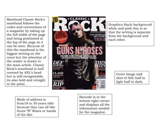
  • 6. Mode of address is from18 to 30 years olds because they can all like Guns “N” Roses or bands of the like. Graphics black background white and pink this is so that the writing is separate from the background and each other. Cover Image mid shot of AXL half in light half in dark. Barcode is in the bottom right corner and displays all the information needed for the magazine. Masthead Classic Rock’s masthead follows the codes and conventions of a magazine by taking up the full width of the page and being positioned at the top of the page so it can be seen. Because of this the masthead is the biggest writing on the cover but the attention of the reader is drawn to the main article. Classic Rock’s masthead is half covered by AXL’s head but is still recognisable, its also bold and straight to the point.
  • 7. Mode of address 18-29 year olds because the rock genre is mostly men from 18-29 years old Graphics very colourful green yellow mostly gets attention at quick glance. Cover Image Muse mid shot looking at the camera. Barcode bottom right hand corner and shows all the information of the magazine Masthead Rock Sound’s masthead follows the codes and conventions of a magazine by taking up the full width of the page and being positioned at the top of the page so it can be seen. Because of this the masthead is the seconded biggest writing on the cover. The main article the attention of the reader. Rock Sound’s masthead is big, bold and straight to the point it also intertwines itself between the bands heads.
  • 8. Mode of address 15 – 29 year olds and people who like rap and that sort of music. Graphics red and white representative of danger used in traffic signs. Cover Image Eminem mid shot arms crossed in a defensive pose. Barcode no barcode visible. Masthead VIBE’s masthead follows the codes and conventions of a magazine by taking up the full width of the page and being positioned at the top of the page so it can be seen. Because of this the masthead is the biggest writing on the cover and draws in the attention of the reader. VIBE’s masthead is big, bold and straight to the point.
  • 9. Mode of address 15 – 39 year olds and people who like this sort of music. Graphics black, white and red bold colours that stand out and can be seen easily. Cover Image “Kings of Leon” half covering the masthead and half covered by the offer. Barcode bottom right hand corner and shows all the information of the magazine Masthead Q’s masthead follows some of the codes and conventions of a magazine by taking up the left corner of the page and being positioned at the top so it can be seen. Because of this the masthead is the biggest writing on the cover and draws in the attention of the reader. Q’s masthead is big, bold and straight to the point. It is slightly covered up by the band.
  • 10. Mode of address 15 – 29 year olds and people who like rap and that sort of music. Graphics Blue, white, black and yellow. Blue and white are calm colours. With them as a background the yellow and black stand out really well. Cover Image “Young Jeezy” looking hard and threatening. Barcode bottom left hand corner and shows all the information of the magazine Masthead The Source’s masthead follows the codes and conventions of a magazine by taking up the full width of the page and being positioned at the top so it can be seen. Because of this the masthead is the biggest writing on the cover and draws in the attention of the reader. The Source’s masthead is big and bold. It is slightly covered up by the singer.
  • 11. Mode of address 15 –29 year olds and people who like this sort of music. Graphics its graphics are black white and red because this shows danger red and black are warning colours. Cover Image “The Script” one looking at the camera and two looking away from it. All in black representative of danger. Barcode bottom left hand corner and shows all the information of the magazine Masthead Hot Press’s masthead follows some of the codes and conventions of a magazine by taking up the left corner of the page and being positioned at the top so it can be seen. The masthead is not the biggest writing on the cover. The attention is drawn to the main article. Hot Press’s masthead is bold and easy to read. It is slightly covered up by the band.
  • 12. Mode of address 18 – 29 year olds and people who like this sort of music. Graphics black, yellow, white and green. Black and yellow are warning colours but not green and white this is to neutralize the magazine for this issue. Cover Image “Corey Taylor” looking smug with an army helmet (represents danger) on and a BBQ in the corner. Barcode bottom right hand corner and shows all the information of the magazine Masthead Kerrang!’s masthead follows the codes of a magazine by taking up the full width of the page and being positioned at the top of the page so it can be seen. Because of this the masthead is the biggest writing on the cover and draws in the attention of the reader. Kerrang!’s masthead is big, bold and recognisable its got black lines across it in places to look like it has been smashed, this is representing that they have broken the conventions by making there magazine.
  • 14. House style similar to layout black and white with important things in red and gold. Mode of address straight to the point tells you what you need to know in a compacted way. Layout the layout is simple all the writing is on the sides and the bottom and a big photo of the band are on the side. Along the top of the page the name of the magazine the word “contents” the date and their web site so the reader can explore more into the magazine. Lure
  • 15. House style green, yellow, black and white with important things in red. Mode of address straight to the point tells you what you need to know Layout the layout is complicated all the writing is on the sides and the bottom and several photos of bands are in the middle. Along the top of the page the name of the magazine and the date it was made the so the reader knows when magazine was made so they can tell if its the latest issue. subscription Lure
  • 16. House style similar to layout black and white with important things in red. Mode of address straight to the point tells you what you need to know Layout the layout is simple all the writing is on the sides and the bottom and a big photo of the band are on the side. Along the top of the page the name of the magazine and the date it was made the so the reader knows when magazine was made so they can tell if its the latest issue.
  • 17. House style similar to layout black and white with important things in red/orange. Mode of address straight to the point tells you what you need to know in as little words possible. Layout the layout is simple all the writing is on the sides and the bottom and a big photo of the band are on the side. Along the top of the page is the date it was made so the reader knows when magazine was made so they can tell if its the latest issue. Lure
  • 18. House style similar to layout black and blue with important things in red like the name. Mode of address straight to the point tells you what you need to know in a very personal way. Layout the layout is simple all the writing is on the sides and the bottom and a big photo of the band are on the side. Along the side of the page is the name of the magazine and the date it was made so the reader knows when magazine was made so they can tell if its the latest issue. Also there is their web side address so the readers can find them online and learn more about the magazine.
  • 19. House style is black and white with important things in bold. Vibe do this a lot with their colours because they are a rap magazine. Mode of address tells you what you need to know Layout the layout is simple all the writing is on the sides and the bottom and a big photo of the band are on the side. Along the top of the page is the date it was made so the reader knows when magazine was made so they can tell if its the latest issue.
  • 20. House style similar to layout black and white with important things in bold. Mode of address straight to the point tells you what you need to know in a fun way. Layout the layout is simple all the writing is down the middle and the photos are on the sides. Along the top of the page is the name of the magazine and the date it was made so the reader knows when magazine was made so they can tell if its the latest issue. Lure
  • 21. House style black, yellow, pink and white with important things in italic. It look like some of it was drawn on by hand this is what “the beat” like to do. Mode of address straight to the point organized in a way to tell you what you need to know in a very quick way. Layout the layout is complex all the writing is in boxes and the photos are as well. Along the top of the page is the name of the magazine and the date it was made so the reader knows when magazine was made so they can tell if its the latest issue. Lure
  • 22. House style black and white with important things in red. Mode of address straight to the point tells you what you need to know Layout the layout is simple all the writing is on the sides and the bottom and a big photo in the middle. Along the top of the page is the name of the magazine and the date it was made so the reader knows when magazine was made so they can tell if its the latest issue. Lure
  • 23. House style similar to layout black, yellow and white with important things in red. Mode of address straight to the point tells you what you need to know in a very quick way. Layout the layout is simple all the writing is on the sides and photos of the bands are on the side. Along the top of the page is the name of the magazine, the wed site so they can get to know more about the magazine itself, and the date it was made so the reader knows when magazine was made so they can tell if its the latest issue. Lure
  • 25. QUOTES Layout a little simplistic half a page is taken up by a photo and the other is just the bands name. Drop Capital House style making the magazine look old and having the writing go across both pages red is used to add emphasis to certain words Adverts.
  • 26. QUOTE Layout only one member of the band is looking at the camera the others are looking at the ground or side. House style making the title of the magazine look like a collage by having the writing look like it has been cut out of a magazine or newspaper so form the title. The writing on the page is alternating from red paragraphs to blue paragraphs this is because the band never meant to become a band and are still disorganized so they set out the paragraphs like this so they resemble that and also so it keeps the audience, reader, interested
  • 27. Stand First and Quote Layout black white and gold simplistic and easily read House style one of the band is in full colour the rest are faded out, he must be the most important.
  • 28. Stand First the rest of the story would be on the next page. Layout very simple a large picture and a title with a stand first as well. House style NME have both pages with a very large picture and a large title introducing the article
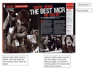
  • 29. Layout whole page covered by the singer in concert. Second page is covered in writing about the band and there next concert. House style dark colours black, red and white for the writing. Goes with the band. Drop Capital Stand First
  • 30. Layout used as a list of gigs for kasabian yellow and red to emphasise the key points. House style dark with light behind the singer. Looks like it was back stage of a concert.
  • 31. Layout question and answer format and a small picture of her and a fan. House style Izzie standing against a wall with writing all around her. Black is used mostly here to make it stand out. pink is used to highlight quotes Quotes
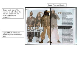
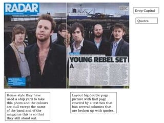
  • 32. Layout big double page picture with half page covered by a text box that has several columns that are broken up with quotes. Drop Capital House style they have used a ship yard to take this photo and the colours are dull except the name of the band and of the magazine this is so that they still stand out. Quotes
  • 33. Quote Layout very similar to the house style note pads are used to get a little more information across in a simple way. House style a page and a half are covered in writing about the awards and photos of the awards are on the other page and in doing so they manage to get most of the information on who won what in a very quick way and using less pages but still keeping there audience interested throughout the article.
  • 34. Stand First Layout a large photo is the back ground of this article and a transparent text box is used as to not cover the image entirely. House style a transparent text box is used so the photo is still seen. White writing is used because it stands out more and catches the eye. There is a yellow highlighted section which is the start of the article this is to attract more attention.
  • 35. Out come to questionnaire.                                                                                          
  • 36. According to the questionnaire most people want the popular stuff in there magazines and this is good to know and hopefully focus on.
  • 37. Result from find your tribe. This wasn’t far off the truth, but I will be aiming at a different target audience for my magazine.
  • 38. Personal learning and reflection. In this task I have learnt a number of new skills.
  • 39. Refection on the front covers Doing the front covers I figured out how to analyses them efficiently I learnt new technical language like Masthead, Graphics and I found out how to see who the magazine is aimed at. I got a good idea on how to set up my contents page for my magazine to make it look professional. Like put in photos and short sections of writing.
  • 40. Reflection on the contents pages. Doing the contents pages I figured out how to analyses them I learnt new technical language I got a good idea on how to set up my font cover for my magazine to make it look professional
  • 41. Reflection on the double pages. Doing the double pages I figured out how to analyses them effectively so I could understand mostly everything about the magazine. I learnt new technical language like stand first, drop capital and house style. I got a good idea on how to set up my double pages for my magazine to make it look professional I will do this by a massive photo covering both of the pages and a transparent text box with the writhing on one side of the page.
  • 42. Reflection on audience research. During the research I noticed that most of the people that answered the questionnaire said that they would read a magazine if it was a pop magazine, posters, new album details and interviews with their favourite bands.