Kendoui
1 like1,253 views

This document provides an overview of using Kendo UI components with Angular. It discusses why one might choose to use Kendo UI, describes some of the main component groups like buttons, charts, dropdowns, grids, layout, popup, dialog, date inputs and inputs. It also covers how to install and configure themes, and how to import, display and handle events of the different components. The document is intended as a guide for developers looking to get started with building applications using Kendo UI and Angular.


![Theme - set up
• As a link tag
• Component level
• Scss
• Angular-cli.json , styles
<link rel="stylesheet" href="/node_modules/@progress/kendo-theme-default/dist/all.css" />
styleUrls: [
‘../../node_modules/@progress/kendo-theme-default/dist/all.css' ]
ViewEncapsulation.None
@import "~@progress/kendo-theme-default/scss/all";
"styles": [
"styles.css",
"../node_modules/@progress/kendo-theme-default/dist/all.css"
]](https://image.slidesharecdn.com/kendoui-171123161947/85/Kendoui-8-320.jpg)


![Install & Usage
Buttons
npm install --save
@progress/kendo-angular-buttons
@progress/kendo-angular-l10n
@angular/animations
@NgModule({
imports : [ ButtonsModule ]
})
export class SomeModule {}
import { ButtonsModule } from '@progress/kendo-angular-buttons';
All buttons
@NgModule({
imports : [ ButtonModule ]
})
export class SomeModule {}
import { ButtonModule } from '@progress/kendo-angular-button'; Specific button](https://image.slidesharecdn.com/kendoui-171123161947/85/Kendoui-12-320.jpg)
![Buttons
Display buttons
@Component({
selector: 'buttons-example',
template: `
<div>
<button kendoButton [icon]="'refresh'">Default button</button>
// Image icon
<button kendoButton [imageUrl]="'https://demos.telerik.com/kendo-ui/content/shared/icons/sports/
snowboarding.png'">Snowboarding</button>
// FontAwsome icon
<link rel="stylesheet" href="https://maxcdn.bootstrapcdn.com/font-awesome/4.5.0/css/font-awesome.min.css"
<button kendoButton [iconClass]="'fa fa-key fa-fw'">Button</button>
</div>
`
})
export class ButtonsExampleComponent implements OnInit {
constructor() { }
ngOnInit() { }
}
Built in Kendo icons
Point out url
Point out CSS class,
ex font-awesome](https://image.slidesharecdn.com/kendoui-171123161947/85/Kendoui-13-320.jpg)
![Buttons with Ripple effect,
i.e Material Look and Feel
import { RippleModule } from '@progress/kendo-angular-ripple';
@NgModule({
imports: [
RippleModule
]
})
export class AppModule {
}
npm install @progress/kendo-angular-ripple
<div kendoRippleContainer>
<link rel="stylesheet" href="https://maxcdn.bootstrapcdn.com/font-awesome/4.5.0/css/font-awesome.min.css">
<button kendoButton [iconClass]="'fa fa-key fa-fw'">Button</button>
</div>](https://image.slidesharecdn.com/kendoui-171123161947/85/Kendoui-14-320.jpg)

![Install & usage
npm install --save
@progress/kendo-angular-charts
@progress/kendo-angular-intl
@progress/kendo-angular-l10n
@progress/kendo-drawing
hammerjs
@angular/animations
npm packages needed
@NgModule({
imports : [ ChartsModule ]
})
export class SomeModule {}
import { ChartsModule } from '@progress/kendo-angular-charts';
All charts
@NgModule({
imports : [ ChartModule ]
})
export class SomeModule {}
import { ChartModule } from '@progress/kendo-angular-charts';
Specific chart
Charts](https://image.slidesharecdn.com/kendoui-171123161947/85/Kendoui-16-320.jpg)
![Display a chart
Charts
@Component({
selector: 'my-app',
template: `
<kendo-chart [resizeRateLimit]="2">
<kendo-chart-series>
<kendo-chart-series-item [data]="seriesData">
</kendo-chart-series-item>
</kendo-chart-series>
</kendo-chart>
`
})
export class AppComponent {
seriesData: number[] = [1, 2, 3, 5];
}
Responsive](https://image.slidesharecdn.com/kendoui-171123161947/85/Kendoui-17-320.jpg)
![Handle events
Charts
export class AppComponent {
private seriesData: number[] = [1, 2, 3, 5];
private onSeriesClick(e): void {
console.log(e.value);
}
}
@Component({
selector: 'my-app',
template: `
<kendo-chart [resizeRateLimit]=“2" onSeriesClick($event)>
<kendo-chart-series>
<kendo-chart-series-item [data]="seriesData">
</kendo-chart-series-item>
</kendo-chart-series>
</kendo-chart>
`
})
Clicking on
this column returns a 2](https://image.slidesharecdn.com/kendoui-171123161947/85/Kendoui-18-320.jpg)

![Dropdowns
Install & usage
npm install --save
@progress/kendo-angular-dropdowns
@progress/kendo-angular-l10n @angular/animations
import { DropDownsModule } from '@progress/kendo-angular-dropdowns';
@NgModule({
imports: [DropDownsModule]
})
export class AppModule {
}
All dropdown
import { AutoCompleteModule } from '@progress/kendo-angular-dropdowns';
@NgModule({
imports: [AutoCompleteModule]
})
export class AppModule {
}
Specific dropdown](https://image.slidesharecdn.com/kendoui-171123161947/85/Kendoui-20-320.jpg)
![Dropdowns
import { Component } from '@angular/core';
@Component({
selector: 'dropdown-example',
template: `
<kendo-autocomplete [data]="data"
[filterable]="true"
(valueChange)="valueChange($event)"
(filterChange)="filterChange($event)"
(open)="open()"
(close)="close()"
(focus)="focus()"
(blur)="blur()"
>
</kendo-autocomplete>
`
})
export class DropdownExampleComponent {
public events: string[] = [];
public source: Array<string> = ["Luke", "Vader", "Palpatine", "Yoda", "Dokuu"];
public data: Array<string> = this.source;
public filterChange(filter: any): void {
console.log("filterChange", filter);
this.data = this.source.filter((s) => s.toLowerCase().indexOf(filter.toLowerCase()) !== -1);
}
}
Assign data property
with your list
Filter, as user types](https://image.slidesharecdn.com/kendoui-171123161947/85/Kendoui-21-320.jpg)

![Install & usage
Grid
import { GridModule } from '@progress/kendo-angular-grid';
@NgModule({
imports: [BrowserModule, BrowserAnimationsModule, GridModule]
})
export class AppModule {
}
npm install --save
@progress/kendo-angular-grid
@progress/kendo-angular-dropdowns
@progress/kendo-angular-inputs
@progress/kendo-angular-dateinputs
@progress/kendo-data-query
@progress/kendo-angular-intl
@progress/kendo-angular-l10n
@progress/kendo-drawing
@progress/kendo-angular-excel-export
@angular/animations
Quite a few dependencies!](https://image.slidesharecdn.com/kendoui-171123161947/85/Kendoui-23-320.jpg)
![Display a Grid
Grid
import { Component } from '@angular/core';
import { customers } from './customers';
@Component({
selector: 'grid-example',
template: `
<kendo-grid
[kendoGridBinding]="gridData"
[pageSize]="10"
[pageable]="true"
[sortable]="true"
[filterable]="true"
[groupable]="true"
[height]="510">
<kendo-grid-column field="CompanyName" [width]="140"></kendo-grid-column>
<kendo-grid-column field="ContactName" [width]="120"></kendo-grid-column>
<kendo-grid-column field="City" [width]="100"></kendo-grid-column>
<kendo-grid-column field="ContactTitle" [width]="130"></kendo-grid-column>
</kendo-grid>
`
})
export class GridExampleComponent {
gridData: any[] = customers;
}](https://image.slidesharecdn.com/kendoui-171123161947/85/Kendoui-24-320.jpg)

![Install & usage
Layout
npm install --save
@progress/kendo-angular-layout
@progress/kendo-angular-l10n
@angular/animations
import { LayoutModule } from '@progress/kendo-angular-layout';
@NgModule({
imports: [LayoutModule]
})
export class AppModule {
}
All layout
import { PanelBarModule } from '@progress/kendo-angular-layout';
@NgModule({
imports: [PanelBarModule]
})
export class AppModule {}
Specific layout](https://image.slidesharecdn.com/kendoui-171123161947/85/Kendoui-26-320.jpg)
![Layout
@Component({
selector: 'layout-example',
styles: [`
.custom-template {
padding: 30px;
text-align: center;
}
`],
template: `
<kendo-panelbar [items]="items"
(stateChange)="onPanelChange($event)">
<ng-template kendoPanelBarItemTemplate let-dataItem>
<div [class]="'custom-template'">
<h4>Custom template: </h4>
<p>{{dataItem.content}}</p>
</div>
</ng-template>
</kendo-panelbar>`
})
export class LayoutExampleComponent {
private items: Array<PanelBarItemModel> = [
<PanelBarItemModel>{ title: "First item", content: "Item content", expanded: true },
<PanelBarItemModel>{
title: "Second item", children: [
<PanelBarItemModel>{ title: "Child item", content: "More content" }
]
}
];
public onPanelChange(event: any) { console.log("stateChange: ", event); }
Nested
Title,
Content,
Expanded,
Children](https://image.slidesharecdn.com/kendoui-171123161947/85/Kendoui-27-320.jpg)

![Install & usage
Popup
npm install --save
@progress/kendo-angular-popup
@angular/animations
import { PopupModule } from '@progress/kendo-angular-popup';
@NgModule({
imports: [PopupModule]
})
export class AppModule {
}](https://image.slidesharecdn.com/kendoui-171123161947/85/Kendoui-29-320.jpg)
![@Component({
selector: 'popup-example',
template: `
<button #anchor (click)="onToggle()" class="k-button">{{toggleText}} Popup</button>
<kendo-popup [animate]="false" [anchor]="anchor" [popupClass]="'content popup'" *ngIf="show">
Popup content.
</kendo-popup>
`,
styles: [`
.content {
padding: 30px;
color: #787878;
background-color: #fcf7f8;
border: 1px solid rgba(0,0,0,.05);
}
`]
})
export class PopupExampleComponent {
private toggleText: string = "Show";
private show: boolean = false;
public onToggle(): void {
this.show = !this.show;
this.toggleText = this.show ? "Hide" : "Show";
}
}
Popup with component offset
Anchor next to an element](https://image.slidesharecdn.com/kendoui-171123161947/85/Kendoui-30-320.jpg)
![Popup with absolute offset
@Component({
selector: 'popup-example',
template: `
<kendo-popup [popupClass]="'content'" [offset]="offset">
Popup content.
</kendo-popup>
`,
styles: [`
.content {
padding: 30px;
color: #787878;
background-color: #fcf7f8;
border: 1px solid rgba(0,0,0,.05);
}
.test {
margin-top: 50px;
min-height: 200px;
border: solid 2px gray;
}
`]
})
export class PopupExampleComponent {
public offset: offset = { left: 100, top: 100 };
}
Absolute offset](https://image.slidesharecdn.com/kendoui-171123161947/85/Kendoui-31-320.jpg)


![Install & usage
Dialog
npm install --save
@progress/kendo-angular-dialog
@progress/kendo-angular-l10n
@angular/animations
import { DialogModule } from '@progress/kendo-angular-dialog';
@NgModule({
imports: [DialogModule]
})
export class AppModule {
}](https://image.slidesharecdn.com/kendoui-171123161947/85/Kendoui-34-320.jpg)


![Install & usage
Date inputs
npm install --save
@progress/kendo-angular-dateinputs
@progress/kendo-angular-intl
@progress/kendo-angular-l10n
@angular/animations
import { DateInputsModule } from '@progress/kendo-angular-dateinputs';
@NgModule({
bootstrap: [AppComponent],
imports: [DateInputsModule]
})
export class AppModule {}
All DateInputs
import { CalendarModule } from '@progress/kendo-angular-dateinputs';
@NgModule({
bootstrap: [AppComponent],
imports: [CalendarModule]
})
export class AppModule {}
Specific DateInput](https://image.slidesharecdn.com/kendoui-171123161947/85/Kendoui-39-320.jpg)
![Display date inputs
Date inputs
import { Component, OnInit } from '@angular/core';
@Component({
selector: 'date-input-example',
template: `
<kendo-calendar [disabled]="true"></kendo-calendar>
`
})
export class DateInputsExampleComponent implements OnInit {
constructor() { }
ngOnInit() { }
}
Possible to set
in disabled state](https://image.slidesharecdn.com/kendoui-171123161947/85/Kendoui-40-320.jpg)
![Date inputs
import { Component, OnInit } from '@angular/core';
@Component({
selector: 'date-input-example',
template: `
<kendo-calendar [disabled]="true"></kendo-calendar>
<kendo-calendar [focusedDate]="focusedDate" ></kendo-calendar>
<kendo-calendar [value]="value"></kendo-calendar>
`
})
export class DateInputsExampleComponent implements OnInit {
public focusedDate: Date = new Date(2017, 11, 10);
public value: Date = new Date(2017, 11, 10);
constructor() { }
ngOnInit() { }
}
Open calendar in the right week
Select a specific day](https://image.slidesharecdn.com/kendoui-171123161947/85/Kendoui-41-320.jpg)

![Install & usage
Inputs
npm install --save
@progress/kendo-angular-inputs
@progress/kendo-angular-intl
@progress/kendo-angular-l10n
@angular/animations
import { InputsModule } from '@progress/kendo-angular-inputs';
@NgModule({
imports: [InputsModule]
})
export class AppModule {
}
All Inputs
import { MaskedTextBoxModule } from '@progress/kendo-angular-inputs';
import { NumericTextBoxModule } from '@progress/kendo-angular-inputs';
@NgModule({
imports: [
MaskedTextBoxModule, NumericTextBoxModule
]
})
export class AppModule {
Specific Input](https://image.slidesharecdn.com/kendoui-171123161947/85/Kendoui-43-320.jpg)
![Inputs
import { Component } from "@angular/core";
@Component({
selector: 'input-example',
template: `
<div class="example-config">
<input id="ac" type="checkbox" [(ngModel)]="includeLiterals">
<label for="ac">Include literals in the value</label>
</div>
<div class="example-wrapper">
<kendo-maskedtextbox
[includeLiterals]="includeLiterals"
[(value)]="value"
[mask]="mask">
</kendo-maskedtextbox>
Component value: {{value}}
</div>
`
})
export class InputExampleComponent {
public includeLiterals: boolean = false;
public value: string = "5748157000194334";
public mask: string = "0000-0000-0000-0000";
}
mask dictates
form and length](https://image.slidesharecdn.com/kendoui-171123161947/85/Kendoui-44-320.jpg)
![@Component({
selector: 'my-app',
template: `
<div class="example-config">
<p>{{ mask }}</p>
<ul>
<li>Y - cyrillic only</li>
<li>L - latin only</li>
</ul>
</div>
<kendo-maskedtextbox
[value]="value"
[mask]="mask"
[rules]="rules">
</kendo-maskedtextbox>
`
})
class AppComponent {
public value: string = "абвг abcd";
public mask: string = "YYYY LLLL";
public rules: { [key: string]: RegExp } = {
"L": /[a-zA-Z]/,
"Y": /[u0400-u0481u048A-u04FF]/
};
}
Inputs
Mask with RegEx rules](https://image.slidesharecdn.com/kendoui-171123161947/85/Kendoui-45-320.jpg)

![Install & usage
Sortable
npm install --save
@progress/kendo-angular-sortable
@progress/kendo-angular-l10n
@angular/animations
import { SortableModule } from '@progress/kendo-angular-sortable';
@NgModule({
bootstrap: [AppComponent],
declarations: [AppComponent],
imports: [SortableModule]
})
export class AppModule {
}](https://image.slidesharecdn.com/kendoui-171123161947/85/Kendoui-47-320.jpg)
![Sortable
import { Component, ViewEncapsulation } from '@angular/core';
@Component({
selector: 'sortable-example',
template: `
<div class="example-config">
<h5>Items: {{items | json}}</h5>
<h5>Disabled items: {{disabledIndexes}}</h5>
</div>
<div class="container-fluid">
<kendo-sortable
[data]="items"
[navigatable]="true"
[animation]="true"
[disabledIndexes]="disabledIndexes"
class="row"
itemClass="item col-xs-6 col-sm-3"
activeItemClass="item col-xs-6 col-sm-3 active"
disabledItemClass="item col-xs-6 col-sm-3 disabled">
>
</kendo-sortable>
</div>
`,
encapsulation: ViewEncapsulation.None
})
export class SortableExampleComponent {
public disabledIndexes: number[] = [0, 2, 5, 7];
public items: string[] = [];
constructor() {
Won’t be
drag n drop targets](https://image.slidesharecdn.com/kendoui-171123161947/85/Kendoui-48-320.jpg)

![Install & usage
Upload
npm install --save
@progress/kendo-angular-upload
@progress/kendo-angular-l10n
@angular/animations
import { UploadModule } from ‘@progress/kendo-angular-upload';
import { HttpClientModule } from ‘@angular/common/http’;
@NgModule({
imports: [HttpClientModule, UploadModule]
})
export class AppModule {
}](https://image.slidesharecdn.com/kendoui-171123161947/85/Kendoui-50-320.jpg)
![Upload
import { Component, ViewChild, ElementRef } from '@angular/core';
import { FileRestrictions, SelectEvent, ClearEvent, RemoveEvent, FileInfo } from '@progress/kendo-angular-
upload';
@Component({
selector: 'upload-example',
template: `
<kendo-upload
[autoUpload]="false"
[saveUrl]="uploadSaveUrl"
[removeUrl]="uploadRemoveUrl"
[restrictions]="uploadRestrictions"
(select)="selectEventHandler($event)"
(clear)="clearEventHandler($event)"
(remove)="removeEventHandler($event)"
(complete)="completeEventHandler($event)">
</kendo-upload>
<event-log title="Event log" [events]="events"></event-log>
<div *ngIf="imagePreviews.length" class="img-preview example-config">
<h3>Preview selected images</h3>
<img *ngFor="let image of imagePreviews"
[src]="image.src"
alt="image preview"
style="width: 200px; margin: 10px;" />
</div>
`
POST with this url
Press upload button
Select file and get preview](https://image.slidesharecdn.com/kendoui-171123161947/85/Kendoui-51-320.jpg)

![Install & usage
Data query
npm install --save @progress/kendo-data-query
import { filterBy } from '@progress/kendo-data-query';
const data = [
{ name: "Pork", category: "Food", subcategory: "Meat" },
{ name: "Pepper", category: "Food", subcategory: "Vegetables" },
{ name: "Beef", category: "Food", subcategory: "Meat" }
];
const result = filterBy(data, {
logic: 'and',
filters: [
{ field: "name", operator: "startswith", value: "p", ignoreCase: true },
{ field: "subcategory", operator: "eq", value: "Meat" },
]
});
console.log(JSON.stringify(result, null, 2));
/* output
[
{ "name": "Pork", "category": "Food", "subcategory": "Meat" }
]
light weight impl
of common functions](https://image.slidesharecdn.com/kendoui-171123161947/85/Kendoui-53-320.jpg)


Kendoui
- 1. Kendo UI with Angular Chris Noring Digital McKinsey @chris_noring
- 2. Why should I care You are on a time crunch in a dev project Some functionality you need is hard to write You might not be a backend and frontend ninja You want to focus on solving business problems over tech problems You need tech support for bugs, or specific features
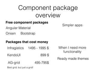
- 3. Component package overview Free component packages Onsen Angular Material Bootstrap Simpler apps Packages that cost money Infragistics KendoUI AG-grid When I need more functionality Ready made themes 1495 - 1995 $ 899 $ 495-795$ Best grid, but just a grid!
- 4. Component groups Buttons Charts DropDowns Grid Layout Popup DateInputs Inputs Ripple Sortable Upload Data query Drawing Excel export PDF Export
- 5. What we want from a component frameworks Input controls, date, numbers etc.. Themes Graphs Exports like Excel, PDFs Custom drawing? Maps
- 6. How to work with Kendo UI - workflow Install a theme Install the npm library you need Import the correct component modules Use the components you need
- 7. Theme npm install --save @progress/kendo-theme-defaultDefault npm install --save @progress/kendo-theme-bootstrapBootstrap npm install --save @progress/kendo-theme-materialMaterial
- 8. Theme - set up • As a link tag • Component level • Scss • Angular-cli.json , styles <link rel="stylesheet" href="/node_modules/@progress/kendo-theme-default/dist/all.css" /> styleUrls: [ ‘../../node_modules/@progress/kendo-theme-default/dist/all.css' ] ViewEncapsulation.None @import "~@progress/kendo-theme-default/scss/all"; "styles": [ "styles.css", "../node_modules/@progress/kendo-theme-default/dist/all.css" ]
- 11. Buttons Button, a normal button ButtonGroup, buttons belonging to same context perform action show selection carry out action SplitButton DropDownButton, popup list with action items carry out action
- 12. Install & Usage Buttons npm install --save @progress/kendo-angular-buttons @progress/kendo-angular-l10n @angular/animations @NgModule({ imports : [ ButtonsModule ] }) export class SomeModule {} import { ButtonsModule } from '@progress/kendo-angular-buttons'; All buttons @NgModule({ imports : [ ButtonModule ] }) export class SomeModule {} import { ButtonModule } from '@progress/kendo-angular-button'; Specific button
- 13. Buttons Display buttons @Component({ selector: 'buttons-example', template: ` <div> <button kendoButton [icon]="'refresh'">Default button</button> // Image icon <button kendoButton [imageUrl]="'https://demos.telerik.com/kendo-ui/content/shared/icons/sports/ snowboarding.png'">Snowboarding</button> // FontAwsome icon <link rel="stylesheet" href="https://maxcdn.bootstrapcdn.com/font-awesome/4.5.0/css/font-awesome.min.css" <button kendoButton [iconClass]="'fa fa-key fa-fw'">Button</button> </div> ` }) export class ButtonsExampleComponent implements OnInit { constructor() { } ngOnInit() { } } Built in Kendo icons Point out url Point out CSS class, ex font-awesome
- 14. Buttons with Ripple effect, i.e Material Look and Feel import { RippleModule } from '@progress/kendo-angular-ripple'; @NgModule({ imports: [ RippleModule ] }) export class AppModule { } npm install @progress/kendo-angular-ripple <div kendoRippleContainer> <link rel="stylesheet" href="https://maxcdn.bootstrapcdn.com/font-awesome/4.5.0/css/font-awesome.min.css"> <button kendoButton [iconClass]="'fa fa-key fa-fw'">Button</button> </div>
- 15. Charts Sparkline Small chart without axis, legends, coordinates, titles etc.. Line, Bar, Column, Area, Pie, Bullet StockChart Made especially for visualising price movement of any financial instrument over time Chart, so many types supported Area, Bar, Box Plot, Bubble, Bullet, Donut, Funnel, Line, Pie, Polar, Radar, RangeArea, RangeBar, Scatter, Waterfall
- 16. Install & usage npm install --save @progress/kendo-angular-charts @progress/kendo-angular-intl @progress/kendo-angular-l10n @progress/kendo-drawing hammerjs @angular/animations npm packages needed @NgModule({ imports : [ ChartsModule ] }) export class SomeModule {} import { ChartsModule } from '@progress/kendo-angular-charts'; All charts @NgModule({ imports : [ ChartModule ] }) export class SomeModule {} import { ChartModule } from '@progress/kendo-angular-charts'; Specific chart Charts
- 17. Display a chart Charts @Component({ selector: 'my-app', template: ` <kendo-chart [resizeRateLimit]="2"> <kendo-chart-series> <kendo-chart-series-item [data]="seriesData"> </kendo-chart-series-item> </kendo-chart-series> </kendo-chart> ` }) export class AppComponent { seriesData: number[] = [1, 2, 3, 5]; } Responsive
- 18. Handle events Charts export class AppComponent { private seriesData: number[] = [1, 2, 3, 5]; private onSeriesClick(e): void { console.log(e.value); } } @Component({ selector: 'my-app', template: ` <kendo-chart [resizeRateLimit]=“2" onSeriesClick($event)> <kendo-chart-series> <kendo-chart-series-item [data]="seriesData"> </kendo-chart-series-item> </kendo-chart-series> </kendo-chart> ` }) Clicking on this column returns a 2
- 19. Dropdowns MultiSelect ComboBox with suggest, like the above Can type the option + select from list DropdownList Can only select from list AutoComplete type and narrow down options
- 20. Dropdowns Install & usage npm install --save @progress/kendo-angular-dropdowns @progress/kendo-angular-l10n @angular/animations import { DropDownsModule } from '@progress/kendo-angular-dropdowns'; @NgModule({ imports: [DropDownsModule] }) export class AppModule { } All dropdown import { AutoCompleteModule } from '@progress/kendo-angular-dropdowns'; @NgModule({ imports: [AutoCompleteModule] }) export class AppModule { } Specific dropdown
- 21. Dropdowns import { Component } from '@angular/core'; @Component({ selector: 'dropdown-example', template: ` <kendo-autocomplete [data]="data" [filterable]="true" (valueChange)="valueChange($event)" (filterChange)="filterChange($event)" (open)="open()" (close)="close()" (focus)="focus()" (blur)="blur()" > </kendo-autocomplete> ` }) export class DropdownExampleComponent { public events: string[] = []; public source: Array<string> = ["Luke", "Vader", "Palpatine", "Yoda", "Dokuu"]; public data: Array<string> = this.source; public filterChange(filter: any): void { console.log("filterChange", filter); this.data = this.source.filter((s) => s.toLowerCase().indexOf(filter.toLowerCase()) !== -1); } } Assign data property with your list Filter, as user types
- 22. Grid Data binding Filtering Grouping Paging Sorting
- 23. Install & usage Grid import { GridModule } from '@progress/kendo-angular-grid'; @NgModule({ imports: [BrowserModule, BrowserAnimationsModule, GridModule] }) export class AppModule { } npm install --save @progress/kendo-angular-grid @progress/kendo-angular-dropdowns @progress/kendo-angular-inputs @progress/kendo-angular-dateinputs @progress/kendo-data-query @progress/kendo-angular-intl @progress/kendo-angular-l10n @progress/kendo-drawing @progress/kendo-angular-excel-export @angular/animations Quite a few dependencies!
- 24. Display a Grid Grid import { Component } from '@angular/core'; import { customers } from './customers'; @Component({ selector: 'grid-example', template: ` <kendo-grid [kendoGridBinding]="gridData" [pageSize]="10" [pageable]="true" [sortable]="true" [filterable]="true" [groupable]="true" [height]="510"> <kendo-grid-column field="CompanyName" [width]="140"></kendo-grid-column> <kendo-grid-column field="ContactName" [width]="120"></kendo-grid-column> <kendo-grid-column field="City" [width]="100"></kendo-grid-column> <kendo-grid-column field="ContactTitle" [width]="130"></kendo-grid-column> </kendo-grid> ` }) export class GridExampleComponent { gridData: any[] = customers; }
- 25. Layout TabStrip Provides an easier way to navigate PanelBar
- 26. Install & usage Layout npm install --save @progress/kendo-angular-layout @progress/kendo-angular-l10n @angular/animations import { LayoutModule } from '@progress/kendo-angular-layout'; @NgModule({ imports: [LayoutModule] }) export class AppModule { } All layout import { PanelBarModule } from '@progress/kendo-angular-layout'; @NgModule({ imports: [PanelBarModule] }) export class AppModule {} Specific layout
- 27. Layout @Component({ selector: 'layout-example', styles: [` .custom-template { padding: 30px; text-align: center; } `], template: ` <kendo-panelbar [items]="items" (stateChange)="onPanelChange($event)"> <ng-template kendoPanelBarItemTemplate let-dataItem> <div [class]="'custom-template'"> <h4>Custom template: </h4> <p>{{dataItem.content}}</p> </div> </ng-template> </kendo-panelbar>` }) export class LayoutExampleComponent { private items: Array<PanelBarItemModel> = [ <PanelBarItemModel>{ title: "First item", content: "Item content", expanded: true }, <PanelBarItemModel>{ title: "Second item", children: [ <PanelBarItemModel>{ title: "Child item", content: "More content" } ] } ]; public onPanelChange(event: any) { console.log("stateChange: ", event); } Nested Title, Content, Expanded, Children
- 28. Popup positions a piece of content next to a specific anchor component !-== modal
- 29. Install & usage Popup npm install --save @progress/kendo-angular-popup @angular/animations import { PopupModule } from '@progress/kendo-angular-popup'; @NgModule({ imports: [PopupModule] }) export class AppModule { }
- 30. @Component({ selector: 'popup-example', template: ` <button #anchor (click)="onToggle()" class="k-button">{{toggleText}} Popup</button> <kendo-popup [animate]="false" [anchor]="anchor" [popupClass]="'content popup'" *ngIf="show"> Popup content. </kendo-popup> `, styles: [` .content { padding: 30px; color: #787878; background-color: #fcf7f8; border: 1px solid rgba(0,0,0,.05); } `] }) export class PopupExampleComponent { private toggleText: string = "Show"; private show: boolean = false; public onToggle(): void { this.show = !this.show; this.toggleText = this.show ? "Hide" : "Show"; } } Popup with component offset Anchor next to an element
- 31. Popup with absolute offset @Component({ selector: 'popup-example', template: ` <kendo-popup [popupClass]="'content'" [offset]="offset"> Popup content. </kendo-popup> `, styles: [` .content { padding: 30px; color: #787878; background-color: #fcf7f8; border: 1px solid rgba(0,0,0,.05); } .test { margin-top: 50px; min-height: 200px; border: solid 2px gray; } `] }) export class PopupExampleComponent { public offset: offset = { left: 100, top: 100 }; } Absolute offset
- 32. Popup service import { PopupService, PopupRef } from '@progress/kendo-angular-popup'; @Component({ selector: 'popup-example', template: ` <ng-template #template> <p style="margin: 30px;">Popup content through service!</p> </ng-template> <div class="example-wrapper"> <button (click)="togglePopup(template)" class="k-button">Toggle with service</button> </div>`, }) export class PopupExampleComponent { private popupRef: PopupRef; constructor(private popupService: PopupService) { } public togglePopup(template: TemplateRef<any>) { if (this.popupRef) { this.popupRef.close(); this.popupRef = null; } else { this.popupRef = this.popupService.open({ content: template, offset: { top: 100, left: 100 } }); } Define a template set template and options in code
- 33. Dialog The Dialog communicates specific information and prompts users to take specific actions by interacting with a modal dialog
- 34. Install & usage Dialog npm install --save @progress/kendo-angular-dialog @progress/kendo-angular-l10n @angular/animations import { DialogModule } from '@progress/kendo-angular-dialog'; @NgModule({ imports: [DialogModule] }) export class AppModule { }
- 35. Display dialog Dialog import { Component, OnInit } from '@angular/core'; @Component({ selector: 'dialog-example', template: ` <kendo-dialog title="Awesome title goes here"> </kendo-dialog> ` }) export class DialogExampleComponent implements OnInit { constructor() { } ngOnInit() { } }
- 36. Dialog rich content import { Component, OnInit } from '@angular/core'; @Component({ selector: 'dialog-example', template: ` <kendo-dialog> <div style="text-align: center; margin: 30px;"> <h4>Enter your e-mail below to unlock.</h4> <p> <input class="k-textbox" placeholder="Your e-mail here" style="width: 300px;" /> </p> <p> <button kendoButton primary="true" style="width: 300px;">GET MY $10 OFF</button> </p> <a href="#">No thanks!</a> </div> </kendo-dialog> ` }) export class DialogExampleComponent implements OnInit { constructor() { } ngOnInit() { } } Richer content, no title
- 37. Dialog with actions import { Component, OnInit } from '@angular/core'; @Component({ selector: 'dialog-example', template: ` <kendo-dialog> <kendo-dialog-titlebar> <div style="font-size: 18px; line-height: 1.3em;"> <span class="k-icon k-i-warning"></span> Delete Data </div> </kendo-dialog-titlebar> <p style="margin: 30px; text-align: center;">This action cannot be undone.</p> <kendo-dialog-actions> <button kendoButton (click)="onDialogClose()">Cancel</button> <button kendoButton (click)="onDeleteData()" primary="true">Delete</button> </kendo-dialog-actions> </kendo-dialog>` }) export class DialogExampleComponent implements OnInit { constructor() { } ngOnInit() { } onDialogClose() { alert("No data deleted."); } onDeleteData() { alert("Data deleted."); } specify actions with kendo-dialog-actions
- 39. Install & usage Date inputs npm install --save @progress/kendo-angular-dateinputs @progress/kendo-angular-intl @progress/kendo-angular-l10n @angular/animations import { DateInputsModule } from '@progress/kendo-angular-dateinputs'; @NgModule({ bootstrap: [AppComponent], imports: [DateInputsModule] }) export class AppModule {} All DateInputs import { CalendarModule } from '@progress/kendo-angular-dateinputs'; @NgModule({ bootstrap: [AppComponent], imports: [CalendarModule] }) export class AppModule {} Specific DateInput
- 40. Display date inputs Date inputs import { Component, OnInit } from '@angular/core'; @Component({ selector: 'date-input-example', template: ` <kendo-calendar [disabled]="true"></kendo-calendar> ` }) export class DateInputsExampleComponent implements OnInit { constructor() { } ngOnInit() { } } Possible to set in disabled state
- 41. Date inputs import { Component, OnInit } from '@angular/core'; @Component({ selector: 'date-input-example', template: ` <kendo-calendar [disabled]="true"></kendo-calendar> <kendo-calendar [focusedDate]="focusedDate" ></kendo-calendar> <kendo-calendar [value]="value"></kendo-calendar> ` }) export class DateInputsExampleComponent implements OnInit { public focusedDate: Date = new Date(2017, 11, 10); public value: Date = new Date(2017, 11, 10); constructor() { } ngOnInit() { } } Open calendar in the right week Select a specific day
- 43. Install & usage Inputs npm install --save @progress/kendo-angular-inputs @progress/kendo-angular-intl @progress/kendo-angular-l10n @angular/animations import { InputsModule } from '@progress/kendo-angular-inputs'; @NgModule({ imports: [InputsModule] }) export class AppModule { } All Inputs import { MaskedTextBoxModule } from '@progress/kendo-angular-inputs'; import { NumericTextBoxModule } from '@progress/kendo-angular-inputs'; @NgModule({ imports: [ MaskedTextBoxModule, NumericTextBoxModule ] }) export class AppModule { Specific Input
- 44. Inputs import { Component } from "@angular/core"; @Component({ selector: 'input-example', template: ` <div class="example-config"> <input id="ac" type="checkbox" [(ngModel)]="includeLiterals"> <label for="ac">Include literals in the value</label> </div> <div class="example-wrapper"> <kendo-maskedtextbox [includeLiterals]="includeLiterals" [(value)]="value" [mask]="mask"> </kendo-maskedtextbox> Component value: {{value}} </div> ` }) export class InputExampleComponent { public includeLiterals: boolean = false; public value: string = "5748157000194334"; public mask: string = "0000-0000-0000-0000"; } mask dictates form and length
- 45. @Component({ selector: 'my-app', template: ` <div class="example-config"> <p>{{ mask }}</p> <ul> <li>Y - cyrillic only</li> <li>L - latin only</li> </ul> </div> <kendo-maskedtextbox [value]="value" [mask]="mask" [rules]="rules"> </kendo-maskedtextbox> ` }) class AppComponent { public value: string = "абвг abcd"; public mask: string = "YYYY LLLL"; public rules: { [key: string]: RegExp } = { "L": /[a-zA-Z]/, "Y": /[u0400-u0481u048A-u04FF]/ }; } Inputs Mask with RegEx rules
- 46. Sortable drag-and-drop functionality to elements within a list
- 47. Install & usage Sortable npm install --save @progress/kendo-angular-sortable @progress/kendo-angular-l10n @angular/animations import { SortableModule } from '@progress/kendo-angular-sortable'; @NgModule({ bootstrap: [AppComponent], declarations: [AppComponent], imports: [SortableModule] }) export class AppModule { }
- 48. Sortable import { Component, ViewEncapsulation } from '@angular/core'; @Component({ selector: 'sortable-example', template: ` <div class="example-config"> <h5>Items: {{items | json}}</h5> <h5>Disabled items: {{disabledIndexes}}</h5> </div> <div class="container-fluid"> <kendo-sortable [data]="items" [navigatable]="true" [animation]="true" [disabledIndexes]="disabledIndexes" class="row" itemClass="item col-xs-6 col-sm-3" activeItemClass="item col-xs-6 col-sm-3 active" disabledItemClass="item col-xs-6 col-sm-3 disabled"> > </kendo-sortable> </div> `, encapsulation: ViewEncapsulation.None }) export class SortableExampleComponent { public disabledIndexes: number[] = [0, 2, 5, 7]; public items: string[] = []; constructor() { Won’t be drag n drop targets
- 49. Upload The Upload helps users send files from their file systems to dedicated server handlers which are configured to receive them.
- 50. Install & usage Upload npm install --save @progress/kendo-angular-upload @progress/kendo-angular-l10n @angular/animations import { UploadModule } from ‘@progress/kendo-angular-upload'; import { HttpClientModule } from ‘@angular/common/http’; @NgModule({ imports: [HttpClientModule, UploadModule] }) export class AppModule { }
- 51. Upload import { Component, ViewChild, ElementRef } from '@angular/core'; import { FileRestrictions, SelectEvent, ClearEvent, RemoveEvent, FileInfo } from '@progress/kendo-angular- upload'; @Component({ selector: 'upload-example', template: ` <kendo-upload [autoUpload]="false" [saveUrl]="uploadSaveUrl" [removeUrl]="uploadRemoveUrl" [restrictions]="uploadRestrictions" (select)="selectEventHandler($event)" (clear)="clearEventHandler($event)" (remove)="removeEventHandler($event)" (complete)="completeEventHandler($event)"> </kendo-upload> <event-log title="Event log" [events]="events"></event-log> <div *ngIf="imagePreviews.length" class="img-preview example-config"> <h3>Preview selected images</h3> <img *ngFor="let image of imagePreviews" [src]="image.src" alt="image preview" style="width: 200px; margin: 10px;" /> </div> ` POST with this url Press upload button Select file and get preview
- 52. Data query Sorting, filtering, grouping, aggregate data operations
- 53. Install & usage Data query npm install --save @progress/kendo-data-query import { filterBy } from '@progress/kendo-data-query'; const data = [ { name: "Pork", category: "Food", subcategory: "Meat" }, { name: "Pepper", category: "Food", subcategory: "Vegetables" }, { name: "Beef", category: "Food", subcategory: "Meat" } ]; const result = filterBy(data, { logic: 'and', filters: [ { field: "name", operator: "startswith", value: "p", ignoreCase: true }, { field: "subcategory", operator: "eq", value: "Meat" }, ] }); console.log(JSON.stringify(result, null, 2)); /* output [ { "name": "Pork", "category": "Food", "subcategory": "Meat" } ] light weight impl of common functions
- 54. Kendo drawing Offers a simple object model for building and manipulating visual scenes. The scenes can be rendered as SVG and PDF documents, Canvas elements, and PNG images Our own graphics lib, lots of Kendo components use this one under the hood
- 55. Install & usage Kendo drawing npm install --save @progress/kendo-drawing
- 56. Kendo drawing import { drawScene } from './draw-scene'; @Component({ selector: 'my-app', template: ` <div #surface></div> ` }) export class AppComponent implements AfterViewInit, OnDestroy { @ViewChild('surface') private surfaceElement: ElementRef; private surface: Surface; public ngAfterViewInit(): void { drawScene(this.createSurface()); } public ngOnDestroy() { this.surface.destroy(); } private createSurface(): Surface { // Obtain a reference to the native DOM element of the wrapper const element = this.surfaceElement.nativeElement; // Create a drawing surface this.surface = Surface.create(element); Define a surface element Draw scene
- 57. Kendo drawing export function drawScene(surface: Surface) { // This rectangle defines the image position and size const imageRect = new Rect( new Point(5, 5), new Size(50, 50) ); // Create the image const imageUrl = `http://www.telerik.com/kendo-angular-ui/components/drawing/images/diego.jpg`; const image = new Image(imageUrl, imageRect); // Create the text const text = new Text( "Diego Roel", new Point(60, 25), { font: "bold 15px Arial" } ); // Place all the shapes in a group const group = new Group(); group.append(image, text); // Translate the group group.transform( transform().translate(50, 50) ); // Render the group on the surface surface.draw(group); Draw image Draw text Move to position Create group and append objects to it Draw the group on the surface
- 58. Summary Consider if in a time crunch with a project Has three themes + you can create your own Supports everything from UI components to Data Query and exports like Excel + PDF Even helps with posting, deleting files against a backend Even helps with posting, deleting files against a backend There is more like internationalization, ton of more controls, GO EXPLORE