SlideShare a Scribd company logo
5
Most read
16
Most read
20
Most read
Designing Magazines: Part 2
Magazine Design
Part 2: Designing Interiors


             When designing a magazine interior, the goal
             is to present information in a way that is both
             visually compelling and well organized.

             Legibility is the most important component.
Magazine Design
Using the Grid System


          The grid system is used in graphic design as a
          way to organizing content on a page.

          Grids are used in newspaper and magazine
          layouts. They organize information into rows
          and columns of text, images, margins, etc.

          These guidelines define the basic elements
          such as the headlines, text and photos, but also
          the space between these elements.
Magazine Design
  Why Use a Grid?


         The advantage to working with this system is
         that it simplifies the design process by providing
         the basic structure for each page.

         The designer can easily place text and images
         into a multi-page document without redesigning
         every new page.
Magazine Design
  Why Use a Grid?


          A designer can use a single grid, or several
          different ones throughout a publication to
          develop a consistent, unified look.

          A well-developed grid system allows for
          interesting variations while the overall
          layout remains unified.
Magazine Design
  Why Use a Grid?


          Grids are invisible on the final, printed piece,
          but during the layout process a designer
          uses the rulers and guidelines in layout
          software to place the page elements.

          When choosing the type of grid to use, it is
          important to know what your visual elements
          are and how they will go onto the page.
Magazine Design
  Types of Grids


        Many types of grids can be used in a design.
        Different types of grids can be used on design
        projects, depending on how text or image heavy
        a piece will be.

        A few commonly used grids are two, three and
        four columns with a top header.

        Another way to create a grid is to divide the
        page vertically and horizontally into squares
        and use these to position the elements on your
        page.
Magazine Design
                                     Types of Grids


                                             Layouts using a lot of text and few or no
                                             graphics might employ a simple system
                                             using just one, two or three columns.


Image source: http://dmweb.free.fr
Magazine Design
                                           Types of Grids


                                                 Magazines, which often combine a number of
                                                 images with text, can benefit from a grid
                                                 comprised of rows and columns of squares.


Image source: http://www.tasveerarts.com
Magazine Design
The Rule of Thirds and Golden Mean


                A simple grid can be applied by simply dividing
                a page into three sections vertically and three
                sections horizontally.

                This uses the Rule of Thirds to create a layout
                with balanced proportions.
Magazine Design
The Rule of Thirds and Golden Mean


                Golden Mean: visually harmonious proportions
                that also work well as the basis for grids.

                Bsed on proportions calculated by the
                Fibonacci sequence 0, 1, 2, 3, 5, 8, 13, 21, 34,
                etc…

                Rule of thumb: grids using odd numbers are
                more visually interesting than those using even
                numbers.
Magazine Design
                       Beyond the Grid


                                    After developing a grid system
                                    in your design, you can extend
                                    elements out of the grid.

                                    If one of the elements in the layout
                                    is larger than a single grid unit, you
                                    can resize the image to fit into two
                                    or more units across the page.

                                    Text boxes, photographs and
                                    headers can span across columns
                                    or rows and even extend onto the
                                    other page in the spread.

Image source: http://agroove.net
Magazine Design
                                 Important Terms

                                             Margins: These keep the boundary
                                             of the page by setting top and
                                             bottom, left and right guides at a
                                             specific distance from the edges.
                                             Margins prevent information from
                                             accidentally being cut off during
                                             printing by keeping it a safe distance
                                             from the edges of the page.

                                             Alleys: White space between design
                                             elements on a page. Depending on
                                             how you've set up your grid the alleys
                                             may run horizontally, vertically, or
                                             both directions on your page.

Image source: http://www.jalehafshar.com
                                             Gutters: The inside margin between
                                             two pages on a spread.
Magazine Design
        Think Spreads, Not Single Pages


                            Image source: www.finitesite.com


Spreads are two pages of a magazine that open next to one another.

When designing magazine content, it is important to think of spreads instead of
designing single, stand-alone pages. This ensures flow and unity between pages.
Magazine Design
                 Creating Hierarchy


In publication design it is important to establish a strong hierarchy,
organizing the information by size, font and/or color according to
its level and importance.

The visual hierarchy should be well-organized and logical, and
should demonstrate contrast between the different areas of text.
Magazine Design
                                       Creating Hierarchy

                                               Headers: Indicate the name of the article.
                                               These are the largest and most visually
                                               prominent text areas on a page. Headers can
                                               experiment with unusual typographic treatment
                                               and decorative or script fonts if appropriate.

                                               Subheads: Indicate secondary information in
                                               an article. Subheaders often indicate the
                                               transition from one line of thought to another
                                               within a body of text.

                                               Body Text: The main copy is the most dense
                                               and longest section of text, and should be set at
                                               a significantly smaller size than the header or
                                               subhead.

                                               It is important to use a readable font that is
                                               large enough to read without squinting, as well
                                               as proper kerning and leading, for maximum
                                               legibility.
Image source: http://fighterdiet.com
Magazine Design
            Making Information Stand Out


Jump lines: Text that indicates an article is continuing on another page.

Jump lines should contrast from the main text in order to set this information
apart. Techniques include setting this information in italics, bold face or another
color than the article.
Magazine Design
      Making Information Stand Out


End Signs: Bullet points or graphics inserted at the end of an article.
End signs signal the end of a story to readers.
Magazine Design
               Making Information Stand Out


                                   Pull Quotes: quotations or highlights pulled
                                   from the article and set apart, usually at larger
                                   size, different font and color from other text.

                                   Pull quotes emphasize important parts of the
                                   story and create a visually interesting graphic
                                   element.


Image source: www.finitesite.com
Magazine Design
                   Consistency


Certain elements, such as page numbers, should always stay
in the same location on every page.

Text within an article should keep a consistent look, even when the
article continues on another page.

Keep column widths and sidebars consistent.

Keep all type treatments unified throughout the entire publication;
all headers, subheads, body copy, jump lines and end signs
should retain the same appearance throughout the issue.

More Related Content

PDF
InDesign Intro
PDF
Designing Magazines: Part 1
PPTX
Magazine Layout Design
PDF
Newspaper Design key terms
PPTX
Magazine design
PPTX
Publication layout and design.pptx
PPTX
Magazine elements
PPTX
Newspaper designing
InDesign Intro
Designing Magazines: Part 1
Magazine Layout Design
Newspaper Design key terms
Magazine design
Publication layout and design.pptx
Magazine elements
Newspaper designing

What's hot (20)

PPTX
Graphic design for marketing professionals
PDF
Graphic design slideshow
PPTX
Graphic design composition
PDF
Graphic design by Muhammad Mujeeb Riaz
PPTX
Yearbook vocabulary
PDF
عرض مدونة الصحافة و النشر - بيت الصحافة
PPTX
Graphic Design
PPT
Graphic Design For non graphic designers
PDF
A crash course in typography
PDF
Publication design
PPT
Page layout final
PPT
Typography presentation
PPTX
Typography
PDF
WHAT IS GRAPHIC DESIGN? (Intro to GD, Wk 1)
PPT
Sub editing and page designing
PPT
Principles Of Design 1
PDF
The typography
PPTX
Textual elements
PPTX
Composition of movie posters
PPT
An Introduction To Graphic Design
Graphic design for marketing professionals
Graphic design slideshow
Graphic design composition
Graphic design by Muhammad Mujeeb Riaz
Yearbook vocabulary
عرض مدونة الصحافة و النشر - بيت الصحافة
Graphic Design
Graphic Design For non graphic designers
A crash course in typography
Publication design
Page layout final
Typography presentation
Typography
WHAT IS GRAPHIC DESIGN? (Intro to GD, Wk 1)
Sub editing and page designing
Principles Of Design 1
The typography
Textual elements
Composition of movie posters
An Introduction To Graphic Design
Ad

Viewers also liked (20)

PPT
Magazine Layout and Colour Scheme
PDF
10 easy ways to better design your magazine. Tips & tricks, tutorials and ins...
PDF
Magazine Design Troubleshooting
PPTX
PR8 Magazine Layout and Page Design
PPTX
Magazine layout ideas
PPTX
Page layout and design
PDF
Print In Motion
PDF
Magazine Design System
PDF
Magazine Cover Design
PDF
Letterhead Business Cards: Designing Corporate Identity Collateral
PDF
The Principles of Good Design
PPTX
Digital Photography Basics
PDF
What is Graphic Design?
PDF
Creating Effective Logos
PPTX
Layout or Makeup Journalism
PDF
Website Design Basics
PDF
Infographics
PDF
Typography Essentials: Part 2
PDF
Typography Essentials: Part 1
PDF
Color Psychology
Magazine Layout and Colour Scheme
10 easy ways to better design your magazine. Tips & tricks, tutorials and ins...
Magazine Design Troubleshooting
PR8 Magazine Layout and Page Design
Magazine layout ideas
Page layout and design
Print In Motion
Magazine Design System
Magazine Cover Design
Letterhead Business Cards: Designing Corporate Identity Collateral
The Principles of Good Design
Digital Photography Basics
What is Graphic Design?
Creating Effective Logos
Layout or Makeup Journalism
Website Design Basics
Infographics
Typography Essentials: Part 2
Typography Essentials: Part 1
Color Psychology
Ad

Similar to Designing Magazines: Part 2 (20)

PPTX
Typography and grids
PPTX
PPT
Printed Graphics Design & Production
PPTX
Layout Designnnnnnnnnnnnnnnnnnnnnnn.pptx
PPTX
UNIT II ORGANIZING INFORMATION-20CDE09-INFORMATION DESIGN
DOCX
Marketing· Product or Service · If product Product, Price, P.docx
PPTX
IVC - Lesson 14
DOC
Mix mag double page spread analysis
PDF
Welcome to International Journal of Engineering Research and Development (IJERD)
PDF
Academic report design
PPT
PPTX
Double page spreads
PPTX
121 190810 The Fundamentals of Creative Design 01-03 by Gavin Ambrose/Paul Haris
PDF
A presentation in my first year "The Grid"
KEY
Grids In Modern Web Design
PPTX
Page Layout
PPTX
Why design matters for newspapers?
PPTX
PPTX
Magazinelayout
PPTX
Analysis of a contents page main task media
Typography and grids
Printed Graphics Design & Production
Layout Designnnnnnnnnnnnnnnnnnnnnnn.pptx
UNIT II ORGANIZING INFORMATION-20CDE09-INFORMATION DESIGN
Marketing· Product or Service · If product Product, Price, P.docx
IVC - Lesson 14
Mix mag double page spread analysis
Welcome to International Journal of Engineering Research and Development (IJERD)
Academic report design
Double page spreads
121 190810 The Fundamentals of Creative Design 01-03 by Gavin Ambrose/Paul Haris
A presentation in my first year "The Grid"
Grids In Modern Web Design
Page Layout
Why design matters for newspapers?
Magazinelayout
Analysis of a contents page main task media

Recently uploaded (20)

PPTX
YV PROFILE PROJECTS PROFILE PRES. DESIGN
PPTX
DOC-20250430-WA0014._20250714_235747_0000.pptx
PDF
Design Thinking - Module 1 - Introduction To Design Thinking - Dr. Rohan Dasg...
DOCX
The story of the first moon landing.docx
PPTX
BSCS lesson 3.pptxnbbjbb mnbkjbkbbkbbkjb
PPTX
mahatma gandhi bus terminal in india Case Study.pptx
PPTX
Tenders & Contracts Works _ Services Afzal.pptx
PDF
Quality Control Management for RMG, Level- 4, Certificate
PPTX
building Planning Overview for step wise design.pptx
PPTX
artificialintelligencedata driven analytics23.pptx
PPTX
Implications Existing phase plan and its feasibility.pptx
PPTX
Wisp Textiles: Where Comfort Meets Everyday Style
PDF
The Advantages of Working With a Design-Build Studio
PPTX
6- Architecture design complete (1).pptx
PPTX
Complete Guide to Microsoft PowerPoint 2019 – Features, Tools, and Tips"
PDF
Emailing DDDX-MBCaEiB.pdf DDD_Europe_2022_Intro_to_Context_Mapping_pdf-165590...
PPT
EGWHermeneuticsffgggggggggggggggggggggggggggggggg.ppt
PDF
SEVA- Fashion designing-Presentation.pdf
PPTX
AC-Unit1.pptx CRYPTOGRAPHIC NNNNFOR ALL
PDF
Interior Structure and Construction A1 NGYANQI
YV PROFILE PROJECTS PROFILE PRES. DESIGN
DOC-20250430-WA0014._20250714_235747_0000.pptx
Design Thinking - Module 1 - Introduction To Design Thinking - Dr. Rohan Dasg...
The story of the first moon landing.docx
BSCS lesson 3.pptxnbbjbb mnbkjbkbbkbbkjb
mahatma gandhi bus terminal in india Case Study.pptx
Tenders & Contracts Works _ Services Afzal.pptx
Quality Control Management for RMG, Level- 4, Certificate
building Planning Overview for step wise design.pptx
artificialintelligencedata driven analytics23.pptx
Implications Existing phase plan and its feasibility.pptx
Wisp Textiles: Where Comfort Meets Everyday Style
The Advantages of Working With a Design-Build Studio
6- Architecture design complete (1).pptx
Complete Guide to Microsoft PowerPoint 2019 – Features, Tools, and Tips"
Emailing DDDX-MBCaEiB.pdf DDD_Europe_2022_Intro_to_Context_Mapping_pdf-165590...
EGWHermeneuticsffgggggggggggggggggggggggggggggggg.ppt
SEVA- Fashion designing-Presentation.pdf
AC-Unit1.pptx CRYPTOGRAPHIC NNNNFOR ALL
Interior Structure and Construction A1 NGYANQI

Designing Magazines: Part 2

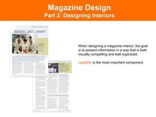
  • 2. Magazine Design Part 2: Designing Interiors When designing a magazine interior, the goal is to present information in a way that is both visually compelling and well organized. Legibility is the most important component.
  • 3. Magazine Design Using the Grid System The grid system is used in graphic design as a way to organizing content on a page. Grids are used in newspaper and magazine layouts. They organize information into rows and columns of text, images, margins, etc. These guidelines define the basic elements such as the headlines, text and photos, but also the space between these elements.
  • 4. Magazine Design Why Use a Grid? The advantage to working with this system is that it simplifies the design process by providing the basic structure for each page. The designer can easily place text and images into a multi-page document without redesigning every new page.
  • 5. Magazine Design Why Use a Grid? A designer can use a single grid, or several different ones throughout a publication to develop a consistent, unified look. A well-developed grid system allows for interesting variations while the overall layout remains unified.
  • 6. Magazine Design Why Use a Grid? Grids are invisible on the final, printed piece, but during the layout process a designer uses the rulers and guidelines in layout software to place the page elements. When choosing the type of grid to use, it is important to know what your visual elements are and how they will go onto the page.
  • 7. Magazine Design Types of Grids Many types of grids can be used in a design. Different types of grids can be used on design projects, depending on how text or image heavy a piece will be. A few commonly used grids are two, three and four columns with a top header. Another way to create a grid is to divide the page vertically and horizontally into squares and use these to position the elements on your page.
  • 8. Magazine Design Types of Grids Layouts using a lot of text and few or no graphics might employ a simple system using just one, two or three columns. Image source: http://dmweb.free.fr
  • 9. Magazine Design Types of Grids Magazines, which often combine a number of images with text, can benefit from a grid comprised of rows and columns of squares. Image source: http://www.tasveerarts.com
  • 10. Magazine Design The Rule of Thirds and Golden Mean A simple grid can be applied by simply dividing a page into three sections vertically and three sections horizontally. This uses the Rule of Thirds to create a layout with balanced proportions.
  • 11. Magazine Design The Rule of Thirds and Golden Mean Golden Mean: visually harmonious proportions that also work well as the basis for grids. Bsed on proportions calculated by the Fibonacci sequence 0, 1, 2, 3, 5, 8, 13, 21, 34, etc… Rule of thumb: grids using odd numbers are more visually interesting than those using even numbers.
  • 12. Magazine Design Beyond the Grid After developing a grid system in your design, you can extend elements out of the grid. If one of the elements in the layout is larger than a single grid unit, you can resize the image to fit into two or more units across the page. Text boxes, photographs and headers can span across columns or rows and even extend onto the other page in the spread. Image source: http://agroove.net
  • 13. Magazine Design Important Terms Margins: These keep the boundary of the page by setting top and bottom, left and right guides at a specific distance from the edges. Margins prevent information from accidentally being cut off during printing by keeping it a safe distance from the edges of the page. Alleys: White space between design elements on a page. Depending on how you've set up your grid the alleys may run horizontally, vertically, or both directions on your page. Image source: http://www.jalehafshar.com Gutters: The inside margin between two pages on a spread.
  • 14. Magazine Design Think Spreads, Not Single Pages Image source: www.finitesite.com Spreads are two pages of a magazine that open next to one another. When designing magazine content, it is important to think of spreads instead of designing single, stand-alone pages. This ensures flow and unity between pages.
  • 15. Magazine Design Creating Hierarchy In publication design it is important to establish a strong hierarchy, organizing the information by size, font and/or color according to its level and importance. The visual hierarchy should be well-organized and logical, and should demonstrate contrast between the different areas of text.
  • 16. Magazine Design Creating Hierarchy Headers: Indicate the name of the article. These are the largest and most visually prominent text areas on a page. Headers can experiment with unusual typographic treatment and decorative or script fonts if appropriate. Subheads: Indicate secondary information in an article. Subheaders often indicate the transition from one line of thought to another within a body of text. Body Text: The main copy is the most dense and longest section of text, and should be set at a significantly smaller size than the header or subhead. It is important to use a readable font that is large enough to read without squinting, as well as proper kerning and leading, for maximum legibility. Image source: http://fighterdiet.com
  • 17. Magazine Design Making Information Stand Out Jump lines: Text that indicates an article is continuing on another page. Jump lines should contrast from the main text in order to set this information apart. Techniques include setting this information in italics, bold face or another color than the article.
  • 18. Magazine Design Making Information Stand Out End Signs: Bullet points or graphics inserted at the end of an article. End signs signal the end of a story to readers.
  • 19. Magazine Design Making Information Stand Out Pull Quotes: quotations or highlights pulled from the article and set apart, usually at larger size, different font and color from other text. Pull quotes emphasize important parts of the story and create a visually interesting graphic element. Image source: www.finitesite.com
  • 20. Magazine Design Consistency Certain elements, such as page numbers, should always stay in the same location on every page. Text within an article should keep a consistent look, even when the article continues on another page. Keep column widths and sidebars consistent. Keep all type treatments unified throughout the entire publication; all headers, subheads, body copy, jump lines and end signs should retain the same appearance throughout the issue.