Mobile experiences
6 likes1,509 views

The document discusses the shift from PCs to smartphones, highlighting the rise of mobile devices and the importance of responsive web design tailored for mobile experiences. It emphasizes the necessity of prioritizing mobile usability and creating separate designs for different devices, advocating for a 'mobile first' approach. Various statistics and examples illustrate the growing trend of mobile device usage in everyday scenarios, urging businesses to adapt to mobile-centric user behaviors.


Mobile experiences
- 1. Jonas Päckos Mobile @pekkos experiences
- 2. This is not the Web Slide Credit: http://www.slideshare.net/bradfrostweb/for-a-futurefriendly-web
- 3. Web This is the Web Web Web Web Web Web Web Web Text Web Web Web Web
- 4. Smart Phones pass PC vs. Smartphone Shipments PC Sales Smartphones passed PC shipments in Q42010 700 Global Shipments in MM SMARTPHONES 600 500 PCS 400 Q42010 2012E 300 200 100 0 2005 2006 2007 2008 2009 2010E 2011E 2012E 2013E Source: http://www.smartonline.com/smarton-products/smarton-mobile/smartphones-pass-pc- Source: http://bit.ly/gIqKm9 Source: http://bit.ly/g5ktGq 10 sales-for-the-first-time-in-history/ Slide Credit: http://www.lukew.com/dmwe.pdf
- 7. the smartphone era begins... original the iPhone 2007 Slide Credit: http://www.slideshare.net/yiibu/adaptation-why-responsive-design-actually-begins-on-the-server
- 8. brings touch, gestures and the real web... web touch iPhone 3G iPhone 2007 2008 Slide Credit: http://www.slideshare.net/yiibu/adaptation-why-responsive-design-actually-begins-on-the-server
- 9. native apps and the rise of Android... android apps iPhone 3GS iPhone 3G 2007 2008 2009 Slide Credit: http://www.slideshare.net/yiibu/adaptation-why-responsive-design-actually-begins-on-the-server
- 10. whither feature phones, and the further rise of Android... htc g-five samsung web os iPhone 4 iPhone 3G 3GS 2007 2008 2009 2010 Slide Credit: http://www.slideshare.net/yiibu/adaptation-why-responsive-design-actually-begins-on-the-server
- 11. blackberry kindle devices go mainstream nook with great expectations... htc LG samsung motorola iPhone 5... 3G 3GS 4 2008 2009 2010 2011 Slide Credit: http://www.slideshare.net/yiibu/adaptation-why-responsive-design-actually-begins-on-the-server
- 12. the bleeding edge... + 'ish via China opportunity Slide Credit: http://www.slideshare.net/yiibu/adaptation-why-responsive-design-actually-begins-on-the-server
- 13. On the go Limited bandwidth One-thumbed and one-eyed Photo Credit: http://www.flickr.com/photos/junglearctic/5978794556/
- 14. 84% at home 80% during miscellaneous times during the day 74% waiting in lines 64% at work Source: http://blog.compete.com/2010/03/12/smartphone-owners-a-ready-and-willing-audience/ Photo Credit: http://www.flickr.com/photos/laughingsquid/3033724807/
- 15. mobile is also used to time-shift 59% 59% ...and%follow%up% ...and follow up sometimes visit sometimes a website on on%a%PC on the PC visit a site their mobile on mobile phone Time Shift Source: Yahoo Source: http://advertising.yahoo.com/article/the-role-of-mobile-devices-in-shopping-process.html
- 16. ...and 34% 34% follow up and follow-up visit a a web site visit site on on a on mobile the PC a PC on mobile phone Time Shift Source: Yahoo Source: http://advertising.yahoo.com/article/the-role-of-mobile-devices-in-shopping-process.html
- 17. 67% 23% 16% 9% Source: http://www.gstatic.com/ads/research/en/2011_TheMobileMovement.pdf
- 18. Twitter 55% Facebook 33% http://www.slideshare.net/HanWang3/69309864-kpcbinternettrends2011 Photo Credit: http://www.flickr.com/photos/mika/4198063912/
- 19. 10% of visitors on mobile devices
- 20. steep increase since last year
- 21. Are we offering anything mobile yet?
- 23. Location Based Services Photo Credit: http://blog.affiliatewindow.com/wp-content/uploads/2011/11/M-Commerce-The-Complete-Picture2.pdf
- 24. Quick Response Code Photo Credit: http://www.flickr.com/photos/waynesutton/5094463490/
- 27. Near Field Communication Photo Credit: http://www.flickr.com/photos/georgo10/3286708793/
- 29. App or Web?
- 30. App • Access address book, SMS, camera, audio input and other sensors • Location detection, Device orientation • Run processes in background • Monetize on app stores and in- app purchases
- 31. Web • Location detection, Device orientation • Harder to get on users home screen • Web don’t require users to download updates
- 33. Native apps increase web use on mobile devices
- 34. Links don’t open apps, they go to web pages
- 35. App or Web?
- 36. App or Web?
- 37. App and Web!
- 39. Hybrid App Downloaded from app store Stored on device Launched like an app
- 40. Hybrid App Same capabilities as native apps (almost) Indistinguishable from a native app
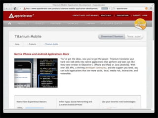
- 41. Hybrid App HTML, CSS, Javascript frameworks jQuery Mobile Sencha Touch Titanium Appcelerator Phone Gap
- 44. •§
- 49. Hybrid App Reuse code between different platforms Load pages from your website, or implement the entire UI in HTML
- 50. Web App Web apps are similiar to mobile web sites, but is tailor- made for the mobile platform Mobile-device-centric interfaces with bigger hit areas, optimised for touch
- 57. ‘‘ Desktop computers and mobile devices are so different that the only way to offer a great user experience is to create two separate designs — typically with fewer features for mobile. — Jakob Nielsen http://www.useit.com/alertbox/mobile-redesign.html
- 61. ‘‘ Desktop computers and mobile devices are so different that the only way to offer a great user experience is to create two separate designs — typically with fewer features for mobile. — Jakob Nielsen http://www.useit.com/alertbox/mobile-redesign.html
- 62. Device
- 63. 84% at home 80% during miscellaneous times during the day 74% waiting in lines 64% at work Source: http://blog.compete.com/2010/03/12/smartphone-owners-a-ready-and-willing-audience/ Photo Credit: http://www.flickr.com/photos/laughingsquid/3033724807/
- 64. Context
- 69. i love it! nice and clean look, easy to navigate and easy to read. well done! but... can you put a bit more news on there? http://www.guardian.co.uk/help/insideguardian/2010/nov/04/new-guardian-mobile-website
- 70. i love it! nice and clean look, easy to navigate and easy to read. well done! but... can you put a bit more news on there? ...that "Sorry, this article isn't yet available on the mobile site" message was bloody annoying. Ended up having to install a browser that spoofs the user agent and renders the full desktop site http://www.guardian.co.uk/help/insideguardian/2010/nov/04/new-guardian-mobile-website
- 71. i love it! nice and clean look, easy to navigate and easy to read. well done! but... can you put a bit more news on there? ...that "Sorry, this article isn't yet available on the mobile site" message was bloody annoying. Ended up having to install a browser that spoofs the user agent and renders the full desktop site There should be a text only version of the site for those of us who don't like the busyness of the main site and are never going to watch the videos http://www.guardian.co.uk/help/insideguardian/2010/nov/04/new-guardian-mobile-website
- 72. ...and 34% 34% follow up and follow-up visit a a web site visit site on on a on mobile the PC a PC on mobile phone Time Shift Source: Yahoo Source: http://advertising.yahoo.com/article/the-role-of-mobile-devices-in-shopping-process.html
- 73. People get upset when they can’t access the same information across multiple devices
- 74. People get upset when they can’t access the same information across multiple devices Don’t dumb it down for mobile
- 76. 1024 x 768 320 x 480
- 77. ‘‘ Losing 80% of your screen space forces you to focus. You need to make sure that what stays on the screen is the most important set of features for your customers and your business. There simply isn’t room for any interface debris or content of questionable value. You need to know what matters most. — Luke Wroblewski http://www.lukew.com/ff/entry.asp?1117
- 82. Bullshit Bullshit Bullshit Content
- 83. ‘‘ If you design mobile first, you create agreement on what matters most. You can then apply the same rationale to the desktop/laptop version of the Web site. We agreed that this was the most important set of features and content for our customers and business -why should that change with more screen space? — Luke Wroblewski http://www.lukew.com/ff/entry.asp?1117
- 84. Mobile first
- 85. Explore / Play Lookup / Find Edit / Create Checkin / Status Mobile behaviors Photo Credit: http://www.flickr.com/photos/carbonnyc/5140154965
- 86. Mobile behaviors
- 87. Content over navigation
- 88. Content over navigation
- 89. Content over navigation
- 90. Content over navigation
- 91. Content over navigation
- 92. Content over navigation Dead end!
- 93. Content over navigation
- 94. Content over navigation
- 95. Content over navigation
- 96. Fixed menu
- 100. Do websites need to look exactly the same in every browser? http://dowebsitesneedtolookexactlythesameineverybrowser.com/
- 103. Do websites need to be experienced exactly the same in every browser? http://dowebsitesneedtobeexperiencedexactlythesameineverybrowser.com/
- 106. Do websites need to be experienced exactly the same on every device?
- 107. One Web
- 108. ‘‘ One Web means making, as far as is reasonable, the same information and services available to users irrespective of the device they are using. However, it does not mean that exactly the same information is available in exactly the same representation across all devices. — W3C http://www.w3.org/TR/mobile-bp/#OneWeb
- 110. Fluid grids Photo Credit: http://www.flickr.com/photos/londonannie/4904832807/lightbox/
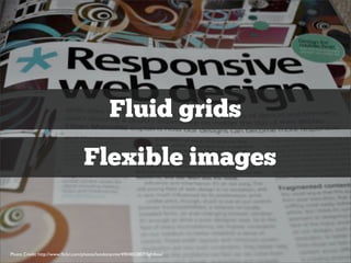
- 111. Fluid grids Flexible images Photo Credit: http://www.flickr.com/photos/londonannie/4904832807/lightbox/
- 112. No, not Browser Sniffing Photo Credit: http://www.flickr.com/photos/timdorr/2096272747/
- 113. Fluid grids Flexible images Media queries Photo Credit: http://www.flickr.com/photos/londonannie/4904832807/lightbox/
- 125. Mobile First Responsive Web Design
- 126. Strategy
- 127. Strategy Structured Content First Mobile Experience First Progressive Enhancement
- 128. Strategy Structured Content First Mobile First Progressive Enhancement
- 129. Strategy Structured Content First Mobile First Progressive Enhancement
- 131. MOBILE WEBSITE WEB MOBILE APPS SOCIAL TABLET MEDIA APPS CONTENT MICROSITES PRINT BLOGS EMAIL INTRANET
- 132. MOBILE WEBSITE WEB MOBILE APPS SOCIAL TABLET MEDIA APPS Properly structured content CONTENT is portable to future platforms MICROSITES PRINT BLOGS EMAIL INTRANET
- 133. Mobile First
- 135. Content is both available to and usable by anyone Photo Credit: http://www.flickr.com/photos/clagnut/315554083
- 136. Solid HTML markup Photo Credit: http://www.flickr.com/photos/clagnut/315554083
- 137. Basic CSS to every browser Photo Credit: http://www.flickr.com/photos/clagnut/315554083
- 138. Advanced CSS to capable browsers and devices Photo Credit: http://www.flickr.com/photos/clagnut/315554083
- 139. Media queries @media screen and (min-device-width: 480px) and (orientation: landscape) { ... }
- 141. Modernizr — testing for capabilities .box { background-color: rgb(127,127,127); } .borderradius .box { border-radius: 6px; }
- 142. Vendor prefixes .box { background-color: rgb(127,127,127); } .borderradius .box { -moz-border-radius: 6px; /* Mozilla */ -webkit-border-radius: 6px; /* Webkit */ -o-border-radius: 6px; /* Opera */ -ms-border-radius: 6px; /* IE */ border-radius: 6px; }
- 144. LESS – LESS CSS code .rounded-corners (@radius: 5px) { -moz-border-radius: @radius; -webkit-border-radius: @radius; -o-border-radius: @radius; -ms-border-radius: @radius; border-radius: @radius; } #header { .rounded-corners; } #footer { .rounded-corners(10px); }
- 145. LESS – generated CSS #header { -moz-border-radius: 5px; -webkit-border-radius: 5px; -o-border-radius: 5px; -ms-border-radius: 5px; border-radius: 5px; } #footer { -moz-border-radius: 10px; -webkit-border-radius: 10px; -o-border-radius: 10px; -ms-border-radius: 10px; border-radius: 10px; }
- 146. Add Javascript unobtrusively to enhance the user experience Photo Credit: http://www.flickr.com/photos/clagnut/315554083
- 154. Does all this sound easy? Photo Credit: http://www.flickr.com/photos/chelsea_nj/4223680604
- 156. Challenges? Mobile First RWD may require a redesign Large technical challenges Javascript libraries are just beginning to evolve Waiting for the ground-breaking redesigns The technique is still young Photo Credit: http://www.flickr.com/photos/chelsea_nj/4223680604
- 157. http://mobilewebbestpractices.com/ http://futurefriend.ly/ Resources
- 158. Thank You. Jonas Päckos Twitter: @pekkos http://about.me/pekkos