Movement overview class tasks 2016
Download as PPTX, PDF2 likes3,370 views

This document provides an overview of lessons for a movement-themed art curriculum. It includes 12 lessons that focus on techniques like figure drawing, portraiture, and experimental mark-making to convey movement. Students will analyze works by artists like Balla, Hume, Bacon, and Hockney. They will complete observational drawings of decaying apples over 8 weeks. The curriculum aims to teach students how to approach artwork in various ways and develop their ability to suggest movement through different materials and techniques.


Movement overview class tasks 2016
- 1. MOVEMENT
- 2. Lesson 1 Crit. of summer work- Students present the work from their Summer Task. L.O: Understand how artwork can be approached in a variety of ways and materials and learn how to come up with their own “next steps”
- 3. Lesson 2/3 • Overlapping figure drawing. Students stand on table for 5 mins each in different sports poses-boxing, tennis, running, javelin etc. The rest of the group draw the figure in 5-10mins in different materials. Overlap each drawing….. • L.O: Learn to draw from life and understand the nature of expressive drawing to reflect the theme of Movement
- 4. LESSON 4/5 A3 Overlapping portraits –profile/ face on /3/4turn in charcoal L.O: Learn how to use charcoal and chalk (tonal blending) to create a blurred image suggesting movement
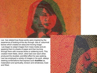
- 5. Lee Gil Woo
- 7. Lee has related how these works were inspired by the experience of looking at the sky through lots of autumnal leaves which created an obscured moving image. Lee began to adapt images from mass media and art, applying them to sheets of paper and then burning through them with incense sticks or soldering irons. This created mesh fields, which, when laid over each other, produced the doubled, pointillist effect he was seeking. Lee has employed a variety of images in his work, always seeking combinations that express such dualities as materialism and spirituality, division and wholeness, East and West.
- 8. HOMEWORK Homework :Research on Anton Bragaglia and Edward Muybridge (2 pages in sketchbook)
- 9. Lesson 6/7: Looking aT colour L.O: learn and understand how colour affects an image Colours affect us in numerous ways, both mentally and physically. A strong red colour has been shown to raise the blood pressure, while a blue colour has a calming effect. Being able to use colours consciously and harmoniously can help you create spectacular results. The Colour Wheel (Make your own colour wheel in your sketchbook) The colour wheel or colour circle is the basic tool for combining colours. The first circular colour diagram was designed by Sir Isaac Newton in 1666. The colour wheel is designed so that virtually any colours you pick from it will look good together. Over the years, many variations of the basic design have been made, but the most common version is a wheel of 12 colours based on the RYB (or artistic) colour model. Traditionally, there are a number of colour combinations that are considered especially pleasing. These are called colour harmonies or colour chords and they consist of two or more colours with a fixed relation in the colour wheel.
- 10. Primary, Secondary and Tertiary Colours In the RYB (or subtractive) colour model, the primary colours are red, yellow and blue. The three secondary colours (green, orange and purple) are created by mixing two primary colours. Another six tertiary colours are created by mixing primary and secondary colours. Warm and cool colours The colour circle can be divided into warm and cool colours. Warm colours are vivid and energetic, and tend to advance in space. Cool colours give an impression of calm, and create a soothing impression. White, black and grey are considered to be neutral. Tints, Shades, and Tones These terms are often used incorrectly, although they describe fairly simple colour concepts. If a colour is made lighter by adding white, the result is called a tint. If black is added, the darker version is called a shade. And if grey is added, the result is a different tone.
- 11. Tints - adding white to a pure hue: Shades - adding black to a pure hue: Tones - adding grey to a pure hue:
- 12. Colour Harmonies - basic techniques for creating colour schemes Below are shown the basic colour chords based on the colour wheel. __________________________________ ______ Complementary colour scheme Colours that are opposite each other on the colour wheel are considered to be complementary colours (example: red and green). The high contrast of complementary colours creates a vibrant look especially when used at full saturation. This colour scheme must be managed well so it is not jarring. Complementary colour schemes are tricky to use in large doses, but work well when you want something to stand out. Complementary colours are really bad for text.
- 13. Analogous colour scheme Analogous colour schemes use colours that are next to each other on the colour wheel. They usually match well and create serene and comfortable designs. Analogous colour schemes are often found in nature and are harmonious and pleasing to the eye. Make sure you have enough contrast when choosing an analogous colour scheme. Choose one colour to dominate, a second to support. The third colour is used (along with black, white or grey) as an accent.
- 14. Colour Theory
- 15. Lesson 4 Work into overlapped drawings with paint/ ink,and finish the background.Photograph and stick in sketchbook. Link to Balla/ Gary Hume L.O: Learn how to refine an image by selecting areas to keep and highlight and adding complementary colour to a background
- 16. Futurism Giacomo Balla “Girl Running on BalconyWhat is this painting technique called? the work does not have a central point of focus
- 17. Dynamism of A Dog on a Leash (1912) Giacomo Balla
- 18. Homework: • Research the work of Balla. Draw a section of “Girl Running on Balcony” Use the analysis question sheet to help you to question and analyse the work • Research Gary Hume and copy one of his Water Paintings
- 19. Gary Hume
- 21. Questions to help you analyse Make sure you cover the following points: A. What is the artwork? What materials have been used to make it? B. What is the title of the artwork? Does this give you any clues as to what the artist is trying to show? C. What is the size of the artwork? Would the size affect how you viewed it? D. When was it made? E. Describe what you can see in the artwork. Does the imagery remind you of anything? F. What is the artist trying to show? Use the formal elements listed below to explain how the artist has achieved this: Line Tone Colour Composition Perspective Pattern Texture G. How have the materials been applied and how does this affect the way you see it? What type of brushstrokes have been used? Does it look like the piece was made quickly and spontaneously or meticulously over a long period of time? Has the artist built up layers? Has the artist included much detail? H. Would you consider the artwork to be representational (realistic) or abstract? Explain why I. What do you consider to be successful or unsuccessful about the artwork and why?
- 22. Other analysis sheet to help:- How to Analyse Artwork Do’s and Don’ts: 1. Do always include the ‘what, how and why’: What is shown in the artwork? How is it made? Why has the artist created it in this way? This will help you to understand the meaning behind the piece and cover each important aspect of your analysis. You must cover all 3. Consider why the artist has given it that title. 2. Do use the appropriate art language. Write about how has the artist uses the formal elements (line, tone, shape, form, colour, composition, perspective, pattern, texture) What effect do these have on what the artist is trying to show? 3. Do include your personal opinions about the artwork. Does it remind you of anything? What do you consider to be successful or unsuccessful about it? Why? 4. Do research relevant information about the artist’s life, ideas, use of materials and techniques. This will help you to learn about the context in which the work was made. Where is the artist from? Was their artwork influenced by what was happening in their personal lives or by the political or social situation at that time? Were they part of an art movement? 5. Do read a range of reviews of their work from the internet, newspapers and magazines to gain a number of different opinions. These will help you to form your own thoughts and develop a balanced understanding. 6. Do explain how this artist’s work links to yours. Is it through the materials and techniques used and/or the idea behind it? 7. Do be concise in your analysis. No waffling 8. Do type up written analysis or hand write very clearly 9. Do not include only biographical information especially when just copied from the internet 10. Do not just be descriptive eg. ‘ Here the artist has used black and white’. WHY? You must comment on the qualities the artist achieves. Eg. Is it to create a dramatic expressive quality? Does it give the artwork a graphic quality? 11. Do not repeat yourself again and again. Comment on different aspects of the artwork and vary your vocabulary 12. Do not waste time researching lots of different artists when you could be doing practical work. On average 2 or 3 relevant artists per project is sufficient. In depth and specific research into fewer artists is better than lots of brief looks at loads. 13. Do not waste time on unnecessary presentation. Keep it simple and easy to read. This time is better spent developing your practical work The process of critical analysis in art involves writing and talking about artworks. You need to look at the artwork in detail and discover what the artist is trying to show and how and why they have used certain materials and techniques to show this. You also need to make connections between their artwork and your own work. This process will give you ideas for your work and help you to build up your knowledge of historical and contemporary art.
- 23. Lesson 8 Experimental Drawing Techniques • Create “Blind” portraits using fine liner pens. • Create Alternative hand drawings (non dominant hand • Create portraits of another student using a pencil attached to a long ruler • Create drawings while keeping your arm completely straight • L.O: Understand how to make drawings in different ways and the value in achieving different mark making
- 24. Lesson 9: Experimental Painting L.O: Understand how to create a portrait using different painting techniques/ mark making to suggest movement. Before the lesson: all students need a portrait photo of themselves to work from Mix up black ready mix paint and Pva glue (50/50) Place a piece of A1/A2 paper on the floor Using the end of your large brush dip in to the paint and hold a metre above the paper. Drip the paint on to the paper and try to draw your portrait (looking a your portrait photo)
- 25. Giacometti’s portraits emerged from an intense scrutiny of his subjects, and a process of continually reworking the image in order to record his shifting visual impressions
- 26. LESSON 10/11 • Using your blind drawings create a 3d version from wire. You must also ensure that it stands up! • L.O: Understand how to create a 3D structure from a 2D image
- 27. LESSON 12/13 Draw your hands in 3 different positions L.O: Understand how to draw from life and apply tonal values using 2B/4B pencils
- 29. Homework (to be completed and checked each week for 8 weeks) Cut open an apple, and store it at home in a lunchbox for 8 weeks. Draw your apple each week as it decays. Use the same materials for each image. Either coloured pencil or watercolour paint L.O: Improve your ability to create observational drawings from life and learn how to study/look at a source in detail and reflect this in your work
- 30. Lesson 14 MonoPrinting Hand out A4 photo of man walking down the stairs (see above) Introduction of Mono-printing. All students mono-print image and stick in sketchbook alongside their Duchamp homework L.O : Understand what a mono-print is and how it can be used in your Art work
- 31. Homework Research and draw “Nude descending a Staircase” –Marcel Duchamp using the analysis sheets
- 32. Lesson 15/16 MOVEMENT AND DISTORTION -Francis Bacon Response Take photos of students with either faces swashed against glass or with sellotape distorting their faces. Print out photos A3 size on cartridge paper. Using impasto technique –with only glue spreaders and acrylic complete painting in Bacon style. L.O : Understand what Impasto is and how to apply this technique using a glue spreader/palette knife.
- 33. HOMEWORK HOMEWORK Francis Bacon/Research See worksheet on Weebly Bring in 2 A4 photos of a celebrity of your choice for next lesson. .
- 34. Lesson 15 Using your 2 images of a celebrity A4 size. Stick one of the images into your sketchbook. Chop the other one into pieces /shapes/squares and put back together as a mixed collage. Stick this in your book. Make a detailed drawing/painting of your new mixed and distorted celebrity collage in your sketchbook. Stick in these images of Jim Shaw’s work into your sketchbook . Find out some information on Jim Shaw –how does he create these pieces and why?. Homework sheet available on Weebly
- 36. Photocollage Homework: David Hockney 1. Create your own photo-collage made up of lots of different photos like Hockney’s here. Your overall image must be out of your sketchbook and be no smaller than A3 in size. Your image must be a portrait like the image on the left. 2. When you have created your photocollage, copy a section of it onto a page in your sketchbook, and paint this section in detail. You can use coloured pencils as an alternative to paint if you like. 3. Cut out and stick in these David Hockney images into your sketchbook. Then put the information on the reverse side of this sheet into your own words. Homework sheet for this task on Weebly
- 38. David Hockney Photo-collage This is called a photocollage rather than a photomontage, because it is more three-dimensional than a montage tends to be. Hockney has always been interested in photography. He first used it as preparation for his painting, but during the 1970s photography gained an independent role in his work. Using 35mm commercially processed colour prints, Hockney created photocollages, which he called “joiners” until the mid 1980s. He compiled them to create a 'complete' picture from a series of individually photographed details. In the 1980s, Hockney primarily experimented with the Polaroid camera, making composite images of photographs arranged in a rectangular grid. His collage technique explores the mysteries and nuances between natural and camera vision. Although, his subject matter ranges from portraiture to still life, his style from representation to abstraction, Hockney uses photography to examine our perception of reality. Family, friends, and collaborators and his own residence, the pool, his dogs, and the California and Arizona landscape are seen in many of his photocollages. Hockney's works have strong links with Cubism. Hockney reflected extensively on this process as connecting to the Cubist sense of multiple angles and especially of movement. These "multiples" convey a strong sense of movement, Hockney argued, in that you the viewer keep adjusting your imagined viewpoint as your eye travels from print to print. And of course by this means you can build up a single image that is many times wider in angle of view than the camera lens. The portrait of his mother here illustrates the technique at close range. We see her at lots of different viewpoints all at once as our eye moves from print to print.
- 40. Lesson 16 Photograph the student photocollages and print each one A4. Mono-print from photo collage (from A4 printout)
- 41. C&C Lesson 17:Cubism Pablo Picasso-Weeping Woman
- 42. Mise en Scene (“Setting in Scene”) Look carefully at the picture and write a paragraph explaining what is going on in the scene from an objective/impartial viewpoint. Imagine you are trying to explain the art work to someone over the telephone Process What has the artist used to make the art work? Consider the materials and media. Has it been presented in a special way I.e. as an installation? Keywords Write down a list of 5-10 keywords in response to this picture: Image Analysis: Writing Frame TITLE: Weeping Woman DATE: 1937 ARTIST: Pablo Picasso Title: How does the title of the work contribute to your understanding of the work? Connections How does this work connect with either the overall theme of the project or your own work? You may be inspired by the artist’s concept, use of media, subject, location, composition etc…
- 43. Source 1 • Pablo Picasso was born on October 25th 1881 in Spain and died on April 8th 1973 . The Weeping Woman series is regarded as a continuation of the tragedy in Guernica. • The model for the painting was Dora Maar, who was working as a professional photographer when Picasso met her in 1936. She was Picasso's mistress from 1936 until 1944 This picture was painted because Picasso responded to the bombing of the Spanish town, Guernica by painting the huge mural Guernica, and for months afterwards he made paintings based on one of the figures in the mural: a weeping woman holding her dead child. • The main feature of the painting is a woman. She is quite obviously distraught as she is grimacing and crying. It is like her face has melted away because she is so sad and it has just left bone there. It is also like the handkerchief she is holding is like broken glass because her world is shattered. The painting is an oil on canvas and is 60 х 49 cm in size. The first thing I notice in the picture is the broken glass and the bone because it is a different colour to the rest of the painting and is all sharp, jagged lines. Picasso has used sharp, jagged lines to exaggerate the woman's grief as in the handkerchief, it looks like broken glass. He has used green and yellow in the picture because they clash and make you feel uncomfortable when you look at it. The painting is not realistic at all because he distorted the model's face to make her look grief-stricken and exaggerated her chin by making it look skeletal and painting it a different colour to the rest of the picture. The mood of the painting is bitter and scared. It makes me feel uncomfortable and awkward because it is a woman weeping and I don't like looking at people crying. The broken glass and bones are strange things to see in a painting but Picasso had his own unique style and it just adds to the grief of the woman
- 44. Source 2 • Picasso returned to the theme of the Weeping Woman, first seen in Guernica clutching the body of her dead child, in a series of drawings, etchings and paintings made in September and October of 1937. These unsettling, emotive works are often read simplistically as mere descriptions of Dora's fiery temperament and the volatile nature of her relationship with Picasso. They are, however, far more complex and explore the fascinating dynamic between the works, the artist and the model. • While the Weeping Women series embodies the essence of Picasso's beloved muse, Dora, it can also be read as a self–portrait revealing the inner torment of a man haunted by horrific images of the massacres taking place in the Spanish Civil War. In the artistic partnership between Dora and Picasso we again see the special empathy between the lovers, where Dora is not simply a model but an impassioned political accomplice committed to conveying a powerful, universal message condemning war. Dora willingly submits her features to be brutally distorted and deconstructed by Picasso who contorts her beauty into a harsh ugliness to arouse raw human emotions of anguish, compassion and despair. • While the Weeping Women vary enormously in colour and technique, the intensity of the expression in her eyes in each painting remains unchanged. In the image the woman’s eyes are staring out of their sockets. Picasso used this in his work as a symbol of awkward pain. In this particularly bold version Picasso has used an unsettling combination of acid greens and vibrant mauves exaggerated by thick black outlines. The startled eyes, rimmed with black eyelashes like Dora's, are popping out of giant boat–like sockets tilted slightly to suggest crying. The triangular nose and sharp, pointed handkerchief express raw grief, while the confined space in which the woman finds herself seems to suggest the stifling claustrophobia of war and an inability to escape
- 45. Source 3 • This is a study of how much pain can be communicated by a human face. It has the features of a specific person, Dora Maar, whom Picasso described as "always weeping". She was in fact his close collaborator in the time of his life when he was most involved with politics. • Let your eyes wander over the sharp surface and you are led by the jagged black lines to the picture's centre, her mouth and chin, where the flesh seems to have been peeled away by corrosive tears to reveal hard white bone. The handkerchief she stuffs in her mouth is like a shard of glass. Her eyes are black apertures. When you are inside this picture you are inside pain; it hits you like a punch in the stomach. • Picasso's insistence that we imagine ourselves into the excoriated face of this woman, into her dark eyes, was part of his response to seeing newspaper photographs of the Luftwaffe's bombing of Guernica on behalf of Franco in the Spanish civil war on April 26, 1937. This painting came at the end of the series of paintings, prints and drawings that Picasso made in protest. It has very personal, Spanish sources. In May 1937 Picasso's mother wrote to him from Barcelona that smoke from the burning city during the fighting made her eyes water. The Mater Dolorosa, the weeping Virgin, is a traditional image in Spanish art, often represented in lurid baroque sculptures with glass tears, like the very solid one that flows towards this woman's right ear. Picasso's father, an artist, made one for the family home. • This painting takes such associations and chews them to pulp. It is about the violence that we feel when we look at it, about translating the rawest human emotion into paint. Its origins lie in the tortured figures of Picasso's Guernica (1937), whose suffering is calculated to convey you beyond the photographs of the bombing to sense momentarily what it was to be there. In Guernica there is a screaming woman holding her dead baby, her tongue a dagger pointing at heaven. The baby's face is a cartoon of death. Picasso followed Guernica with his series of Weeping Woman paintings in which the woman's mourning continues, without end. She cries and cries. In different versions the Weeping Woman's face is crushed to an abject lump, twisted out of recognition.
- 46. Content What do you think are the artist’s intentions? There may be more than one. ‘PEC’ each intention. The artist intended to… He / she did this by… (describe something in the image) He / she wanted us to think / react … What wider social, political or cultural issues is/was the artist addressing? ______ is considering ______ in this piece of work. This is shown by _____ The artist wanted to explore _____ How do the materials and techniques used by the artist support the work and the artist’s intentions? (This could include scale, composition as well as the particular process.) The artist has used ______ in creating this work. This creates a ______ effect. This helps to support the artist’s point about _____ P E C P E C P E C
- 47. HOMEWORK On an A3/A2 piece of mountboard create a self portrait using only cut up sections of colour/texture from magazines Complete 1 page of research in your book on Jonathan Yeo’s collages (include images) or Gabi Trinkaus
- 49. Students take 20 photos of a figure or themselves (direct a friend to take them for you?) . In these photos you must take some:- Close ups of facial features/sections of the body or pose/close ups of hands or sections of clothing. Each photo must be taken from above, the side and below to give an all round impression of he 3D figure. Try to make sure the subject is involved in an activity, like eating, drinking, reading, playing a game etc so the images look natural. You don’t need lots of images of the background but some objects could be included. Stick to mainly the face and body. Bring in the set of 20 images to your next lesson. You do NOT need to make a photo collage with these. Also : Buy and bring into school your canvas for your Final piece: A1 size minimum HOMEWORK
- 50. If your photos were put into a collage they may look like these….
- 52. Every week you will complete a different painting from your photos using a different painting style. Try to choose which images suit a certain painting technique. Look at the textures and shapes in your images to decide.
- 53. Experimental painting techniques (Lessons 18-20) L.O: Understand how to create different mark making effects using different techniques and/ or implements. Understand how and why these different techniques can change your perception of an image-How can these be useful in a painting? What effect can they have on the subject/background/foreground? Blur Choose one photo and try to blur this using brushes/sponges/acrylic/fan brushes.
- 54. Dripping LESSON 19: Choose another photo and experiment with dripping paint. Hold your wood upright. Paint a new section of your painting using thick acrylic. Paint very quickly before paint dries. Drip water down the work and let it run.
- 55. Flat colour • LESSON 19: Choose another section and complete using flat Pop Art painting style. Choose the dominant colour in each area and complete the section using very flat tones.
- 56. Dragging/finger painting • LESSON 20: Choose another section and paint using only fingers/hands and dragging the paint across the board. Mix colours first!
- 57. IMPASTO,SCUMBLING,SGRAFFITO,TRANSLUCENT LAYERING (lesson 21) Demonstration of each technique Write up an explanation of each technique in your books and underneath demonstrate the technique Scumbling: The practice of applying paint on top of another given colour. The aim is to allow some of the underlying paint to show through the final painting Impasto: a technique used in painting, where paint is laid on an area of the surface very thickly, usually thickly enough that the brush or painting-knife strokes are visible. Paint can also be mixed right on the canvas Sgraffito: Made by scratching through a surface to reveal a lower layer of a contrasting colour, typically done in plaster or in slip on ceramics before firing. Also used in painting. Translucent Layering/Glazing: In oil painting, the simplest form of a glaze is a thin, oily, transparent layer of paint spread over the top of an opaque colour that has dried..The thin oily layers of a glaze can help to create details that would be more difficult with opaque paints—e.g. the complexities of skin tones.
- 59. Practicing Techniques: Lesson 22 • Hand outs: Cut up sections of different textures from magazines./images from internet. (see on Weebly) Students: Take 3 cut up sections and stick these in your book. Replicate these using the appropriate techniques you have looked at
- 61. Painting tips for Photorealism Effect: When painting an area where you want solid colour load up the paint on the brush. When painting an area that you want to glaze, make sure the paint is a lot thinner and more watery on the brush. In general, don't apply the paint too thickly or heavily when you are trying to achieve Photorealism. One aim of Photorealism is to replicate the smooth surface of a photo... therefore keep your paints thinned! Begin with a bigger brush and block in all areas with the overall colour required. Ignore the highlights and shadows for now. You can add these in afterwards Pure black from the tube has an artificial quality to it that you usually want to avoid. Try to use a mixture of Cadmium red and Phathalo or Ultramarine Blue After you paint your underpainting in which you mapped out all the important areas of colour, begin working on your glazes or your lighter /darker tones and then your detail.
- 62. 1. complete the underpainting
- 63. After underpainting the face with a mid-tone flesh colour, there are three distinct steps that should be followed in painting the skin: •applying the dark tones •applying the light tones •refining the tone, colour and texture The dark and light tones applied in the first two stages are finally heightened for dramatic effect by increasing their contrast and smoothing out any irregularities in their paint surface.
- 64. Look at the eyes above and see the stages of the painting.
- 65. During the next experimental painting lessons, you will choose your best 10 images. Draw or project each photo on to a different piece of board. Sometimes you may choose to crop a photo even more
- 66. Paint each section using different techniques:- Photorealism Blur Dripping Dragging Impasto Sgraffito Flat Colour
- 67. Once you have finished all ten mini paintings, Begin to put your pieces together in different compositions. Photograph 3 different compositions and stick these images in your book explaining why you would like to present them in this way. Richard Patterson, ‘Culture Station’
- 68. Year 10 Movement Checklist 2015 Please make sure you have the following work completed for this project. Most of this work should be in your sketchbooks and presented neatly and explained carefully. Try to explain how each piece of work links to the theme of movement and how your own work relates to the artists that you have studied. Movement Summer work Overlapping charcoal portraits (classwork) Research on Anton Bragaglia/ Muybridge Classwork painting of figure moving Blind pen/experimental drawings of the portrait Wire sculpture (photographed) Mono-print of man walking down the stairs Copy of Marcel Duchamp “Nude descending a Staircase” plus research Colour Theory workshops Apple project Gary Hume /Balla research and images Watercolour painting of man walking away Francis Bacon style distorted portrait and research Mono-print/drawing of your distorted face Glue spreader painting of face 3 detailed studies of the hand David Hockney style photo collage (Portrait) David Hockney research Analysis of Picasso’s Weeping Woman Jim Shaw drawing and research Your own Jim Shaw style celebrity collage with drawing Black and white test painting of your photo-collage (in acrylic/section)) Painting techniques/ brush techniques Portraits inspired by Giacometti using acrylic and PVA drippy paint Jonathan Yeo/ Gabi Trinkaus inspired collage and research/images on the artists Your final piece paintings. (10) Due in __________________________________________
- 69. Extra ideas for Extensions to project
- 70. Lesson Research on Henry Moore
- 71. Homework Take photos of a figure in different positions
- 72. Lesson • Create an abstract figure drawing from your photos
Editor's Notes
- #17: Balla’s Girl Running on a Balcony (1912, above) is a study of a figure in motion. Borrowing from the pointillist technique, Balla has not mixed his non-primary colours in advance, but creates those by painting contrasting dots close to one another. Without emphasizing any element in the work, this technique is repeated throughout the picture surface. Therefore, the work does not have a central point of focus. It appears to be continuing outside the canvas to the spectator’s space, emphasizing the continuous motion of the girl.