


Page layout
- 2. Conventions
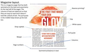
- 3. Margin Title Columns Pull quote Page numbers White space Symmetrical balance in text Reverse printing? Drop capitals Magazine layout. This is a magazine page that has both symmetry (in the text) and asymmetry (in the top half of the page). The columns of text are layed out so that they are easy to read and it doesn’t look like a block of text. The pull quote in the middle helps break up the text too.
- 4. Magazine layout. Pull quote Pull quote Columns Reverse printing Blobs and star Symmetrical balance Page number Cutouts Drop capitals Title This is good example of a very symmetrical magazine spread. The text is split up well by the cutout images in the centre of the spread. The duality of colour from the left side to the right side is very aesthetically pleasing. The negative space being two different colours means that there is more going on on the page, leading to the negative space being interesting instead of just one block colour. Spread Rules
- 5. Magazine layout. Titles Strapline Drop capitals Columns Negative space In terms of the terminology that we have been taught, there arent too many examples here, but I think that makes this a very nice spread, due to it simplicity. There is not too much text here, and that’s is because of the audience of this magazine wont want to read as much as, for example, the audience of National Geographic. There is too much negative space here, leading to the right side of the spread looking a bit empty and a bit dull, contrasting tot eh opposite side, where there isn't much negative space, as there are things going on in the background o the image.
- 6. Magazine layout. This is a less traditional magazine page from Mens Health. Here, instead of the text being in paragraphs in columns, it is in annotation form, describing and giving information on the images which are the focus of the viewers immediate gaze. There is use of reverse printing here, with the text being white against the dark background, contrasting to the conventional white on black technique of presenting text. This example doesn’t really work well for showing the conventions of this type of media, but what it does show is how creative you can be with the design of a page, and how good you can make it look whilst still having readable text. Whilst it doesn’t have many conventions it does have the grids for the little bits of text. Title Strapline Images are cutouts. Blobs and stars Reverse printing Subtitle? Images/objects layed out in column fashion the text is normally in. Margin for text but not images Negative space
- 8. Tabloid design. This is the tabloid newspaper that I have designed. U uses the three column technique seen in pretty much all tabloids, with the text and images being split into three different sections. I am pleases with what I have done here, as I have captured the general look of the typical tabloid pretty well. I think that to improve this image, I could make sure that there is a bit less negative space and that more space is used so it looks a bit more visually intriguing. I also could make the Sainsbury’s voucher bit a bit more professional and a bit more interesting.
- 9. Magazine design This is the example of a magazine spread that I have made using Adobe Indesign. This is done by setting the grid to 5x5, which gives you a lot of freedom compared to the three columns of the tabloid. I think that the example that I have made is a solid effort, it looks pretty decent and the text is split up so that it doesn't’t look like a massive task to read. I haven't spit his face up down the fold of fhe pages either which I think is good. To improve this work, I think that I would adjust the shapes and the spacing around the pull quote so that It stands out more.
- 10. Magazine design
- 11. Magazine design
- 12. Website design
- 13. Hierarchy
- 15. Fibbers task
- 16. Quote task
- 17. Copy editing