SlideShare a Scribd company logo
Michael Hawley
Chief Design Officer, Mad*Pow
@hawleymichael
Paul Doncaster
Senior User Experience Designer, Thomson Reuters
 Why we should care
 Why it’s not always as simple as asking:
“Which option do you prefer?”
 Methods to consider
 Case Study: Greenwich Hospital
 Case Study: WestlawNext
 Summary/Comparison
3
Preference and Desirability Testing, Measuring Emotional Response to Guide Design - UPA 2011 - Michael Hawley & Paul Doncaster
6
http://www.behaviormodel.org/
Core motivators include:
• Pleasure/pain
• Hope/fear
• Acceptance/rejection
7
http://www.xdstrategy.com/2008/10/28/desirability_studies/
8
Preference and Desirability Testing, Measuring Emotional Response to Guide Design - UPA 2011 - Michael Hawley & Paul Doncaster
“There’s just
something
about it . . .”
“It reminds me
of…”
“I ordinarily
don’t like red,
but for some
reason it works
here . . .”
“It’s nice and
clean.”
“It’s better
than the
other ones.”
“We should go with design C over
A and B, because I feel it evokes
the right kind of emotional
response in our audience that is
closer to our most important
brand attributes.”
12
 Present three different concepts or ideas to participants, and ask them to
identify how two of them are different from the third and why.
13
 Broad, experience-based
questionnaires, that also include
questions relating to visual appeal and
aesthetics
• SUS (System Usability Scale)
• QUIS (Questionnaire for User
Interface Satisfaction)
• WAMMI (Website Analysis and
Measurement Inventory)
14
Show participants a user
interface for a very brief
moment, then take it away.
Participants recall their first
impression, then moderator
probes for meaning.
• Helpful for layout decisions,
prominence of content, labels
• www.fivesecondtest.com
15
Attention designers:
You have
50 milliseconds
to make a good
first impression
• Electroencephalography (EEG):
Brain activity
• Electromyography (EMG):
Muscles and Excitement
• Electrodermal Activity (EDA):
Sweat, Excitement
• Blood Volume Pressure (BVP):
Arousal
• Pupil Dilation:
Arousal and Mental Workload
• Respiration:
Negative Valence or Arousal
16
17
Dr. Pieter Desmet, Technical University of Delft
http://www.premo-online.com
18
http://www.microsoft.com/usability/uepostings/desirabilitytoolkit.doc
19
 Determine intended brand attributes (and their opposites)
20
1. Leverage existing marketing/brand
materials
2. Alternatively, stakeholder brainstorm
to identify key brand
attributes/descriptors using full list of
product reaction cards as a start
3. Tip: “If the brand was a person, how
would it speak to your customers?”
 Methodology
1. Include 60/40 split of positive and negative words
2. Target 60 words, optimized to test brand
3. Simple question: “Which of the following words do you feel
best describe the site/design/product (please select 5):”
4. One comp per participant, or multiple comps per participant
(no more than 3)
 Participants
1. Qualitative: Paired with usability testing
2. Quantitative: Target minimum of 30 per option if possible
21
1. Calculate percentage of
positive and negative
attributes per design
2. Visualize overall
sentiment of feedback
using “word clouds” (see
wordle.net)
22
68%Positive
32%Negative
• Align the website with the character of the Hospital
• Update the site after nearly 10 years
• Counter impressions that Greenwich is more than just
maternity and elder care
• Communicate that they are long-standing members of
the community
23
• 3 visually designed comps
• 50 people reacted to each comp (quantitative) via survey
• Additional feedback obtained via participant interviews
(qualitative)
24
Hello, I am requesting feedback on a website I am working on. Your answers let
me know if the site is conveying the right feel.
1. What are your initial reactions to the web site?
2. Which of the following words best do you feel best describe the site (select 5):
Survey Questions
25
26
88% Positive
12% Negative
27
87% Positive
13% Negative
28
95% Positive
5% Negative
• Mix of qualitative and quantitative is key
o Qualitative helps provide color to the results
o Quantitative resonates with stakeholders and executives
• Position results as one form of input to decision-making
process, not declaring a “winner”
• Simple, cost-efficient way to assess audience’s emotional
response to a design
29
30
UX Research Team:
Paul Doncaster
Drew Drentlaw
Shannon O’Brien
Bill Quie
November Samnee
Preference and Desirability Testing, Measuring Emotional Response to Guide Design - UPA 2011 - Michael Hawley & Paul Doncaster
 for Phase 1
• Use large sample sizes to establish a design “baseline,”
from which to advance the design direction in subsequent
iterations
• Isolate preference trends for specific page design aspects
• Determine tolerance for manipulation of the site “brand”
• Maintain tight security
 Sessions were held in 4 cities over 5 days
◦ Seattle
◦ Denver
◦ Memphis
◦ Minneapolis-St. Paul
 4 sessions were held per day, with a maximum of 25
participants per session
 1.5 hours allotted per study, most participants finished
in less than 1 hour
 319 participants successfully completed their sessions
 Participants completed the study at individual
workstations at their own pace
 All workstations included a 20” monitor, at 1024x768
resolution
Memphis, TN, May 2009
1. Brief review of Westlaw critical screens
2. Positive/negative word selection to describe Westlaw
35
1. Each set of Element variations were viewed in full screen
2. Participant selects “top choice” by dragging a thumbnail
image to a drop area
36
37
1. All options viewed in full screen
2. Participant selects “top choice” by dragging a
thumbnail image to a drop area
Preference and Desirability Testing, Measuring Emotional Response to Guide Design - UPA 2011 - Michael Hawley & Paul Doncaster
 Visual Weight (6 options)
 Use of Imagery (8 options)
 Components (4 options)
 Search Area (4 options)
 Palette (10 options)
1. 19 HP designs viewed in full screen (randomized)
2. All 19 options are presented again; participant assigns a
rating using a 10-point slider.
3. Top 5 and Bottom 2 choices are positioned in order of
rating values on one long, scrollable page.
Next to each design displayed, rates key aspects for
each design on a 5-point scale
Preference and Desirability Testing, Measuring Emotional Response to Guide Design - UPA 2011 - Michael Hawley & Paul Doncaster
Repeat the process for Results List design:
• Design Elements
• Column Collapsing (4 options)
• Column Separation (2 options)
• Theme/Color (8 options)
• Design Gallery
• 14 Results Lists designs (randomized)
• Key Aspects Rated
• Color scheme
• Global Header
• Summary and Excerpt (list contents)
• Filters design (left column)
• Overall look and feel
Repeat the process for Document Display design:
• Design Elements
• Tabs vs. Links (4 options)
• Background Separation (4 options)
• Margin Width (3 options)
• Font Size (12 options)
• Locate (2 options)
• Design Gallery
• 9 Document Display designs (randomized)
• Key Aspects Rated
• Color scheme
• Layout of content
• Text formatting
• Overall look and feel
“Based on the designs I’ve liked most today . . .”
50
 Results were analyzed across 8 different sample filters
• Job Title
• Age
• Testing Location
• Years of Experience
• Hours per Week Researching
• Organization Size
• Role (decision-maker status)
 The top picks were surprisingly consistent across all of the
‘Top 5’ lists analyzed
52
1
2
3
4
5
Overall (319)
Job Title. Top 5 out of 19 possible.
Associate (189) Librarian (37) Partner (81)
1
2
3
4
5
1
2
3
4
5
1
2
3
4
5
Solo Practitioner (5)
1
2
3
4
5
HP16
HP10
HP15
HP8
HP5
HP16
HP15
HP15
HP15
HP10
HP1
HP8
HP8
HP16
HP5
HP5
HP14
HP16
HP8
HP19
HP1
HP6
HP8
HP7
HP13
 Home Page (19)
◦ HP16 & HP15 designs consistently
placed in the Top 5 across all filters
 Results List (14)
◦ RL4 consistently placed in the Top 3
across all sample filters, and was the
#1 choice for 80% of all participants
 Document Display (9)
◦ DD3 placed in the Top 5 across all
sample filters and was the #1 choice
for 77% of all participants
 Note, participants were asked to describe the current Westlaw
before being shown the new designs.
54
Current Westlaw
1. Cluttered
2. Helpful
3. Comfortable
4. Efficient
5. Credible
New Designs
1. Attractive
2. Modern
3. Efficient
4. Helpful
5. Comfortable
 5 design themes were derived from post-session discussions
• “New design(s) are better than current Westlaw”
• “Clean and Fresh”
• “Contrast is Important”
• “Prefer Westlaw Blue”
• “No Big Fonts Please”
 The study narrowed the list of potential designs, and we
better understood what design elements that Westlaw users
liked and disliked.
56
Kansas City, MO, Sept 2009
 Goals
• Refine preferences for selected design directions
• Understand users personal reasons for liking their
preferred choices
• Get closure on other design options for online and
printed content
• Sustain tight security
 Tool
• Same as in Round 1, with some minor revisions to
accommodate specialized input
 Method
◦ View, Rate, and Pick Top Choice for
 Homepage (3 options)
 Result List (2 options)
 Document Display (2 options)
 “Why?”
◦ Simple preference selection for two unresolved UI design
issues
 Citing References: Grid display or List display?
 Out of Plan Indication design (6 options)
◦ Type formatting preferences for 3 different content types
 Font Face
 Font Size
 Margin Width
 Logistics
◦ 3 cities (Philadelphia, Kansas City, Los Angeles)
◦ 1 Day
◦ 226 participants
 Analysis
◦ Filters (8 categories) were used to score the designs for each
visual preference
 Results
◦ Clear choices for top designs in each of all categories
◦ “Why” feedback shed new light on designs under consideration
and helped focus “homestretch” design activities
 Home Page (3)
◦ HP3 ranked #1in 94% of filter groups
(54% of total participants)
 Results List (2)
◦ RL5 ranked #1in 97% of filter groups
(58% of total participants)
 Document Display (2)
◦ DD7 ranked #1in 94% of filter groups
(61% of total participants)
 The main concerns regarding Homepage Design HP3
◦ Search Box
 Too small
 How do I do a Terms-and-Connectors search?
◦ Browse Section
 How do I specify multiple or specific search content?
 Poor organization
 Poor label
◦ Need access to “often-used” content
◦ Need better access to help
61
 Goals
◦ Get feedback on branding options from decision makers and
those who influence purchase of the product
◦ Get closure on final outstanding design issues
 Tool
◦ Same as in Rounds 1 & 2, with some minor revisions to
accommodate specialized input
 Method
◦ Wordmark/Branding
 View wordmark color combinations and design elements against
different backgrounds, pick top choice and provide comments
 Make a final “Top Choice” from all selections
◦ Simple preference selection for outstanding UI design issues
 Header Space: Tile or No Tile?
 Notes Design
 Location: Inline or Column?
 State: Open or Closed?
 Headnote Icon design (4 variations)
1
2
3
4
Your Most Liked
Your Least Liked
What color combination do you prefer? Please rank the 4 combinations below according to your preferences.
To rank, click and drag an item from the left to a box on the right.
 Logistics
◦ 3 cities (Seattle, Denver, Boston)
◦ 1 Day
◦ 214 participants
 Analysis
◦ Simple preference, no advanced filters
 Results
◦ Decision-makers confirmed that critical brand elements should be
retained
Image Overall DM
Votes
Sole
Decision
Makers
Decision
Making
Committee
Member
Influence
Decision
Makers
1
38%
(46/121)
9 14 23
2
36%
(43/121)
11 15 17
3
21%
(25/121)
9 6 10
4
6%
(7/121)
2 1 4
67
Measuring
Emotional Response
to Guide Design
• Quantitative & qualitative data to
identify preference trends
• “Slicing” across identifiable filters
• Emphasis on “gut-level” reactions
• Intolerance for manipulation of
product brand
• Rapid turnaround of data to all
stakeholders
o Executive
o Design
o Development
69
May 2009
Sept 2009
Feb 2010
 At what cost(s)?
• We held off asking “why” until the second round
• If we had asked why in the first round, we might have
o avoided some of internal design battles
o gotten more granular ammunition for communicating the design
vision to stakeholders
• “Need for speed” attained at the cost of detailed analysis
 Recommendations for anyone thinking of
undertaking something like this
• Procure a “Matt” to create and administer your tool
• Get a good technical vendor for on-site
• Report results in as close to real-time as possible on a
wiki or other web-page
72
 Both groups valued support in design
decision making
 Align methodology with needs of the project
 Research-inspired, not research-decided
73
74
 Benedek, Joey and Trish Miner. “Measuring Desirability: New Methods for
Evaluating Desirability in a Usability Lab Setting.” Proceedings of UPA 2002
Conference, Orlando, FL, July 8–12, 2002.
http://www.microsoft.com/usability/uepostings/desirabilitytoolkit.doc
 Lindgaard, Gitte, Gary Fernandes, Cathy Dudek, and J. Brown. "Attention Web
Designers: You Have 50 Milliseconds to Make a Good First Impression!"
Behaviour and Information Technology, 2006.
http://www.imagescape.com/library/whitepapers/first-impression.pdf
 Rohrer, Christian. “Desirability Studies: Measuring Aesthetic Response to
Visual Designs.” xdStrategy.com, October 28, 2008. Retrieved February 10,
2010. http://www.xdstrategy.com/2008/10/28/desirability_studies
75
 User Focus. "Measuring satisfaction: Beyond the Usability Questionnaire."
Retrieved February 10, 2010.
http://www.userfocus.co.uk/articles/satisfaction.html
 UserEffect. "Guide to Low-Cost Usability Tools." Retrieved May 12, 2010.
http://www.usereffect.com/topic/guide-to-low-cost-usability-tools
 Tullis, Thomas and Jacqueline Stetson. “A Comparison of Questionnaires for
Assessing Website Usability.” Usability Professionals’ Association Conference,
2004.
home.comcast.net/~tomtullis/publications/UPA2004TullisStetson.pdf

Westerman, S. J., E. Sutherland, L. Robinson, H. Powell, and G. Tuck. “A
Multi-method Approach to the Assessment of Web Page Designs.”
Proceedings of the 2nd international conference on Affective Computing and
Intelligent Interaction, 2007.
http:// portal.acm.org/citation.cfm?id=1422200
76
 Five Second Test
http://fivesecondtest.com/
 Feedback Army
http://www.feedbackarmy.com
 Wordle
http://www.wordle.net
 PrEmo
http://www.premo-online.com
77

More Related Content

PDF
Desirability Testing: Analyzing Emotional Response to a Design
PPTX
Online training
PPTX
10 tips for a better UX survey
PPTX
Surveys in practice and theory
PPTX
Better UX Surveys part 1
PPTX
Forms that work: Understanding forms to improve their design by @cjforms
PPTX
Improving Care Experiences Through Human Centered Design - HXR 2016 - Jonatha...
PPTX
Meeting at the Intersection of Content Strategy and UX - UXPA Boston 2015 - M...
Desirability Testing: Analyzing Emotional Response to a Design
Online training
10 tips for a better UX survey
Surveys in practice and theory
Better UX Surveys part 1
Forms that work: Understanding forms to improve their design by @cjforms
Improving Care Experiences Through Human Centered Design - HXR 2016 - Jonatha...
Meeting at the Intersection of Content Strategy and UX - UXPA Boston 2015 - M...

Viewers also liked (20)

PPTX
How do we talk about healthcare - HXR 2016 - Marli Mesibov & Dana Ortegon
PPTX
Experience Research Best Practices - UX Meet Up Boston 2013 - Dan Berlin
PPTX
Don't Fear the Small Numbers - HXR 2016 - Dan Berlin and Susan Mercer
PDF
Personas, the Cause of and Solution to All of Life's Problems - UXPA Boston 2...
PDF
Structured Data and User Experience - Paul Kahn, 2012
PPT
Social Media and Patient Centric Design, Facilitating Provider-Patient Relati...
PDF
Harness the power of avatars, case studies - HXR 2014 - Ciara Taylor
PDF
Prototyping for Early Validation - Michael Hawley, 2009
PPT
Communities of Care, Strategic Social Interaction Design for Healthcare - ide...
PDF
Organizational Parkour, the Negotiation Game - Seattle Infocamp 2013 - Joan V...
PPTX
Naratives in Healthcare, Stories as Drivers of Change - HXR 2016 - Samantha D...
PPTX
Using Games and Narative in Behavior Change Design - HXR 2016 - Samantha Demp...
PPT
Search and Filter Interface Round Up - Userability Marathon 2009 - Amy Cueva
PDF
Research & Design Methods in Healthcare - HDX 2013 - Adam Connor
PDF
Designing Design Workshops - Adam Connor, 2016
PDF
Digital Whips and Other Persuasive Technologies - HXR 2014 - Dustin Ditommaso
PDF
The Need for Speed, Optimizing the User Experience pt2 - UXPA Boston 2014 - J...
PPTX
Building Out a User Experience Team, Making UX Relevant Companywide - UPA 201...
PDF
Customer Journey Mapping Illustrating the Big Picture - MIMA Summit 2013 - Me...
PDF
HxRefactored - Case Studies - Ciara Taylor - Mad*Pow
How do we talk about healthcare - HXR 2016 - Marli Mesibov & Dana Ortegon
Experience Research Best Practices - UX Meet Up Boston 2013 - Dan Berlin
Don't Fear the Small Numbers - HXR 2016 - Dan Berlin and Susan Mercer
Personas, the Cause of and Solution to All of Life's Problems - UXPA Boston 2...
Structured Data and User Experience - Paul Kahn, 2012
Social Media and Patient Centric Design, Facilitating Provider-Patient Relati...
Harness the power of avatars, case studies - HXR 2014 - Ciara Taylor
Prototyping for Early Validation - Michael Hawley, 2009
Communities of Care, Strategic Social Interaction Design for Healthcare - ide...
Organizational Parkour, the Negotiation Game - Seattle Infocamp 2013 - Joan V...
Naratives in Healthcare, Stories as Drivers of Change - HXR 2016 - Samantha D...
Using Games and Narative in Behavior Change Design - HXR 2016 - Samantha Demp...
Search and Filter Interface Round Up - Userability Marathon 2009 - Amy Cueva
Research & Design Methods in Healthcare - HDX 2013 - Adam Connor
Designing Design Workshops - Adam Connor, 2016
Digital Whips and Other Persuasive Technologies - HXR 2014 - Dustin Ditommaso
The Need for Speed, Optimizing the User Experience pt2 - UXPA Boston 2014 - J...
Building Out a User Experience Team, Making UX Relevant Companywide - UPA 201...
Customer Journey Mapping Illustrating the Big Picture - MIMA Summit 2013 - Me...
HxRefactored - Case Studies - Ciara Taylor - Mad*Pow
Ad

Similar to Preference and Desirability Testing, Measuring Emotional Response to Guide Design - UPA 2011 - Michael Hawley & Paul Doncaster (20)

PPTX
Desirability and Preference Testing - UPA International 2011
PPTX
Preference and Desirability Testing: Measuring Emotional Response to Guide De...
PDF
UX Overview_ZiaRahman
PDF
Ux gsg
PPTX
Tampa UX November 2014 Meetup
PPTX
D4D session d21 - Really baking it in integrating the ux design process with...
PPTX
Measuring UX
PPT
User interface design for the Web Engineering Psychology
PPTX
What’s in your BA Toolbox – Has User experience and Usability gone to the way...
PDF
User Experience Design: an Overview
PDF
Early Signal Testing: Designing Atlassian’s New Look
PDF
Lean UX Secrets: 5 UX Hacks to Build Better Experiences, Faster
PDF
Research Portfolio - Josh LaMar
PDF
Designing the user experience
PDF
Usable Government Forms and Surveys: Best Practices for Design (from MoDevGov)
PDF
My UX Portfolio
PDF
UX HACKS. Better Experiences. Faster. Leaner. Smarter.
PPTX
Intro to UX Design
DOCX
1 httpswww.eeoc.goveeocnewsroomrelease10-7-19.cfm2 ht.docx
PPT
Design Is Content, Too
Desirability and Preference Testing - UPA International 2011
Preference and Desirability Testing: Measuring Emotional Response to Guide De...
UX Overview_ZiaRahman
Ux gsg
Tampa UX November 2014 Meetup
D4D session d21 - Really baking it in integrating the ux design process with...
Measuring UX
User interface design for the Web Engineering Psychology
What’s in your BA Toolbox – Has User experience and Usability gone to the way...
User Experience Design: an Overview
Early Signal Testing: Designing Atlassian’s New Look
Lean UX Secrets: 5 UX Hacks to Build Better Experiences, Faster
Research Portfolio - Josh LaMar
Designing the user experience
Usable Government Forms and Surveys: Best Practices for Design (from MoDevGov)
My UX Portfolio
UX HACKS. Better Experiences. Faster. Leaner. Smarter.
Intro to UX Design
1 httpswww.eeoc.goveeocnewsroomrelease10-7-19.cfm2 ht.docx
Design Is Content, Too
Ad

More from Mad*Pow (20)

PDF
Webinar: What Did I Miss? The Hidden Costs of Depriortizing Diversity in User...
PDF
Webinar: Intro to Strategic Foresight & Futures Thinking
PDF
Let’s Get Meta: Applying Service Design To Improve Employee Experiences… and ...
PDF
Behavior Change Design: A Comprehensive Yet Practical Approach to Improving H...
PPTX
Webinar: When Nothing is Fine
PPTX
Design More Innovative Solutions with a Holistic Understanding of the Chronic...
PDF
Accessibility Workshop July 2020
PPTX
FXD 2019 Keynote: Joseph Smiley, E*TRADE
PDF
FXD 2019 Keynote: Stephen Gates, InVision
PPTX
FXD 2019: Brian McLaughlin, Bottomline Technologies
PPTX
FXD 2019 Keynote: Rob Gifford, Mad*Pow
PPTX
FXD 2019 Interactive Session: Behavior Based Design
PDF
FXD 2019 Keynote: Marti Gold, SiriusXM
PDF
FXD 2019 Keynote: Christine Berglund, CapitalOne
PDF
FXD 2019 Keynote: Andy Vitale, SunTrust Bank
PPTX
FXD 2019 Leadership Round Table
PDF
HXD 2019 Leadership Round Table
PDF
Aline Holzwarth, Pattern Health
PDF
Vanessa Mason, Institute for the Future
PDF
Trina Histon, Aubrey Kraft, W. Scott Heisler, Kaiser Permanente Care Manageme...
Webinar: What Did I Miss? The Hidden Costs of Depriortizing Diversity in User...
Webinar: Intro to Strategic Foresight & Futures Thinking
Let’s Get Meta: Applying Service Design To Improve Employee Experiences… and ...
Behavior Change Design: A Comprehensive Yet Practical Approach to Improving H...
Webinar: When Nothing is Fine
Design More Innovative Solutions with a Holistic Understanding of the Chronic...
Accessibility Workshop July 2020
FXD 2019 Keynote: Joseph Smiley, E*TRADE
FXD 2019 Keynote: Stephen Gates, InVision
FXD 2019: Brian McLaughlin, Bottomline Technologies
FXD 2019 Keynote: Rob Gifford, Mad*Pow
FXD 2019 Interactive Session: Behavior Based Design
FXD 2019 Keynote: Marti Gold, SiriusXM
FXD 2019 Keynote: Christine Berglund, CapitalOne
FXD 2019 Keynote: Andy Vitale, SunTrust Bank
FXD 2019 Leadership Round Table
HXD 2019 Leadership Round Table
Aline Holzwarth, Pattern Health
Vanessa Mason, Institute for the Future
Trina Histon, Aubrey Kraft, W. Scott Heisler, Kaiser Permanente Care Manageme...

Recently uploaded (20)

PPTX
building Planning Overview for step wise design.pptx
PDF
Trusted Executive Protection Services in Ontario — Discreet & Professional.pdf
PPTX
Implications Existing phase plan and its feasibility.pptx
PDF
High-frequency high-voltage transformer outline drawing
PDF
GREEN BUILDING MATERIALS FOR SUISTAINABLE ARCHITECTURE AND BUILDING STUDY
PPT
UNIT I- Yarn, types, explanation, process
PDF
Benefits_of_Cast_Aluminium_Doors_Presentation.pdf
PDF
The Advantages of Working With a Design-Build Studio
PPTX
Special finishes, classification and types, explanation
PPTX
Causes of Flooding by Slidesgo sdnl;asnjdl;asj.pptx
PPTX
Fundamental Principles of Visual Graphic Design.pptx
PPTX
YV PROFILE PROJECTS PROFILE PRES. DESIGN
PPTX
DOC-20250430-WA0014._20250714_235747_0000.pptx
PDF
Urban Design Final Project-Context
PPTX
An introduction to AI in research and reference management
PPTX
AD Bungalow Case studies Sem 2.pptxvwewev
PPTX
12. Community Pharmacy and How to organize it
PPTX
Wisp Textiles: Where Comfort Meets Everyday Style
PDF
Emailing DDDX-MBCaEiB.pdf DDD_Europe_2022_Intro_to_Context_Mapping_pdf-165590...
PDF
BRANDBOOK-Presidential Award Scheme-Kenya-2023
building Planning Overview for step wise design.pptx
Trusted Executive Protection Services in Ontario — Discreet & Professional.pdf
Implications Existing phase plan and its feasibility.pptx
High-frequency high-voltage transformer outline drawing
GREEN BUILDING MATERIALS FOR SUISTAINABLE ARCHITECTURE AND BUILDING STUDY
UNIT I- Yarn, types, explanation, process
Benefits_of_Cast_Aluminium_Doors_Presentation.pdf
The Advantages of Working With a Design-Build Studio
Special finishes, classification and types, explanation
Causes of Flooding by Slidesgo sdnl;asnjdl;asj.pptx
Fundamental Principles of Visual Graphic Design.pptx
YV PROFILE PROJECTS PROFILE PRES. DESIGN
DOC-20250430-WA0014._20250714_235747_0000.pptx
Urban Design Final Project-Context
An introduction to AI in research and reference management
AD Bungalow Case studies Sem 2.pptxvwewev
12. Community Pharmacy and How to organize it
Wisp Textiles: Where Comfort Meets Everyday Style
Emailing DDDX-MBCaEiB.pdf DDD_Europe_2022_Intro_to_Context_Mapping_pdf-165590...
BRANDBOOK-Presidential Award Scheme-Kenya-2023

Preference and Desirability Testing, Measuring Emotional Response to Guide Design - UPA 2011 - Michael Hawley & Paul Doncaster

  • 1. Michael Hawley Chief Design Officer, Mad*Pow @hawleymichael Paul Doncaster Senior User Experience Designer, Thomson Reuters
  • 2.  Why we should care  Why it’s not always as simple as asking: “Which option do you prefer?”  Methods to consider  Case Study: Greenwich Hospital  Case Study: WestlawNext  Summary/Comparison
  • 3. 3
  • 6. 6 http://www.behaviormodel.org/ Core motivators include: • Pleasure/pain • Hope/fear • Acceptance/rejection
  • 8. 8
  • 10. “There’s just something about it . . .” “It reminds me of…” “I ordinarily don’t like red, but for some reason it works here . . .” “It’s nice and clean.” “It’s better than the other ones.”
  • 11. “We should go with design C over A and B, because I feel it evokes the right kind of emotional response in our audience that is closer to our most important brand attributes.”
  • 12. 12
  • 13.  Present three different concepts or ideas to participants, and ask them to identify how two of them are different from the third and why. 13
  • 14.  Broad, experience-based questionnaires, that also include questions relating to visual appeal and aesthetics • SUS (System Usability Scale) • QUIS (Questionnaire for User Interface Satisfaction) • WAMMI (Website Analysis and Measurement Inventory) 14
  • 15. Show participants a user interface for a very brief moment, then take it away. Participants recall their first impression, then moderator probes for meaning. • Helpful for layout decisions, prominence of content, labels • www.fivesecondtest.com 15 Attention designers: You have 50 milliseconds to make a good first impression
  • 16. • Electroencephalography (EEG): Brain activity • Electromyography (EMG): Muscles and Excitement • Electrodermal Activity (EDA): Sweat, Excitement • Blood Volume Pressure (BVP): Arousal • Pupil Dilation: Arousal and Mental Workload • Respiration: Negative Valence or Arousal 16
  • 17. 17 Dr. Pieter Desmet, Technical University of Delft http://www.premo-online.com
  • 19. 19
  • 20.  Determine intended brand attributes (and their opposites) 20 1. Leverage existing marketing/brand materials 2. Alternatively, stakeholder brainstorm to identify key brand attributes/descriptors using full list of product reaction cards as a start 3. Tip: “If the brand was a person, how would it speak to your customers?”
  • 21.  Methodology 1. Include 60/40 split of positive and negative words 2. Target 60 words, optimized to test brand 3. Simple question: “Which of the following words do you feel best describe the site/design/product (please select 5):” 4. One comp per participant, or multiple comps per participant (no more than 3)  Participants 1. Qualitative: Paired with usability testing 2. Quantitative: Target minimum of 30 per option if possible 21
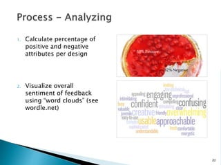
  • 22. 1. Calculate percentage of positive and negative attributes per design 2. Visualize overall sentiment of feedback using “word clouds” (see wordle.net) 22 68%Positive 32%Negative
  • 23. • Align the website with the character of the Hospital • Update the site after nearly 10 years • Counter impressions that Greenwich is more than just maternity and elder care • Communicate that they are long-standing members of the community 23
  • 24. • 3 visually designed comps • 50 people reacted to each comp (quantitative) via survey • Additional feedback obtained via participant interviews (qualitative) 24 Hello, I am requesting feedback on a website I am working on. Your answers let me know if the site is conveying the right feel. 1. What are your initial reactions to the web site? 2. Which of the following words best do you feel best describe the site (select 5): Survey Questions
  • 25. 25
  • 29. • Mix of qualitative and quantitative is key o Qualitative helps provide color to the results o Quantitative resonates with stakeholders and executives • Position results as one form of input to decision-making process, not declaring a “winner” • Simple, cost-efficient way to assess audience’s emotional response to a design 29
  • 30. 30 UX Research Team: Paul Doncaster Drew Drentlaw Shannon O’Brien Bill Quie November Samnee
  • 32.  for Phase 1 • Use large sample sizes to establish a design “baseline,” from which to advance the design direction in subsequent iterations • Isolate preference trends for specific page design aspects • Determine tolerance for manipulation of the site “brand” • Maintain tight security
  • 33.  Sessions were held in 4 cities over 5 days ◦ Seattle ◦ Denver ◦ Memphis ◦ Minneapolis-St. Paul  4 sessions were held per day, with a maximum of 25 participants per session  1.5 hours allotted per study, most participants finished in less than 1 hour  319 participants successfully completed their sessions
  • 34.  Participants completed the study at individual workstations at their own pace  All workstations included a 20” monitor, at 1024x768 resolution Memphis, TN, May 2009
  • 35. 1. Brief review of Westlaw critical screens 2. Positive/negative word selection to describe Westlaw 35
  • 36. 1. Each set of Element variations were viewed in full screen 2. Participant selects “top choice” by dragging a thumbnail image to a drop area 36
  • 37. 37
  • 38. 1. All options viewed in full screen 2. Participant selects “top choice” by dragging a thumbnail image to a drop area
  • 41.  Visual Weight (6 options)  Use of Imagery (8 options)  Components (4 options)  Search Area (4 options)  Palette (10 options)
  • 42. 1. 19 HP designs viewed in full screen (randomized) 2. All 19 options are presented again; participant assigns a rating using a 10-point slider. 3. Top 5 and Bottom 2 choices are positioned in order of rating values on one long, scrollable page. Next to each design displayed, rates key aspects for each design on a 5-point scale
  • 48. Repeat the process for Results List design: • Design Elements • Column Collapsing (4 options) • Column Separation (2 options) • Theme/Color (8 options) • Design Gallery • 14 Results Lists designs (randomized) • Key Aspects Rated • Color scheme • Global Header • Summary and Excerpt (list contents) • Filters design (left column) • Overall look and feel
  • 49. Repeat the process for Document Display design: • Design Elements • Tabs vs. Links (4 options) • Background Separation (4 options) • Margin Width (3 options) • Font Size (12 options) • Locate (2 options) • Design Gallery • 9 Document Display designs (randomized) • Key Aspects Rated • Color scheme • Layout of content • Text formatting • Overall look and feel
  • 50. “Based on the designs I’ve liked most today . . .” 50
  • 51.  Results were analyzed across 8 different sample filters • Job Title • Age • Testing Location • Years of Experience • Hours per Week Researching • Organization Size • Role (decision-maker status)  The top picks were surprisingly consistent across all of the ‘Top 5’ lists analyzed
  • 52. 52 1 2 3 4 5 Overall (319) Job Title. Top 5 out of 19 possible. Associate (189) Librarian (37) Partner (81) 1 2 3 4 5 1 2 3 4 5 1 2 3 4 5 Solo Practitioner (5) 1 2 3 4 5 HP16 HP10 HP15 HP8 HP5 HP16 HP15 HP15 HP15 HP10 HP1 HP8 HP8 HP16 HP5 HP5 HP14 HP16 HP8 HP19 HP1 HP6 HP8 HP7 HP13
  • 53.  Home Page (19) ◦ HP16 & HP15 designs consistently placed in the Top 5 across all filters  Results List (14) ◦ RL4 consistently placed in the Top 3 across all sample filters, and was the #1 choice for 80% of all participants  Document Display (9) ◦ DD3 placed in the Top 5 across all sample filters and was the #1 choice for 77% of all participants
  • 54.  Note, participants were asked to describe the current Westlaw before being shown the new designs. 54 Current Westlaw 1. Cluttered 2. Helpful 3. Comfortable 4. Efficient 5. Credible New Designs 1. Attractive 2. Modern 3. Efficient 4. Helpful 5. Comfortable
  • 55.  5 design themes were derived from post-session discussions • “New design(s) are better than current Westlaw” • “Clean and Fresh” • “Contrast is Important” • “Prefer Westlaw Blue” • “No Big Fonts Please”  The study narrowed the list of potential designs, and we better understood what design elements that Westlaw users liked and disliked.
  • 56. 56 Kansas City, MO, Sept 2009
  • 57.  Goals • Refine preferences for selected design directions • Understand users personal reasons for liking their preferred choices • Get closure on other design options for online and printed content • Sustain tight security  Tool • Same as in Round 1, with some minor revisions to accommodate specialized input
  • 58.  Method ◦ View, Rate, and Pick Top Choice for  Homepage (3 options)  Result List (2 options)  Document Display (2 options)  “Why?” ◦ Simple preference selection for two unresolved UI design issues  Citing References: Grid display or List display?  Out of Plan Indication design (6 options) ◦ Type formatting preferences for 3 different content types  Font Face  Font Size  Margin Width
  • 59.  Logistics ◦ 3 cities (Philadelphia, Kansas City, Los Angeles) ◦ 1 Day ◦ 226 participants  Analysis ◦ Filters (8 categories) were used to score the designs for each visual preference  Results ◦ Clear choices for top designs in each of all categories ◦ “Why” feedback shed new light on designs under consideration and helped focus “homestretch” design activities
  • 60.  Home Page (3) ◦ HP3 ranked #1in 94% of filter groups (54% of total participants)  Results List (2) ◦ RL5 ranked #1in 97% of filter groups (58% of total participants)  Document Display (2) ◦ DD7 ranked #1in 94% of filter groups (61% of total participants)
  • 61.  The main concerns regarding Homepage Design HP3 ◦ Search Box  Too small  How do I do a Terms-and-Connectors search? ◦ Browse Section  How do I specify multiple or specific search content?  Poor organization  Poor label ◦ Need access to “often-used” content ◦ Need better access to help 61
  • 62.  Goals ◦ Get feedback on branding options from decision makers and those who influence purchase of the product ◦ Get closure on final outstanding design issues  Tool ◦ Same as in Rounds 1 & 2, with some minor revisions to accommodate specialized input
  • 63.  Method ◦ Wordmark/Branding  View wordmark color combinations and design elements against different backgrounds, pick top choice and provide comments  Make a final “Top Choice” from all selections ◦ Simple preference selection for outstanding UI design issues  Header Space: Tile or No Tile?  Notes Design  Location: Inline or Column?  State: Open or Closed?  Headnote Icon design (4 variations)
  • 64. 1 2 3 4 Your Most Liked Your Least Liked What color combination do you prefer? Please rank the 4 combinations below according to your preferences. To rank, click and drag an item from the left to a box on the right.
  • 65.  Logistics ◦ 3 cities (Seattle, Denver, Boston) ◦ 1 Day ◦ 214 participants  Analysis ◦ Simple preference, no advanced filters  Results ◦ Decision-makers confirmed that critical brand elements should be retained
  • 67. 67
  • 68. Measuring Emotional Response to Guide Design • Quantitative & qualitative data to identify preference trends • “Slicing” across identifiable filters • Emphasis on “gut-level” reactions • Intolerance for manipulation of product brand • Rapid turnaround of data to all stakeholders o Executive o Design o Development
  • 70.  At what cost(s)? • We held off asking “why” until the second round • If we had asked why in the first round, we might have o avoided some of internal design battles o gotten more granular ammunition for communicating the design vision to stakeholders • “Need for speed” attained at the cost of detailed analysis
  • 71.  Recommendations for anyone thinking of undertaking something like this • Procure a “Matt” to create and administer your tool • Get a good technical vendor for on-site • Report results in as close to real-time as possible on a wiki or other web-page
  • 72. 72
  • 73.  Both groups valued support in design decision making  Align methodology with needs of the project  Research-inspired, not research-decided 73
  • 74. 74
  • 75.  Benedek, Joey and Trish Miner. “Measuring Desirability: New Methods for Evaluating Desirability in a Usability Lab Setting.” Proceedings of UPA 2002 Conference, Orlando, FL, July 8–12, 2002. http://www.microsoft.com/usability/uepostings/desirabilitytoolkit.doc  Lindgaard, Gitte, Gary Fernandes, Cathy Dudek, and J. Brown. "Attention Web Designers: You Have 50 Milliseconds to Make a Good First Impression!" Behaviour and Information Technology, 2006. http://www.imagescape.com/library/whitepapers/first-impression.pdf  Rohrer, Christian. “Desirability Studies: Measuring Aesthetic Response to Visual Designs.” xdStrategy.com, October 28, 2008. Retrieved February 10, 2010. http://www.xdstrategy.com/2008/10/28/desirability_studies 75
  • 76.  User Focus. "Measuring satisfaction: Beyond the Usability Questionnaire." Retrieved February 10, 2010. http://www.userfocus.co.uk/articles/satisfaction.html  UserEffect. "Guide to Low-Cost Usability Tools." Retrieved May 12, 2010. http://www.usereffect.com/topic/guide-to-low-cost-usability-tools  Tullis, Thomas and Jacqueline Stetson. “A Comparison of Questionnaires for Assessing Website Usability.” Usability Professionals’ Association Conference, 2004. home.comcast.net/~tomtullis/publications/UPA2004TullisStetson.pdf  Westerman, S. J., E. Sutherland, L. Robinson, H. Powell, and G. Tuck. “A Multi-method Approach to the Assessment of Web Page Designs.” Proceedings of the 2nd international conference on Affective Computing and Intelligent Interaction, 2007. http:// portal.acm.org/citation.cfm?id=1422200 76
  • 77.  Five Second Test http://fivesecondtest.com/  Feedback Army http://www.feedbackarmy.com  Wordle http://www.wordle.net  PrEmo http://www.premo-online.com 77