1. Seaborn & Plotly: A Visual
Exploration of Data
Welcome! This presentation explores Seaborn and Plotly. Discover the
power of Python for data visualization. We'll cover various chart types and
their code.
by Vishant Singh
2. Introduction: Unveiling the Power of Data
Visualization
Why Visualize Data?
• Gain insights: Quickly understand complex data trends and
patterns.
• Improve communication: Effectively convey findings to
diverse audiences.
• Data visualization: Identify outliers and anomalies for
deeper analysis.
Seaborn & Plotly
Seaborn provides high-level interface. Plotly allows interactive,
web-based visualizations. Both work with Pandas DataFrames.
import seaborn as sns
import plotly.express as px
3. Seaborn Essentials: Setting
the Stage for Elegant Plots
Aesthetic Control
Customize plot styles, color
palettes, and fonts to create
visually appealing graphics.
DataFrame Integration
Seamlessly integrates with
Pandas DataFrames for easy
data input and manipulation.
Simplified Syntax
Offers a high-level interface, reducing code complexity for common
statistical plots.
4. Scatter Plots with Seaborn: Unveiling
Relationships
Load Data
Import your dataset into a Pandas DataFrame.
Create Plot
Use sns.scatterplot() to visualize relationships.
Customize
Adjust markers, colors, and labels for clarity and aesthetic appeal.
import seaborn as sns
import matplotlib.pyplot as plt
sns.scatterplot(x='x_column', y='y_column', data=df)
plt.show()
5. Bubble Charts with Seaborn:
Adding a Dimension of Insight
1 Set Up Plot
Use scatterplot() with the size parameter.
2 Define Size
Map a third variable to the size of the bubbles.
3 Enhance Appearance
Adjust bubble sizes and transparency for optimal visual representation.
sns.scatterplot(x='x_column', y='y_column',
size='size_column', data=df, alpha=0.5)
6. Pie Charts with Seaborn: Visualizing Proportions
1
Aggregate Data
Group data to calculate category sizes.
2
Create Pie
Use matplotlib to create the pie chart with the aggregated data.
3
Customize
Add labels, colors, and explode effects for clarity and visual impact.
import matplotlib.pyplot as plt
plt.pie(df['category_size'], labels=df['category'])
plt.show()
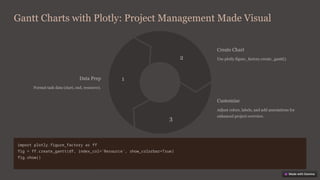
7. Gantt Charts with Plotly: Project Management Made Visual
Data Prep
Format task data (start, end, resource).
1
Create Chart
Use plotly.figure_factory.create_gantt().
2
Customize
Adjust colors, labels, and add annotations for
enhanced project overview.
3
import plotly.figure_factory as ff
fig = ff.create_gantt(df, index_col='Resource', show_colorbar=True)
fig.show()
8. Contour Plots with Plotly: Exploring 3D Data in 2D
1
Prepare Data
Create a grid of x, y, and z values.
2
Generate Plot
Use plotly.graph_objects.Contour() to represent the data in 2D.
3
Refine Appearance
Adjust contour levels, color scales, and labels for optimal data
interpretation.
import plotly.graph_objects as go
fig = go.Figure(data=[go.Contour(z=z_values, x=x_values, y=y_values)])
fig.show()
9. Sunburst Charts with Plotly:
Hierarchical Data Visualization
Structure Data
Organize data into parent-child
hierarchies.
Create Chart
Use plotly.express.sunburst() to
visualize hierarchical relationships.
Customize
Refine colors, labels, and levels to highlight key hierarchical structures.
import plotly.express as px
fig = px.sunburst(df, path=['parent', 'child'],
values='values')
fig.show()
10. Polar Charts & Heatmaps with
Plotly: Unique Visualizations
Polar Plots
Visualize data in a circular coordinate
system, ideal for representing angles
and magnitudes.
Heatmaps
Display data as a color-coded matrix,
ideal for showing correlations and
patterns in large datasets.
import plotly.express as px
fig = px.line_polar(df, r='radius', theta='angle')
fig.show()
fig = px.imshow(data)
fig.show()


![Pie Charts with Seaborn: Visualizing Proportions
1
Aggregate Data
Group data to calculate category sizes.
2
Create Pie
Use matplotlib to create the pie chart with the aggregated data.
3
Customize
Add labels, colors, and explode effects for clarity and visual impact.
import matplotlib.pyplot as plt
plt.pie(df['category_size'], labels=df['category'])
plt.show()](https://image.slidesharecdn.com/seaborn-and-plotly-a-visual-exploration-of-data-250514085839-1cf85b8d/85/Seaborn-and-Plotly-A-Visual-Exploration-of-Data-pptx-6-320.jpg)
![Contour Plots with Plotly: Exploring 3D Data in 2D
1
Prepare Data
Create a grid of x, y, and z values.
2
Generate Plot
Use plotly.graph_objects.Contour() to represent the data in 2D.
3
Refine Appearance
Adjust contour levels, color scales, and labels for optimal data
interpretation.
import plotly.graph_objects as go
fig = go.Figure(data=[go.Contour(z=z_values, x=x_values, y=y_values)])
fig.show()](https://image.slidesharecdn.com/seaborn-and-plotly-a-visual-exploration-of-data-250514085839-1cf85b8d/85/Seaborn-and-Plotly-A-Visual-Exploration-of-Data-pptx-8-320.jpg)
![Sunburst Charts with Plotly:
Hierarchical Data Visualization
Structure Data
Organize data into parent-child
hierarchies.
Create Chart
Use plotly.express.sunburst() to
visualize hierarchical relationships.
Customize
Refine colors, labels, and levels to highlight key hierarchical structures.
import plotly.express as px
fig = px.sunburst(df, path=['parent', 'child'],
values='values')
fig.show()](https://image.slidesharecdn.com/seaborn-and-plotly-a-visual-exploration-of-data-250514085839-1cf85b8d/85/Seaborn-and-Plotly-A-Visual-Exploration-of-Data-pptx-9-320.jpg)
