SlideShare a Scribd company logo
Contact me if you need design advice or if you have any design problems, want to share
some design examples (I collect them), or you just want to chat!
Email: tmkister@nanatoo.com
Audience analysis is widely accepted as a core component of the information-development
lifecycle.
Audience analysis typically includes collecting information about your users – from
demographic data (such as age, profession, geographic location) to underlying values.
However, we tend to overlook one of the most important factors in understanding our
audience: That is, how human beings…
…regardless of age, economic status, education, or any other particulars, perceive and
processes visual information on the most basic physiological and neurological levels.
A simplified way of understanding visual perception is to think of it in terms of two phases:
Sensation and Translation.
Sensation occurs in the eye…
…and translation occurs in the brain.
During sensation, light enters the eye through the pupil and the lens.
The lens inverts the light…
…and focuses it on the retina, which is the area at the back of the eye that contains
photoreceptor cells…
…called rods and cones.
Rods facilitate vision in low-light conditions and are associated with peripheral vision.
Cones facilitate vision in normal light conditions and are associated with the perception of
color. There are three main types of cones cells, each of which responds to either red,
green, or blue light.
Cone cells are also associated with detail and allow us to detect contrast between features,
including shadows and edges. This, in turn, allows us to perceive both shape and position.
The way that our photoreceptors works means that there are essentially three types of
visual information that we initially perceive: shape, color, and position.
Shape, color, and position are directly correlated with the basic design elements, or the
elements of art, taught to design students. While there is some variation in how basic
design elements are taught, from a physiological perspective, the traditionally taught
elements all represent some form of shape, color, and position.
Texture, for example, is an effect created with a combination of shape, color, and position.
And these three basic design elements…
…are the building blocks of page design, and make up the overall layout, individual
elements, and text.
It is important to note that, while we traditionally treat text as separate from visual design,
and both are very complex to master, the way we process them is essentially the same.
Each of the three basic design elements has attributes – or characteristics – that we choose
as page designers. For example, shape attributes can include curve, angle, and symmetry.
The attributes that we choose convey meaning to our users. For example, curves and circles
tend to convey connection, community, and wholeness, while right angles and squares
tend to convey stability, order, and logic.
The same is true for color…
The Science Behind Good Page Design
…position…
The Science Behind Good Page Design
…and typography.
So, how do we derive meaning from these basic elements and their attributes? That
happens during the second basic phase of perception: translation...
…which occurs in the brain. The exact workings of the brain are still largely a mystery.
In general, our brain works in very complex ways to detect features…
…identify and categorize them…
…discard or ignore irrelevant features…
Placeholder
…create patterns to fill in any missing information…
…and make associations with what we already know about the world…
…based on our past experiences.
To complicate matters, these processes occur in sequence, in unison, and in reverse.
There are several frameworks for understanding how we derive meaning from visual
stimuli. One such early framework, known as Gestalt, was born from the study of
philosophy…
…and emerged around the same time that photography and motion pictures became
popular.
Gestalt theorists realized that what we perceive does not logically follow from what is
perceivable. For example, they noted how a series of static images that shift position
creates an illusion of motion, and called this the “phi phenomenon.”
They noted that “the whole is something other than the sum of its parts” so that, two plus
two equals…
…a cat!
In this picture for example, we perceive a dog…
…despite the fact that each individual element has no resemblance to the actual parts of a
dog.
There are many Gestalt principles that range from simple to complex, and they often
interact with one another. Proximity, for example…
…is a simple principle of grouping that describes how we tend to categorize elements that
are positioned close to another…
…as related.
And the grouping principle of proximity…
…can interact with other grouping principles, such as symmetry.
A more complex Gestalt principle is Reification, in which our minds perceive visual stimuli
that doesn’t actually exist in order to make sense of what we see. In this example…
…our minds perceive a triangle that doesn’t actually exist…
…because we can make sense of a triangle much more easily than we can make sense of
the three other shapes.
Multistability describes how – when visual stimuli are ambiguous – we can move between
interpretations that are entirely different.
And we do the same thing with text.
All of these principles, or heuristics, describe how we process visual information, and they
form the basis for the traditionally taught design principles. Just as with the design
elements, there are many variations on how design principles are taught, and they usually
represent a combination of various related concepts.
For example, emphasis and contrast are listed as two separate principles, but are actually
related concepts because you often convey emphasis…
…by increasing contrast.
Therefore, just as with the three elements of design, the principles of design can be
simplified and distilled into contrast, repetition, alignment, and position...
…or CRAP (which is a common mnemonic used in page design).
However, even conceiving of these as four separate concepts is actually a bit problematic.
Alignment is a type of position…
…and the terms “contrast” and “repetition”…
…and the terms contrast and repetition relate to the same thing: the degree of difference
on a spectrum that ranges from completely unrelated to exactly the same.
That’s why – on the most basic level – all design principles can be thought of in terms of a
single concept: Gradient.
The concept of a gradient can be applied to each of the basic design elements, including
shape…
…color…
…and position.
You can see the concept of gradient in page design all the time, with headings (which have
graduated sizes, weights, and surrounding white space)…
…with lists (which use increasing indents for subordinate items)….
…and with color.
There is another important concept related to the science of good page design: attention,
or the degree to which a person successfully attends to, or focuses on, something.
Our attention is instinctively and almost instantaneously attracted to certain things. For
example, if I show you this slide, your eyes inevitably return to the white circle. We are
evolutionarily “hard wired” to pay attention to certain things…
…things that include physical features, like edges…
…and conceptual things, like faces…
…food…
…danger…
…and sex…
…and one of the things we are most sensitive to is difference.
The initial stages of our attention to these things occurs involuntarily, and is a function of
how our eyes and minds work. When light enters the eye, it is focused on a small area of
the retina called the fovea.
The fovea contains a much greater density of cone cells than the rest of the retina, and is
the only area of the retina that allows us to perceive a high level of detail. Because this is
such a small area (about one percent of the retina)…
…most of our field of view is blurry…
…and only a small area is actually in focus...
…an area about the size of your thumbnail if you hold your thumb up at arm’s length.
Because this area is so small, our eyes constantly move across our field of view in
involuntary, abrupt movements called “saccades.”
Our minds then stitch the small, in-focus images together into a perceived whole.
In page design, we can make design choices that direct the user’s attention in ways that are
automatic and do not require any conscious effort.
Another key factor in attention is the fact that our capacity to process information is
limited. One way to think of this is in terms of perceptual and cognitive load.
Perceptual load refers to the amount of stress placed on our ability to process visual stimuli
given a perceptual task.
In this case, the task is to identify either the N or the X.
Cognitive load refers to the amount of stress placed on our ability to translate and interpret
meaning in order to achieve full comprehension.
Because our total capacity is limited…
…our job as page designers is to optimize perceptual load in order to maximize the
resources available for attention and comprehension.
The design of this webpage has a high perceptual load because of all the visual stimuli that
isn’t related to accomplishing a task.
This webpage design has an even higher perceptual load. At first glance, it seems to
conform to the principles of good design. However, on closer inspection you can see that it
lacks the necessary visual cues needed to accomplish even the most basic online task –
there are none of the traditional menus, buttons, etc.
Generally speaking, high-load designs decrease information-processing speed and accuracy.
Therefore, you might think that our job is to minimize perceptual load, but that’s an
oversimplification. You can minimize perceptual load...
...by creating page designs that are static and boring. However, simply minimizing
perceptual load overlooks other important factors.
It’s important to note that we instinctively and automatically assign meaning to everything,
and then discard or ignore what is irrelevant…
So, if a design includes characteristics that are incongruent with meaning, we have to sort
through what matters and what doesn’t and use our conscious mind to comprehend
meaning, so that speed and accuracy are low.
If a design includes characteristics that are neutral in terms of meaning, speed and
accuracy increase.
By making visual stimuli more complex in ways that are congruent with meaning, speed and
accuracy increase even more.
There is another important component of attention that is often overlooked, particularly in
certain genres of information development like technical communication. If perceptual load
relates to perceivability, and cognitive load relates to understandability...
...then both work together to capture and direct our attention...
…which facilitates comprehension and, therefore, usability. If you think of both as existing
along a normal curve…
…too little load doesn’t hold our attention and doesn’t facilitate comprehension…
…too much load overwhelms our capacity for attention and doesn’t facilitate
comprehension…
…and so the key is to find the sweet spot in the middle – the point at which page design
facilitates comprehension. Which brings us to the second important component of page
design that is so often overlooked...
...pleasure!
When perceptual and cognitive load are successfully optimized, we experience pleasure.
There are at least two types of pleasure that are important in page design. One occurs at
the “a-ha” moment of comprehension...
…such as when we are shown an apparently meaningless image…
…and then are shown a caption that shows that the image means something. Research has
shown that, at the moment of comprehension, our brains release endomorphins, which
suppress pain and are associated with pleasure.
The second type of pleasure is aesthetic pleasure. Statistic analyses have shown that
aesthetic pleasure occurs when there is a balance between typicality and novelty…
…between unity and variety…
…between sameness and difference. Which brings us back again to the primary principle of
page design: gradient.
The pleasure that we experience when engaging with well-design information has a
Pavlovian positive-reinforcement effect, in which our information-seeking behavior is
rewarded, which encourages and facilitates further engagement.
So, the way we process visual information is directly correlated with best practices in page
design…
…but how do you combine the basic design elements…
…with the fundamental design principle of gradient into successful page designs?
Of course, it’s a complex answer – there are no rote recipes for good design…
…in part, because there are so many variables. As soon as you make one design choice…
…it’s going to impact other design choices because page design is essentially about
relationships…
…the relationships between the elements on a page.
Design requires a type of logic called conditional reasoning, which consists of “if-then”
choices. Here, for example, if I use two narrow columns, then I should use more white
space between the paragraphs instead of using a first-line indent. Otherwise, the
indentation for both paragraphs and lists can cause the eye to get lost while tracking across
lines of text.
The design process is very similar to the writing process – we combine basic elements
based on common principles to create meaning.
Just as with writing, there are a number of sources that provide rules and guidelines, and it
takes time and experimentation to really figure out how to apply them in real life – to
figure out what “proper” alignment and a “logical” color palette are.
And – just as with writing – there is also a lot of bad advice out there – which is why having
a deeper understanding is so important.
A good way to learn is to look in areas of information development you might not normally
be exposed to – areas like user experience design, presentation design, and data
visualization.
Since we’re just about out of time, I’d like to share just two guiding principles with you –
principles that can be used for every design choice. The first is Just-Noticeable Difference
(JND), which is a technical term used in perception studies…
…that refers the degree of difference required to be detected 50% of the time.
Because we assign meaning to everything and then discard or ignore what is irrelevant – if
you use just enough difference to be noticeable, then that conserves cognitive resources
and lowers perceptual and cognitive load.
Which is one reason this is bad advice…
…using arbitrary font weights creates an additional degree of difference that is unnecessary
and increases load. The change in font weights has no purpose, other than to introduce
difference simply for the sake of difference.
Which brings us to the second piece of advice, which is to use intentional design. Careless
design choices cause extra perceptual and cognitive load by either contradicting meaning…
Placeholder
…or by adding visual clutter. (Don’t use decoration.)
Instead, make sure every design choice is intentional and has a purpose.
And, when in doubt, keep it simple.
We have taken just a peek at how the science of human visual perception forms the basis
for good page design, and there’s so much more to explore. I just want to leave you with
one final thought. Despite a long tradition of silos in both education and business…
…that positions content and design as separate things that are in opposition to one
another…
…content and design are inseparable, and both are necessary in creating high-quality
information deliverables.
Design without content is meaningless, and content without design is incomprehensible.
And, even with all of the design elements removed, this block of text is still in a font, in a
color, in shape, positioned on the page. Without any design elements…
…you have nothing.
And a ton of research shows that design matters. A 2004 study of the effects of content and
design on users of health-care websites showed that content factors had an 83-percent
weighted importance in terms of trust and engagement.
The same study showed that design factors were more important, with a 94-percent
weighted importance.
And design is particularly important during the initial stages of engagement…
…because effective visual design is so powerful that it can instill persistent trust and
facilitate engagement, despite known issues with usability and content.
So, in terms of knowing your audience, know that good page design can make the
difference between...
...this...
...and this.
Contact me if you need design advice or if you have any design problems, want to share
some design examples (I collect them), or you just want to chat!
Email: tmkister@nanatoo.com
To cite this presentation: Kister, Tina M. “The Science of Good Page Design (A Brief Introduction).” presented at Information
Development World 2018: Building a Modern Online Technical Resource Center, Menlo Park, California, November 28, 2018.
• Biederman, Irving, and Edward A. Vessel. “Perceptual Pleasure and the Brain: A Novel Theory Explains Why the Brain
Craves Information and Seeks It Through the Senses.” American Scientist 94 (2006): 247–53.
• Blijlevens, J, Clementine Thurgood, Paul Hekkert, Lin-Lin Chen, Helmut Leder, and T W. Allan Whitfield. “The Aesthetic
Pleasure in Design Scale: The Development of a Scale to Measure Aesthetic Pleasure for Designed Artifacts.” Psychology
of Aesthetics, Creativity, and the Arts 11 (February 1, 2017): 86–98. https://doi.org/10.1037/aca0000098.
• Cairo, Alberto. “The Truthful Art: Data, Charts, and Maps for Communication.” Accessed November 9, 2018.
https://www.amazon.com/Truthful-Art-Data-Charts-
Communication/dp/0321934075/ref=sr_1_1?ie=UTF8&qid=1541766732&sr=8-1&keywords=the+truthful+art.
• Chen, Kang-chen, and Hye Jung Choi. “Visual Attention and Eye Movements,” 2008.
• Chugh, Sagar. “Aesthetics vs. Usability.” 00:01:40 UTC. https://www.slideshare.net/schugh/aesthetics-vs-usability.
• Curtin, John J., and Bradley A. Fairchild. “Alcohol and Cognitive Control: Implications for Regulation of Behavior during
Response Conflict.” Journal of Abnormal Psychology 112, no. 3 (August 2003): 424–36.
• Debue, Nicolas, and Cécile van de Leemput. “What Does Germane Load Mean? An Empirical Contribution to the Cognitive
Load Theory.” Frontiers in Psychology 5 (2014). https://doi.org/10.3389/fpsyg.2014.01099.
• Detlef, Pete. “Conducting an Audience Analysis: What Is Important to Your Audience.” 24 Hour Translation Services, 2017.
https://www.24hourtranslation.com/conducting-an-audience-analysis-what-is-important-to-your-audience.html.
• Duarte, Nancy. Slide:Ology: The Art and Science of Creating Great Presentations. Sebastopol, CA: O’Reilly Media, 2008.
• Goldstein, E. Bruce, and James Brockmole. Sensation and Perception. 10th ed. Cengage Learning, 2016.
https://books.google.com/books?id=x5d4CgAAQBAJ&printsec=frontcover&dq=Sensation+and+Perception&hl=en&sa=X&
ved=0ahUKEwjxhM6rpNbdAhUN61MKHS2XClwQ6AEIKTAA#v=onepage&q&f=false.
• Grais, Stuart. “Gestalt Principles.” DePaul University, College of Computing and Digital Media. Accessed November 9,
2018. http://facweb.cs.depaul.edu/sgrais/gestalt_principles.htm.
• Hart, Geoff. “Technical Communications Primer: Gestalt Theory and Visual Design.” TechWhirl, March 12, 2012.
https://techwhirl.com/technical-communications-primer-gestalt-theory-and-visual-design/.
Bibliography Page 1
• Johnson, Jeff. Designing with the Mind in Mind: Simple Guide to Understanding User Interface Design Guidelines. 2nd ed.
Waltham, MA: Elsevier, 2014.
• Kitenga, Te. “A World of Edges.” Accessed October 23, 2018. http://www.tekitenga.com/visual-perception/a-world-of-
edges/.
• Lavie, Nilli, Zhicheng Lin, Nahid Zokaei, and Volker Thoma. “The Role of Perceptual Load in Object Recognition.” Journal of
Experimental Psychology: Human Perception and Performance Journal of Experimental Psychology: Human Perception and
Performance 35 (2009): 1346–58.
• Lindgaard, Gitte, Gary Fernandes, Cathy Dudek, and Judith Brown. “Attention Web Designers: You Have 50 Milliseconds to
Make a Good First Impression!” Behaviour & Information Technology 25 (2006): 115–26.
• Marciano, Hadas, and Yaffa Yeshurun. “Large Inter-Individual and Intra-Individual Variability in the Effect of Perceptual
Load.” PLOS ONE 12, no. 4 (April 13, 2017): e0175060. https://doi.org/10.1371/journal.pone.0175060.
• Mazza, Riccardo. Introduction to Information Visualization. London: Springer-Verlag, 2009.
//www.springer.com/us/book/9781848002180.
• Murphy, G., and C. M. Greene. “Perceptual Load Affects Eyewitness Accuracy and Susceptibility to Leading Questions.”
Frontiers in Psychology 7 (2016).
• Murphy, Gillian, John A. Groeger, and Ciara M. Greene. “Twenty Years of Load Theory—Where Are We Now, and Where
Should We Go Next?” Psychonomic Bulletin & Review 23, no. 5 (October 1, 2016): 1316–40.
https://doi.org/10.3758/s13423-015-0982-5.
• Panday, V., Wouter M. Bergmann Tiest, and A. M. L. Kappers. “The Influence of Edges as Salient Features in Haptic Shape
Perception of 3D Objects.” In 2011 IEEE World Haptics Conference, 529–32. Istanbul: IEEE, 2011.
https://doi.org/10.1109/WHC.2011.5945541.
• Pelli, Denis G. “Two Stages of Perception.” Theories of Vision, 1997.
https://pdfs.semanticscholar.org/46fe/a20b34fc32f129cd9d7b3fa55fa221e1d8fd.pdf.
• Peromaa, Tarja-L., and Pentti I. Laurinen. “Separation of Edge Detection and Brightness Perception.” Vision Research 44,
no. 16 (July 1, 2004): 1919–25. https://doi.org/10.1016/j.visres.2004.03.005.
• Purves, Dale, George J. Augustine, David Fitzpatrick, Lawrence C. Katz, Anthony-Samuel LaMantia, James O. McNamara,
and S. Mark Williams. “Anatomical Distribution of Rods and Cones.” Neuroscience. 2nd Edition, 2001.
https://www.ncbi.nlm.nih.gov/books/NBK10848/.
Bibliography Page 2
• Purves, Dale, Brian B. Monson, Janani Sundararajan, and William T. Wojtach. “How Biological Vision Succeeds in the
Physical World.” Proceedings of the National Academy of Sciences 111 (2014): 4750–55.
https://doi.org/10.1073/pnas.1311309111.
• Roelofs, A., M. van Turennout, and M. G. H. Coles. “Anterior Cingulate Cortex Activity Can Be Independent of Response
Conflict in Stroop-Like Tasks.” Proceedings of the National Academy of Sciences 103, no. 37 (September 12, 2006): 13884–
89. https://doi.org/10.1073/pnas.0606265103.
• Shaikh, A. Dawn, Barbara S. Chaparro, and Doug Fox. “Perception of Fonts: Perceived Personality Traits and Uses.”
Usability News 8 (2006): 1–6.
• Sillence, Elizabeth, Pam Briggs, Lesley Fishwick, and Peter Harris. “Trust and Mistrust of Online Health Sites.” In
Proceedings of the SIGCHI Conference on Human Factors in Computing Systems, 663–70. ACM, 2004.
• Stribley, Mary. “20 Design Rules You Should Never Break.” Learn, April 14, 2015. https://www.canva.com/learn/design-
rules/.
• Tractinsky, Noam, Adi S. Katz, and Dror Ikar. “What Is Beautiful Is Usable.” Interacting with Computers 13 (2000): 127–45.
• Treisman, Anne, and Stephen Gormican. “Feature Analysis in Early Vision: Evidence from Search Asymmetries.”
Psychological Review 95 (1988): 15–48.
• Tufte, Edward R. Envisioning Information. Cheshire, Connecticut: Graphics Pr, 1990.
• Ware, Colin. Visual Thinking for Design. Amsterdam: Elsevier Morgan Kaufmann, 2011.
• Williams, Robin. The Non-Designer’s Design Book: Design and Typographic Principles for the Visual Novice, 2015.
• Wolfe, Jeremy M. “Guidance of Visual Search by Preattentive Information.” In Neurobiology of Attention, 101–4. Elsevier,
2005.
• Wolfe, Jeremy M., Kyle R. Cave, and Susan L. Franzel. “Guided Search: An Alternative to the Feature Integration Model for
Visual Search.” Journal of Experimental Psychology: Human Perception and Performance Journal of Experimental
Psychology: Human Perception and Performance 15 (1989): 419–33.
• Wolfe, Jeremy M., and W. Gray. “Guided Search 4.0.” Integrated Models of Cognitive Systems, 2007, 99–119.
• Yau, Nathan. Visualize This: The FlowingData Guide to Design, Visualization, and Statistics. John Wiley & Sons, 2011.
Bibliography Page 3
Sensation refers to the process of receiving visual stimuli from the outside world. Translation refers to the neurological
and chemical processes that occur after light is converted into electrochemical impulses and sent through the optic
nerve to the brain.
The Science of
Good Page
Design
(A Brief Introduction)
Introduction
Information developers should be proficient in page design,
as well as writing, as both are essential in creating deliv-
erables that are easy to find, read, use, understand, and
remember. While audience analysis is a fairly standard
component of best practices in information development, we
tend to overlook one of the most important characteristics of
our audience – that is, how human beings, regardless of age,
economic status, gender, and other demographic particulars,
process visual information.
Tina M. Kister
Consultant, Nanatoo Communications
Sensation
During sensation, light enters the eye through the cornea, the pupil, and the lens. The lens inverts the light and focuses it on
the retina, which is the area at the back of the eye that contains photoreceptor cells called rods and cones.
Visual Perception
Design is an integral component of all information develop-
ment, and the physiology and anatomy of human perception
form the basis of best practices in design. With a deep under-
standing of how people process information, you can make
design decisions that reinforce meaning, improve processes,
and result in high-quality deliverables. A simplified way of
understanding visual perception is to think of it in terms of
two phases: sensation and translation. Sensation occurs in
the eye, and translation occurs in the brain.
Rods and Cones
Rods facilitate vision in low-light conditions and are associated with peripheral vision.
Cones facilitate vision in normal light conditions and are associated with the percep-
tion of color. There are three main types of cones cells, each of which responds to
either red, green, or blue light. Cone cells are also associated with perception of detail
and allow us to detect contrast between features, including shadows and edges. This,
in turn, allows us to perceive both shape and position.
Cone cells are associated with perception of detail and allow us to detect contrast between
features, including shadows and edges. Cone cells also allow us to perceive color, and different
cone cells are sensitive to either red, green, or blue light.
There are essentially three types of visual information that we
initially perceive: shape, color, and position.
w is a Gestalt heuristic that describes how, when
visual stimuli are ambiguous, we
can move between interpretations that are
entirely different.
Design Elements (Shape, Color, Position)
The way that our photoreceptors works means that there are essentially three types of visual informa-
tion that we initially perceive: shape, color, and position. These three elements are directly correlated
with the basic design elements taught to all beginning designers. Because the three basic elements
can be combined in various
ways to form the tradition-
ally taught elements, there
is some variation in how
basic design elements are
taught. However, it’s helpful
to remember that, from a
physiological perspective, the
traditionally taught elements
all represent some form of
shape, color, and position.
Each of the three basic design
elements (of shape, color,
and position) has attributes
– or characteristics – that
we choose as page designers,
and these attributes convey
meaning.
Translation
Translation occurs in the brain, and, while sensation relates primarily to receiving visual stimuli,
translation relates to how we derive meaning from visual stimuli. In general, our brain works in very
complex ways to detect features in our field of vision, and then to identify, categorize, and organize the
features; discard or ignore irrelevant features; create patterns to fill in missing information; and make
associations with what we already know about the world based on our past experiences.
Gestalt Heuristics
There are several frameworks for
understanding how we derive meaning
from visual stimuli. One such frame-
work, known as Gestalt, describes
how we interpret visual stimuli.
There are many Gestalt princi-
ples that range from simple to
complex, and they often interact with
one another.
Design Principles (or Gradient)
Frameworks that describe how we derive meaning from visual stimuli are the basis for the tradition-
ally taught design principles, which represent a combination of related concepts. In page design, the
basic design principles are often simplified to Contrast, Repetition, Alignment, and Position, or CRAP.
However, they can be further distilled into the single concept of gradient, or degree of difference.
Traditional design principles can be distilled into the single concept of gradient, or the degree of difference in the
attributes chosen for the basic design elements. The concept of gradient is evident in all page design, including in the
use of headings (with graduated weights and sizes), lists (with increasing indentation for subordinate list items), and
color, as demonstrated in the web-page design for Information Development World 2018.
Our eyes and minds are predisposed to direct our attention to certain things, which include features like edges, and
also include concepts like faces, food, danger, and sex. One of the things we are most sensitive to is difference.
Attention
There is another important concept related to the science of good page design: attention, or the degree to which a person
successfully “attends to,” or focuses on, something.
Instinctive and Automatic
Our attention is instinctively attracted to certain features (such as edges) as well as conceptual things (like faces, food, danger,
and sex, and difference). Our eyes and minds are “hard-wired” (evolutionarily predisposed) to direct our attention to differ-
ence, and this is reinforced by how our eyes move across our field of view in short, abrupt movements called saccades.
Saccades are necessary because only a small area within our field of view is actually in focus – most of our field of view is
blurry. Saccades allow us to receive several small, in-focus images, which our minds then stitch together into a perceived
whole. As page designers, we can make design choices that direct user attention before conscious effort is engaged.
The way we process visual information is directly related to the basic design
elements and principles used in page design, and the application of best
practices directs the user’s attention to deliverables that are easy to find,
read, understand, use, and remember.
Limited Capacity
Another key factor in attention is the
fact that our capacity to process infor-
mation is limited. One way to think of
our attention capacity is in terms of
perceptual and cognitive load. Percep-
tual load refers to the amount of stress
placed on our ability to process visual
stimuli given a perceptual task. Cogni-
tive load refers to the amount of stress
placed on our ability to translate and
interpret meaning in order to achieve
full comprehension. Our job as page
designers is to optimize perceptual load
in order to maximize the resources
available for attention and comprehen-
sion.
Pleasure
Another important component of
attention is pleasure. Studies have
shown that the moment of compre-
hension is associated with a release of
endomorphins, which are associated
with pleasure. Studies have also shown
that aesthetic pleasure is related to
finding a balance between sameness
and difference, which, in turn, brings us
back to the distilled design principle of
gradient. The pleasure that we experi-
ence when interacting with high-quality
information reinforces and encourages
information-seeking behavior and leads
to further audience engagement.
Application
There are no rote recipes for good design, in part because there are so many vari-
ables. Good page design is about the relationships between page elements, and
good design choices are based on using conditional reasoning, or “if-then” logic.
Just as with writing, there are a number of sources that provide rules and guide-
lines, and it takes time and experimentation to figure out which ones are valid and
how to apply them. A good way to learn is to look in areas of information develop-
ment you might not normally be exposed to – areas like user experience design,
presentation design, and visualizing information (statistics).
Just-Noticeable Difference and Intentional Design
The key to successful page design is to use the three design elements (shape, color,
and position), and alter their attributes (e.g., angle, hue, and alignment) along a
gradient of difference using Just-Noticeable Difference (just enough difference to
convey meaning) and intentional design (making design choices with a purpose).
Using these two concepts will help you make design choices that optimize percep-
tual and cognitive load, direct the user’s attention, and facilitate comprehension,
usability, and engagement.
Conclusion
Despite a long tradition of silos in both education and business that positions
content and design as separate things that are in opposition to one another,
content and design are inseparable, and both are necessary in creating high-
quality information deliverables. Research has shown that design factors are more
important than content factors, particularly during the initial stages of engage-
ment. Effective visual design is so powerful that it can instill persistent trust and
facilitate engagement, despite known issues with usability and content.
Recommended Reading
Johnson, Jeff. Designing with the Mind in Mind: Simple Guide to Understanding
User Interface Design Guidelines. 2nd ed. Waltham, MA: Elsevier, 2014.
Duarte, Nancy. Slide:ology: The Art and Science of Creating Great Presentations.
Sebastopol, CA: O’Reilly Media, 2008.
Goldstein, E. Bruce, and James Brockmole. Sensation and Perception. 10th ed.
Cengage Learning, 2016.
Williams, Robin. The Non-Designer’s Design Book: Design and Typographic Princi-
ples for the Visual Novice, 2015.
Contact
Tina M. Kister
Nanatoo Communications
tmkister@nanatoo.com
(435)-260-1565
www.nanatoo.com

More Related Content

PPT
J Weeks9831563 Task4
PPT
Gestalt Laws and Design
PDF
Visual perception-illusions-paradoxes
PDF
PDF
Forming art ; making and responding
PPTX
Visual perception concepts
PDF
Cerebro creativo goel, 2014
PPT
Visual perception 1
J Weeks9831563 Task4
Gestalt Laws and Design
Visual perception-illusions-paradoxes
Forming art ; making and responding
Visual perception concepts
Cerebro creativo goel, 2014
Visual perception 1

Similar to The Science Behind Good Page Design (20)

PPT
Visual Perception
PPTX
design thinking.pptx.....................
PPTX
visual perception ppt2.pptx
PPTX
visual perception ppt2.pptx
PPT
Visual Perception Lecture 2
PPTX
Visual communication by asad lashari
PPTX
Fundamentals of Design - basic design ways of seeing
PPTX
basic design 2.pptx elements of design by
PPTX
basic design 2.pptx of design elements in architecture
PPTX
IVC - Lesson 06
PDF
Extended Essay Abstract Example
PPTX
Week 1-2. Reading Visual Introduction.pptx
DOCX
Chapter 7Thinking and IntelligenceFigure 7.1 Thinking .docx
DOCX
Chapter 7Thinking and IntelligenceFigure 7.1 Thinking .docx
PDF
User Experience 2: Psychology Concepts
PPTX
Perceptual organization & factors influencing perception
DOCX
Visual grammar
PDF
Fundamentals of visual communication unit iii
PDF
A Handbook of Cognition for UX Designers
PPTX
Cognition and Language
Visual Perception
design thinking.pptx.....................
visual perception ppt2.pptx
Visual Perception Lecture 2
Visual communication by asad lashari
Fundamentals of Design - basic design ways of seeing
basic design 2.pptx elements of design by
basic design 2.pptx of design elements in architecture
IVC - Lesson 06
Extended Essay Abstract Example
Week 1-2. Reading Visual Introduction.pptx
Chapter 7Thinking and IntelligenceFigure 7.1 Thinking .docx
User Experience 2: Psychology Concepts
Perceptual organization & factors influencing perception
Visual grammar
Fundamentals of visual communication unit iii
A Handbook of Cognition for UX Designers
Cognition and Language
Ad

More from Information Development World (20)

PDF
What Does it Mean to Be Helpful? with Scott Abel, The Content Wrangler
PPTX
Putting Design Thinking to Work with Buck Bard of Canary.Works
PDF
[Workshop Part 1-3] Modernizing Your Technical Resource Center - Assessing th...
PPTX
[Workshop Part 1-4] Modernizing Your Technical Resource Center - Assessing th...
PDF
[Panel] Convincing Your Company to Improve Your Technical Resource Center
PDF
Applying Agile and Lean Thinking to Content Development and Delivery with Rya...
PPTX
[Case Study] Adopting an Agile Content Development Process with Debra Brinson...
PPTX
[Case Study] Content User Experience - Quality versus Quantity with Eeshita G...
PDF
Forget Artificial Intelligence - Stop Squandering Human Intelligence with Mik...
PPTX
Organizing Content the Right Way with Jeannette Stewart of Translation Commons
PPTX
[Workshop Part 2-4] Driving Toward the Future State with Joe Gelb of Zoomin S...
PDF
The Value Proposition of Content Strategy with Anna Schlegel, NetApp
PPTX
Data-Driven to Know We Have Effective Content with Jenifer Schlotfeldt and Co...
PPTX
Leveraging Microcontent for Effective Customer Experiences with Rob Hanna, Pr...
PPTX
[Case Study] Harnessing Engaging Content for a Richer Customer Experience wit...
PPTX
What's Your Problem? Creating a Project Brief to Build Consensus with Doreen ...
PPTX
Building Conversational Interfaces - The Do's and Don'ts with Ondrej Sirocka
PPTX
When Rule-Based Chatbots Hit the Wall - How to Overcome their Limitations wit...
PDF
The Value of Visual Content and the Simplified User Interface with Daniel Fos...
PPTX
There's No AI Without IA with Seth Earley
What Does it Mean to Be Helpful? with Scott Abel, The Content Wrangler
Putting Design Thinking to Work with Buck Bard of Canary.Works
[Workshop Part 1-3] Modernizing Your Technical Resource Center - Assessing th...
[Workshop Part 1-4] Modernizing Your Technical Resource Center - Assessing th...
[Panel] Convincing Your Company to Improve Your Technical Resource Center
Applying Agile and Lean Thinking to Content Development and Delivery with Rya...
[Case Study] Adopting an Agile Content Development Process with Debra Brinson...
[Case Study] Content User Experience - Quality versus Quantity with Eeshita G...
Forget Artificial Intelligence - Stop Squandering Human Intelligence with Mik...
Organizing Content the Right Way with Jeannette Stewart of Translation Commons
[Workshop Part 2-4] Driving Toward the Future State with Joe Gelb of Zoomin S...
The Value Proposition of Content Strategy with Anna Schlegel, NetApp
Data-Driven to Know We Have Effective Content with Jenifer Schlotfeldt and Co...
Leveraging Microcontent for Effective Customer Experiences with Rob Hanna, Pr...
[Case Study] Harnessing Engaging Content for a Richer Customer Experience wit...
What's Your Problem? Creating a Project Brief to Build Consensus with Doreen ...
Building Conversational Interfaces - The Do's and Don'ts with Ondrej Sirocka
When Rule-Based Chatbots Hit the Wall - How to Overcome their Limitations wit...
The Value of Visual Content and the Simplified User Interface with Daniel Fos...
There's No AI Without IA with Seth Earley
Ad

Recently uploaded (20)

PDF
NewMind AI Weekly Chronicles - August'25 Week I
PPTX
Big Data Technologies - Introduction.pptx
PDF
Advanced methodologies resolving dimensionality complications for autism neur...
PDF
Chapter 3 Spatial Domain Image Processing.pdf
PPTX
KOM of Painting work and Equipment Insulation REV00 update 25-dec.pptx
PPTX
Effective Security Operations Center (SOC) A Modern, Strategic, and Threat-In...
PDF
Diabetes mellitus diagnosis method based random forest with bat algorithm
PDF
How UI/UX Design Impacts User Retention in Mobile Apps.pdf
PPT
Teaching material agriculture food technology
PDF
Peak of Data & AI Encore- AI for Metadata and Smarter Workflows
PDF
KodekX | Application Modernization Development
PDF
Building Integrated photovoltaic BIPV_UPV.pdf
PDF
Spectral efficient network and resource selection model in 5G networks
PPTX
Cloud computing and distributed systems.
PDF
NewMind AI Monthly Chronicles - July 2025
PDF
Dropbox Q2 2025 Financial Results & Investor Presentation
DOCX
The AUB Centre for AI in Media Proposal.docx
PPTX
Detection-First SIEM: Rule Types, Dashboards, and Threat-Informed Strategy
PDF
Machine learning based COVID-19 study performance prediction
PDF
TokAI - TikTok AI Agent : The First AI Application That Analyzes 10,000+ Vira...
NewMind AI Weekly Chronicles - August'25 Week I
Big Data Technologies - Introduction.pptx
Advanced methodologies resolving dimensionality complications for autism neur...
Chapter 3 Spatial Domain Image Processing.pdf
KOM of Painting work and Equipment Insulation REV00 update 25-dec.pptx
Effective Security Operations Center (SOC) A Modern, Strategic, and Threat-In...
Diabetes mellitus diagnosis method based random forest with bat algorithm
How UI/UX Design Impacts User Retention in Mobile Apps.pdf
Teaching material agriculture food technology
Peak of Data & AI Encore- AI for Metadata and Smarter Workflows
KodekX | Application Modernization Development
Building Integrated photovoltaic BIPV_UPV.pdf
Spectral efficient network and resource selection model in 5G networks
Cloud computing and distributed systems.
NewMind AI Monthly Chronicles - July 2025
Dropbox Q2 2025 Financial Results & Investor Presentation
The AUB Centre for AI in Media Proposal.docx
Detection-First SIEM: Rule Types, Dashboards, and Threat-Informed Strategy
Machine learning based COVID-19 study performance prediction
TokAI - TikTok AI Agent : The First AI Application That Analyzes 10,000+ Vira...

The Science Behind Good Page Design

  • 1. Contact me if you need design advice or if you have any design problems, want to share some design examples (I collect them), or you just want to chat! Email: tmkister@nanatoo.com
  • 2. Audience analysis is widely accepted as a core component of the information-development lifecycle.
  • 3. Audience analysis typically includes collecting information about your users – from demographic data (such as age, profession, geographic location) to underlying values.
  • 4. However, we tend to overlook one of the most important factors in understanding our audience: That is, how human beings…
  • 5. …regardless of age, economic status, education, or any other particulars, perceive and processes visual information on the most basic physiological and neurological levels.
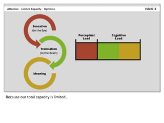
  • 6. A simplified way of understanding visual perception is to think of it in terms of two phases: Sensation and Translation.
  • 7. Sensation occurs in the eye…
  • 9. During sensation, light enters the eye through the pupil and the lens.
  • 10. The lens inverts the light…
  • 11. …and focuses it on the retina, which is the area at the back of the eye that contains photoreceptor cells…
  • 13. Rods facilitate vision in low-light conditions and are associated with peripheral vision.
  • 14. Cones facilitate vision in normal light conditions and are associated with the perception of color. There are three main types of cones cells, each of which responds to either red, green, or blue light.
  • 15. Cone cells are also associated with detail and allow us to detect contrast between features, including shadows and edges. This, in turn, allows us to perceive both shape and position.
  • 16. The way that our photoreceptors works means that there are essentially three types of visual information that we initially perceive: shape, color, and position.
  • 17. Shape, color, and position are directly correlated with the basic design elements, or the elements of art, taught to design students. While there is some variation in how basic design elements are taught, from a physiological perspective, the traditionally taught elements all represent some form of shape, color, and position.
  • 18. Texture, for example, is an effect created with a combination of shape, color, and position.
  • 19. And these three basic design elements…
  • 20. …are the building blocks of page design, and make up the overall layout, individual elements, and text.
  • 21. It is important to note that, while we traditionally treat text as separate from visual design, and both are very complex to master, the way we process them is essentially the same.
  • 22. Each of the three basic design elements has attributes – or characteristics – that we choose as page designers. For example, shape attributes can include curve, angle, and symmetry.
  • 23. The attributes that we choose convey meaning to our users. For example, curves and circles tend to convey connection, community, and wholeness, while right angles and squares tend to convey stability, order, and logic.
  • 24. The same is true for color…
  • 29. So, how do we derive meaning from these basic elements and their attributes? That happens during the second basic phase of perception: translation...
  • 30. …which occurs in the brain. The exact workings of the brain are still largely a mystery.
  • 31. In general, our brain works in very complex ways to detect features…
  • 33. …discard or ignore irrelevant features…
  • 35. …create patterns to fill in any missing information…
  • 36. …and make associations with what we already know about the world…
  • 37. …based on our past experiences.
  • 38. To complicate matters, these processes occur in sequence, in unison, and in reverse.
  • 39. There are several frameworks for understanding how we derive meaning from visual stimuli. One such early framework, known as Gestalt, was born from the study of philosophy…
  • 40. …and emerged around the same time that photography and motion pictures became popular.
  • 41. Gestalt theorists realized that what we perceive does not logically follow from what is perceivable. For example, they noted how a series of static images that shift position creates an illusion of motion, and called this the “phi phenomenon.”
  • 42. They noted that “the whole is something other than the sum of its parts” so that, two plus two equals…
  • 44. In this picture for example, we perceive a dog…
  • 45. …despite the fact that each individual element has no resemblance to the actual parts of a dog.
  • 46. There are many Gestalt principles that range from simple to complex, and they often interact with one another. Proximity, for example…
  • 47. …is a simple principle of grouping that describes how we tend to categorize elements that are positioned close to another…
  • 49. And the grouping principle of proximity…
  • 50. …can interact with other grouping principles, such as symmetry.
  • 51. A more complex Gestalt principle is Reification, in which our minds perceive visual stimuli that doesn’t actually exist in order to make sense of what we see. In this example…
  • 52. …our minds perceive a triangle that doesn’t actually exist…
  • 53. …because we can make sense of a triangle much more easily than we can make sense of the three other shapes.
  • 54. Multistability describes how – when visual stimuli are ambiguous – we can move between interpretations that are entirely different.
  • 55. And we do the same thing with text.
  • 56. All of these principles, or heuristics, describe how we process visual information, and they form the basis for the traditionally taught design principles. Just as with the design elements, there are many variations on how design principles are taught, and they usually represent a combination of various related concepts.
  • 57. For example, emphasis and contrast are listed as two separate principles, but are actually related concepts because you often convey emphasis…
  • 59. Therefore, just as with the three elements of design, the principles of design can be simplified and distilled into contrast, repetition, alignment, and position...
  • 60. …or CRAP (which is a common mnemonic used in page design).
  • 61. However, even conceiving of these as four separate concepts is actually a bit problematic.
  • 62. Alignment is a type of position…
  • 63. …and the terms “contrast” and “repetition”…
  • 64. …and the terms contrast and repetition relate to the same thing: the degree of difference on a spectrum that ranges from completely unrelated to exactly the same.
  • 65. That’s why – on the most basic level – all design principles can be thought of in terms of a single concept: Gradient.
  • 66. The concept of a gradient can be applied to each of the basic design elements, including shape…
  • 69. You can see the concept of gradient in page design all the time, with headings (which have graduated sizes, weights, and surrounding white space)…
  • 70. …with lists (which use increasing indents for subordinate items)….
  • 72. There is another important concept related to the science of good page design: attention, or the degree to which a person successfully attends to, or focuses on, something.
  • 73. Our attention is instinctively and almost instantaneously attracted to certain things. For example, if I show you this slide, your eyes inevitably return to the white circle. We are evolutionarily “hard wired” to pay attention to certain things…
  • 74. …things that include physical features, like edges…
  • 75. …and conceptual things, like faces…
  • 79. …and one of the things we are most sensitive to is difference.
  • 80. The initial stages of our attention to these things occurs involuntarily, and is a function of how our eyes and minds work. When light enters the eye, it is focused on a small area of the retina called the fovea.
  • 81. The fovea contains a much greater density of cone cells than the rest of the retina, and is the only area of the retina that allows us to perceive a high level of detail. Because this is such a small area (about one percent of the retina)…
  • 82. …most of our field of view is blurry…
  • 83. …and only a small area is actually in focus...
  • 84. …an area about the size of your thumbnail if you hold your thumb up at arm’s length.
  • 85. Because this area is so small, our eyes constantly move across our field of view in involuntary, abrupt movements called “saccades.”
  • 86. Our minds then stitch the small, in-focus images together into a perceived whole.
  • 87. In page design, we can make design choices that direct the user’s attention in ways that are automatic and do not require any conscious effort.
  • 88. Another key factor in attention is the fact that our capacity to process information is limited. One way to think of this is in terms of perceptual and cognitive load.
  • 89. Perceptual load refers to the amount of stress placed on our ability to process visual stimuli given a perceptual task.
  • 90. In this case, the task is to identify either the N or the X.
  • 91. Cognitive load refers to the amount of stress placed on our ability to translate and interpret meaning in order to achieve full comprehension.
  • 92. Because our total capacity is limited…
  • 93. …our job as page designers is to optimize perceptual load in order to maximize the resources available for attention and comprehension.
  • 94. The design of this webpage has a high perceptual load because of all the visual stimuli that isn’t related to accomplishing a task.
  • 95. This webpage design has an even higher perceptual load. At first glance, it seems to conform to the principles of good design. However, on closer inspection you can see that it lacks the necessary visual cues needed to accomplish even the most basic online task – there are none of the traditional menus, buttons, etc.
  • 96. Generally speaking, high-load designs decrease information-processing speed and accuracy. Therefore, you might think that our job is to minimize perceptual load, but that’s an oversimplification. You can minimize perceptual load...
  • 97. ...by creating page designs that are static and boring. However, simply minimizing perceptual load overlooks other important factors.
  • 98. It’s important to note that we instinctively and automatically assign meaning to everything, and then discard or ignore what is irrelevant…
  • 99. So, if a design includes characteristics that are incongruent with meaning, we have to sort through what matters and what doesn’t and use our conscious mind to comprehend meaning, so that speed and accuracy are low.
  • 100. If a design includes characteristics that are neutral in terms of meaning, speed and accuracy increase.
  • 101. By making visual stimuli more complex in ways that are congruent with meaning, speed and accuracy increase even more.
  • 102. There is another important component of attention that is often overlooked, particularly in certain genres of information development like technical communication. If perceptual load relates to perceivability, and cognitive load relates to understandability...
  • 103. ...then both work together to capture and direct our attention...
  • 104. …which facilitates comprehension and, therefore, usability. If you think of both as existing along a normal curve…
  • 105. …too little load doesn’t hold our attention and doesn’t facilitate comprehension…
  • 106. …too much load overwhelms our capacity for attention and doesn’t facilitate comprehension…
  • 107. …and so the key is to find the sweet spot in the middle – the point at which page design facilitates comprehension. Which brings us to the second important component of page design that is so often overlooked...
  • 109. When perceptual and cognitive load are successfully optimized, we experience pleasure.
  • 110. There are at least two types of pleasure that are important in page design. One occurs at the “a-ha” moment of comprehension...
  • 111. …such as when we are shown an apparently meaningless image…
  • 112. …and then are shown a caption that shows that the image means something. Research has shown that, at the moment of comprehension, our brains release endomorphins, which suppress pain and are associated with pleasure.
  • 113. The second type of pleasure is aesthetic pleasure. Statistic analyses have shown that aesthetic pleasure occurs when there is a balance between typicality and novelty…
  • 114. …between unity and variety…
  • 115. …between sameness and difference. Which brings us back again to the primary principle of page design: gradient.
  • 116. The pleasure that we experience when engaging with well-design information has a Pavlovian positive-reinforcement effect, in which our information-seeking behavior is rewarded, which encourages and facilitates further engagement.
  • 117. So, the way we process visual information is directly correlated with best practices in page design…
  • 118. …but how do you combine the basic design elements…
  • 119. …with the fundamental design principle of gradient into successful page designs?
  • 120. Of course, it’s a complex answer – there are no rote recipes for good design…
  • 121. …in part, because there are so many variables. As soon as you make one design choice…
  • 122. …it’s going to impact other design choices because page design is essentially about relationships…
  • 123. …the relationships between the elements on a page.
  • 124. Design requires a type of logic called conditional reasoning, which consists of “if-then” choices. Here, for example, if I use two narrow columns, then I should use more white space between the paragraphs instead of using a first-line indent. Otherwise, the indentation for both paragraphs and lists can cause the eye to get lost while tracking across lines of text.
  • 125. The design process is very similar to the writing process – we combine basic elements based on common principles to create meaning.
  • 126. Just as with writing, there are a number of sources that provide rules and guidelines, and it takes time and experimentation to really figure out how to apply them in real life – to figure out what “proper” alignment and a “logical” color palette are.
  • 127. And – just as with writing – there is also a lot of bad advice out there – which is why having a deeper understanding is so important.
  • 128. A good way to learn is to look in areas of information development you might not normally be exposed to – areas like user experience design, presentation design, and data visualization.
  • 129. Since we’re just about out of time, I’d like to share just two guiding principles with you – principles that can be used for every design choice. The first is Just-Noticeable Difference (JND), which is a technical term used in perception studies…
  • 130. …that refers the degree of difference required to be detected 50% of the time.
  • 131. Because we assign meaning to everything and then discard or ignore what is irrelevant – if you use just enough difference to be noticeable, then that conserves cognitive resources and lowers perceptual and cognitive load.
  • 132. Which is one reason this is bad advice…
  • 133. …using arbitrary font weights creates an additional degree of difference that is unnecessary and increases load. The change in font weights has no purpose, other than to introduce difference simply for the sake of difference.
  • 134. Which brings us to the second piece of advice, which is to use intentional design. Careless design choices cause extra perceptual and cognitive load by either contradicting meaning…
  • 136. …or by adding visual clutter. (Don’t use decoration.)
  • 137. Instead, make sure every design choice is intentional and has a purpose.
  • 138. And, when in doubt, keep it simple.
  • 139. We have taken just a peek at how the science of human visual perception forms the basis for good page design, and there’s so much more to explore. I just want to leave you with one final thought. Despite a long tradition of silos in both education and business…
  • 140. …that positions content and design as separate things that are in opposition to one another…
  • 141. …content and design are inseparable, and both are necessary in creating high-quality information deliverables.
  • 142. Design without content is meaningless, and content without design is incomprehensible. And, even with all of the design elements removed, this block of text is still in a font, in a color, in shape, positioned on the page. Without any design elements…
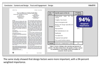
  • 144. And a ton of research shows that design matters. A 2004 study of the effects of content and design on users of health-care websites showed that content factors had an 83-percent weighted importance in terms of trust and engagement.
  • 145. The same study showed that design factors were more important, with a 94-percent weighted importance.
  • 146. And design is particularly important during the initial stages of engagement…
  • 147. …because effective visual design is so powerful that it can instill persistent trust and facilitate engagement, despite known issues with usability and content.
  • 148. So, in terms of knowing your audience, know that good page design can make the difference between...
  • 151. Contact me if you need design advice or if you have any design problems, want to share some design examples (I collect them), or you just want to chat! Email: tmkister@nanatoo.com
  • 152. To cite this presentation: Kister, Tina M. “The Science of Good Page Design (A Brief Introduction).” presented at Information Development World 2018: Building a Modern Online Technical Resource Center, Menlo Park, California, November 28, 2018. • Biederman, Irving, and Edward A. Vessel. “Perceptual Pleasure and the Brain: A Novel Theory Explains Why the Brain Craves Information and Seeks It Through the Senses.” American Scientist 94 (2006): 247–53. • Blijlevens, J, Clementine Thurgood, Paul Hekkert, Lin-Lin Chen, Helmut Leder, and T W. Allan Whitfield. “The Aesthetic Pleasure in Design Scale: The Development of a Scale to Measure Aesthetic Pleasure for Designed Artifacts.” Psychology of Aesthetics, Creativity, and the Arts 11 (February 1, 2017): 86–98. https://doi.org/10.1037/aca0000098. • Cairo, Alberto. “The Truthful Art: Data, Charts, and Maps for Communication.” Accessed November 9, 2018. https://www.amazon.com/Truthful-Art-Data-Charts- Communication/dp/0321934075/ref=sr_1_1?ie=UTF8&qid=1541766732&sr=8-1&keywords=the+truthful+art. • Chen, Kang-chen, and Hye Jung Choi. “Visual Attention and Eye Movements,” 2008. • Chugh, Sagar. “Aesthetics vs. Usability.” 00:01:40 UTC. https://www.slideshare.net/schugh/aesthetics-vs-usability. • Curtin, John J., and Bradley A. Fairchild. “Alcohol and Cognitive Control: Implications for Regulation of Behavior during Response Conflict.” Journal of Abnormal Psychology 112, no. 3 (August 2003): 424–36. • Debue, Nicolas, and Cécile van de Leemput. “What Does Germane Load Mean? An Empirical Contribution to the Cognitive Load Theory.” Frontiers in Psychology 5 (2014). https://doi.org/10.3389/fpsyg.2014.01099. • Detlef, Pete. “Conducting an Audience Analysis: What Is Important to Your Audience.” 24 Hour Translation Services, 2017. https://www.24hourtranslation.com/conducting-an-audience-analysis-what-is-important-to-your-audience.html. • Duarte, Nancy. Slide:Ology: The Art and Science of Creating Great Presentations. Sebastopol, CA: O’Reilly Media, 2008. • Goldstein, E. Bruce, and James Brockmole. Sensation and Perception. 10th ed. Cengage Learning, 2016. https://books.google.com/books?id=x5d4CgAAQBAJ&printsec=frontcover&dq=Sensation+and+Perception&hl=en&sa=X& ved=0ahUKEwjxhM6rpNbdAhUN61MKHS2XClwQ6AEIKTAA#v=onepage&q&f=false. • Grais, Stuart. “Gestalt Principles.” DePaul University, College of Computing and Digital Media. Accessed November 9, 2018. http://facweb.cs.depaul.edu/sgrais/gestalt_principles.htm. • Hart, Geoff. “Technical Communications Primer: Gestalt Theory and Visual Design.” TechWhirl, March 12, 2012. https://techwhirl.com/technical-communications-primer-gestalt-theory-and-visual-design/. Bibliography Page 1
  • 153. • Johnson, Jeff. Designing with the Mind in Mind: Simple Guide to Understanding User Interface Design Guidelines. 2nd ed. Waltham, MA: Elsevier, 2014. • Kitenga, Te. “A World of Edges.” Accessed October 23, 2018. http://www.tekitenga.com/visual-perception/a-world-of- edges/. • Lavie, Nilli, Zhicheng Lin, Nahid Zokaei, and Volker Thoma. “The Role of Perceptual Load in Object Recognition.” Journal of Experimental Psychology: Human Perception and Performance Journal of Experimental Psychology: Human Perception and Performance 35 (2009): 1346–58. • Lindgaard, Gitte, Gary Fernandes, Cathy Dudek, and Judith Brown. “Attention Web Designers: You Have 50 Milliseconds to Make a Good First Impression!” Behaviour & Information Technology 25 (2006): 115–26. • Marciano, Hadas, and Yaffa Yeshurun. “Large Inter-Individual and Intra-Individual Variability in the Effect of Perceptual Load.” PLOS ONE 12, no. 4 (April 13, 2017): e0175060. https://doi.org/10.1371/journal.pone.0175060. • Mazza, Riccardo. Introduction to Information Visualization. London: Springer-Verlag, 2009. //www.springer.com/us/book/9781848002180. • Murphy, G., and C. M. Greene. “Perceptual Load Affects Eyewitness Accuracy and Susceptibility to Leading Questions.” Frontiers in Psychology 7 (2016). • Murphy, Gillian, John A. Groeger, and Ciara M. Greene. “Twenty Years of Load Theory—Where Are We Now, and Where Should We Go Next?” Psychonomic Bulletin & Review 23, no. 5 (October 1, 2016): 1316–40. https://doi.org/10.3758/s13423-015-0982-5. • Panday, V., Wouter M. Bergmann Tiest, and A. M. L. Kappers. “The Influence of Edges as Salient Features in Haptic Shape Perception of 3D Objects.” In 2011 IEEE World Haptics Conference, 529–32. Istanbul: IEEE, 2011. https://doi.org/10.1109/WHC.2011.5945541. • Pelli, Denis G. “Two Stages of Perception.” Theories of Vision, 1997. https://pdfs.semanticscholar.org/46fe/a20b34fc32f129cd9d7b3fa55fa221e1d8fd.pdf. • Peromaa, Tarja-L., and Pentti I. Laurinen. “Separation of Edge Detection and Brightness Perception.” Vision Research 44, no. 16 (July 1, 2004): 1919–25. https://doi.org/10.1016/j.visres.2004.03.005. • Purves, Dale, George J. Augustine, David Fitzpatrick, Lawrence C. Katz, Anthony-Samuel LaMantia, James O. McNamara, and S. Mark Williams. “Anatomical Distribution of Rods and Cones.” Neuroscience. 2nd Edition, 2001. https://www.ncbi.nlm.nih.gov/books/NBK10848/. Bibliography Page 2
  • 154. • Purves, Dale, Brian B. Monson, Janani Sundararajan, and William T. Wojtach. “How Biological Vision Succeeds in the Physical World.” Proceedings of the National Academy of Sciences 111 (2014): 4750–55. https://doi.org/10.1073/pnas.1311309111. • Roelofs, A., M. van Turennout, and M. G. H. Coles. “Anterior Cingulate Cortex Activity Can Be Independent of Response Conflict in Stroop-Like Tasks.” Proceedings of the National Academy of Sciences 103, no. 37 (September 12, 2006): 13884– 89. https://doi.org/10.1073/pnas.0606265103. • Shaikh, A. Dawn, Barbara S. Chaparro, and Doug Fox. “Perception of Fonts: Perceived Personality Traits and Uses.” Usability News 8 (2006): 1–6. • Sillence, Elizabeth, Pam Briggs, Lesley Fishwick, and Peter Harris. “Trust and Mistrust of Online Health Sites.” In Proceedings of the SIGCHI Conference on Human Factors in Computing Systems, 663–70. ACM, 2004. • Stribley, Mary. “20 Design Rules You Should Never Break.” Learn, April 14, 2015. https://www.canva.com/learn/design- rules/. • Tractinsky, Noam, Adi S. Katz, and Dror Ikar. “What Is Beautiful Is Usable.” Interacting with Computers 13 (2000): 127–45. • Treisman, Anne, and Stephen Gormican. “Feature Analysis in Early Vision: Evidence from Search Asymmetries.” Psychological Review 95 (1988): 15–48. • Tufte, Edward R. Envisioning Information. Cheshire, Connecticut: Graphics Pr, 1990. • Ware, Colin. Visual Thinking for Design. Amsterdam: Elsevier Morgan Kaufmann, 2011. • Williams, Robin. The Non-Designer’s Design Book: Design and Typographic Principles for the Visual Novice, 2015. • Wolfe, Jeremy M. “Guidance of Visual Search by Preattentive Information.” In Neurobiology of Attention, 101–4. Elsevier, 2005. • Wolfe, Jeremy M., Kyle R. Cave, and Susan L. Franzel. “Guided Search: An Alternative to the Feature Integration Model for Visual Search.” Journal of Experimental Psychology: Human Perception and Performance Journal of Experimental Psychology: Human Perception and Performance 15 (1989): 419–33. • Wolfe, Jeremy M., and W. Gray. “Guided Search 4.0.” Integrated Models of Cognitive Systems, 2007, 99–119. • Yau, Nathan. Visualize This: The FlowingData Guide to Design, Visualization, and Statistics. John Wiley & Sons, 2011. Bibliography Page 3
  • 155. Sensation refers to the process of receiving visual stimuli from the outside world. Translation refers to the neurological and chemical processes that occur after light is converted into electrochemical impulses and sent through the optic nerve to the brain. The Science of Good Page Design (A Brief Introduction) Introduction Information developers should be proficient in page design, as well as writing, as both are essential in creating deliv- erables that are easy to find, read, use, understand, and remember. While audience analysis is a fairly standard component of best practices in information development, we tend to overlook one of the most important characteristics of our audience – that is, how human beings, regardless of age, economic status, gender, and other demographic particulars, process visual information. Tina M. Kister Consultant, Nanatoo Communications Sensation During sensation, light enters the eye through the cornea, the pupil, and the lens. The lens inverts the light and focuses it on the retina, which is the area at the back of the eye that contains photoreceptor cells called rods and cones. Visual Perception Design is an integral component of all information develop- ment, and the physiology and anatomy of human perception form the basis of best practices in design. With a deep under- standing of how people process information, you can make design decisions that reinforce meaning, improve processes, and result in high-quality deliverables. A simplified way of understanding visual perception is to think of it in terms of two phases: sensation and translation. Sensation occurs in the eye, and translation occurs in the brain. Rods and Cones Rods facilitate vision in low-light conditions and are associated with peripheral vision. Cones facilitate vision in normal light conditions and are associated with the percep- tion of color. There are three main types of cones cells, each of which responds to either red, green, or blue light. Cone cells are also associated with perception of detail and allow us to detect contrast between features, including shadows and edges. This, in turn, allows us to perceive both shape and position.
  • 156. Cone cells are associated with perception of detail and allow us to detect contrast between features, including shadows and edges. Cone cells also allow us to perceive color, and different cone cells are sensitive to either red, green, or blue light. There are essentially three types of visual information that we initially perceive: shape, color, and position. w is a Gestalt heuristic that describes how, when visual stimuli are ambiguous, we can move between interpretations that are entirely different. Design Elements (Shape, Color, Position) The way that our photoreceptors works means that there are essentially three types of visual informa- tion that we initially perceive: shape, color, and position. These three elements are directly correlated with the basic design elements taught to all beginning designers. Because the three basic elements can be combined in various ways to form the tradition- ally taught elements, there is some variation in how basic design elements are taught. However, it’s helpful to remember that, from a physiological perspective, the traditionally taught elements all represent some form of shape, color, and position. Each of the three basic design elements (of shape, color, and position) has attributes – or characteristics – that we choose as page designers, and these attributes convey meaning. Translation Translation occurs in the brain, and, while sensation relates primarily to receiving visual stimuli, translation relates to how we derive meaning from visual stimuli. In general, our brain works in very complex ways to detect features in our field of vision, and then to identify, categorize, and organize the features; discard or ignore irrelevant features; create patterns to fill in missing information; and make associations with what we already know about the world based on our past experiences. Gestalt Heuristics There are several frameworks for understanding how we derive meaning from visual stimuli. One such frame- work, known as Gestalt, describes how we interpret visual stimuli. There are many Gestalt princi- ples that range from simple to complex, and they often interact with one another. Design Principles (or Gradient) Frameworks that describe how we derive meaning from visual stimuli are the basis for the tradition- ally taught design principles, which represent a combination of related concepts. In page design, the basic design principles are often simplified to Contrast, Repetition, Alignment, and Position, or CRAP. However, they can be further distilled into the single concept of gradient, or degree of difference.
  • 157. Traditional design principles can be distilled into the single concept of gradient, or the degree of difference in the attributes chosen for the basic design elements. The concept of gradient is evident in all page design, including in the use of headings (with graduated weights and sizes), lists (with increasing indentation for subordinate list items), and color, as demonstrated in the web-page design for Information Development World 2018. Our eyes and minds are predisposed to direct our attention to certain things, which include features like edges, and also include concepts like faces, food, danger, and sex. One of the things we are most sensitive to is difference. Attention There is another important concept related to the science of good page design: attention, or the degree to which a person successfully “attends to,” or focuses on, something. Instinctive and Automatic Our attention is instinctively attracted to certain features (such as edges) as well as conceptual things (like faces, food, danger, and sex, and difference). Our eyes and minds are “hard-wired” (evolutionarily predisposed) to direct our attention to differ- ence, and this is reinforced by how our eyes move across our field of view in short, abrupt movements called saccades. Saccades are necessary because only a small area within our field of view is actually in focus – most of our field of view is blurry. Saccades allow us to receive several small, in-focus images, which our minds then stitch together into a perceived whole. As page designers, we can make design choices that direct user attention before conscious effort is engaged.
  • 158. The way we process visual information is directly related to the basic design elements and principles used in page design, and the application of best practices directs the user’s attention to deliverables that are easy to find, read, understand, use, and remember. Limited Capacity Another key factor in attention is the fact that our capacity to process infor- mation is limited. One way to think of our attention capacity is in terms of perceptual and cognitive load. Percep- tual load refers to the amount of stress placed on our ability to process visual stimuli given a perceptual task. Cogni- tive load refers to the amount of stress placed on our ability to translate and interpret meaning in order to achieve full comprehension. Our job as page designers is to optimize perceptual load in order to maximize the resources available for attention and comprehen- sion. Pleasure Another important component of attention is pleasure. Studies have shown that the moment of compre- hension is associated with a release of endomorphins, which are associated with pleasure. Studies have also shown that aesthetic pleasure is related to finding a balance between sameness and difference, which, in turn, brings us back to the distilled design principle of gradient. The pleasure that we experi- ence when interacting with high-quality information reinforces and encourages information-seeking behavior and leads to further audience engagement. Application There are no rote recipes for good design, in part because there are so many vari- ables. Good page design is about the relationships between page elements, and good design choices are based on using conditional reasoning, or “if-then” logic. Just as with writing, there are a number of sources that provide rules and guide- lines, and it takes time and experimentation to figure out which ones are valid and how to apply them. A good way to learn is to look in areas of information develop- ment you might not normally be exposed to – areas like user experience design, presentation design, and visualizing information (statistics). Just-Noticeable Difference and Intentional Design The key to successful page design is to use the three design elements (shape, color, and position), and alter their attributes (e.g., angle, hue, and alignment) along a gradient of difference using Just-Noticeable Difference (just enough difference to convey meaning) and intentional design (making design choices with a purpose). Using these two concepts will help you make design choices that optimize percep- tual and cognitive load, direct the user’s attention, and facilitate comprehension, usability, and engagement. Conclusion Despite a long tradition of silos in both education and business that positions content and design as separate things that are in opposition to one another, content and design are inseparable, and both are necessary in creating high- quality information deliverables. Research has shown that design factors are more important than content factors, particularly during the initial stages of engage- ment. Effective visual design is so powerful that it can instill persistent trust and facilitate engagement, despite known issues with usability and content. Recommended Reading Johnson, Jeff. Designing with the Mind in Mind: Simple Guide to Understanding User Interface Design Guidelines. 2nd ed. Waltham, MA: Elsevier, 2014. Duarte, Nancy. Slide:ology: The Art and Science of Creating Great Presentations. Sebastopol, CA: O’Reilly Media, 2008. Goldstein, E. Bruce, and James Brockmole. Sensation and Perception. 10th ed. Cengage Learning, 2016. Williams, Robin. The Non-Designer’s Design Book: Design and Typographic Princi- ples for the Visual Novice, 2015. Contact Tina M. Kister Nanatoo Communications tmkister@nanatoo.com (435)-260-1565 www.nanatoo.com