SlideShare a Scribd company logo
3
Most read
5
Most read
20
Most read
10/14/2019 Types of Graphs and Charts and Their Uses: with Examples and Pics
intellspot.com/types-graphs-charts/ 1/24
If you are wondering what are the di erent types of
graphs and charts, their uses and names, this page
summarizes them with examples and pictures.
As the di erent kinds of graphs aim to represent data,
they are used in many areas such as: in statistics, in
data science, in math, in economics, in business and
etc.
Every type of graph is a visual representation of data
on diagram plots (ex. bar, pie, line chart) that show
di erent types of graph trends and relationships
between variables.
Home  Business Intelligence 
Types of Graphs and Charts And Their Uses
10 Email Data
Mining
Software And
Analytics …
Examples of
Unstructured
Data
10 Best Data
Scrubbing
Software Tools
Data
Dashboard
Examples: With
Best
Visualization
& …
10 Best BI
Reporting
Tools (And A …
RELATED POSTS
Types of Graphs and
Charts And Their Uses
Tweet
Share 3
Like 3
Save 1
Powerful Skills And Tools To Unlock Data For Business Grow  
WRITE A POST
Home Business Intelligence Data Science Market Intelligence
Management

10/14/2019 Types of Graphs and Charts and Their Uses: with Examples and Pics
intellspot.com/types-graphs-charts/ 2/24
Although it is hard to tell what are all the types of
graphs, this page consists all of the common types of
statistical graphs and charts (and their meanings)
widely used in any science.
1. Line Graphs
A line chart graphically displays data that changes
continuously over time. Each line graph consists of
points that connect data to show a trend (continuous
change). Line graphs have an x-axis and a y-axis. In the
most cases, time is distributed on the horizontal axis.
Uses of line graphs:
Example: 
The following line graph shows annual sales of a
particular business company for the period of six
consecutive years:
FEATURED POST
RECOMMENDED
POSTSWhen you want to show trends. For example,
how house prices have increased over time.
•
When you want to make predictions based on a
data history over time.
•
When comparing two or more di erent variables,
situations, and information over a given period of
time.
•
50
Sustainable
Competitive
Advantages:
Examples &
Sources
15 Examples
Of
Competitive
Advantage
Strategies
That Work Great
25 Best Free
Online
Competitor
Analysis Tools
That Work
E ectively
50 Best Web Competitive
Intelligence Tools and
Techniques
Tweet
Share 3
Like 3
Save 1

10/14/2019 Types of Graphs and Charts and Their Uses: with Examples and Pics
intellspot.com/types-graphs-charts/ 3/24
Note: the above example is with 1 line. However, one
line chart can compare multiple trends by several
distributing lines.
2. Bar Charts
Bar charts represent categorical data with rectangular
bars (to understand what is categorical data see
categorical data examples). Bar graphs are among the
most popular types of graphs and charts in economics,
statistics, and marketing. They are commonly used to
compare several categories of data.
Each rectangular bar has length and height
proportional to the values that they represent.
One axis of the bar chart presents the categories being
compared. The other axis shows a measured value.
Bar Charts Uses:
When you want to display data that are grouped
into nominal or ordinal categories (see nominal
vs ordinal data).
•
31 Best Ways
To Collect
Data For
Secondary
Research
How To Do
Competitive
Market
Research and
Analysis? The
Guide
Marketing
Intelligence:
Types,
De nition,
Examples
35 Data
Scientist
Quali cations
And Skills
Needed To
Succeed
Supervised vs
Unsupervised
Learning:
Algorithms
and Examples
Data Driven
Decision
Making:
Process and
Model
Tweet
Share 3
Like 3
Save 1

10/14/2019 Types of Graphs and Charts and Their Uses: with Examples and Pics
intellspot.com/types-graphs-charts/ 4/24
Example:
The bar chart below represents the total sum of sales
for Product A and Product B over three years.
The bars are 2 types: vertical or horizontal. It doesn’t
matter which kind you will use. The above one is a
vertical type.
3. Pie Charts
When it comes to statistical types of graphs and charts,
the pie chart (or the circle chart) has a crucial place
and meaning. It displays data and statistics in an easy-
to-understand ‘pie-slice’ format and illustrates
numerical proportion.
FREE DOWNLOAD
To compare data among di erent categories.•
Bar charts can also show large data changes over
time.
•
Bar charts are ideal for visualizing the distribution
of data when we have more than three categories.
•
Tweet
Share 3
Like 3
Save 1
GET MORE STUFF
FROM
INTELLSPOT.COM
Subscribe to our mailing
list and get interesting
stu and updates to your
email inbox.
I consent to my
submitted data being
collected via this form*
SIGN UP NOW
We respect your privacy and
take protecting it seriously.
We will use your emails only
to send you noti cations for
the new posts.
Enter your email here

10/14/2019 Types of Graphs and Charts and Their Uses: with Examples and Pics
intellspot.com/types-graphs-charts/ 5/24
Each pie slice is relative to the size of a particular
category in a given group as a whole. To say it in
another way, the pie chart brakes down a group into
smaller pieces. It shows part-whole relationships.
To make a pie chart, you need a list of categorical
variables and numerical variables.
Pie Chart Uses:
Example:
The pie chart below represents the proportion of types
of transportation used by 1000 students to go to their
school.
When you want to create and represent the
composition of something.
•
It is very useful for displaying nominal or ordinal
categories of data.
•
To show percentage or proportional data.•
When comparing areas of growth within a
business such as pro t.
•
Pie charts work best for displaying data for 3 to 7
categories.
•
Tweet
Share 3
Like 3
Save 1

10/14/2019 Types of Graphs and Charts and Their Uses: with Examples and Pics
intellspot.com/types-graphs-charts/ 6/24
Pie charts are widely used for displaying marketing
data.
4. Histogram
A histogram shows continuous data in ordered
rectangular columns (to understand what is
continuous data see our post discrete vs continuous
data). Usually, there are no gaps between the
columns.
The histogram displays a frequency distribution
(shape) of a data set. At rst glance, histograms look
alike to bar graphs. However, there is a key di erence
between them. Bar Chart represents categorical data
and histogram represent continuous data.
Histogram Uses:
When the data is continuous.•
When you want to represent the shape of the
data’s distribution.
•
Tweet
Share 3
Like 3
Save 1

10/14/2019 Types of Graphs and Charts and Their Uses: with Examples and Pics
intellspot.com/types-graphs-charts/ 7/24
Example:
The histogram below represents per capita income for
ve age groups.
Histograms are very widely used in statistics, business,
and economics.
5. Scatter plot
The scatter plot is an X-Y diagram that shows a
relationship between two variables. It is used to plot
data points on a vertical and a horizontal axis. The
purpose is to show how much one variable a ects
another.
When you want to see whether the outputs of two
or more processes are di erent.
•
To summarize large data sets graphically.•
To communicate the data distribution quickly to
others.
•
Tweet
Share 3
Like 3
Save 1

10/14/2019 Types of Graphs and Charts and Their Uses: with Examples and Pics
intellspot.com/types-graphs-charts/ 8/24
Usually, when there is a relationship between 2
variables, the rst one is called independent. The
second variable is called dependent because its values
depend on the rst variable.
Scatter plots also help you predict the behavior of one
variable (dependent) based on the measure of the
other variable (independent).
Scatter plot uses:
Example:
The below Scatter plot presents data for 7 online
stores, their monthly e-commerce sales, and online
advertising costs for the last year.
When trying to nd out whether there is a
relationship between 2 variables.
•
To predict the behavior of dependent variable
based on the measure of the independent
variable.
•
When having paired numerical data.•
When working with root cause analysis tools to
identify the potential for problems.
•
When you just want to visualize the correlation
between 2 large datasets without regard to time.
•
Tweet
Share 3
Like 3
Save 1

10/14/2019 Types of Graphs and Charts and Their Uses: with Examples and Pics
intellspot.com/types-graphs-charts/ 9/24
The orange line you see in the plot is called “line of
best t” or a “trend line”. This line is used to help us
make predictions that are based on past data.
The Scatter plots are used widely in data science and
statistics. They are a great tool for visualizing linear
regression models.
More examples and explanation for scatter plots you
can see in our post what does a scatter plot show and
simple linear regression examples.
6. Venn Chart
Venn Diagram (also called primary diagram, set
diagram or logic diagrams) uses overlapping circles to
visualize the logical relationships between two or more
group of items.
Venn Diagram is one of the types of graphs and charts
used in scienti c and engineering presentations, in
computer applications, in maths, and in statistics.
Tweet
Share 3
Like 3
Save 1

10/14/2019 Types of Graphs and Charts and Their Uses: with Examples and Pics
intellspot.com/types-graphs-charts/ 10/24
The basic structure of the Venn diagram is usually
overlapping circles. The items in the overlapping
section have speci c common characteristics. Items in
the outer portions of the circles do not have common
traits.
Venn Chart Uses:
Example:
The following science example of Venn diagram
compares the features of birds and bats.
7. Area Charts 
When you want to compare and contrast groups
of things.
•
To categorize or group items.•
To illustrate logical relationships from various
datasets.
•
To identify all the possible relationships between
collections of datasets.
•
Tweet
Share 3
Like 3
Save 1

10/14/2019 Types of Graphs and Charts and Their Uses: with Examples and Pics
intellspot.com/types-graphs-charts/ 11/24
Area charts show the change in one or several
quantities over time. They are very similar to the line
chart. However, the area between axis and line are
usually lled with colors.
Despite line and area charts support the same type of
analysis, they cannot be always used
interchangeably. Line charts are often used to
represent multiple data sets. Area charts cannot show
multiple data sets clearly because area charts show a
lled area below the line.
Area Chart Uses:
The area chart has 2 variants: a variant with data plots
overlapping each other and a variant with data plots
stacked on top of each other (known as stacked area
chart – as the shown in the following example).
Example:
The area chart below shows quarterly sales for
product categories A and B for the last year.
When you want to show trends, rather than
express speci c values.
•
To show a simple comparison of the trend of
data sets over the period of time.
•
To display the magnitude of a change.•
To compare a small number of categories.•
Tweet
Share 3
Like 3
Save 1

10/14/2019 Types of Graphs and Charts and Their Uses: with Examples and Pics
intellspot.com/types-graphs-charts/ 12/24
This area chart shows you a quick comparison of the
trend in the quarterly sales of Product A and Product B
over the period of the last year.
8. Spline Chart
The Spline Chart is one of the most widespread types
of graphs and charts used in statistics. It is a form of
the line chart that represent smooth curves through
the di erent data points.
Spline charts possess all the characteristics of a line
chart except that spline charts have a tted curved line
to join the data points. In comparison, line charts
connect data points with straight lines.
Spline Chart Uses:
When you want to plot data that requires the
usage of curve- tting such as a product lifecycle
chart or an impulse-response chart.
•
Spline charts are often used in designing Pareto
charts.
•
Tweet
Share 3
Like 3
Save 1

10/14/2019 Types of Graphs and Charts and Their Uses: with Examples and Pics
intellspot.com/types-graphs-charts/ 13/24
Example:
The following spline chart example shows sales of a
company through several months of a year:
9. Box and Whisker Chart
A box and whisker chart is a statistical graph for
displaying sets of numerical data through their
quartiles. It displays a frequency distribution of the
data.
The box and whisker chart helps you to display the
spread and skewness for a given set of data using the
ve number summary principle: minimum, maximum,
median, lower and upper quartiles. The ‘ ve-number
summary’ principle allows providing a statistical
summary for a particular set of numbers. It shows you
the range (minimum and maximum numbers), the
Spline chart also is often used for data modeling
by when you have limited number of data points
and estimating the intervening values.
•
Tweet
Share 3
Like 3
Save 1

10/14/2019 Types of Graphs and Charts and Their Uses: with Examples and Pics
intellspot.com/types-graphs-charts/ 14/24
spread (upper and lower quartiles), and the center
(median) for the set of data numbers.
A very simple gure of a box and whisker plot you can
see below:
Box and Whisker Chart Uses:
Example:
The table and box-and-whisker plots below shows test
scores for Maths and Literature for the same class.
When you want to observe the upper, lower
quartiles, mean, median, deviations, etc. for a
large set of data.
•
When you want to see a quick view of the dataset
distribution.
•
When you have multiple data sets that come
from independent sources and relate to each
other in some way.
•
When you need to compare data from di erent
categories.
•
Tweet
Share 3
Like 3
Save 1

10/14/2019 Types of Graphs and Charts and Their Uses: with Examples and Pics
intellspot.com/types-graphs-charts/ 15/24
Maths 35 77 92 43 55 66 73 70
Literature 35 43 40 43 50 60 70 92
Box and Whisker charts have applications in many
scienti c areas and types of analysis such as statistical
analysis, test results analysis, marketing analysis, data
analysis, and etc.
10. Bubble Chart
Bubble charts are super useful types of graphs for
making a comparison of the relationships between
data in 3 numeric-data dimensions: the Y-axis data, the
X-axis data, and data depicting the bubble size.
Bubble charts are very similar to XY Scatter plots but
the bubble chart adds more functionality – a third
dimension of data that can be extremely valuable.
Both axes (X and Y) of a bubble chart are numeric.
Bubble Chart Uses:
Tweet
Share 3
Like 3
Save 1

10/14/2019 Types of Graphs and Charts and Their Uses: with Examples and Pics
intellspot.com/types-graphs-charts/ 16/24
Example:
The bubble chart below shows the relationship
between Cost (X-Axis), Pro t (Y-Axis), and Probability of
Success (%) (Bubble Size).
11. Pictographs
The pictograph or a pictogram is one of the more
visually appealing types of graphs and charts that
display numerical information with the use of icons or
picture symbols to represent data sets.
They are very easy to read statistical way of data
visualization. A pictogram shows the frequency of data
as images or symbols. Each image/symbol may
represent one or more units of a given dataset.
When you have to display three or four
dimensions of data.
•
When you want to compare and display the
relationships between categorized circles, by the
use of proportions.
•
Tweet
Share 3
Like 3
Save 1

10/14/2019 Types of Graphs and Charts and Their Uses: with Examples and Pics
intellspot.com/types-graphs-charts/ 17/24
Pictograph Uses:
Example: 
The following pictographic represents the number of
computers sold by a business company for the period
from January to March.
The pictographic example above shows that in January
are sold 20 computers (4×5 = 20), in February are sold
30 computers (6×5 = 30) and in March are sold 15
computers.
12. Dot Plot
Dot plot or dot graph is just one of the many types of
graphs and charts to organize statistical data. It uses
dots to represent data. A Dot Plot is used for relatively
When your audience prefers and understands
better displays that include icons and illustrations.
Fun can promote learning.
•
It’s habitual for infographics to use of a pictogram.•
When you want to compare two points in an
emotionally powerful way.
•
Tweet
Share 3
Like 3
Save 1

10/14/2019 Types of Graphs and Charts and Their Uses: with Examples and Pics
intellspot.com/types-graphs-charts/ 18/24
small sets of data and the values fall into a number of
discrete categories.
If a value appears more than one time, the dots are
ordered one above the other. That way the column
height of dots shows the frequency for that value.
Dot Plot Uses:
Example:
Suppose you have a class of 26 students. They are
asked to tell their favorite color. The dot plot below
represents their choices:
It is obvious that blue is the most preferred color by
the students in this class.
To plot frequency counts when you have a small
number of categories.
•
Dot plots are very useful when the variable is
quantitative or categorical.
•
Dot graphs are also used for univariate data
(data with only one variable that you can
measure).
•
Tweet
Share 3
Like 3
Save 1

10/14/2019 Types of Graphs and Charts and Their Uses: with Examples and Pics
intellspot.com/types-graphs-charts/ 19/24
13. Radar Chart
A radar chart is one of the most modern types of
graphs and charts – ideal for multiple
comparisons. Radar charts use a circular display with
several di erent quantitative axes looking like spokes
on a wheel. Each axis shows a quantity for a di erent
categorical value.
Radar charts are also known as spider charts, web
charts, star plots, irregular polygons, polar charts,
cobweb charts or Kiviat diagram.
Radar Chart has many applications nowadays in
statistics, maths, business, sports analysis, data
intelligence, and etc.
Radar Chart Uses:
Example:
For example, we can compare employee’s
performance with the scale of 1-8 on subjects such as
Punctuality, Problem-solving, Meeting Deadlines,
Marketing Knowledge, Communications. A point that is
closer to the center on an axis shows a lower value
and a worse performance.
When you want to observe which variables have
similar values or whether there are any outliers
amongst each variable.
•
To represent multiple comparisons.•
When you want to see which variables are scoring
low or high within a dataset. This makes radar
chart ideal for displaying performance.
•
Tweet
Share 3
Like 3
Save 1

10/14/2019 Types of Graphs and Charts and Their Uses: with Examples and Pics
intellspot.com/types-graphs-charts/ 20/24
Label Punctuality Problem-
solving
Meeting
Deadlines
Marketing
Knowledge
Communicatio
Jane 6 5 8 7 8
Samanta 7 5 5 4 8
It is obvious that Jane has a better performance than
Samanta.
14. Pyramid Graph
When it comes to easy to understand and good
looking types of graphs and charts, pyramid graph has
a top place.
Tweet
Share 3
Like 3
Save 1

10/14/2019 Types of Graphs and Charts and Their Uses: with Examples and Pics
intellspot.com/types-graphs-charts/ 21/24
A pyramid graph is a chart in a pyramid shape or
triangle shape. These types of charts are best for data
that is organized in some kind of hierarchy. The levels
show a progressive order.
Pyramid Graph Uses:
Example:
A classic pyramid graph example is the healthy food
pyramid that shows fats, oils, and sugar (at the top)
should be eaten less than many other foods such as
vegetables and fruits (at the bottom of the pyramid).
Conclusion:
When you want to indicate a hierarchy level
among the topics or other types of data.
•
Pyramid graph is often used to represent
progressive orders such as: “older to newer”,
“more important to least important”, “speci c to
least speci c”‘ and etc.
•
When you have a proportional or interconnected
relationship between data sets.
•
Tweet
Share 3
Like 3
Save 1

10/14/2019 Types of Graphs and Charts and Their Uses: with Examples and Pics
intellspot.com/types-graphs-charts/ 22/24
You might know that choosing the right type of chart is
some kind of tricky business.
Practically, the choice depends on 2 major things: on
the kind of analysis you are you want to perform and
on the type of data you have.
Commonly, when we aim to facilitate a comparison,
we use a bar chart or radar chart. When we want to
show trends over time, we use a line chart or an area
chart and etc.
Anyway, you have a wide choice of types of graphs and
charts. Used in the right way, they are a powerful
weapon to help you make your reports and
presentations both professional and clear.
What are your favorite types of graphs and charts?
Share your thoughts on the eld below.
Silvia Valcheva
Silvia Vylcheva has more than 10 years of
experience in the digital marketing world –
which gave her a wide business acumen and
the ability to identify and understand
different customer needs.
Silvia has a passion and knowledge in different business and
marketing areas such as inbound methodology, data
intelligence, competition research and more.
Tweet
Share 3
Like 3
Save 1

10/14/2019 Types of Graphs and Charts and Their Uses: with Examples and Pics
intellspot.com/types-graphs-charts/ 23/24
LEAVE A COMMENT
RELATED POSTS
Examples of
Unstructured
Data
12 Data Entry
Projects
Outsourcing
Companies: Best
List
Best Data
Collection Tools:
Software Apps
Worth
Considering
Comments*
Your Name* Your Email*
Website
Tweet
Share 3
Like 3
Save 1

10/14/2019 Types of Graphs and Charts and Their Uses: with Examples and Pics
intellspot.com/types-graphs-charts/ 24/24
This site uses Akismet to reduce spam. Learn how your
comment data is processed.
Save my name, email, and website in this browser for the next
time I comment.
Notify me of follow-up comments by email.
Notify me of new posts by email.
SUBMIT
Tweet
Share 3
Like 3
Save 1
About
Intellspot.com is a blog that aims to help you
understand and use data to reveal valuable
insights, improve decision making and boost
innovations.
Here you will nd articles, lessons, insights, tools,
techniques and powerful software solutions that
help you grow.
Main Menu
Home
Business Intelligence
Marketing Intelligence
Management
Free Resources
Business Intelligence, Data Science, and Management Copyright


More Related Content

PPTX
Bar Graphs And Histograms
PPT
Graph ppt
PPTX
Bar chart, pie chart, histogram
PPTX
Types of Charts
PPTX
Bar chart
PDF
Frequency distribution, central tendency, measures of dispersion
PPT
discrete and continuous data
Bar Graphs And Histograms
Graph ppt
Bar chart, pie chart, histogram
Types of Charts
Bar chart
Frequency distribution, central tendency, measures of dispersion
discrete and continuous data

What's hot (20)

PPTX
SCATTER PLOTS
PPT
Types of graphs
PPT
Probability and statistics
PPTX
Introduction to Statistics - Basic concepts
PPTX
Scatter Plot.pptx
PPT
Scatter plots
PPTX
Types of graphs
PPT
Charts And Graphs
PPT
Charts and graphs
PPT
Types Of Charts
PPTX
Scatter Diagram
PPTX
Different Types of Graphs
PPT
General Statistics boa
PPT
Stem and-leaf plots
PPTX
Charts in Microsoft Excel
PPTX
Data handling -
PPTX
PPT
How to Create Bar and Line Graphs
PDF
Presentation of Data - How to Construct Graphs
SCATTER PLOTS
Types of graphs
Probability and statistics
Introduction to Statistics - Basic concepts
Scatter Plot.pptx
Scatter plots
Types of graphs
Charts And Graphs
Charts and graphs
Types Of Charts
Scatter Diagram
Different Types of Graphs
General Statistics boa
Stem and-leaf plots
Charts in Microsoft Excel
Data handling -
How to Create Bar and Line Graphs
Presentation of Data - How to Construct Graphs
Ad

Similar to Types of graphs and charts and their uses with examples and pics (20)

PPTX
introduction to statistics
PPTX
Statistical Graphics / Exploratory Data Analysis - DAY 2 - 8614 - B.Ed - AIOU
PPTX
Top 8 Different Types Of Charts In Statistics And Their Uses
PPTX
types of graphs and charts000000000.pptx
PPT
Graphs and chars
PPTX
Organizing And Presenting Data.pptx
PPTX
5. KINDS OF GRAPHS FOR DATA PRESENTATION.pptx
PPTX
5. KINDS OF GRAPHS FOR DATA PRESENTATION.pptx
PPTX
matplotlib library - visualization .pptx
PPTX
Presentation - Understanding Chart Types and Their Uses.pptx
PPTX
Organizing And Presenting Data.pptx
PPTX
Graphical Representation In Statistics.
PPTX
Types of Chart
PPT
Chp 4
PPTX
TYPES OF GRAPH & FLOW CHART
PDF
AI 11 - Data Visualizaton.pdf ......m.........
DOCX
Lab file on research methodology
PPTX
4. Organising and Displaying of Data.pptx
PPTX
REPORT ON BASIC STATISTICS Graphs, Plots, and Charts.pptx
introduction to statistics
Statistical Graphics / Exploratory Data Analysis - DAY 2 - 8614 - B.Ed - AIOU
Top 8 Different Types Of Charts In Statistics And Their Uses
types of graphs and charts000000000.pptx
Graphs and chars
Organizing And Presenting Data.pptx
5. KINDS OF GRAPHS FOR DATA PRESENTATION.pptx
matplotlib library - visualization .pptx
Presentation - Understanding Chart Types and Their Uses.pptx
Organizing And Presenting Data.pptx
Graphical Representation In Statistics.
Types of Chart
Chp 4
TYPES OF GRAPH & FLOW CHART
AI 11 - Data Visualizaton.pdf ......m.........
Lab file on research methodology
4. Organising and Displaying of Data.pptx
REPORT ON BASIC STATISTICS Graphs, Plots, and Charts.pptx
Ad

More from Makati Science High School (20)

PPTX
Writing a Scientific Paper
DOCX
Research Paper Rubrics 2020
PPTX
Statistical test discuss 5
PDF
Measures of variation discuss 2.1
PDF
Measures of dispersion discuss 2.2
PPTX
Materials and methods discuss
PPT
Inferential stat tests samples discuss 4
PPT
Ds vs Is discuss 3.1
PDF
Descriptive inferential-discuss 1
PDF
Central tendency m,m,m 1.2
PPT
Central tendency discuss 2
PDF
Levels of measurement discuss
PDF
Gantt chart discuss 3
PDF
Gantt chart discuss 2
PDF
Gantt chart discuss 1
PPTX
Research Designs -9 experimental Designs
PPTX
Research designs Pt 1
PPTX
Identifying variables
PPTX
Kinds and classifications of research
PPTX
Research Ethical Issues
Writing a Scientific Paper
Research Paper Rubrics 2020
Statistical test discuss 5
Measures of variation discuss 2.1
Measures of dispersion discuss 2.2
Materials and methods discuss
Inferential stat tests samples discuss 4
Ds vs Is discuss 3.1
Descriptive inferential-discuss 1
Central tendency m,m,m 1.2
Central tendency discuss 2
Levels of measurement discuss
Gantt chart discuss 3
Gantt chart discuss 2
Gantt chart discuss 1
Research Designs -9 experimental Designs
Research designs Pt 1
Identifying variables
Kinds and classifications of research
Research Ethical Issues

Recently uploaded (20)

PPTX
Lesson notes of climatology university.
PDF
FourierSeries-QuestionsWithAnswers(Part-A).pdf
PPTX
PPT- ENG7_QUARTER1_LESSON1_WEEK1. IMAGERY -DESCRIPTIONS pptx.pptx
PDF
Sports Quiz easy sports quiz sports quiz
PDF
The Lost Whites of Pakistan by Jahanzaib Mughal.pdf
PPTX
human mycosis Human fungal infections are called human mycosis..pptx
PPTX
master seminar digital applications in india
PDF
Insiders guide to clinical Medicine.pdf
PPTX
Pharma ospi slides which help in ospi learning
PPTX
Institutional Correction lecture only . . .
PDF
3rd Neelam Sanjeevareddy Memorial Lecture.pdf
PDF
01-Introduction-to-Information-Management.pdf
PPTX
PPH.pptx obstetrics and gynecology in nursing
PDF
Pre independence Education in Inndia.pdf
PPTX
Cell Types and Its function , kingdom of life
PPTX
1st Inaugural Professorial Lecture held on 19th February 2020 (Governance and...
PDF
Classroom Observation Tools for Teachers
PPTX
IMMUNITY IMMUNITY refers to protection against infection, and the immune syst...
PDF
VCE English Exam - Section C Student Revision Booklet
PPTX
Final Presentation General Medicine 03-08-2024.pptx
Lesson notes of climatology university.
FourierSeries-QuestionsWithAnswers(Part-A).pdf
PPT- ENG7_QUARTER1_LESSON1_WEEK1. IMAGERY -DESCRIPTIONS pptx.pptx
Sports Quiz easy sports quiz sports quiz
The Lost Whites of Pakistan by Jahanzaib Mughal.pdf
human mycosis Human fungal infections are called human mycosis..pptx
master seminar digital applications in india
Insiders guide to clinical Medicine.pdf
Pharma ospi slides which help in ospi learning
Institutional Correction lecture only . . .
3rd Neelam Sanjeevareddy Memorial Lecture.pdf
01-Introduction-to-Information-Management.pdf
PPH.pptx obstetrics and gynecology in nursing
Pre independence Education in Inndia.pdf
Cell Types and Its function , kingdom of life
1st Inaugural Professorial Lecture held on 19th February 2020 (Governance and...
Classroom Observation Tools for Teachers
IMMUNITY IMMUNITY refers to protection against infection, and the immune syst...
VCE English Exam - Section C Student Revision Booklet
Final Presentation General Medicine 03-08-2024.pptx

Types of graphs and charts and their uses with examples and pics

  • 1. 10/14/2019 Types of Graphs and Charts and Their Uses: with Examples and Pics intellspot.com/types-graphs-charts/ 1/24 If you are wondering what are the di erent types of graphs and charts, their uses and names, this page summarizes them with examples and pictures. As the di erent kinds of graphs aim to represent data, they are used in many areas such as: in statistics, in data science, in math, in economics, in business and etc. Every type of graph is a visual representation of data on diagram plots (ex. bar, pie, line chart) that show di erent types of graph trends and relationships between variables. Home  Business Intelligence  Types of Graphs and Charts And Their Uses 10 Email Data Mining Software And Analytics … Examples of Unstructured Data 10 Best Data Scrubbing Software Tools Data Dashboard Examples: With Best Visualization & … 10 Best BI Reporting Tools (And A … RELATED POSTS Types of Graphs and Charts And Their Uses Tweet Share 3 Like 3 Save 1 Powerful Skills And Tools To Unlock Data For Business Grow   WRITE A POST Home Business Intelligence Data Science Market Intelligence Management 
  • 2. 10/14/2019 Types of Graphs and Charts and Their Uses: with Examples and Pics intellspot.com/types-graphs-charts/ 2/24 Although it is hard to tell what are all the types of graphs, this page consists all of the common types of statistical graphs and charts (and their meanings) widely used in any science. 1. Line Graphs A line chart graphically displays data that changes continuously over time. Each line graph consists of points that connect data to show a trend (continuous change). Line graphs have an x-axis and a y-axis. In the most cases, time is distributed on the horizontal axis. Uses of line graphs: Example:  The following line graph shows annual sales of a particular business company for the period of six consecutive years: FEATURED POST RECOMMENDED POSTSWhen you want to show trends. For example, how house prices have increased over time. • When you want to make predictions based on a data history over time. • When comparing two or more di erent variables, situations, and information over a given period of time. • 50 Sustainable Competitive Advantages: Examples & Sources 15 Examples Of Competitive Advantage Strategies That Work Great 25 Best Free Online Competitor Analysis Tools That Work E ectively 50 Best Web Competitive Intelligence Tools and Techniques Tweet Share 3 Like 3 Save 1 
  • 3. 10/14/2019 Types of Graphs and Charts and Their Uses: with Examples and Pics intellspot.com/types-graphs-charts/ 3/24 Note: the above example is with 1 line. However, one line chart can compare multiple trends by several distributing lines. 2. Bar Charts Bar charts represent categorical data with rectangular bars (to understand what is categorical data see categorical data examples). Bar graphs are among the most popular types of graphs and charts in economics, statistics, and marketing. They are commonly used to compare several categories of data. Each rectangular bar has length and height proportional to the values that they represent. One axis of the bar chart presents the categories being compared. The other axis shows a measured value. Bar Charts Uses: When you want to display data that are grouped into nominal or ordinal categories (see nominal vs ordinal data). • 31 Best Ways To Collect Data For Secondary Research How To Do Competitive Market Research and Analysis? The Guide Marketing Intelligence: Types, De nition, Examples 35 Data Scientist Quali cations And Skills Needed To Succeed Supervised vs Unsupervised Learning: Algorithms and Examples Data Driven Decision Making: Process and Model Tweet Share 3 Like 3 Save 1 
  • 4. 10/14/2019 Types of Graphs and Charts and Their Uses: with Examples and Pics intellspot.com/types-graphs-charts/ 4/24 Example: The bar chart below represents the total sum of sales for Product A and Product B over three years. The bars are 2 types: vertical or horizontal. It doesn’t matter which kind you will use. The above one is a vertical type. 3. Pie Charts When it comes to statistical types of graphs and charts, the pie chart (or the circle chart) has a crucial place and meaning. It displays data and statistics in an easy- to-understand ‘pie-slice’ format and illustrates numerical proportion. FREE DOWNLOAD To compare data among di erent categories.• Bar charts can also show large data changes over time. • Bar charts are ideal for visualizing the distribution of data when we have more than three categories. • Tweet Share 3 Like 3 Save 1 GET MORE STUFF FROM INTELLSPOT.COM Subscribe to our mailing list and get interesting stu and updates to your email inbox. I consent to my submitted data being collected via this form* SIGN UP NOW We respect your privacy and take protecting it seriously. We will use your emails only to send you noti cations for the new posts. Enter your email here 
  • 5. 10/14/2019 Types of Graphs and Charts and Their Uses: with Examples and Pics intellspot.com/types-graphs-charts/ 5/24 Each pie slice is relative to the size of a particular category in a given group as a whole. To say it in another way, the pie chart brakes down a group into smaller pieces. It shows part-whole relationships. To make a pie chart, you need a list of categorical variables and numerical variables. Pie Chart Uses: Example: The pie chart below represents the proportion of types of transportation used by 1000 students to go to their school. When you want to create and represent the composition of something. • It is very useful for displaying nominal or ordinal categories of data. • To show percentage or proportional data.• When comparing areas of growth within a business such as pro t. • Pie charts work best for displaying data for 3 to 7 categories. • Tweet Share 3 Like 3 Save 1 
  • 6. 10/14/2019 Types of Graphs and Charts and Their Uses: with Examples and Pics intellspot.com/types-graphs-charts/ 6/24 Pie charts are widely used for displaying marketing data. 4. Histogram A histogram shows continuous data in ordered rectangular columns (to understand what is continuous data see our post discrete vs continuous data). Usually, there are no gaps between the columns. The histogram displays a frequency distribution (shape) of a data set. At rst glance, histograms look alike to bar graphs. However, there is a key di erence between them. Bar Chart represents categorical data and histogram represent continuous data. Histogram Uses: When the data is continuous.• When you want to represent the shape of the data’s distribution. • Tweet Share 3 Like 3 Save 1 
  • 7. 10/14/2019 Types of Graphs and Charts and Their Uses: with Examples and Pics intellspot.com/types-graphs-charts/ 7/24 Example: The histogram below represents per capita income for ve age groups. Histograms are very widely used in statistics, business, and economics. 5. Scatter plot The scatter plot is an X-Y diagram that shows a relationship between two variables. It is used to plot data points on a vertical and a horizontal axis. The purpose is to show how much one variable a ects another. When you want to see whether the outputs of two or more processes are di erent. • To summarize large data sets graphically.• To communicate the data distribution quickly to others. • Tweet Share 3 Like 3 Save 1 
  • 8. 10/14/2019 Types of Graphs and Charts and Their Uses: with Examples and Pics intellspot.com/types-graphs-charts/ 8/24 Usually, when there is a relationship between 2 variables, the rst one is called independent. The second variable is called dependent because its values depend on the rst variable. Scatter plots also help you predict the behavior of one variable (dependent) based on the measure of the other variable (independent). Scatter plot uses: Example: The below Scatter plot presents data for 7 online stores, their monthly e-commerce sales, and online advertising costs for the last year. When trying to nd out whether there is a relationship between 2 variables. • To predict the behavior of dependent variable based on the measure of the independent variable. • When having paired numerical data.• When working with root cause analysis tools to identify the potential for problems. • When you just want to visualize the correlation between 2 large datasets without regard to time. • Tweet Share 3 Like 3 Save 1 
  • 9. 10/14/2019 Types of Graphs and Charts and Their Uses: with Examples and Pics intellspot.com/types-graphs-charts/ 9/24 The orange line you see in the plot is called “line of best t” or a “trend line”. This line is used to help us make predictions that are based on past data. The Scatter plots are used widely in data science and statistics. They are a great tool for visualizing linear regression models. More examples and explanation for scatter plots you can see in our post what does a scatter plot show and simple linear regression examples. 6. Venn Chart Venn Diagram (also called primary diagram, set diagram or logic diagrams) uses overlapping circles to visualize the logical relationships between two or more group of items. Venn Diagram is one of the types of graphs and charts used in scienti c and engineering presentations, in computer applications, in maths, and in statistics. Tweet Share 3 Like 3 Save 1 
  • 10. 10/14/2019 Types of Graphs and Charts and Their Uses: with Examples and Pics intellspot.com/types-graphs-charts/ 10/24 The basic structure of the Venn diagram is usually overlapping circles. The items in the overlapping section have speci c common characteristics. Items in the outer portions of the circles do not have common traits. Venn Chart Uses: Example: The following science example of Venn diagram compares the features of birds and bats. 7. Area Charts  When you want to compare and contrast groups of things. • To categorize or group items.• To illustrate logical relationships from various datasets. • To identify all the possible relationships between collections of datasets. • Tweet Share 3 Like 3 Save 1 
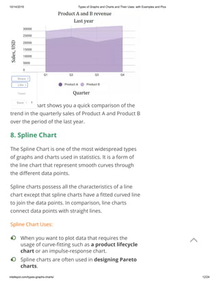
  • 11. 10/14/2019 Types of Graphs and Charts and Their Uses: with Examples and Pics intellspot.com/types-graphs-charts/ 11/24 Area charts show the change in one or several quantities over time. They are very similar to the line chart. However, the area between axis and line are usually lled with colors. Despite line and area charts support the same type of analysis, they cannot be always used interchangeably. Line charts are often used to represent multiple data sets. Area charts cannot show multiple data sets clearly because area charts show a lled area below the line. Area Chart Uses: The area chart has 2 variants: a variant with data plots overlapping each other and a variant with data plots stacked on top of each other (known as stacked area chart – as the shown in the following example). Example: The area chart below shows quarterly sales for product categories A and B for the last year. When you want to show trends, rather than express speci c values. • To show a simple comparison of the trend of data sets over the period of time. • To display the magnitude of a change.• To compare a small number of categories.• Tweet Share 3 Like 3 Save 1 
  • 12. 10/14/2019 Types of Graphs and Charts and Their Uses: with Examples and Pics intellspot.com/types-graphs-charts/ 12/24 This area chart shows you a quick comparison of the trend in the quarterly sales of Product A and Product B over the period of the last year. 8. Spline Chart The Spline Chart is one of the most widespread types of graphs and charts used in statistics. It is a form of the line chart that represent smooth curves through the di erent data points. Spline charts possess all the characteristics of a line chart except that spline charts have a tted curved line to join the data points. In comparison, line charts connect data points with straight lines. Spline Chart Uses: When you want to plot data that requires the usage of curve- tting such as a product lifecycle chart or an impulse-response chart. • Spline charts are often used in designing Pareto charts. • Tweet Share 3 Like 3 Save 1 
  • 13. 10/14/2019 Types of Graphs and Charts and Their Uses: with Examples and Pics intellspot.com/types-graphs-charts/ 13/24 Example: The following spline chart example shows sales of a company through several months of a year: 9. Box and Whisker Chart A box and whisker chart is a statistical graph for displaying sets of numerical data through their quartiles. It displays a frequency distribution of the data. The box and whisker chart helps you to display the spread and skewness for a given set of data using the ve number summary principle: minimum, maximum, median, lower and upper quartiles. The ‘ ve-number summary’ principle allows providing a statistical summary for a particular set of numbers. It shows you the range (minimum and maximum numbers), the Spline chart also is often used for data modeling by when you have limited number of data points and estimating the intervening values. • Tweet Share 3 Like 3 Save 1 
  • 14. 10/14/2019 Types of Graphs and Charts and Their Uses: with Examples and Pics intellspot.com/types-graphs-charts/ 14/24 spread (upper and lower quartiles), and the center (median) for the set of data numbers. A very simple gure of a box and whisker plot you can see below: Box and Whisker Chart Uses: Example: The table and box-and-whisker plots below shows test scores for Maths and Literature for the same class. When you want to observe the upper, lower quartiles, mean, median, deviations, etc. for a large set of data. • When you want to see a quick view of the dataset distribution. • When you have multiple data sets that come from independent sources and relate to each other in some way. • When you need to compare data from di erent categories. • Tweet Share 3 Like 3 Save 1 
  • 15. 10/14/2019 Types of Graphs and Charts and Their Uses: with Examples and Pics intellspot.com/types-graphs-charts/ 15/24 Maths 35 77 92 43 55 66 73 70 Literature 35 43 40 43 50 60 70 92 Box and Whisker charts have applications in many scienti c areas and types of analysis such as statistical analysis, test results analysis, marketing analysis, data analysis, and etc. 10. Bubble Chart Bubble charts are super useful types of graphs for making a comparison of the relationships between data in 3 numeric-data dimensions: the Y-axis data, the X-axis data, and data depicting the bubble size. Bubble charts are very similar to XY Scatter plots but the bubble chart adds more functionality – a third dimension of data that can be extremely valuable. Both axes (X and Y) of a bubble chart are numeric. Bubble Chart Uses: Tweet Share 3 Like 3 Save 1 
  • 16. 10/14/2019 Types of Graphs and Charts and Their Uses: with Examples and Pics intellspot.com/types-graphs-charts/ 16/24 Example: The bubble chart below shows the relationship between Cost (X-Axis), Pro t (Y-Axis), and Probability of Success (%) (Bubble Size). 11. Pictographs The pictograph or a pictogram is one of the more visually appealing types of graphs and charts that display numerical information with the use of icons or picture symbols to represent data sets. They are very easy to read statistical way of data visualization. A pictogram shows the frequency of data as images or symbols. Each image/symbol may represent one or more units of a given dataset. When you have to display three or four dimensions of data. • When you want to compare and display the relationships between categorized circles, by the use of proportions. • Tweet Share 3 Like 3 Save 1 
  • 17. 10/14/2019 Types of Graphs and Charts and Their Uses: with Examples and Pics intellspot.com/types-graphs-charts/ 17/24 Pictograph Uses: Example:  The following pictographic represents the number of computers sold by a business company for the period from January to March. The pictographic example above shows that in January are sold 20 computers (4×5 = 20), in February are sold 30 computers (6×5 = 30) and in March are sold 15 computers. 12. Dot Plot Dot plot or dot graph is just one of the many types of graphs and charts to organize statistical data. It uses dots to represent data. A Dot Plot is used for relatively When your audience prefers and understands better displays that include icons and illustrations. Fun can promote learning. • It’s habitual for infographics to use of a pictogram.• When you want to compare two points in an emotionally powerful way. • Tweet Share 3 Like 3 Save 1 
  • 18. 10/14/2019 Types of Graphs and Charts and Their Uses: with Examples and Pics intellspot.com/types-graphs-charts/ 18/24 small sets of data and the values fall into a number of discrete categories. If a value appears more than one time, the dots are ordered one above the other. That way the column height of dots shows the frequency for that value. Dot Plot Uses: Example: Suppose you have a class of 26 students. They are asked to tell their favorite color. The dot plot below represents their choices: It is obvious that blue is the most preferred color by the students in this class. To plot frequency counts when you have a small number of categories. • Dot plots are very useful when the variable is quantitative or categorical. • Dot graphs are also used for univariate data (data with only one variable that you can measure). • Tweet Share 3 Like 3 Save 1 
  • 19. 10/14/2019 Types of Graphs and Charts and Their Uses: with Examples and Pics intellspot.com/types-graphs-charts/ 19/24 13. Radar Chart A radar chart is one of the most modern types of graphs and charts – ideal for multiple comparisons. Radar charts use a circular display with several di erent quantitative axes looking like spokes on a wheel. Each axis shows a quantity for a di erent categorical value. Radar charts are also known as spider charts, web charts, star plots, irregular polygons, polar charts, cobweb charts or Kiviat diagram. Radar Chart has many applications nowadays in statistics, maths, business, sports analysis, data intelligence, and etc. Radar Chart Uses: Example: For example, we can compare employee’s performance with the scale of 1-8 on subjects such as Punctuality, Problem-solving, Meeting Deadlines, Marketing Knowledge, Communications. A point that is closer to the center on an axis shows a lower value and a worse performance. When you want to observe which variables have similar values or whether there are any outliers amongst each variable. • To represent multiple comparisons.• When you want to see which variables are scoring low or high within a dataset. This makes radar chart ideal for displaying performance. • Tweet Share 3 Like 3 Save 1 
  • 20. 10/14/2019 Types of Graphs and Charts and Their Uses: with Examples and Pics intellspot.com/types-graphs-charts/ 20/24 Label Punctuality Problem- solving Meeting Deadlines Marketing Knowledge Communicatio Jane 6 5 8 7 8 Samanta 7 5 5 4 8 It is obvious that Jane has a better performance than Samanta. 14. Pyramid Graph When it comes to easy to understand and good looking types of graphs and charts, pyramid graph has a top place. Tweet Share 3 Like 3 Save 1 
  • 21. 10/14/2019 Types of Graphs and Charts and Their Uses: with Examples and Pics intellspot.com/types-graphs-charts/ 21/24 A pyramid graph is a chart in a pyramid shape or triangle shape. These types of charts are best for data that is organized in some kind of hierarchy. The levels show a progressive order. Pyramid Graph Uses: Example: A classic pyramid graph example is the healthy food pyramid that shows fats, oils, and sugar (at the top) should be eaten less than many other foods such as vegetables and fruits (at the bottom of the pyramid). Conclusion: When you want to indicate a hierarchy level among the topics or other types of data. • Pyramid graph is often used to represent progressive orders such as: “older to newer”, “more important to least important”, “speci c to least speci c”‘ and etc. • When you have a proportional or interconnected relationship between data sets. • Tweet Share 3 Like 3 Save 1 
  • 22. 10/14/2019 Types of Graphs and Charts and Their Uses: with Examples and Pics intellspot.com/types-graphs-charts/ 22/24 You might know that choosing the right type of chart is some kind of tricky business. Practically, the choice depends on 2 major things: on the kind of analysis you are you want to perform and on the type of data you have. Commonly, when we aim to facilitate a comparison, we use a bar chart or radar chart. When we want to show trends over time, we use a line chart or an area chart and etc. Anyway, you have a wide choice of types of graphs and charts. Used in the right way, they are a powerful weapon to help you make your reports and presentations both professional and clear. What are your favorite types of graphs and charts? Share your thoughts on the eld below. Silvia Valcheva Silvia Vylcheva has more than 10 years of experience in the digital marketing world – which gave her a wide business acumen and the ability to identify and understand different customer needs. Silvia has a passion and knowledge in different business and marketing areas such as inbound methodology, data intelligence, competition research and more. Tweet Share 3 Like 3 Save 1 
  • 23. 10/14/2019 Types of Graphs and Charts and Their Uses: with Examples and Pics intellspot.com/types-graphs-charts/ 23/24 LEAVE A COMMENT RELATED POSTS Examples of Unstructured Data 12 Data Entry Projects Outsourcing Companies: Best List Best Data Collection Tools: Software Apps Worth Considering Comments* Your Name* Your Email* Website Tweet Share 3 Like 3 Save 1 
  • 24. 10/14/2019 Types of Graphs and Charts and Their Uses: with Examples and Pics intellspot.com/types-graphs-charts/ 24/24 This site uses Akismet to reduce spam. Learn how your comment data is processed. Save my name, email, and website in this browser for the next time I comment. Notify me of follow-up comments by email. Notify me of new posts by email. SUBMIT Tweet Share 3 Like 3 Save 1 About Intellspot.com is a blog that aims to help you understand and use data to reveal valuable insights, improve decision making and boost innovations. Here you will nd articles, lessons, insights, tools, techniques and powerful software solutions that help you grow. Main Menu Home Business Intelligence Marketing Intelligence Management Free Resources Business Intelligence, Data Science, and Management Copyright 